Monday, August 31, 2009

The French (Im)Perfection


Another quick post with a few pieces by designer Thomas Sauvage for Ego Paris. It's really stunning outdoor furniture that seems to just scream to be at some five star hotel on the French Riviera.

First, the Premiere Collection, here's the lounge chair:

For something seaside, you have to love how it looks like a fish. It's perfect. The low armchair also has a certain grace to it:


But we do have a bit of a problem, Houston. Sauvage has created an entire collection out of one idea. Unfortunately, in extrapolating each style into too many different pieces, he somehow gets lost. Some of the other pieces, while they do appear to be part of the same collection, end up boring at best, and at worst, just plain awkward. The Premiere Armchair is doing nothing for me at all, although I suppose it's inoffensive enough:


But the Premiere café table is almost messy. If nothing else, it for sure has none of the elegance of the lounge chair, at all:


The same thing happens with the Tandem Collection. The lounge chairs for sunbathing are so beautifully sophisticated:

I adore how the mesh is totally flush with the wood, and they gently diverge to curve up and down. It's a terribly adept handling of shape of materials. Even in a more shocking yellow, the lines are perfect and the umbrellas are unique and interesting:

The collection is basically sectional, allowing you to create all different seating arrangements around the pool. The other low, loungey pieces are all quite nice and work entirely harmoniously in groups.

But again, trying to apply the same style to other pieces in the collection was not the best idea. The tables are fine and simple, but end up looking mostly bland and utilitarian. The Tandem High Bench is almost downright horrifying:

A minute ago I was relaxing at the pool sipping on a Mojito. Now I'm...in the army? Weird. Sauvage clearly has talent and a good eye. I think he'd be well served to either create pieces that merely complement one another without being so literal and trying to force them against their will into one inflexible style, or recognize when a style concept has been exhausted and allow the collections to be a little less all inclusive. If he began another collection altogether at the dining table and chairs, I'm sure they'd be exquisite, but perhaps extending it all the way down to lounge chairs would be inadvisable...not to mention unnecessary.

©2009, Ryan Witte

Thursday, August 27, 2009

We Will Rock U--Part Two

Next we jump ahead two decades to the 1950s. It was in 1954 that the institute was renamed The Rockefeller University, they created a graduate program, and began to expand. But first, CSBA added this extension to the Hospital in 1951, seen here at the top right with the mostly nondescript Gasser Hall in the right foreground:
Click for larger.
--All photos ©2009, Ryan Witte, except where otherwise noted.

Obviously, that's not a building from 1951, from the looks of it. It was renovated again in 2000 by HOK, the absolute masters of stadium and sports arena architecture whose roster of projects is so gargantuan I won't even bother to go into it here. They also added the fifth and sixth floors. Here's what it looked like when it was being constructed, quite sensitive in style to the original structure it was supplementing:
--Photo courtesy Shepley Bullfinch.

But when Harrison & Abramovitz came in toward the end of that decade, things really started to get interesting. This is also when Kiley redid the landscape design.

In 1958 Harrison & Abramovitz built Caspary Hall/ Abby Aldrich Rockefeller Hall and the President's House. Caspary and Abby Aldrich easily read as one single building, but it's divided in two on the interior with faculty offices in Caspary and a dining hall and other amenities in Abby Aldrich.

The southern end is Caspary. This is one of the many inviting outdoor spaces, nicely concealed from the main entrance roadway by dense foliage:

Then the southern end is Abby Aldrich:
I didn't go into the buildings too much, but this one I did, because it seemed to be the only way to get from the lower level to the upper level without walking all the way around the building. The interiors are gorgeous in that sparse mid-century sort of way. Here's a lounge area with Chuck Close's portrait of Philip Glass:
And on the opposite side of that wall, a portrait by Paul Peter Kiehart of Abby Aldrich Rockefeller herself:
I don't know if anyone actually lights those fireplaces in the winter, but I certainly hope they can and do. It would be such a beautiful place to hang out on a frosty winter night.

This section of the building had a number of interesting paintings, one that looked like Piet Mondrian but wasn't, one that looked like Clyfford Still but wasn't, and a few others that looked like they were but weren't. Outside is a sculpture that looked like and actually was by Herbert Ferber, Homage to Piranesi, I (1963):

The northern end of the building terminates in the most incredible sort of pavilion, one of those moments of discovery and an example of the team's goal to create a series of "outdoor rooms" throughout the campus:
You could smell barbecue all over this part of the campus, it was coming from here. The food looked unbelievably delicious, but I didn't think I should ask for a taste. This gets even better, too. Where that greenery is, just right of center, is actually a circular opening to the lower level with a tree growing up through it:
The campus is situated on a hill, like with Founder's Hall positioned majestically at the top of it as seen from York Avenue. Almost all the later buildings take amazing advantage of that slope to create these incredible views and meandering routes from one level to the next. It's as if they conceived of the inhabitable volumes and their interrelationships not just on the X and Y axes, but also fully on the Z.

Right outside that covered patio is this extremely charming fountain:


They have more grills you can see there, which I assume the students/ faculty can use to make burgers whenever they like. The public relations person pointed out that it's been called an "urban oasis," and she wasn't kidding. This place seems like paradise in the summertime. It's no wonder they can lure the world's greatest scientists to this place.

To the west of this pool is the Philosopher's Garden, with a terraced area with tables and chairs--remarkably full of people, by the way, so I didn't photograph it--and more fountains.


There were ducks everywhere, not surprisingly, just wandering around. In this pool was a mother with a bunch of ducklings trailing behind her. But in the distance there you can see arguably the most widely recognized building on the campus, the domed Caspary Auditorium.
There's another duck there, if you look closely. The dome may not look quite as familiar because it was originally covered in mosaic tiles--at least, that's how I remembered seeing it in photographs. Within eight months after it was completed, the original tiles had bit by bit started to come dislodged and pop off like projectiles, I was told. Some years ago, Abramovitz' firm covered it over with this Fullerish dome. I asked if there were plans to redo the mosaic, and I guess there aren't, which I think is kind of a shame, but I can understand that this is probably far more durable and it is, reportedly, self-cleaning, which is good considering bird poop and so on.

I love how the geometries work so beautifully with the sunlight and shadow.
The entrance and interior are totally sculptural in this wonderfully late-50s sort of way, too. You walk through a set of double doors (around the corner from the Chuck Close) into a staircase lobby not much larger than the doorway. The staircase corridor gets wider and wider as you step down toward a wall of glass and a set of glass doors that lead into the auditorium below. In other words, you enter it from above through that concrete bridge you see in those exterior shots. Along one side of the stairs are these terraced pits filled with stones that once contained plantings. The other side of the staircase was made into a ramp for ADA compliance. There was an event going on inside and a trio of snotty 20-something year olds--I guess working?--in the lobby, so I just took a quick look and left without getting photos of it. Here's what it looked like when it was first built:
--Photo courtesy Desde la memoria urbana.
The acoustics were by Bolt, Beranek & Newman, who I think I may have discussed before elsewhere. They also created the revolutionary live translation system at the United Nations and acoustic specifications for the ill-fated Philharmonic Hall before it was overhauled in the 1970s. I'll be the first to point out that what happened at Lincoln Center was not at all their fault, in fact Leo Beranek (who very kindly corresponded with me briefly by email) did everything he possibly could under insane circumstances, but that story is way too long to go into here. They were the ones to implement the ARPANET, what eventually became...this. They were the first to use the "@" symbol for email addresses and they created the first protocol router. They're now called BBN Technologies and are a fascinating company.

Unfortunately, I couldn't even get close to the President's House to so much as see it. In fact, the security guard at that entrance was being a bit of a butthole, to be honest. I swear, I think one of the job requirements for being a security guard is that you need to have self-esteem issues and become very easily intoxicated by small amounts of power. He needed to prove to me that his you-know-whats were WAY bigger than mine. Luckily I know how to appease these types. I puckered up and kissed his behind, and by the end of our exchange, he was all about shaking my hand oh, so politely and making nice.

On top of it all, finding any images anywhere of the President's House was like some kind of tragicomic Surrealist scavenger hunt. The person at the Rockefeller Archives was very nice, and they do have some from when the buildings were first built, but I wasn't going to make a trip to Sleepy Hollow or whatever (I've already been up there, trying to catch a glimpse of the Headless Horseman--we didn't), or pay all the fees to get them. For some great historical photos, check out Robert Stern's New York 1960. Rockefeller University PR were kind enough to let me show this image of when it was first built, from an old transparency:


Anyway, I did get some nice shots from the river promenade:


As for the interiors, these photos are the work of a very cordial and fantastic photographer by the name of Marie Kotschedoff (I always have to be careful when I try to spell that). I highly recommend checking out her work.

Here you can see the amazing interior landscaped courtyard, which responded perfectly to Kiley's landscaping of the campus in general, and very much reminds me of Philip Johnson's residential work from this same period:

And the dining room, which evidently could accommodate dinner parties for around fifty people or something insane:

Part Three forthcoming.

©2009, Ryan Witte

Wednesday, August 26, 2009

Being Institutionalized

Another of the shows I haven't really had a chance to mention until now was the Armory Show. It was at the concurrent sort of sister show, Volta, where I found the work of Ian Davis. I was fascinated by his scenes and asked him for an interview. Here it is, for your enjoyment.

Ryan Witte: First of all, where do you call home?

Ian Davis: I live in Jersey City.

RW: Do you have a studio there or somewhere close by?

ID: My studio is in Hoboken. I've been there for the last six years but don't recommend it. I've had a great deal on a subsidized apartment in Jersey City, but apart from that it has no perks whatsoever for artists. I'm actually moving upstate at the end of this month, into a house that was built before the Civil War, with a studio in the back yard.
I'm looking forward to it.

RW: Wow, that sounds incredible. Although those old houses can tend to get a bit dusty.

Do you have music playing while you work?

ID: I listen to music constantly. That and NPR, like everybody else.

RW: What kind of music will you usually listen to?

ID: All types of music. For the last couple years, it's been lots of '60s psychedelia, mostly West Coast and English stuff. I'm interested in the way music from that era was crafted. It was weird, sonically, but the song was still important. I think that relates to my work in some way: this idea of things being a bit bent, a bit skewed, but it's still defined and articulated.

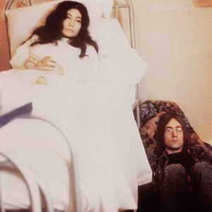
RW: I can totally see that, especially with some of Pink Floyd's really early work. I have this whole weird theory about what happened to music during that time, mostly revolving around John & Yoko's Life with the Lions that I won't bore you with--have you heard their first few solo records? But in my humble opinion, after around that time, the entire way music would be conceived and composed changed so dramatically.

ID: I'm really interested in recordings as opposed to performances. The thing about this music from roughly '66 to '68 is that people started making records that couldn't be performed. The drums are slowed down to give them a certain texture, the guitar is recorded over the drums, but is played by a guy standing in a field, and you get ambient noise behind it, there are backwards harpsichords, etc.. A lot of this music has very childlike sentiments, but there's a darkness there, as well. The Beach Boys made an amazing record called Smiley Smile that has a lot of the feeling I'm thinking of. It sort of creates its own little world.
I don't listen to too much new music, like Indie Rock or whatever. Lately I'm enjoying Fats Waller, The Stone Roses, Ronnie Lane...

Ian Davis, Auditorium (2006, acrylic on Masonite)
--All Davis images courtesy Leslie Tonkonow Artworks.
RW: I notice you seem to prefer working on linen, and only one of the pieces I saw was on Masonite. Because of the kind of work you do, I'd actually think Masonite would be ideal. What is it you like about working on linen?

ID: The supports are just sort of what I have around. Somebody gave me a huge amount of linen, so I'm using that. Masonite is good, but big panels are really cantankerous, so I pretty much avoid using them for anything large. To be honest, I can't really tell the difference between linen and canvas, because once the surfaces are prepared and gessoed and sanded a million times, they act the same. Maybe if I were a different type of painter, there would be an advantage to one or the other, but for the way I work, it's pretty much the same.

Climate (2008, acrylic on linen), click to enlarge.
RW: Do you calculate your perspective by some geometric method or do you work it out by eye?

ID: The way I deal with perspective is anything but scientific. I'd describe the method I use as "good enough."

RW: [LOL]

ID: In other words, I typically decide while I'm making the painting what elements need to be correct-looking for the space to feel somewhat believable, but then I often contradict the perspective in places, so things don't look too static--a little off-kilter.

I use the most low-tech methods for putting things into perspective. It's a little embarrassing. If a painting is big, I have to calculate more (I use the term "calculate" loosely). A lot of masking tape is used. I try not to make things look too settled. But when I'm working out perspective, I'm using sticks and ropes and tape and all sorts of devices. Whatever works. It's not typically a mathematical thing, like Piero della Francesca or something.

RW: So halfway through, they look like one of those Jasper Johns pieces with all kinds of wooden bars and strings hanging off them?

ID: When the paintings are in progress, they look like a mess. I have to rope them in. They're built the way they look, and it's not until I'm about eighty percent done that they start to look like a painting, at all.

Dining Hall (2009, acrylic on linen)
RW: The spaces your subjects occupy are enormous and a few have no visible ceiling. The ceiling in the Dining Hall, for instance, would have to be at least ninety feet high, if not higher. Does being framed by the proportions of a painting guide or distort the environments in it, or do you proportion your paintings to accommodate what will be in them?

ID: The relationship between the spaces and the figures is pretty much worked out on the fly. Sometimes I want architecture to dwarf the people. Sort of like the way the architecture dwarfs Anthony Perkins in Orson Welles' The Trial--this idea of the institution dwarfing the people.
Court scene begins at around 3:45.
I really like the way scale is used in that movie.

RW: It's interesting that you mention that here, because Citizen Kane was remarkable for being one of the first films to ever show ceilings in its interior shots. Most Hollywood movie sets didn't have them so they could be lit more thoroughly, but Welles insisted for artistic reasons.

ID: I wasn't aware of that about Citizen Kane, although I love the movie (obviously) and wasn't aware of some of the lengths he went to to get what he wanted to see. Have you seen The Magnifent Ambersons?

RW: No, I haven't, but I think the man is a genius, and I really should see more of his work.

ID: That's a really good one, too. I don't know why you can't get it anywhere.

RW: Maybe because the final release was so mangled beyond recognition by the studio? It may be too far from Welles' original vision to be of as much interest to his fans as the others.

Anyway, to get back to your paintings...

ID: The sizes of the paintings are not exactly arbitrary, but I don't fuss about it a lot. Occasionally, I'll start a painting and realize that it needs to be bigger and I'll start it over somewhere else. Typically, I'll just fill up the surface of whatever I have.

RW: This is probably a very obvious question in regard to your work, but do institutions breed uniformity?

Guilded Age (2008, acrylic on linen)
ID: I'm not sure that institutions breed uniformity. I hate to take a definitive position on that, but I'd say that that's pretty much the objective of most institutions. I'm just not sure that uniformity is always a bad thing. Usually I'm taking a critical look at some really basic characteristic of human nature such as greed, or opportunism, or conformity.

Excavation (2008, acrylic on canvas)
RW: The gaze of your subjects also seems to be always very limited in scope (to only whatever happens to be lit by the light on their helmets) or focused on one single point in space, one fetishized object. Is there something dangerous about their inability to grasp a bigger, more complete impression of their surroundings?

ID: I think of the figures in my paintings as people who have lost their ability to do anything other than go along with it all. Occasionally there will be a few people sneaking sideways glances, but for the most part they are participants. They stare at a fixed point because they have been told to.

RW: I'm curious about these sideways glancers. Are they checking to see what everybody else is doing so they can properly conform, or perhaps making sure everyone else is doing what they're told, or are they renegades?

ID: I really don't know about the sideways glancers. When I'm painting a crowd, I'm just sitting really close and not stopping to look much. It happens better if I don't constantly check my progress. Occasionally, some of the people are looking at each other accidentally. Sometimes I'll paint a guy and he looks just like my ninth grade geometry teacher or some actor or something. There's a little pause, "oh, I just painted Jan-Michael Vincent..." something like that. Just little accidents. If I were too conscious of doing all this repetitive stuff, I'd never get anything done. A lot of these paintings just become what they are by the virtue of being painted. I think some of the mystery or darkness might just be inherent.

Physicians (2008, acrylic on linen)
RW: Is the culture of institutions somehow self-defeating? In other words, does the necessity to focus resources on one goal or another prevent them from solving the problems they face in a more efficient manner?

ID: I don't really know about the culture of institutions. I don't have a fixed perspective on that. I tend to look at all clubs critically, but I suppose that they are necessary to get things done. I think it's easier to focus on fixing one thing rather than trying to fix everything. I'm just skeptical, because I'm a bit more attuned to observing man's destructive objectives, and how they are often carried out under the guise of "progress."

Strategy (2006, acrylic on canvas)
RW: In the broadest possible sense--that is, divorced from militarism--what constitutes an "army"?

ID: I would describe an army as a group of obedient people who do not function as individuals. But again, I certainly don't consider myself an authority on this, since I've never been in an army. I'm just trying to create masses rather than individuals.

Corporation (2006, acrylic on canvas)
RW: Is corporate culture inherently detrimental to human beings and/ or the planet we inhabit?

Clients (2008, acrylic on linen)
ID: I think corporate culture is repulsive and destructive and requires its participants to feign ignorance of the effects of their actions on the world around them. I don't think this is inherent to corporations, but as long as the accumulation of wealth is the only goal, then everything else becomes insignificant.

Banquet (2006, acrylic on linen)
RW: Have you ever worked in a 9-to-5 cubicle job?

ID: I have always avoided the 9-to-5. When I was eighteen and knew nothing about being an artist, I read a book on Keith Haring where he explained that you can't be an artist unless that's all you're trying to be, which I took very much to heart. I didn't really start painting seriously until I was twenty-one, however. I never had a desire to do any work other than my own.

RW: Do you hope your paintings will be perceived as "beautiful"?

ID: I definitely want my work to be beautiful. That's really important to me. I suppose it's my idea of beauty that might be a bit peculiar. But I'm interested in making a beautiful object. This isn't the only goal, obviously, but I'm interested in a dark sort of beauty.

RW: I definitely think you succeed. But it makes for a strange contrast in your work. While the pieces are formally very pleasing to the eye, the scenes you depict are somehow unsettling and a little bit creepy, which I take to be on purpose...

Thanks, Ian!

Ian Davis is represented in New York by Leslie Tonkonow Artworks:
www.tonkonow.com
212 255 8450

©2009, Ryan Witte