I'd noticed Studio JSPR some years ago because of their Plastic Fantastic line. Since then, I've come to be most impressed with how diverse their talents are. In other words, their different projects are individually very cool but also brilliant in very different ways from one another.
Plastic Fantastic is this stuff: They're traditional looking pieces of furniture, no doubt replicas of antiques. But JSPR has coated them entirely in polyurethane rubber, so in addition to the vibrant, even shocking colors, they're perfectly fine outdoors. I absolutely love this idea. There's something almost surreal about the vision of that antique sofa, bright white, sitting outside on your lawn as a piece of outdoor furniture. Unlike plastic, the rubber allows them to be soft under your behind, unlike metal they won't rust, and unlike fabric mesh they won't be a haven for mildew. I wanted to go the opposite direction, as well. I imagined the pieces in wholly realistic colors: brown hardware like wood and cushions painted to look like upholstery. I love the idea of seeing an ordinary chair out in the backyard, especially if guests can see it in a rainstorm and think it's being ruined, when it's actually made of rubber and completely fine.
Evidently the first rubber coat is fibrous, so it won't work with stencils. The last colored layer can take stencils. In fact, JSPR has used such a technique to add logos to pieces for hotels and situations like that. They pointed out, though, that with these pieces I've shown, because of the shapes, stenciling is very time consuming and difficult and works far better on their more modern Minimal line, which has more flat surfaces. Nonetheless, I'd assume it would be just as easy to give one of them a custom paint job as it would with any other piece of furniture.
The next project I found very cool is their Cover Tiles. It's a series of ceramic tiles that expose the plumbing in your bathroom. This idea is just so awesome. I actually do have an exposed pipe in my bathroom, but it happens to be for the steam heat. We've all seen those old bathrooms with the exposed plumbing, though. To me, this is just the perfect, most elegant solution to that. It makes something we're normally inclined to want to hide into a design gesture, perhaps even a hindrance into an asset.
A matte black bathroom could be very chic. It might also be a little depressing or maybe just a bit too 1980s for my taste. These tiles are also offered in white, which I fear might look a bit utilitarian. I may be at risk of sounding like a broken record, but I'd love to see these in more traditional colors and patterns, even something that hints at being Victorian, for instance. I guess that's just my own aesthetic, but I definitely think it could emphasize the unorthodox, informal quality of the tiles if, in contrast, it appeared they were trying to be very formal, indeed. An upcoming post will give me additional opportunity to force my opinions on tile down your throat.
I also wish they were a bit more accommodating to using one's own plumbing fixtures. Not only can the choice of fixtures be a significant design element in a bathroom, where the location of water sources is pretty much the most important feature of the room, but people also tend to be very picky about their water flow. Some insist on saving water, others want needles of water to scour themselves, yet others want a hand-held shower head for those hard-to-reach body parts.
This year at the ICFF, they unveiled something as different from these last two items as they are from each other. It's a number of steel and glass cases for all your treasured belongings. Now that's interesting enough, mostly as a result of the giant glass dome on top. When they group a bunch of cases together, though, it becomes something really remarkable. They look like some dusty old British natural history museum in the 1870s, but like you're looking at it through a kaleidoscope. Really wonderful. As in some of their press shots, the cases seem to be begging for fossilized or taxidermied animals to display. But that's what makes this so perfect for a collection of something else, whatever your passion might be.
Let's imagine something really, really awful, how about? After you've recovered from all the violent Cute-induced vomiting, the cases would make you stop and think, "Wait a minute...is there something special about this horrifying Precious Moments figurine that I should be seeing? Why is it displayed so beautifully? Was it a one-off piece now worth hundreds of thousands of dollars? Was it painted by Francesco Clemente working his way through college? What's going on here?" And for a collection of less sickening art objects, even better. I'd also like to see these cases not free-standing on the floor, but custom built into a wall, with different shapes projecting out of it and exquisitely lit by sharp points of halogen light. I'm not sure if JSPR does custom work like that, but I'm sure if you lived in the Netherlands, they'd consider it for the right price.
Terminal 1: Eastern Airlines (Chester L. Churchill, 1959)
Chester L. Churchill has fallen well into obscurity, and evidently this forgettable building didn't help. He was also a tugboat, though, by the way. His T1 was demolished when Eastern dissolved. The new building, designed by William Nicholas Bodouva & Associates and completed in 1998, is alright but mostly uninteresting. I skipped it. I was admittedly more interested in the original mid-century buildings, anyway.
At the moment, construction barriers obscure Terminal 2. Likely the best thing about it is its entryway, a group of hexagonal roof platforms on stilts vaguely reminiscent of Wright's Johnson Wax Building (though not nearly as sophisticated). It's now operated by Delta, which acquired both Northeast and Northwest Orient. Braniff, the coolest airline to ever fly, is sadly gone. My first terminal was Terminal 3.
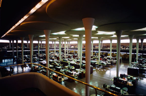
The Worldport is a truly spectacular building. The rumor is that it's at risk of being demolished by Delta. The project was supposed to begin this summer, but there it still stands. I will admit that it very much needs some tender loving care, but no way should it be razed. The underside of the four-acre canopy appears a little bit pockmarked but otherwise has held up remarkably well.
The minuscule interior is arguably in worse shape than the exterior. When its entire elliptical volume was both unobstructed by interior structures and freely navigated, it was no doubt far more majestic. As it stands now, it's chopped in half by ticket counters and cluttered with security checkpoints. As soon as you walk in the door, you can barely take two steps before colliding with something. As merely a grand entrance lobby on a much larger, expanded terminal, this room would be glorious. At the moment, it looks like it's about the burst at the seams.
The windows are a bit grimy and really ought to be replaced. The ceiling is stained with what appears to be water damage. Then there are these weird flag things with rope (tubes?) hanging from them that appear to be either trying to conceal air ducts or some kind of badly conceived art installation. Possibly they collect water from leaks in the roof.
An intervention to save this terminal would have to be very careful, however. While the original terminal would be beautiful as an entrance lobby, a renovation would do it great justice to allow some planes to be boarded under the canopy as originally intended.
If it could, for certain T3 could boast the shortest walk from gate to airplane of any terminal in the world. Likely, with security as tight as it's become, this wouldn't be possible. My idea was to allow express service for top frequent flyers to quickly board commuter planes here with some kind of high-tier ID card, and send the regular passengers into the larger terminal to the rear. TAMS also designed the expansion behind this building in 1976.
The AirTrain structure here is not as much a huge blight on the vista--though it definitely is--as it is so very out of place, stylistically. Thoughtful architecture could have made the AirTrain construction a seamless part of the older structures. Instead, the new battles with the old, and quite inelegantly. The airport had been sharply criticized from the very beginning as being a disconnected hodgepodge of architectural confusion. The construction of the AirTrain was one last opportunity to pull the wildly disparate architecture into a cohesive whole once and for all. This opportunity was entirely lost.
Also now gone are Milton Hebald's sculpture Zodiac Screen for the enormous glass wind buffer that now announces Delta's residency. --Photo courtesy Life, obviously. It was the largest sculpture grouping of its kind in the world at the time and is now allegedly owned and stored by the New York Transit Authority. [I say "of its kind," because the people calling it simply "the largest sculpture in the world" have clearly never heard of either this or this, or for that matter, this.] Aside from the reference to the skies, I'm not sure I see the relevance of the Zodiac signs here, although I suppose they were a better choice of mythological subject than the story of Icarus.
It was around the Worldport, also, that I took notice of the landscaping. There's not much land left to scape, and visually it pales pathetically in comparison to Wallace Harrison's original plans. But I was pleased to see that the small amount of landscaping that remains is quite lush, very well maintained, and as pleasing to the eye as it can manage under the circumstances.
Giving me a hard time about photography at this terminal was another paranoid construction worker. The irony this time being that I wasn't even anywhere near the building, particularly, but rather facing out a window from inside the AirTrain station. I found this to be the most bizarre thing about the nature of security at JFK... Part 3.
Looking back on the Architectural Digest Show weeks later, the work of the New Traditionalists in SoHo was some of the work that still stuck with me most. When I first saw their booth, I thought it looked especially handsome and really liked their aesthetic. But when the booth rep started pointing things out to me, I got really impressed. It's the kind of stuff I've spoken about before. It's first of all applying hot new technologies to familiar forms. Secondly, it's the kind of stuff you'd possibly pass by thinking it's nice, but only upon taking a much closer look might you realize how impeccably crafted it is. I appreciate both the subtlety of that and the potential for "ooohhh!" kinds of moments.
Their Chair No. 79 shows all the adept craftsmanship: Chair No. 395 has all the warm, handsome richness of an old library: Side Table No. 33 gives you something vaguely familiar, but in decidedly new colors:
Most impressive are the details. Like the door faces on the Credenza No. 840. It's navy plaid leather:
But the piece that really took me over the edge was their Chair No. 66. Now, it looks like your ordinary club chair, more or less. Minor details like the buckled straps at the bottom make it fairly obvious that this is a high quality piece of furniture. But the rep pointed out to me the upholstery. It looks in the photo like suede. In fact, even in person, even getting right up to it and touching it, it seems like suede. Actually, it's laser cut leather. The leather has been cut in grooves about a half a millimeter apart, almost like very, very fine leather corduroy. It has the most amazing texture to it, and I was immediately blown away by this classy and fascinating use of new technology in a piece that looks undeniably classic.
At long last, here is the huge project to which I've made reference a few times. It's a follow-up to my story about JFK Airport from a couple years ago and a more in-depth look at its architecture.
I've now had the opportunity to visit the greatest gateway in the United States twice, just for the pure pleasure of doing so. The first time was by train, starting from another important structure in the story, Walter Gropius' Pan Am Building (now MetLife, 1962). My second, more recent trip was by car.
--Google Maps view. Arrival by automobile is sort of like riding a kiddy roller coaster at an amusement park--but without the fun part. This is not to say that the signage isn't terrifically clear and easy to follow, but the arrangement of the roadways defies all common sense. Having driven around "Terminal City" most of the afternoon, I finally feel that I have some concept of how it's all laid out, and I'm sure seasoned taxi drivers are comfortable with it. For the occasional traveler, it's something of a mess.
It was admittedly before my time, but I can't help but pine for so intuitive a notion as a simple oval roadway dotted by well-placed terminals, as it was originally conceived. I'm sure employees who arrive by car know the tricks, but getting from one place to another inside the airport is a nightmare. Every time I left a terminal, I had to exit the airport entirely, go around that South Service Road, and enter again. I must have done that seven times.
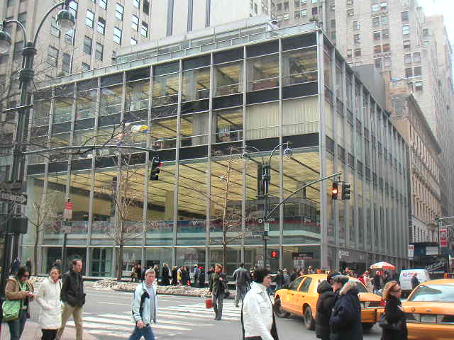
Though quite modestly sized, this bank has very suave proportions and is wonderfully sleek. Raised up off the ground on thin steel pillars, it appears to float on the horizon in a quite magical way. It was functional, though: the open ground level was originally intended to accommodate drive-in services. There's something very Miesian about that, as well.
As Ada Louise Huxtable has said, SOM were and are the absolute masters of the curtain wall. This building shows off their skills to great effect. The structure of the building--that is, the row of steel piers--has been pulled apart from the glass enclosure. Structure and enclosure become rationally two separate functions of the architecture.
The interior--accessed by a floating double staircase--is sparse and shiny in a deliciously 1950s sort of way. Ironically, although it isn't even an airline terminal, this was where I encountered the most staunch resistance to my camera. This was an over-zealous construction worker with delusions of CIA involvement. Not only did he give me a good talking to, but very nearly grabbed me by the scruff of the neck to drag me bodily into the bank manager's office upstairs. The manager was very nice, but I could tell he needed some assuaging before he'd be comfortable with the idea that I was there only to appreciate the architecture of his workplace (which I'm fairly certain he'd never considered before).
Before moving on, I wanted to mention a couple of news items. First of all, DOCOMOMO, the fantastic organization that works to protect our Modernist heritage, has launched their new website. I'll have to say, it looks quite nice, and I'm happy to see them thriving.
On a lighter note, one of my favorite craftspeople, Joshua Ben Longo of Longoland, who I've talked about before, got commissioned to do this hilarious German TV commercial:
His monsters represent exorbitant telephone charges. It makes me wonder if Longo's ever been approached by, say, a troupe of experimental puppeteers, and if not, then why on earth hasn't he?
I also noticed from looking around again that he has some of his sketches on his website, and they're really quite fun in their own right: Click that.
I thought it was about time for some bikes. Is it ever a bad time for bikes, really? I spotted Confederate Motors from Birmingham, Alabama, at the Auto Show this year. They were a bit hard to miss, though, actually, located in the main lobby rather than on one of the exhibition floors. This is truly some of the most astonishing design work I have seen in a very long time.
I'm going to start with the F131 Hellcat Combat, because it's the most traditional of all their bikes. Let it be said, of course, that "traditional" is extremely relative when describing anything Confederate is doing. Here's the Hellcat: Most definitely click these. The Hellcat weighs in at 490 pounds with a horsepower of 149. Now its posture and attitude are clearly American. I'm tempted to argue that even if Ducati or Yamaha were to actively try to replicate the sensibility of American bikes, they'd get something close but just a little bit...off. The effortlessness with which Confederate captured it is brilliant because, at the same time, they don't look like any other bikes out there. Even more, they look like something from the far distant future. The Hellcat is a little bit too soft and curvaceous, in my humble opinion, although a gorgeous machine, to be sure. It would've been perfect underneath the leather-clad behind of Kristanna Loken. All of them have been sold.
It's very difficult to decide between the next two, but I'll go first with the B120 Wraith: With a top speed of 185 miles-per-hour, the Wraith is the fastest bike in its class. In fact, it shattered the record by 25 miles-per-hour. Its monocoque construction is mostly aircraft-grade aluminum and carbon fiber. So it has 125 horsepower and 134 foot-pounds of torque on a bike that weighs only 390 pounds. That's sort of like taking the engine from this: And putting it onto this: Of course, the Laugh & Learn™ Mower has "poppity-pop action," and you really can't beat that.
I find it most impressive that Confederate doesn't just have a design concept for their machines; they have a fully-articulated design philosophy. It's what can be said for only the greatest industrial designers through history: Dreyfuss, Loewy, Bel Geddes. They weren't just making nice objects, they were transforming the world. It's not something that I'd be necessarily surprised to find in some grad school designer with perfectly clean fingernails. I also wouldn't be surprised to see a fantastic, straightforward design coming from someone in the machine shop, building a bike from scratch, from the ground up. The difference with Confederate is that they have the best of both worlds: a deep understanding of the aesthetic they're creating and dirt under their fingernails.
When you really look at the bikes, you can see what they're after. The design speaks of honesty and integrity, brute strength, and a fearless individuality. In essence, "be true to yourself, wear it with pride, and if anyone doesn't like it, they can screw off." It's something Harley-Davidson lost years ago, not long after the first yuppie corporate tool bought one to satiate his blossoming mid-life crisis. Need I even mention cheesy Hard-Rock-Cafe-style tourist trap restaurants? I'm not saying Harley doesn't do some great work, but the best thing about them is their historical continuity. They hardly celebrate rebellion anymore, and Confederate easily proves that the appeal of "Americanness" is a much more elusive, mysterious quality.
They're so very pared down that I actually needed to ask if they're street legal. It turns out that all of Confederate's bikes are. If you want a Wraith, you'd better be quick about it; they're limited to an edition of 250, and there's only one of them left.
The Wraith's spongeworthy performance notwithstanding, my favorite of Confederate's existing bikes is the P120 Fighter Combat: --Photo by Randal Crow. --Photo by Michael Furman. Although the carbon fiber wheel fork of the Wraith is no doubt lighter weight, more aerodynamic, and perhaps even stronger, visually I find it a bit awkward. I also find the sharp, triangular profile of the Fighter more pleasing. To me, the lucidity of the contours is in such glorious counterpoint to the ostentatious display of its structural complexity. --Both Crow. It's a bit longer than the Wraith and heavier at 460 pounds. But with 160 horsepower, it's no slouch in the performance department, either. It has a top speed of around 155 miles-per-hour. Of the fifty of these built, only four remain. They also made thirteen P120 Black Flags, of which only nine remain: --Photo by Arik Sokol.
I was told this project is three years old now, so it's not as much the future of Confederate as it is perhaps the present. But I thought I'd end with the Renovatio concept bike, which I think is absolutely brilliant: I can't help but think that from an engineering standpoint, cantilevering the seat off the back like that would require stronger and therefore heavier framing. But it looks so freaking cool, who would ever care? I bet it even has poppity-pop action.


