I suppose it may seem as if I'm on a Harrison & Abramovitz kick lately. It's true that, like I said, I've been trying to see all the buildings by Lincoln Center's architects in the tri-state area that I can. But really it was just by chance that I got around to seeing this one. It's directly adjacent to Kips Bay Plaza, so I figured the day I went there would be a great opportunity to see this one.
I asked the DOCOMOMO folks if they knew where it was, because I had tried to look it up myself and it was surprisingly difficult to figure it out. Much like Philip Johnson's East Wing of the MoMA, this building is not as much on the radar of works by H&A in New York. In fact, I'm not even sure I could tell you how I knew it was there. I feel like someone mentioned it to me at some point, but I have no idea why it would have come up. It's small, for one thing, and it's also sort of hidden in the huge complex of NYU's Langone Medical Center. I just got the Victoria Newhouse book about Harrison in the mail. I had read most of it back when I worked at Rockefeller Center, but I never owned a copy myself. I'm very much looking forward to reading it cover-to-cover. It barely mentions this building at all.
Built in 1957, stylistically, it's sort of halfway between the United Nations and the Metropolitan Opera House. It was originally called the Loeb Student Center and is now evidently called Alumni Hall.
Yes, I know the United Nations includes a roster of architects far greater than Wallace Harrison, but there are some similarities that can't be ignored that I'll get to below. It's a wonderful modestly-sized mid-century building--in fact, not much larger than a very large house. Fortunately, since I didn't know exactly what I was looking for, as soon as I walked into the hospital's front lobby, it was immediately obvious that this was the work of H&A.
Newhouse attributes this solely to Abramovitz. I'm quite sure the author knew what she was talking about. I'm just always a bit reluctant to attribute the work of a firm to any one, single practitioner in it. It may very well have been predominantly his responsibility, but the idea that Abramovitz created this building start to finish without even the slightest input from Harrison just doesn't fly with me, somehow. We do say the same about Avery Fisher Hall, myself for the sake of simplicity more than anything, but to me that's even less plausible because it was so much larger of a project. Granted, Harrison was probably busy pulling out his last remaining hairs trying to deal with Rudolph Bing, the Met's General Manager at the time, and was happy to leave the majority of Fisher (and this little project) in Abramovitz' hands.
Like the United Nations tower, Alumni Hall has two transparent (long) walls and two solid (short) walls.
I'm going to ignore the large window on the north wall for the time being. I don't believe the masonry wall is supporting much, which I'll also get to below, but it gives this building and the others like it by them an extremely primary form. It's as if the entire structure is nothing more than two posts and a beam, stretched out deep enough to form an enclosure. It's simple, but in the best and most straightforward possible way. By separating them so sharply, it also amplifies the two aspects of building, one as old as architecture itself--the masonry wall--the other not much more than a generation old--the steel and glass curtain wall.
It's nice to see the window mullions at this early stage, also. They're not quite as evolved as they would become in later projects. But they still beg questions. Why bother to include them at all? They're obviously not supporting much more than perhaps the glass itself; you can see the columns supporting the roof right inside the window line--also the reason the masonry end walls don't exactly work as posts. And why have the mullions protruding outward? Most buildings using this technology did their best to emphasize the shiny sleekness of the glass in perfectly flat planes (as with Lever House). And one might be inclined to suggest it would be appropriate here to conceal the mullions, to create further contrast with the masonry. One might even use rusticated stone instead of brick to take this to the next level, but that was Richard Neutra's business, here I think they were going for something a little different.
The mullions accomplish the same thing here that they do at Greene Hall, but in a more polar way. On one axis, the building is wide open, from the other, it reads as a solid block. Also similar here is how the prominent mullions emphasize the verticality of a building only two stories high, quite short.
They also employed the same strategy that Eero Saarinen would with the CBS Headquarters, "Black Rock." Instead of lowering Alumni Hall down below grade like Saarinen, H&A built up the surrounding ground a few steps. The effect is the same, though, that the base of the building is concealed from view. You don't notice where it starts, just where it goes, that is, up. I'll have to admit I think the lion statues are completely bizarre. They seem utterly out of place and I really can't imagine H&A specifying them, especially considering how much great works of Modern Art they used in other projects.
So let's go back to that window on the north wall. First of all, why is there a window there at all? It seems like it's deadening the impact of solid versus transparent that they appear to be exploiting in the building overall.
But there's something purposeful about it. It's not just a bare opening of glass in an otherwise solid brick wall. Its frame is fairly thin, but the fact remains that it does have a frame. Although very minimal, the window frame is a conspicuous bit of ornamentation on an otherwise modern building. Clearly, this window was intended to accomplish something specific. It was given weight.
The other thing about it is where it's located. The location of this window on that wall is almost...strange. One might easily guess that it opens onto the second floor, but even that isn't exactly clear, especially considering that the lobby space around to the right is full-height. Beyond that, it seems to defy its nature as a window, because it doesn't give any indication of having a relationship to the interior of the building, what windows are generally supposed to do. In other words, it's not really large enough or in the right proportions to allow you to see much of the interior. It's not one of a regular pattern of bays next to it. It isn't paired with an identical window on the first floor directly below it. It feels very alone somehow, but at the same time, it's just large enough to be sufficient by itself on that wall. In fact, one might argue that this wall didn't want any more windows.
By having some weight but not accomplishing the things that windows normally do on the exterior of a building, this window becomes a purely compositional element on the façade. It becomes a purely architectural gesture in the design of the building. I see some parallels with the prominent balconies of Greene Hall, and if I wanted to extrapolate, I might suggest that the entire arched portico of the Metropolitan Opera is an evolution of this same idea, coerced into shape by the exigencies of the Lincoln Center campus.
The interiors of Alumni Hall I found really quite lovely in a pared-down 1950s sort of way. The floating staircases mirroring each other at either end and the overhanging balcony are elegant in their simplicity. The formality of their arrangement is pleasing in response to their diminutive size.
The palette of materials is also vibrant yet restrained, and has a luxurious feeling without being overly formal. The wood paneling framed in aluminum looks strikingly contemporary to me. I also think mosaic was a fantastic choice that gives the wall surface a tactile, hand-crafted sort of texture, offsetting perhaps the other cold, hard surfaces.
And there you have my visit to Alumni Hall. Another H&A project down, many more to go.
All images ©2010 and text ©2011, Ryan Witte.
Happy New Year everyone! To ring in 2011, I'm going to discuss something outside of New York. I didn't end up spending New Year's here, but instead I went down to Philadelphia to hang out with my good friend, Kathrin. On the train I realized I was headed in the right direction. The trains headed toward New York at 5PM on New Year's Eve have to be the most irritating experience on the planet, I'm guessing. A tin can stuffed with loud, drunken fools running up and down the aisles, shouting and barfing everywhere. No, thanks! The train I was on was practically empty and quite pleasant.
New Year's Day we went on a little adventure to see some buildings. I'm very grateful since Kathrin's main area of interest isn't architecture, but we were able to find things that we were each interested in seeing for different reasons. I'll have to say that I was quite impressed by Philadelphia's twentieth-century architecture. On my previous trip, I ended up seeing a lot of the older historic buildings, which of course are wonderful. But this time, hanging out with someone who's lived there, I saw a lot of things I probably wouldn't have as a tourist.
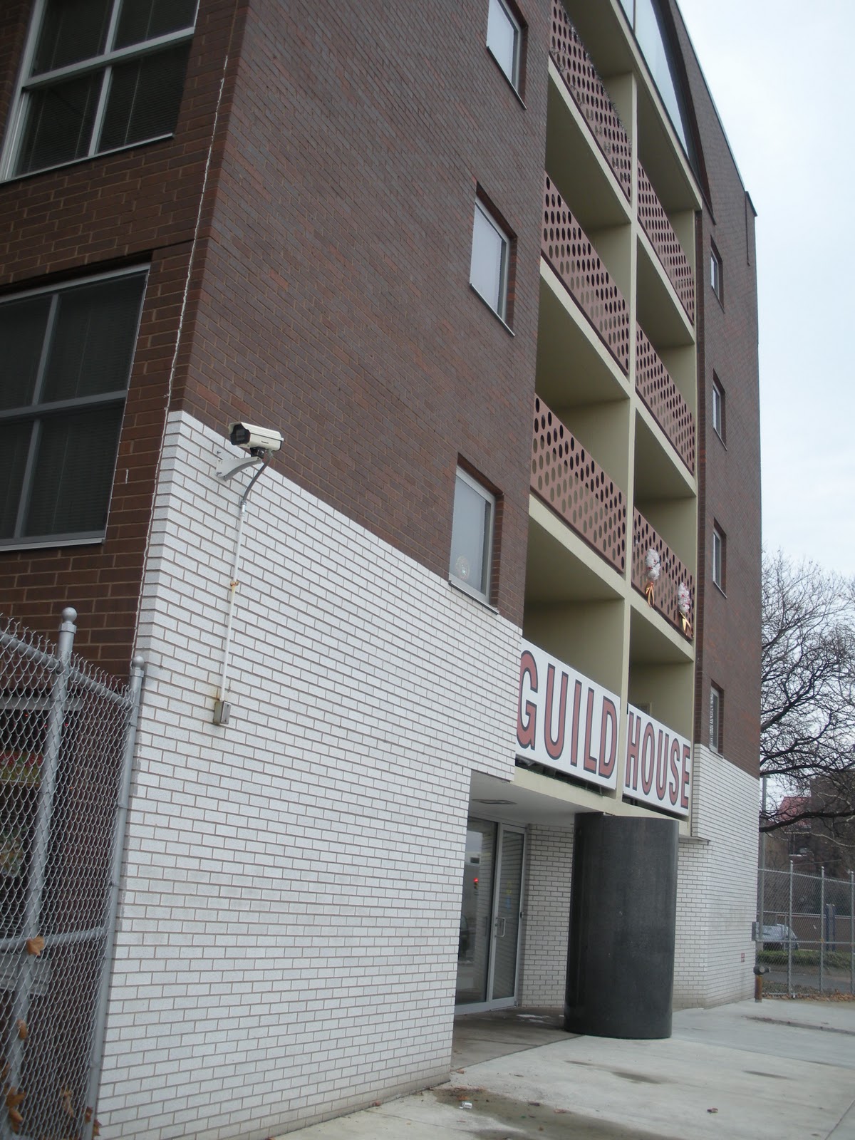
Perhaps I'll discuss the other things we saw a in a separate post. This post I'd like to dedicate to one of the most important buildings in Philadelphia, arguably one of the greatest works of Postmodernism on the entire east coast, and probably the most important thing built in Philly by Venturi, Scott, Brown & Associates (VSBA). It's Guild House.
There are a number of different years of completion to be found, but VSBA says 1966, and they ought to know. I told my friend she was probably going to laugh when she saw it and think to herself, "THIS is the building you wanted to see???" At first glance, it looks extremely ordinary. At second glance, it looks downright mediocre. And of course, that was the whole point. There's so much more to this building than I realized before seeing it in person.
 Dominating the front façade is obviously the sign, announcing what this building is, like a giant Pop advertisement. While I was taking that first picture, Kathrin was talking to the receptionist, who said it's a historic landmark, which I was very happy to hear. Actually, the entire central section is a sign or, more properly speaking, a group of signs. But what I mean is how VSBA makes this a "decorated shed."
The white brick at the bottom is quite clearly only one brick deep and stops at the first corner instead of continuing around the building. So already you have the sensation that this wall has been slapped onto the front of the building.
This is then contrasted at the top, where a very thin stripe of white bricks, starting one brick behind the front wall, wraps around the sides of the building. Notice, too, that although the windows are a number of different shapes and sizes, every single one of them breaks the white stripe. In other words, that white stripe isn't located in between floors where it would remain unbroken, but is allowed the complexity (grin) of discontinuity. As for the many different types of windows, I have complained previously about the "too many windows" problem as you'd normally see it in McMansion architecture. What VSBA does, though, is use that variety with purpose, to give the building rhythm and intrigue.
There are also breaks in the masonry forming recessed lines that appear to demarcate the individual floors. This may be the case, but it also forces the impression that the windows are positioned right up at the ceiling on the interior, with no room for even a window frame. This happens again with the main window on the front, which I'll get to below.
Back to the front wall, at that first corner, you can see that the wall extends upward--needlessly--above the roof line. If all of the walls are higher than the actually roof plane to control the drainage of water or whatever, this one is clearly higher. It's thicker than a single brick deep, likely for structural reasons, but yet again, the planar quality of the wall is being emphasized. And if that weren't enough, slots have been cut out at the top corners, so that you can actually see the shallow depth of this wall, even from directly in front of the building.
The other great thing about this building, which my friend and I spoke about a little bit, is how beautifully awkward the whole thing is. I was really quite disturbed that the enormous television antenna is no longer there, smack in the middle of the top of the front façade. You can see a sort of pipe or something sticking up where it should be. Guild House was, and is, senior housing, now operated by Friends' Housing for the Elderly. The large room behind that arched window is the common area, lounge, recreation room, whatever they call it. What VSBA was saying, basically, is that all elderly people do is sit around and watch television all day long. The antenna was completely irreverent, very funny, and somewhat controversial, which is probably why it was taken down. Only a firm like this one would ever dare do something like that, and I think they proved their genius with that one very small gesture. For very similar reasons, they also composed the posts of the chain link fence in the front, which I wish I'd noticed at the time.
In my opinion, in the interests of preserving the architectural integrity, I think they should have DirecTV come in and install a big, fat satellite dish right on that spot. In fact, with recognizable hardware up there, they'd probably give Guild House free installation and satellite service indefinitely. "It would be so unattractive," my friend said. But that's exactly what VSBA was doing, taking something completely ordinary and using it as ornamentation, every bit as much as Andy Warhol was taking ordinary objects and images and making them "Art." Evidently VSBA came in and completely renovated Guild House in 2008. I'm very surprised they didn't try to do something about the missing antenna.
But the awkwardness remains with that window despite the removal of the antenna above it. The first thing to notice, and VSBA did this a lot, is that it slips right up under the top edge of the wall like the windows on the side wings. It's way too close for comfort to the top of the building. This makes the slots on either side even more brilliant, because it totally contradicts them (grin). Obviously it's not open behind the full width of this wall, you can see right into that window that there's an interior space there. In a sense, the building is "lying" to you, something I discussed earlier about the brilliance of VSBA. The slots are telling you there's nothing behind the top few feet of that wall, the window is telling you the opposite.
Structurally speaking, this gets even more interesting. The arch, historically, is a structural form. That was its principal function. But although it's in the shape of an arch, this window opening is quite clearly not even supporting itself, because there's a pillar right in the center of it (obscured by the window dressings). Then, because the window is so large, you can see into it and see the three support columns in the space behind it, extending up from the balcony framing. The load being carried out to the ends of the arch is also obviously being supported in some other way, because directly underneath the arch, on the floors below, is a window bay. The whole structural purpose of the arch is completely canceled out.
The main entrance is equally as awkward, for sort of opposite reasons.
There didn't really need to be a column there, we've all seen much larger cantilevers than that tiny little balcony. But okay, there's a column. So you have the central spine and the first floor balcony hanging out over the entrance. To increase the impact of this, the group of balconies all the way to the top is framed by a big sectioned box, in different colors and materials, to give it added visual weight. Possibly the column is truly supporting all of that above it. But the column is gigantic, far, far bigger than it would ever need to be to hold up the front of the building, and it appears to be a solid block of granite. Clearly the doors are positioned on either side of it, but still, you can't just walk straight into the building. Instead you have to walk around that column. You have to physically engage with the architecture of the building in order to enter it.
And there's more. The column is lying, also, and it's quite obvious about it. The front half of the granite cylinder is sticking out from the front wall plane. That half of the column therefore can't possibly be serving any structural function. If that weren't clear enough, in another delightful little detail, the top of the column is stepped up at the back where the balcony rests on it, further emphasizing its being divided in two halves. In one perfect, cylindrical shape, the column has two distinctly different natures. In a sense, I think this might be quite a bit less transcendent had the column been fluted. Fluting would have been visually distracting from the purity of this. At the back--if it is, in fact, supporting anything, and that's debatable--it is what a column is supposed to be, structural support. At the front, it's a sculpture of a column. It's merely the architectural symbol, "column," divorced from function, what I elsewhere called an "architeme." It accomplishes exactly the same thing as the arched window; it makes architecture into a visual language.
Behind the column, the slanting white brick walls are in complete contradiction with the outer edges of the front façade. At the edges, as pointed out above, the white brick reads as a single flat plane, whereas the angled walls leading to the doors make the center of the building read as three-dimensional volumes. These slanted walls also cut out under the ends of the balconies on either side, providing no support at all, despite the fact that the columns visible inside the window at the top are significant precisely because they appear to be adding the needed support that the arch has been rendered unable to provide.
If I weren't already a huge fan of VSBA and absolutely certain of their genius in so many ways, I definitely would be after seeing this building with my own eyes. The singular focus of their vision and the way that very similar and primary contradictions are expressed in such a wide variety of different architectural statements reminds me of what I was able to say about Hans Hofmann and Barnett Newman. I think it's entirely worth noting that this building is more or less concurrent with some of the best work by those two painters. If a little later, then at least we must allow for the fact that a building is a much bigger commitment than a painting.
More from Philadelphia to come.
All text and images ©2011, Ryan Witte


