New Year's Day we went on a little adventure to see some buildings. I'm very grateful since Kathrin's main area of interest isn't architecture, but we were able to find things that we were each interested in seeing for different reasons. I'll have to say that I was quite impressed by Philadelphia's twentieth-century architecture. On my previous trip, I ended up seeing a lot of the older historic buildings, which of course are wonderful. But this time, hanging out with someone who's lived there, I saw a lot of things I probably wouldn't have as a tourist.
Perhaps I'll discuss the other things we saw a in a separate post. This post I'd like to dedicate to one of the most important buildings in Philadelphia, arguably one of the greatest works of Postmodernism on the entire east coast, and probably the most important thing built in Philly by Venturi, Scott, Brown & Associates (VSBA). It's Guild House.

There are a number of different years of completion to be found, but VSBA says 1966, and they ought to know. I told my friend she was probably going to laugh when she saw it and think to herself, "THIS is the building you wanted to see???" At first glance, it looks extremely ordinary. At second glance, it looks downright mediocre. And of course, that was the whole point. There's so much more to this building than I realized before seeing it in person.
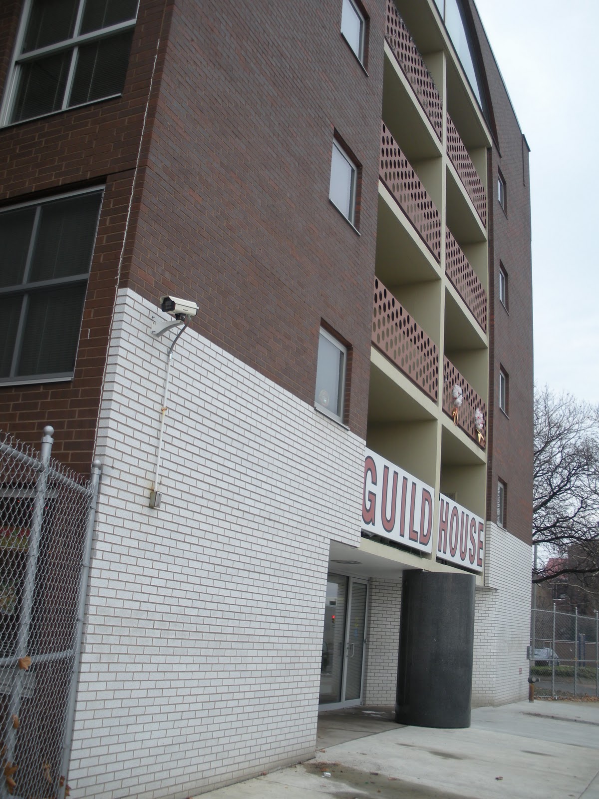 Dominating the front façade is obviously the sign, announcing what this building is, like a giant Pop advertisement. While I was taking that first picture, Kathrin was talking to the receptionist, who said it's a historic landmark, which I was very happy to hear. Actually, the entire central section is a sign or, more properly speaking, a group of signs. But what I mean is how VSBA makes this a "decorated shed."
The white brick at the bottom is quite clearly only one brick deep and stops at the first corner instead of continuing around the building. So already you have the sensation that this wall has been slapped onto the front of the building.

There are also breaks in the masonry forming recessed lines that appear to demarcate the individual floors. This may be the case, but it also forces the impression that the windows are positioned right up at the ceiling on the interior, with no room for even a window frame. This happens again with the main window on the front, which I'll get to below.
Back to the front wall, at that first corner, you can see that the wall extends upward--needlessly--above the roof line. If all of the walls are higher than the actually roof plane to control the drainage of water or whatever, this one is clearly higher. It's thicker than a single brick deep, likely for structural reasons, but yet again, the planar quality of the wall is being emphasized. And if that weren't enough, slots have been cut out at the top corners, so that you can actually see the shallow depth of this wall, even from directly in front of the building.


In my opinion, in the interests of preserving the architectural integrity, I think they should have DirecTV come in and install a big, fat satellite dish right on that spot. In fact, with recognizable hardware up there, they'd probably give Guild House free installation and satellite service indefinitely. "It would be so unattractive," my friend said. But that's exactly what VSBA was doing, taking something completely ordinary and using it as ornamentation, every bit as much as Andy Warhol was taking ordinary objects and images and making them "Art." Evidently VSBA came in and completely renovated Guild House in 2008. I'm very surprised they didn't try to do something about the missing antenna.
But the awkwardness remains with that window despite the removal of the antenna above it. The first thing to notice, and VSBA did this a lot, is that it slips right up under the top edge of the wall like the windows on the side wings. It's way too close for comfort to the top of the building. This makes the slots on either side even more brilliant, because it totally contradicts them (grin). Obviously it's not open behind the full width of this wall, you can see right into that window that there's an interior space there. In a sense, the building is "lying" to you, something I discussed earlier about the brilliance of VSBA. The slots are telling you there's nothing behind the top few feet of that wall, the window is telling you the opposite.
Structurally speaking, this gets even more interesting. The arch, historically, is a structural form. That was its principal function. But although it's in the shape of an arch, this window opening is quite clearly not even supporting itself, because there's a pillar right in the center of it (obscured by the window dressings). Then, because the window is so large, you can see into it and see the three support columns in the space behind it, extending up from the balcony framing. The load being carried out to the ends of the arch is also obviously being supported in some other way, because directly underneath the arch, on the floors below, is a window bay. The whole structural purpose of the arch is completely canceled out.
The main entrance is equally as awkward, for sort of opposite reasons.


Behind the column, the slanting white brick walls are in complete contradiction with the outer edges of the front façade. At the edges, as pointed out above, the white brick reads as a single flat plane, whereas the angled walls leading to the doors make the center of the building read as three-dimensional volumes. These slanted walls also cut out under the ends of the balconies on either side, providing no support at all, despite the fact that the columns visible inside the window at the top are significant precisely because they appear to be adding the needed support that the arch has been rendered unable to provide.
If I weren't already a huge fan of VSBA and absolutely certain of their genius in so many ways, I definitely would be after seeing this building with my own eyes. The singular focus of their vision and the way that very similar and primary contradictions are expressed in such a wide variety of different architectural statements reminds me of what I was able to say about Hans Hofmann and Barnett Newman. I think it's entirely worth noting that this building is more or less concurrent with some of the best work by those two painters. If a little later, then at least we must allow for the fact that a building is a much bigger commitment than a painting.
More from Philadelphia to come.
All text and images ©2011, Ryan Witte
No comments:
Post a Comment