Monday, September 12, 2011

Dis Connecticut--Part One

After my incredible experience at Bronx Community College, I was very excited to see another work by Marcel Breuer. A great opportunity arose a couple weeks ago, so I went to see his Litchfield High School (1956) in Litchfield, Connecticut.

Ironically, despite the architect, it feels like a bit of neglect to the directions begun by my posts discussing equality to be visiting a state that is almost eighty percent white/ non-hispanic. To be fair, Connecticut's population of people of color is larger than I would have thought. I fear that too many of them are to be found in urban areas without the scenic beauty or New England charm of towns like Litchfield.

This trip was the most perfect evidence of how the universe decides what path one is meant to follow, greases wheels in some directions, and erects insurmountable walls in others. It also proves how flexibility and spontaneity are requisites for getting the most out of what the universe wants you to experience. So many things in our lives are arguably in the hands of fate, anyway.

I had discussed the unfortunate incompetence of Google Maps where it concerns driving directions before, but had they been perfectly accurate, we never would have passed by our destination and discovered the lovely center of the town of Litchfield where we ended up finding a very nice restaurant at which to have lunch.

We were discussing how all of Connecticut's school districts are regional. Students are bussed to enormous centralized high schools from very long distances. Perhaps this wasn't in the works in the mid-1950s when Litchfield High was constructed, it isn't a terribly large building. But if the state's educational system was undergoing reform or gearing up to do so, it would make sense that a new school building would've been commissioned. As much as Connecticut adores its (gorgeous) traditional architecture at the expense of anything new or innovative, I must commend them for choosing Breuer. I'm calling this a "high school" because it originally housed years nine through twelve. It now has years seven through twelve, and although it was expanded, I'll have to say it's an extremely small building for that amount of student ages.

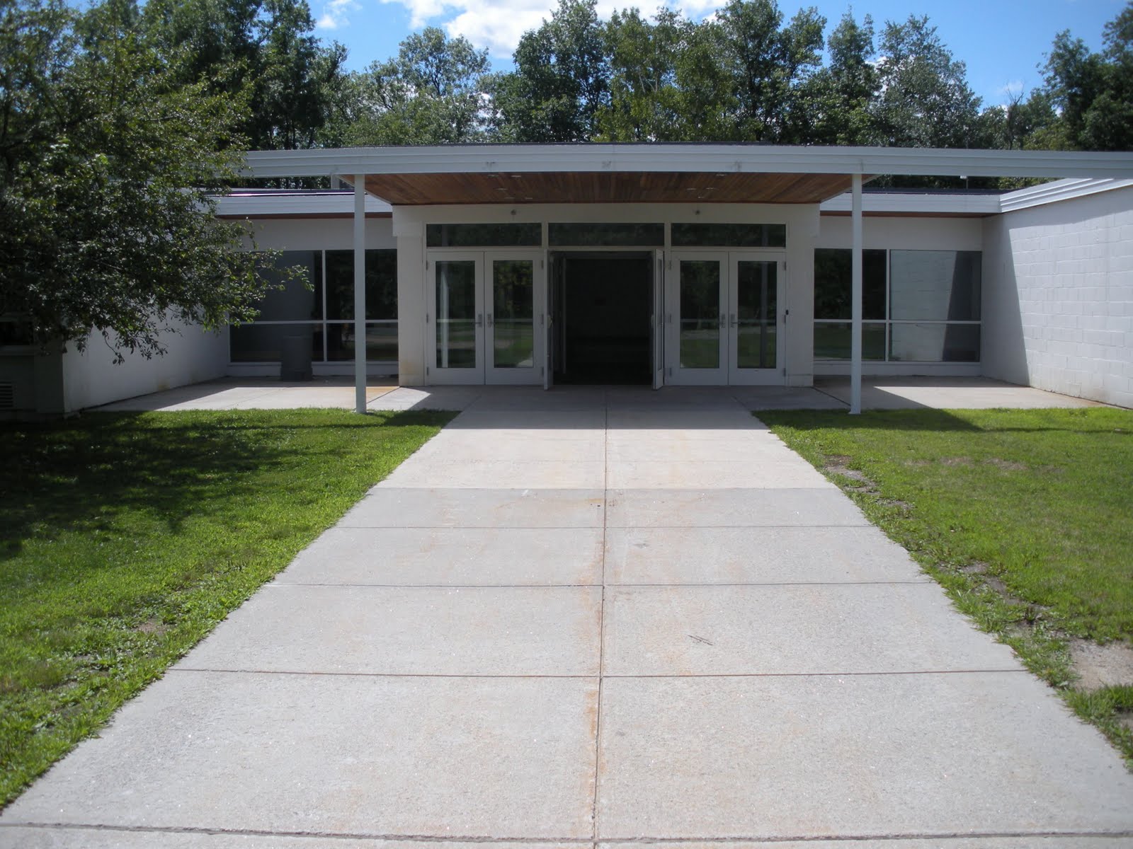
The people at the school, namely the secretary, Ms. Johnson, and her coworker (Ms. Fox or Ms. Ream, I didn't see her name plaque), couldn't have been nicer, more helpful, or more accommodating. It turns out her first name is Kathleen, but I think it's much funnier to keep calling her "Ms. Johnson," since that's what all the students would be calling her. Strangely, they were really the only two souls we encountered during our hour and a half or so visit there. I heard voices down hallways a few times, but saw no other faces. The school's administrative offices are now inside the main entrance seen here. This is all new construction from 2007. The architects did their level best to restore as much of Breuer's intent after a very unfortunate renovation in the mid-1970s nearly destroyed the design entirely. The original main entrance to the school was around to the northwest, which I'll get to below.

It was fortunate that the opportunity arose to see this before the school year had begun, when likely keeping students out of my camera's lens even on a Sunday would have been very difficult. I also don't know if Litchfield has any summer school or summer programs, but there was no one there at this time of August. We were given free rein to explore pretty much the entire building. We didn't try to really access any classrooms or anything, I felt that would be taking unnecessary advantage of their hospitality. The design of the school is such, however, that everything is so opened with interior windows and glass doors that we could examine most of it by sight anyway.

The best thing about Litchfield High is how banal it would appear in its construction at first glance, and on the other hand, how intriguing and masterful is its design, in spite of that. One might even say that this building is the flip-side to Robert Venturi's Guild House, because the school was made intriguing despite the fact that its origin as a state-funded project might encourage banality, whereas Guild House was made to appear ordinary despite its deeper complexity.

The most frustrating thing about the building is that it's practically impossible to get any clear impression of what of it is actually Marcel Breuer's. So much has been added to this building, so much of a presumably different character, and so much that obscures the evident clarity of the original structure. Even studying and comparing the various photographs of the building, as I have for probably hours now, it's a complete mind game trying to make sense of what is what. As different materials, images, and information have come in, I've had to revise this story a number of times.

Another problem is that this building is very far below anyone's radar. There's a very disturbing pattern of events appearing as this post is being written. Litchfield High is an obscure work, of which few people apparently take notice. No one seems to care about the Bronx Community College buildings and fewer people seem to know anything about them. The Whitney Museum is callously abandoning their iconic Breuer building to move downtown, leaving it in the hands of the Metropolitan Museum, as if it were some bit of random leftovers to be dumped in the trash.

As I've told numerous visitors to New York, the Whitney is my favorite museum here, in large part because of the magic of their Breuer building, which is both a work of art in and of itself and a brilliant space in which to display modern art. For crying out loud, some of the works in the Biennial very smartly and poignantly responded to the specific design of the building where it appeared. I'm sure their new facility will be remarkable. I'm also sure that the Met knows how to handle a twentieth-century masterpiece like the Whitney building on Madison. This is hardly the point. How can a Modern master be so flagrantly and routinely dismissed in this day and age? The same question can be asked about I. M. Pei, with equal chagrin.

While Litchfield High was no doubt a lovely bit of 1950s architecture in its way, and perhaps even sophisticated on some levels, it's anything but a monumental example of Breuer's work. It's been so altered that it hardly counts as something you'd want to attribute to him anymore, as I mentioned above. Syracuse University holds the majority of the Breuer archives, but it was going to take FBI training, a century or two, and a magic wand for me to get copies of the floor plans that I needed. As it is, this post has taken far longer to finish than I ever would have hoped. Looking around on the internet unearthed practically nothing about this project. As unprofessional as it feels, my last resort is to make my best guesses as to what happened when.

Litchfield High tells a story with its façades, of which no two are alike and which change continuously around the building. My narrative plan was to go around the outside, around the outside, but a couple of spaces won't really translate to the outer façades because they're in the center of the building. One thing I liked a lot was the central courtyard, which truly does fill the hallways with natural light. This would seem to be a signature of mid-century architecture, as much as it was a staple for ancient Greek domestic architecture. The mid-century architects loved carving these glass boxes into the interiors of their buildings. I'm not convinced it's a feature that needed to go away, either.

For some reason I was drawn to the Home Economics classroom, which is now called a "Food Lab." It just looked so warm and inviting. I'm not convinced that "Home Economics" is necessarily an outdated name for the subject, except that presumably this course is more about the art of cooking than it is about the financial management of a household. I still can't help but wonder why cooking isn't packaged differently in schools, first of all as a true tool of survival, health, and fitness, but also as an art form bursting with fascinating chemistry. The first time I experienced how simple syrup (half water, half sugar) behaves, doing such completely different things at different temperatures of boiling, I instantly became fascinated. All the other staple ingredients are like that, too.

Litchfield High unfolds in a particularly linear way because, with what one might consider the exception of the two-story-high gymnasium, it's all on one level. That whole wall at the gymnasium's upright end wall, as Breuer designed it, was entirely glass. The 1970s crime removed the entire glass wall and covered it over. There was concern about having a glass wall in a room designed for projectiles to be flying through the air, and the glare from the sun was so bad that, at a certain time of day, you couldn't even see the basketball hoop in that direction. Luckily the architects were permitted in 2007 to restore at least the top half of that wall to its original glass, but not without a fight.

The new main entrance now faces the southeast. To the east of this is a pavilion housing the cafeteria, which I believe was one of the additions made in the 1970s. I'm baffled as to where students ate lunch before this, as the original layout seems to include no space large enough aside from the gymnasium. Presumably the wing of the building behind this was originally a cafeteria and was divided into smaller classrooms, including the one now housing the Food Lab.

The original structure is built almost entirely of simple concrete blocks painted white. While looking around inside, I sort of half lamented that Breuer was forced, likely by budgetary constraints, to use such a mundane building material. I also immediately recognized that it's this very fact that makes this such a fascinating project. It's one thing to see the flights of ingenuity possible when an architect has all the access to funding and new building technologies at her or his disposal, like Saarinen did working for all the biggest corporations in the country. It's quite another to see how a great architect would approach something as commonplace as concrete block and low-cost and, I suspect, highly-standardized building techniques. In this first pavilion, it is already apparent that this is not going to be your typical run-of-the-mill concrete block school building.

First, almost all the windows are recessed to protect the interiors from the direct glare of sunlight. Visually, it gives the façades a real depth, formal power, and drama. Now, it's possible that the bays that contained doorways were stretched by the addition of an entrance just wide enough that they'd be structurally unsound. But the point is that here cylindrical columns support the cross beam, rather than stacks of concrete block or some other solution. With their very subtle, pared-down nod to the classical colonnade, they give the entrances a sense of formality. It's simple, but having noticed Breuer's often exuberant attention to entrances in other projects, I have to believe this was conscious.

Another thing to bear in mind is the wedge-shaped roof providing a clerestory that bathes the cafeteria below in natural light. Only a tiny triangle of it is visible on the top left of the photo above. There's also a much more striking example of this, which I'll discuss below. Ms. Johnson said the cafeteria might look a bit of a mess since all the tables were folded up, but I thought it looked clean and fine. The natural light really does flatter the interior and likely those occupying it. I was surprised to notice that the cafeteria was rather small. Doing some rough math, figuring on maybe three lunch periods, I can't imagine the school has a roster of more than around 300 students, which is really not very big, only 50 students per grade.

Around the corner from this is another moment which would seem to confirm the symbolism used for the entrances, but first is what happens at the corner. Unlike the sort of buttress at the opposite end, this carved-out corner of the building serves no purpose but a sculptural one, to both emphasize the massing of the façade to the left and to mark the corner of the building with a bit of (pragmatically unnecessary) artistry. It seems to lighten the mass of the building to some degree, as well.


Traveling around to the northeast façade, things are a bit more industrial and not as scenic, but it was here that I began to see how every part of this building was going to be different than all the others. First is what is mostly likely a service entrance to the cafeteria up a small stair. Since it is an entrance, it's punctuated by a single cylindrical column.

Immediately to the right of this is a loading dock supplying the cafeteria with chicken nuggets, foot long hot dogs, and vanilla physedibles, whatever the heck that is.


This section and the one to follow I also believe were added in the '70s. At the corner of this wall are two small window alcoves. Then there are these two wedge-shaped window bays, unique to this façade of the building. We are pretty much full on into Brutalism at this point. By about 1976 and beyond, Postmodernism had mostly taken over new construction (for better or worse). Perhaps not amongst less adventuresome architecture firms. In any case, in adding to a 1950s Modernist structure, besides Brutalism there was really no other style to draw from besides the highly geometrically complex late-late-Modernism that would eventually lead to Deconstructivism.

Breuer most certainly would have coaxed these into his signature isosceles trapezoid had the concrete block construction allowed it, but I'm somewhat impressed that they got fairly close. The choice of pairs for both the alcoves and the wedges is interesting first because two is not enough to create a rhythm. For that you would need three or more. In fact, there's something very conscious about when and where a rhythm would be allowed to bust out in the design. Because they're not rhythmic, these windows instead become singularly ornamental in character. The other thing that's great about the wedged ones is that, as only two together, they desperately want to be symmetrical with each other, but the directional form of them makes this impossible.

Then another entrance with its tell-tale cylindrical columns. This entrance is unique on the building because, much like the adjacent window bays, it's the only one that is decidedly asymmetrical, but more prominently so because the columns are so symmetrically placed under the crossbeam. In addition to that, rather than leading straight into the entrance, the path makes an ostentatious turn from the direct center of the columns to the off-center doorway. It's as if the placement of the columns is asking for one thing, and the location of the doorway is asking for the opposite.

There was an entrance here in Breuer's original plan. Had these additions been designed by him, I'd love it. The unfortunate thing is that one must question the brilliance of the architect from the '70s who clearly had so little respect for this building. In the hands of a master, this is quite interesting. In the hands of a less talented practitioner, one is forced to ask if it were merely a bad design decision.

Happily enough, the footprint for the next addition happens to be Breuer's favorite shape, an isosceles trapezoid. It's a small shallow wing that juts out to the north which I assume was also constructed in the 1970s. Due to its plan, the next two corner angles are both obtuse. A surprising level of artistry in the construction is displayed at these corners if you consider that each of the rectangular (and hollow) concrete blocks up at the roof line would necessarily have to have been cut on a not-very-imprecise angle to fit together that way and form a seamless line between the adjacent walls.

The building here opens up into a wonderful, large, grassy courtyard, which was the school's original main entrance. Breuer characteristically planned the approach to his building very carefully, straight in from the northeast from Bantam Road, rather than from the southeast off Plumb Hill Road, as it is now. The remnants of this roadway can still be seen, now overgrowing with weeds and shrubs. Why they decided to change the entry to essentially the back of the building is unclear. I very much suspect it was for traffic reasons, especially since the stretch of Constitution Way that delivers buses to Plumb Hill is conspicuously widened to four lanes, while the surrounding roads remain mostly at two. Buses would come in at an angle pointing right onto the main entrance canopy. The shallow V-shape of the courtyard's southern facades would greet arriving students like open arms or an open book.

The centerpiece is an entrance easily as significant as the new main entrance at the front, if not more so. The metal columns which help support the canopy are practically invisible in comparison to the cylindrical concrete ones used elsewhere (and I suspect were intended to visually dematerialize). Clearly the apparent floating of the canopy, or at least the impression that its principle support is the horizontal beam in front, was the main emphasis here.

This one opens up onto a large sort of student lounge area with couches and chairs at the junction of a number of hallways which would have to be one of the "hearts" of the school when filled with students. This space is also pleasingly bathed in light thanks to the large windows on either side of the entrance.


I was here drawn for some bizarre reason to the lockers. They appeared as if they might have been the original lockers. They're from a company called Republic Steel Corporation, which has been around since the turn of the twentieth century. This model, though, called the "Designer" line, was in production from 1970 to 2005, so likely they went in during the 1970s renovation. The spooky thing about my attraction to them was that the locker toward which I gravitated was locker A1: the very FIRST locker.

Back outside to the courtyard is what makes the incredible contrast with the main entrance. Perhaps it was programmatic rather than stylistic, but I still think this feature could as easily have been located around to the rear. I suspect this would have been the more obvious choice made by an architect with less vision. It's a small garden on the north side of the main entry court that I'm fairly certain is purposely located off the science classrooms. It's mostly hidden behind a cement block wall.

It looks a bit overgrown. I kind of want to get in there, clean it up, and actually landscape it with all kinds of interesting, educational, and edible plants carved through with nice field stone walkways. This could be linked up so advantageously with the Food Lab. All those carnivorous plants would be so cool, although I don't think we have the right climate for them. Same thing with those crazy desert plants that store gallons and gallons of water in huge tank-like forms. Anyway, the point is that in contrast to the main entrance, this garden has the most domestic quality to it. The greenhouse I think I heard was part of the mid-1970s renovation, perhaps also the diminutive doorway access on the right. If you saw this photograph out of context, for sure you'd think it was the backyard of some modernist house.

This wing juts out to the northeast of the main structure. The walkway leading to it (from which the greenhouse protrudes) marked the northern end of the main structure and this wing extended just a bit further north. From what I can determine, the entrance here and the end wing were added in the '70s, along with a sizable extension of the main building behind it. The windowless cement walls form a relatively unfriendly barricade and must provide somewhat grim interiors. It's a bit confusing that there'd be no glass, especially considering they are I believe also science classrooms, the rooms that have the most potential to require ventilation. Stylistically, the end of this wing is not bothering me at all. Because the building reads in such a strictly linear fashion, these windowless masses form a very strong punctuation mark at the end of the long, complex northeast façade. Around this corner, the character of the building changes drastically from public to private.

The whole northwest façade--the extensions of the science wing and the northern end of the main structure--is more or less bland and unfortunate. Coming around to the southwest of the building is a view that it's quite a shame so few people will ever see it. The border of the school's property, lined with trees and shrubs, rides so close to the building itself that it's obviously not intended to be used as a route to or from anywhere on foot, except for grounds maintenance staff. But at the end of a long, regular stretch of window bays appears--in my opinion--the building's most incredible feature: the library.

Appropriate for an institution of learning, perhaps, that aside from the gymnasium, the building's most sculptural moment would be the library. This was also not Breuer's work, from what I can tell, but extremely well done.


The extension made the library twice as large and added a clerestory and a row of four windows canted off axis. The geometry of these various intersecting planes is relatively complex, and responds beautifully to the plan of the building proper.


Breuer's main building was essentially Y-shaped in plan, with the top left arm of the Y bent in the middle and the science wing extending off the foot. All these 120-degree angles are most notable on the inside of the building. Although squeezing auxiliary offices and facilities into oddly-shaped corners could have easily produced some awkward lines, the hallways and various circulation routes are prevented by these angles from ever being monotonous. Moral of the story, the design of the library extension was very smart for manifesting Breuer's 120-degree angle as an ornamental bit of architectural sculpture at this joint in the building.
The interior of the library was equally wonderful, bathed in natural light. It was one of the only rooms we entered aside from the cafeteria. But seeing it through the glass doors, I just could not resist. 

The four columns clustered in the center create an interesting centerpiece to the room and frame a ramp leading down to a slightly lower level.


Past this is a stretch of this wing--the top right of the Y--which remains as Breuer intended. Past the concrete wall that juts out in the middle of this length of façade is another extension added in the mid-70s. The treatment of the southern façade of this branch (around the corner at the far end of this wall) shows the same forms as the front of the cafeteria extension, though more asymmetrical. 

Further on, at a slightly different angle to this, is one of the additions from 2007. This one is far easier to distinguish from the earlier work, because the firm clad their structures in corrugated metal siding to set it apart.


Where this wing meets the older structure was something I found very strange. It was these oddly sculpted metal end caps on the firewalls. It seemed a very out-of-place, almost postmodern gesture on the building that I didn't quite understand. Evidently this had been a huge fight between the 2007 architecture firm and their contractor, who would only fix his mistake for an additional fee. It also goes to show how very quasi-traditional most construction must be in this part of the country, that a contractor would even consider doing such a thing on an otherwise so modern building. But the other problem is that as a bit of ornamentation, if intentional, it's not even executed well. It looks like the guy cut the metal sheets with a chain saw.

The opposite side of this is back around the new front entrance again and the incredible gymnasium.
As originally conceived, the gym was not actually attached to the building, but accessed by a covered walkway. It would have been the sculptural equivalent at Litchfield to Begrisch Hall in the Bronx.


Photo source unknown.


Adding to the gym's character as a sculptural adornment on an otherwise rather sedate building was a another sculpted volume providing a doorway on its northern end, where the new entrance and administrative offices have now filled in that courtyard.


There's my visit to Marcel Breuer's Litchfield High School. I'm actually not finished with Litchfield or Connecticut, but I'll let the suspense build for my next post.

Photo source unknown.
All text and images ©2011, Ryan Witte unless noted.

Saturday, August 6, 2011

All the Park's a Stage

I'm sort of ashamed to admit that this was my first time visiting this site, not only because it's by the architects responsible for the transformation of Lincoln Center, about which I should have benefit of the utmost implicit understanding, but also because it's one of the most extraordinary things to be built in New York in recent years. I knew that before even seeing it in person. And while something very similar to this was built in Paris which I have not had the pleasure to see, I'm willing to test the limits of my credibility to suggest that it might very well be one of the most amazing things to be built in any city. The reason I say that is both that it's so unique and that it's been so uniquely successful. Something like this could only have happened in a place like New York, because the possibility for it to exist relies so intimately on New York's very particular history and evolution, as it must have in Paris. It did what the greatest moments of genius have always done, it took a shortcoming and turned it into an advantage. This project is like Marilyn Monroe's quivery-lipped smile.

All my regular readers and anyone even remotely tapped in to the pulse of New York architecture know, of course, that I'm talking about the High Line Park by Diller, Scofidio + Renfro (2011).


In another sense, I'm sort of glad that I chose this moment to go to see it, because the second phase, from Twentieth to Thirtieth Streets, was only just completed. I suspect I got a much more full impression of what this project is all about because there was more of it to become acquainted with for me than if I'd gone last summer.

My companion for the day was actually my mom. We've discovered that the cultural events we enjoy seeing together are not limited to performances at Lincoln Center or museum shows, and include things like this. She's been open to the topic of architecture and design through my devotion to the subjects and, for instance, was nearly as transfixed by the writings of Ada Louise Huxtable as I was when I lent her the book. But this is not her main area of interest. Like me, she is a sponge for learning and information, and where our expertise overlaps I think is in communication and language. Only I've been applying them to the visual arts and especially architecture. She's a great person with whom to have discussions about architecture and design for the very reason that her experience with it and opinions are not shaped by the blinders of an "insider's" view, if that's what you'd call me. In a way, they're much more pure and less elitist or overly academic.

The true triumph of the High Line is that in our own separate ways, and in many other ways that intersected, we both thought it was glorious and wonderful.

Speaking of museums, our day actually started out trying to get into the Alexander McQueen exhibit at the Metropolitan museum. That just wasn't meant to happen. I won't go into it, but at a certain point I realized our luck was not going our way at the Met and we should just leave and forget it. That will need to be a later post.

I was glad to have my camera in the vicinity of this first building, because I think it's so cool. It's the Westyard Distribution Center (1970), by Davis, Brody & Associates.

It's just so massive and imposing. The way it narrows toward the top hints at something ancient, namely a pyramid, but it also has the effect of making the building appear taller than it is. One small detail I never noticed before was at the corner piers. If you look closely, the two perpendicular walls are cracked open by the tiniest sliver. So while, from afar, they look heavy and strong, when you get up close, they turn paper thin.

We started our journey at the northern end of the High Line at Thirtieth Street and walked south.

I wanted to look at the very northern end and noticed that it turns west toward the river, what could potentially be an incredible approach to the Hudson river if they decide to continue it. I assume that this would transport materials from barges on the river to the factories and warehouses in the Meat Packing District and back again. I tried to determine if the small amount of building materials piled up on the other side of the chain link fence were reminiscent of the ones used for the new park and indicating that they do intend to continue northward, but it was difficult to tell.

We were talking about how, if they do continue northward, it would make the perfect junction with what has been discussed as incredible new development over the west side rail yards, something west Midtown has been sorely needing for years.

The High Line's plantings are really remarkable. Having the not-yet-renovated section at the north to use in comparison is great. You can see how the new flora very much appears as if it grew there by chance, but more beautifully than were they mere weeds. 

A coworker was telling me about some friends whose apartment overlooks the High Line. One of them writes little plays and then they perform them out their windows for people who happen to be passing by. First of all, only in New York. Secondly, what an absolutely fantastic idea. Thirdly, I think it only goes to prove what a work of genius and transcendental success this park has been, that it was not only highly creative in conception and execution, but that it has given rise to further bursts of creativity. I wonder if this building is where my coworker's friends live.

One minor problem I noticed in this northern section is the width of the path. The fact that it would be so easy to correct if they chose to do so is another wonderful thing about the design. Now that I'm thinking about it, however, I believe it was intentional. What I'm talking about is how the path is just not quite wide enough for two pairs of people to walk side by side in opposite directions without one of them needing to step out of the way. The measurements for that would be so easy to determine, and must be entirely ingrained in the minds of DS+R, whose work so often rejoices in the pedestrian. Giving them the benefit of the doubt, I'll need to conclude that forcing visitors to mingle in this way encourages a sense of community that the city below often makes it all too easy to avoid.

The furnishings are also extremely well-designed. And that I can say they are designed--in fact, designed into the very fabric of the park--is one of the things that makes this whole project a true work of art. I really loved the warm, dark tone of the wood against the cool grey stone and the greenery. Further south in the older section, it becomes apparent that the wood will weather to a grayish color, as well, making for less of a contrast but blending into the stone quite nicely: a change of material without a change in color.

Starting at Twenty-Seventh Street, the path rises up above the level of the plantings and remains over it all the way down to mid-block south of Twenty-Fifth. Further expression of what this has accomplished is in that there are smaller gravel paths accessing the plantings but are restricted to maintenance staff. 

It's as if DS+R wanted to completely remove all human interference with the natural landscape from this section of the park, to allow it to grow unfettered and undisturbed, something that happens virtually nowhere else I can think of on the island of Manhattan and in probably not anywhere in Brooklyn or Queens, either. Looking over the edge, I noticed that they were planted rather sparsely. I was curious if this was intended to grow in naturally over time to completely fill in, and perhaps also other plants that happen to find their seeds there by chance. I love that idea and actually have an "orphan plants" garden on my fire escape where I nurture whatever plants happen to pop up in my pots (unless they're bad weeds).

In the middle of the raised section is another very interesting moment. It was the first of many occasions I found to observe what I'll call "the theater of urban life," something for which DS+R should be famous if they aren't already. Lincoln Center is just chock full of them (come on my tour and ask me, I'll show them all to you). On the other side of this wooden bench, which faces the footpath, is another bench facing the opposite direction that looks out onto Twenty-Sixth Street. It's essentially inviting you to just sit and watch the city.


Even more interesting, though, are these arms that branch off in seemingly random directions. One of them looks back onto those wooden benches and, although somewhat obscured by greenery, focuses your attention again on the other visitors to the park. Another one I found particularly indicative of their concept because of at what it encourages you to look...or more precisely, what it doesn't. This protruding balcony invites you to step out to the end of it, but only to show you something perfectly ordinary, a plain gray warehouse building now presumably offices for some graphic design firm or similar. It's as if DS+R are asking you to look more closely at the banal details of a city which so often reeks of the tacky spectacular.

Now we arrive at the first of the crazy new buildings to go up because of the High Line that one discovers when traveling south. This one is 245 Tenth Avenue (2009) by Della Valle + Bernheimer, who have since split into two firms. Taken in and of itself, this is a pretty cool building. The unfortunate thing about it is that the two things it has going for it--namely its unusual angularity and its random pattern of windows--were both accomplished much better and more suavely by two other buildings in its immediate vicinity that I'll get to below.


And they come at you rapid-fire after this. The whole neighborhood has been stuffed full of unusual buildings. The next is the one that I think pretty decidedly carries its angularity with more strength. Not only that, but the way it expresses its engineering in response to its profile is fascinating. This one has gotten quite a lot of press so many of you probably know that it's HL23 (2010) by Neil Denari.


Immediately next door to this is another one, High Line 519 (which I sort of by accident pronounced the way I think it's supposed to be: "High Line Five-One-Nine") by Lindy Roy. I had already looked into Roy, because she designed the new art gallery at the Metropolitan Opera House. I'm sure that guy sticking his head out the window with I guess his daughter? thought I was taking a picture of him, not realizing they'd be nothing more than a blurry dot in the image.


Down a little way from those is a group of tiered platforms that have a sort of amphitheater (of urban life) feeling to them. It's the same wood, presumably, as the benches that will similarly weather to a lighter gray. While it's most likely constructed with a frame of steel or some other metal underneath, I really liked how at the edges, it's made to look like wooden planks stacked up as if in a lumberyard. It's a great little detail that celebrates the industrial history of this neighborhood.

Next is a section maybe around 150- to 200-feet long where the plantings are much higher and form two walls of greenery on either side of the footpath. When these grow in even further, I think it may give the sensation of suddenly encountering a jungle. In fact, it almost gets a bit claustrophobic, but you aren't in it for long before it opens back up again. You can also notice how in this section, the railroad tracks were left in place.

Just past this are two wonderful sculptures, one on each side of the path, by Sarah Sze called Still Life with Landscape (Model for a Habitat). They basically look like the surrounding neighborhood, with little buildings in a kind of forced perspective and perched on a silvery metal lattice. But the little houses may actually work as birdhouses, and it also has little trays filled with birdseed and others with water. There didn't seem to be any birds even remotely interested in utilizing the facilities, certainly because there were too many people around. It seems kind of a shame, and perhaps it should have been located further from the path or extended up high enough that visitors couldn't disturb the birds. It may get more birds in the morning hours when not as many people are there.

This has nothing really to do with the High Line since it's been there since 1904. I thought I'd include the General Theological Seminary anyway because I've always thought it was such a beautiful building. The architect was C. C. Haight, and most New Yorkers will know that it has an incredible and rather large walled garden in the middle of the block that I assume is closed off to the general public.

Next is another cluster of the new buildings that went up at least peripherally because of the neighborhood rejuvenation caused by the High Line. First is Jean Nouvel's 100 Eleventh Avenue (2010). I've been intending to go get a nice long look at this one ever since it was completed but just haven't had the chance. It remains an unfortunate side note in this story. My mom even said in a rather funny matter-of-fact way, "I don't think we're seeing the best view of that building." We had sort of discussed getting a better look at it on our walk back uptown, but at that point all we really wanted was a glass of wine. This view does in any case show the randomized window patterns I mentioned above in regard to 245 Tenth. More on this one in a future post.

Right across the street from Nouvel's is Frank Gehry's IAC Building, which I won't bother to discuss here since I already wrote a whole post dedicated to it.

Since then, next door to the Gehry have been built the rather bland-looking 520 West Chelsea by Annabelle Selldorf, which didn't particularly need to be built, and the equally bland Metal Shutter Houses in between them. But the Shutter Houses are by Shigeru Ban and should not be underestimated. The shutters refer to giant garage doors that open up residents' entire wall to the outside. Absolutely astonishing when you think about it. I am curious, as one article pointed out, as to whether winds would ever be calm enough blowing in off the river--not to mention at the right temperature--for residents to take advantage of the shutters.

The bends in tracks allowed for a few moments of wide-open space which, in comparison to the mostly narrow path the rest of the way, gives a bit of room to breathe and stretch out. While the railroad tracks curved, the elevated structure was built more simply in straight lines. So if you think about the geometry of that, there would be a lot of extra space in the corners. In this first one, they built a kind of trellis with climbing plants winding up through them which neither my mom nor I recognized, but were very interesting botanical choices. When they grow in more fully, the shade will be wonderful here, and more than that, like sitting in a living room (read "living ROOM," not "LIVing room").

Opposite this are a beautiful old red-brick tenement building and two of the newer additions to the neighborhood. Nearest the High Line is another project by Della Valle + Bernheimer, 459 West Eighteenth Street (2009). This one was said by at least one critic to be more successful than the one above. I'm not all that convinced. The black and white marking off of two very distinct blocks in the massing is a little bit too obvious for my taste. If it were me, I'd use a more subtle difference in texture or something along those lines. In its defense, the slanted windows in the top three floors are very cool, and evidently at a certain time of day, sunlight streams into one of those windows and back out the other side.


The one further from the park is the Chelsea Modern (2008) by Audrey Matlock. Although I think she's done more striking work than this, it's quite a fine building. What you'd never notice from this far away is how the zigzagging bands of glass intersect one another at tiny junctions. It's just one small detail that helps to elevate the building to a higher level of artistry.

Just past this is another "theater of urban life" moment, this one most specifically in the shape of an amphitheater. This one is interesting because it looks like it should descend to an actual stage but ends instead at windows, like three television monitors showing the traffic passing by below. It also can be descended by ramp, meaning it's wheelchair-accessible, which is very nice.

Here we arrive at the very heart of the High Line. While the entire length of it is filled with follies and interesting things to see, here we discover a whole bunch of amenities and clever features all clustered together. There are public restrooms tucked into one of the neighboring buildings. My mom decided to take advantage of them, so I sat on one of the benches to wait. While I was sitting there, a man took a drink from the water fountain next to me. It started talking. I can't remember what it said, some sort of strange poetry. When my mom returned, I told her about it, and she said the entire bathroom was talking to her. One the voices was saying "you can do it, you can do it, you can do it," which I think is absolutely hilarious. One blogger I noticed said she hates the talking water fountains. I think this is ridiculous. It's such a wonderful idea that wouldn't have occurred to many firms without DS+R's experience with multimedia work. I also love how the waste water runs down off the side in a channel, although I suspect this is why they can't be used in freezing temperatures.

There's a cluster of people selling gift items under the shade of a building, food stands, and a sandwich shop. Then, one of the most genius features of the whole park, a stretch of walkway with a sheet of cool water running over it to wet your feet. There were actually a ton of people with sandals and flip-flops removed, cooling their feet. I'm surprised I was able to get a shot with no one in it except at the very end of the view.

There are innumerable details making this park exquisite. In fact, I'm tempted to say I've seen very little work in recent years that has been so attentive to details. One of them I particularly liked was all the unique ways that the stone and plantings interweave with the existing railroad tracks (which were numbered, removed, and then reinstalled, it sounds like).

At last, we arrive at our final building, The Standard Hotel by Polshek Partnership. Although the grayish hue it gives off is a bit bland, I do rather like this building. Part of it for me is its distinctly 1960s flavor. But this façade is interesting because of the way Polshek has emphasized the framing of the two wings. Not only do they drop the frames down below the glazing, but also at different heights, and again at the top. You're obviously being asked to take notice of them. They become like two giant pictures on display above the park.

The underside of the building is appropriately sculptural since it's one of only three structures that remain over the pathway of the Highline, and the only one not part of its original functioning (as with buildings that would load materials on and off of cargo trains).

The hotel has a towering balcony arrogantly visible to passersby on the High Line, but not open to the public and only available for no doubt ridiculously expensive private events. This was the first of many signs that this hotel is utterly inhospitable and snotty. Fantastically fabulous though it may be, I would not recommend it to anyone. We weren't even offered an opportunity to look at this space, despite the fact that they were merely setting up for the evening's event. So much for us being potentially wealthy enough to rent this space for a party. I certainly wouldn't now. One of the women did recommend we go and take a look at the roof, which is open to the public.

The interior design of this place is absolutely sick. The elevators are perfectly black with video monitors on (I think) two sides, playing video collages mashed from scenes from highly stylized and gorgeously cinematographed movies. The two I recognized were Fellini Satyricon and Dune, two films I love most especially for their visual lushness. This must no doubt have been due to the involvement of Hollywood set designer Shawn Hausman in the hotel's design. Here is the elevator lobby on the top floor. I realize you can't see much, but the abstract quality of this image only serves to amplify the otherworldly quality it had in abundance.

The hallway leading into the bar was out of control. The walls are paneled in upholstered shiny cream-colored vinyl. Rows of faceted mirrors are right out of the 1930s. And the geometrically sculpted brass door is, appropriately, right out of Dune. The bar itself is the perfect combination of 1930s nightclub, early-1970s bachelor pad, and science fiction movie.

Gratefully, the one hostess recommended that we look at the restrooms. I'm glad she did because they truly are astonishing. There's a large number of individual little rooms off a branching, angular hallway. The ones on the inside are completely black with only the dimmest vertical bar of red light at a couple of their corners. They have to be impossible to photograph well. Even with a tripod and a long exposure time, I think the quality of the (lack of) light would be distorted at best.

Photo by Ginny Raffa.
The ones out at the window line, on the other hand, are nothing if not a full exercise in exhibitionism. One entire wall is completely glass, from below the floor all the way up to the ceiling and practically beyond; the ceilings are at least ten-feet tall. The toilet faces the window, so women have no choice but to look out, shy men luck out most of the time unless they need to do you-know-what. Then, on the floor closest to the window line is a grille that you can see through, almost like you're standing precariously over the edge of the building. The toilet is so close to the window that, if you're sitting on it, half of your feet is dangling out over this ledge.

A lot of restrooms that play with these ideas of modesty and exposure will employ glass that automatically frosts over when the door is locked or the lights are turned on. It's possible these windows do that, but I don't think so. It's possible that the light inside is so dim that even after dark, you'll see not much more than a reflection on the glass from the outside; New York never gets very dark, anyway, except in a blackout. If nothing can be seen from outside, it's more just an effect for the guest using the restroom. I was reminded of the public restroom I'd heard about in Times Square but never got a chance to see. It was inside a box of one-way mirrored glass. Doing your business, you could see out, but no one could see you. Evidently the challenge to one's sense of modesty was still quite powerful.

While the plays performed by people in apartments overlooking the High Line are presumably more or less legitimate, if avant-garde, the funny thing here is that the performances going on inside the Standard's room windows have evidently been more along the lines of amateur erotica. There have been sightings of various sex acts being put on display at times. In the bar's restrooms, this is practically enforced.

At this point, there's only one building even remotely close enough to the Standard to see anything, it's not completed yet, and appears possibly to be offices, not residences. I have a feeling, though, that any residences there or in future buildings to go up will be absolute paradise for perverts with telescopes. It makes it all the more ironic that for whatever reason, they have a problem with seeing men's legs, which I'll get to below.

In any case, they are some of the most incredible interiors I've seen in a very long time. It's the work of Roman and Williams. It starts with Modernism from the early-twentieth century, when the High Line was built, at the ground floor. The inspirations move forward in time as you rise to the top of the building. Their inspiration for the bar was Warren Platner, a designer of prominence in the 1960s and '70s, who also worked with Eero Saarinen, I. M. Pei, and Raymond Loewy.

This makes it all the more disappointing, especially considering my great respect for the design, that the attitude was overpowering. Attention Boutique Hotels. You want something other than a derisive warning to Stay Away from (with all humility) savvy and knowledgeable writers like myself? Instruct your employees on this very important fact, of which we've been reminded time and time again where I work: you never know who it is you're encountering. For all they knew, I was the multi-billionaire best friend of the hotel owner's son being treated like an interloper.

I was wearing shorts. It was about ninety-five degrees outside, for crying out loud. I wouldn't say the hostesses and security were "condescending," but they were about as unaccommodating and unwelcoming as they could possibly have been without descending fully into condescension. They have a dress code: No Shorts. Despite the fact that they were not open, there were no patrons to be seen anywhere, and they were quite obviously still merely setting up for the evening's crowd, I was permitted only the most fleeting glance at the bar proper, and not without a quickly-diffused admonishment from one of the security guards.

As I started to discuss quietly at the time, I've become very disgusted by dress codes. They are almost across the board racist, sexist, classist, heterosexist, or an ugly combination of the above.

Racist because they very often are designed to keep out an element perceived as troublesome: the "thug" element, which usually refers to Black men. "No Sneakers," for instance: this makes no concession whatsoever to whether the sneakers in question happen to be a $30 pair from K-Mart or one-of-a-kind Nike prototypes worth thousands of dollars.

Sexist because men are required to be covered from head-to-toe, but women, and most prominently the hostesses themselves, I have absolutely no doubt can be wearing the tiniest miniskirts and enter unimpeded to adorn the space like furniture in all their sexually objectified splendor. If the Standard has a "no thong showing in your ass crack above low-rider jeans" dress code, I'll give you a billion dollars. While this next statement is unfortunately tinged by male privilege, I'll also add that women may therefore dress appropriately for the summer temperatures, while we men must be overdressed and uncomfortable. They didn't mention my sleeveless shirt, but I can imagine they probably don't allow tank-tops, either.

Classist because these codes are so often based in what is typically a white middle-class assessment of what garments are appropriate or inappropriate in a given environment. This is a cultural construct with opposing alternatives. Ironically, it's not aristocratic. Many of the unusual, avant-garde garments found at the highest price points would be frowned-upon, also (and were with me, at the 21 Club. We ate elsewhere).

Heterosexist because in the more conservative venues they would in no way account for the many varied ways individuals choose to express their gender identities. How would the bigoted host of an expensive old-school restaurant apply their "dress code" to a woman with short-cropped hair wearing a man's tailored suit, for instance?

While I'll be the first to invite anyone to enjoy the fun of dressing up sharp for the pure pleasure of doing so on a special night out, I call for the boycott of any business strictly employing dress codes to enforce their outdated and disgraceful discrimination. This kind of thing has no place in a city as diverse and multicultural as New York. I want no part of it at all.

We did go up to the roof, which was pretty spectacular, if smaller than I'd have imagined. There was surprisingly little space to sit to enjoy a cocktail, even less that was in shade. We didn't. The best thing about it, aside from the mind-boggling views, was the round water bed cushions. I never would have known, but my mom felt one of them. Such a fantastic idea. There was also a really nice guest hanging out up there--much nicer than the hotel employees--who offered to take a picture of my mom and me.

The end point of the High Line (traveling south) is surprisingly anti-climactic. Nothing particularly punctuates it, there's no exit stair so there need not be any through traffic, there's no folly or striking detail, it's a diminutive space with most of its views blocked by high bushes. None of the regulars who know the layout of the park will bother to go there, since they know there's no exit. I think all this can add up to only one thing: romance. This is the spot where a couple, having strolled the length of the High Line and enjoyed a lovely afternoon together, end here and become engaged to marry.


We ended our day with a big pitcher of sangria and a little food at another one of my favorite buildings in New York, the National Maritime Union Building (now the Maritime Hotel, 1966), by Albert C. Ledner.

It's maybe interesting to contrast my adoration for this building with my criticism of Michael Graves' project for Donald Trump. But the obviousness of the porthole windows here works so much better because of its 1960s context. For Pop, the more obvious a symbol was, the more successful it could be to accomplish what was needed in this time of questioning and transition. Furthermore, it's a warm and kind gesture considering that the original guests would have been presumably ship captains and the like, as if in an attempt to help them feel more at home away from home.

Although the windows are a bit unfortunately small for the building's present use, it's still a very groovy hotel. Right after it opened, it hosted in its ballroom a legendary Halloween party that attracted nearly 4000 people, many of them celebrities, and which was DJed beautifully by yours truly.

I never saw the inside of this building when it first opened before I was born. In fact, very likely the only people who did were members of the Maritime Union. But I was impressed to notice things about the interior that led me to believe it's mostly either original furnishings, or historically accurate recreations of the original interiors. It's in these various minor details about the design of it. It's forms that would have seemed right in 1966, somehow, but which a designer today wouldn't necessarily think of in an attempt to create a retro 1960s look for an interior; they're too obscure.

There's also a bit of wear and tear that could never have occurred in the short time this has been in use as a hotel, and which it would make no sense to employ as a sort of false aging technique, especially since most 1960s interiors work was so slick and glossy. I really hope their fireplace is still operational. What a delightful place to hang out on a cold winter's night.

Over dinner, I was talking about how I'll be interested to see the High Line again after it's settled in to itself, so to speak. It's too new now, and hasn't found its rhythm. There are too many tourists, too many people going to see it for the first time (and of course, I was guilty of that myself), it's too novel for too many of its visitors. It will be interesting to see how, when the buzz dies down, how it will be used by its regulars. The other thing is that Central Park, in comparison, has not only a century-old rhythm in place, but it's also much larger. The amount of tourists who visit Central Park could never be enough to dilute the rhythms of its local regular users (and I've often been surprised by how many tourists do go, if only to sit and eat lunch--I mean, most of these people come from places where there's a forest out their backyard, and the rest of them from places that also have parks). The High Line, on the other hand, feels inundated at the moment, overwhelmed. I'll be pleased to see how it grows into the landscape of the city over time.

So there's my visit to the High Line Park. As an added side note, if you're interested in learning more, 92Y is hosting a talk by Liz Diller, Ricardo Scofidio, and Charles Renfro at 8PM on October 4th. It appears they'll be discussing the park and also Lincoln Center, which I'm very excited to hear, although I already know just about everything there is to know about that.


All text and images ©2011, Ryan Witte, unless noted.