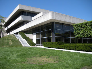
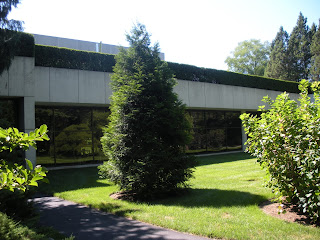
It is a beautiful building, to be sure, but I think it was one of the less interesting things that Stone did. And that was at the beginning. She evidently changed her mind after it was finished.
In my estimation, Edward Durell Stone really was one of the first to bring ornament back into architecture after the Modernists rejected it so completely. But he reinterpreted the concept of ornamenting architecture in a truly post-Modernist way (and I mean that to read "with Modernism behind us" not in the sense of the Postmodern movement, although he was doing that, also). It wasn't as if he hadn't fully obeyed Loos' Law and embraced the International Style, either, quite the contrary. Had his use of ornament been consistent from the '20s through the '40s, it would just feel cheap.
His ornament was in a very Modernist idiom, if there can be such a thing, rather than being a new embrace of historical forms. And his very contemporary use of ornament was also fully incorporated into the architecture. It was, in other words, a very architectural kind of ornamentation. It wasn't just some bit of sculptural decoration slapped onto the side of an otherwise conventionally Modernist structure.
I don't mean to imply any derision toward Robert Venturi. True, Venturi was slapping (often two-dimensional) ornament onto numbingly bland structures (what was so genius about it). But that was the whole point. Venturi was after something else entirely. His use of ornament was much more Pop. It was advertising, and in a very broad sense; the number nine on the Lieb House "advertises" its street address. It turned architecture into a consumer product just like any on a supermarket shelf. In a non-commercial sense, his ornamentation was similarly about "announcement," in the way that a pediment can "announce" the main entrance to a building and distinguish it from other doorways. Venturi's approach was therefore more of a linguistic one, while Stone was using ornament to emphasize and accent his overall geometric vision.
Coincidentally, Stone also designed a nice little Gulf gas station at JFK Airport, but it's no longer there and was impossible for me to find in a photograph. He also designed what was once a Bloomingdale's and is now a Sears not much more than about 500 yards from my mother's house on Long Island. If I'm out there on a nice day, I may walk around and get some pictures of it. I have a vague recollection of knowing it was by Stone, but it's so similar to PepsiCo that the last time I was out there, I was immediately reminded that it was his work.
 |
| Google Maps view. |
I've already talked about the rigorous, orderly entrance court, but its formal impact really cannot be overstated.
 Obviously, the office floors increase in size from the ground floor to the top. This accomplishes two things. First of all, because the building is so large, the added floorspace really adds up. They therefore got a great deal more square footage for a relatively small footprint. Secondly, it gives the building a decidedly imposing stance. It always seems to be looming over you. On a building even a couple of stories taller, the device might be incredibly oppressive. It works so wonderfully because the building is rather short.
Here's what I mean about the ornament accentuating the overall architectural vision. At the junctions of each wing, as seen in some of the previous photos, there's a pattern of stepped recesses. This is exceptionally brilliant. It's actually the antithesis of conventional ornament because it's subtractive rather than additive. More than that, it echos the design of the entire structure. He didn't attach stepped pyramids to the wall face, but reversed it, exactly what he did with the building.
The pattern on the friezes similarly employs a motif of overlapping stacked blocks twisting in and around one another. This especially calls to mind his treatment of the southeastern end.

It's impressive how adeptly Stone is able to change the tone on the southeastern end. Here he staggers the extensions of the building so it feels almost casual, far less imposing.

He also projects the back end of the building out to greet the phenomenal landscape, as if to say "yes, my building is monumental, but the natural setting is glorious, as well." But it would seem important to create a more open, welcoming mood where employees would gather on the terrace to have lunch.

As you walk around, the stacked balconies shift in and out creating different textures and relationships, as if in motion.
And then, most shockingly there is this one single vantage that congeals back into rigid formality again.
In a sense, it achieves the exact same thing as the landscaping does when it takes you from a wild, natural chaos and plunges you into strict, sharp geometry. It was here that a groundskeeper passed behind me, so I asked him if I was correct in assuming that those balconies are for the presidents and CEOs. He confirmed that they are. I said "they must be really fancy, huh?" He said he's been in those offices a couple of times and a few of them even have fireplaces. "I thought you'd like that," he said. He was right.
The other thing that changes briefly here is the quality of the glass. Around the entire structure, the overhangs bathe the tinted glass windows in shadow, creating stark stripes of black and white. The windows are entirely visually impervious. Since the glass of the cafeteria is allowed to drop lower, and the cafeteria interior was kept bright white, the windows become a bit more transparent and open up a bit, amplifying the welcoming vibe.
 He drops the rigor in only three places, really. Here at the back is one. Another is right underneath the Miró sculpture. It's purposely concealed from view by the landscaping, so I couldn't see much, but it appears to be mechanical functions, likely HVAC, and/or a service entrance. The third is at the northeast corner, underneath the Kenneth Snelson sculpture, where there's an entrance to the employees' gymnasium from a remarkably intimate sunken court.
So there's PepsiCo. If this series didn't make it perfectly clear, I'll say one last time, everyone should go and see it in person. It was one of the most amazing places I've ever been. Hope you enjoyed the trip.
All text and images ©2010, Ryan Witte, except where noted.


No comments:
Post a Comment