Showing posts with label Edward Durell Stone. Show all posts

Wednesday, May 25, 2011

Jumble on the East Side

Yesterday I had to take my laptop in to hopefully recover all the countless thousands of hours of music I've put on it over the past year or so after it decided to crash, and maybe repair it. I'd even thought a day earlier that I needed to back-up my music to my external hard-drive, but it's also being annoying lately. Please cross your fingers for me. I realized afterwards that I was in the neighborhood of a building I've been wanting to see and had the afternoon free to do so.

I asked the doorman of a high-rise apartment building, who was no help. Finally I realized I'd need to call Information for the address. I tried a wonky payphone that stole my 50 cents. I'm one of the last five people on the planet who doesn't own a cell phone. Sue me. I went into this tacky-ass accessories store that looked like it was selling bracelets for twelve-year-olds at the mall to ask for change for a dollar. The salesperson said no and was pretty much just nasty about it. She grumbled at me, "I can't open the register without a sale." "Oh, this sale is already finished?" I asked, pointing to the customer with her wallet out and poised to hand over money. "Yes." Mmhmm.

Next I tried this tea shop. The salesperson was more than happy to change my dollar for quarters. Since she was so helpful, I thought to just ask her if she'd ever spotted this foundation I was looking for. She hadn't, but offered to look it up for me on the computer. She also offered me a free sample of their spicy black tea, which was extremely delicious. As I told her, I'm much more of a coffee drinker, but I do enjoy a nice cup of tea now and then. The store was Kusmi Tea at Third Avenue and Sixty-First Street. I'm no connoisseur, but for the tea drinkers out there, I highly recommend it. The whole place smelled delicious and the tea was great.

So, business owners, here's how this works. Your employees treat people like crap, and you get called "tacky" and "nasty." Your salespeople are friendly, helpful, nice, and offer free samples, and you get a free plug on blogs like this one. Whether you buy tea leaves from them or not, definitely check out Kusmi Tea if you're in that neighborhood.

She found me the address.


First I just have to mention how bizarre this whole block is. First there's one of the most awkard, ugliest brownstones I've ever spotted in New York. How this disaster was ever allowed to remain standing in an uber-wealthy neighborhood like this I have no idea (one of the other, more conventional brownstones was being lusciously renovated in marble and mahogany as I passed by it). What were they thinking? It doesn't help that it's falling apart, but those bay windows look like an architect from 1930 traveled to 1970 and saw all the worst buildings on the planet to bring back in time.

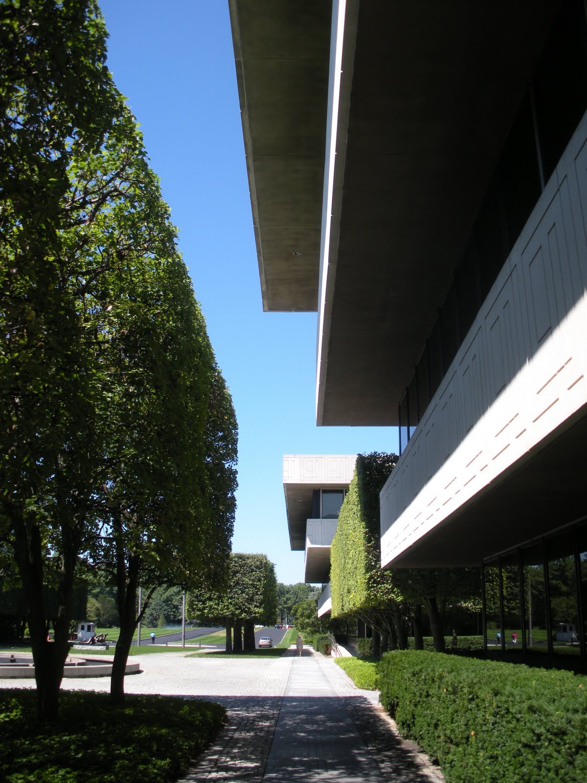
Next to this is a building which, without knowing up front, I knew had to be Edward Durell Stone just by looking at it, and it is: 130 East Sixty-Fourth Street, "The Corcoran" (1956).


Then there's Martin Scorcese's house, which looks like a Tudor mansion squashed weirdly into the footprint of a New York City rowhouse.

Evidently Steven Spielberg and Zsa Zsa Gabor [LOL] both live on this block, also. [EDIT: My coworker informed me that Spielberg has since moved to a different building.] I'd LOVE to hear some of the impromptu conversations that arise on the way to the corner store around here.

There's the vaguely Georgian townhouse and all the regular but beautiful brownstones on this block, and then we find my intended destination, Philip Johnson's Asia House (1959).


It's such an exquisitely styled Modernist building. But what really impresses me is how Johnson was able to make Modernism feel Asian in some vague way. It's something about the white-painted window surrounds. It works so beautifully. It's something that hints at, say, a black lacquer box or cabinet. The interior of the New York State Theater has a kind of Asian sensibility to it that I also can't quite identify. Both buildings had sculptures by Yasuhide Kobashi: the State has the gold sculptures on the main stairs, Asia House had a piece called The Village, which was the largest terra cotta sculpture crafted since the Etruscan era. I've been trying to find out if the Asia Society still owns it (they've moved to the west side), but I've contacted them about seventeen times and have not been able to get an answer.

Asia House responds so beautifully to the light. The stark black and white of the façade changes its character in so many different ways. Much of the interior has been altered, from what I could tell, by the current owner, the Russell Sage Foundation, which conducts research in the social sciences. There is what looks like a delightful garden out the back end of the building. I was not permitted to go there. The receptionist was very nice, and talkative, but she wouldn't let me go anywhere. She gave me the contact information for their marketing person, but I'm not sure it's worth it to contact her. The furnishings they've chosen for their lobby look mostly like budget motel, so I wouldn't have much grander expectations for the upper floors. The main staircase would have seemed freshly sparse and minimal at the time, but now looks a bit pedestrian, having not been accented properly. In other words, they've chosen to decorate in a way that feels "homey" but it sabotages the interior architecture by making it look industrial in comparison.


All text and images ©2011, Ryan Witte.

Thursday, October 28, 2010

Having a Pepsi Day--Part 3 (Architecture)

To wrap up, here is the building, itself, which I think is remarkable. I honestly have no idea why Ada Louise Huxtable hates Stone so much. Clearly, she found the majority of Postmodernism to be frivolous hackery. She makes great arguments in support of that. I find it very strange, also, that she seemed to like the General Motors Building (1968) so much.

It is a beautiful building, to be sure, but I think it was one of the less interesting things that Stone did. And that was at the beginning. She evidently changed her mind after it was finished.

In my estimation, Edward Durell Stone really was one of the first to bring ornament back into architecture after the Modernists rejected it so completely. But he reinterpreted the concept of ornamenting architecture in a truly post-Modernist way (and I mean that to read "with Modernism behind us" not in the sense of the Postmodern movement, although he was doing that, also). It wasn't as if he hadn't fully obeyed Loos' Law and embraced the International Style, either, quite the contrary. Had his use of ornament been consistent from the '20s through the '40s, it would just feel cheap.

His ornament was in a very Modernist idiom, if there can be such a thing, rather than being a new embrace of historical forms. And his very contemporary use of ornament was also fully incorporated into the architecture. It was, in other words, a very architectural kind of ornamentation. It wasn't just some bit of sculptural decoration slapped onto the side of an otherwise conventionally Modernist structure.

I don't mean to imply any derision toward Robert Venturi. True, Venturi was slapping (often two-dimensional) ornament onto numbingly bland structures (what was so genius about it). But that was the whole point. Venturi was after something else entirely. His use of ornament was much more Pop. It was advertising, and in a very broad sense; the number nine on the Lieb House "advertises" its street address. It turned architecture into a consumer product just like any on a supermarket shelf. In a non-commercial sense, his ornamentation was similarly about "announcement," in the way that a pediment can "announce" the main entrance to a building and distinguish it from other doorways. Venturi's approach was therefore more of a linguistic one, while Stone was using ornament to emphasize and accent his overall geometric vision.

Coincidentally, Stone also designed a nice little Gulf gas station at JFK Airport, but it's no longer there and was impossible for me to find in a photograph. He also designed what was once a Bloomingdale's and is now a Sears not much more than about 500 yards from my mother's house on Long Island. If I'm out there on a nice day, I may walk around and get some pictures of it. I have a vague recollection of knowing it was by Stone, but it's so similar to PepsiCo that the last time I was out there, I was immediately reminded that it was his work.

Google Maps view.
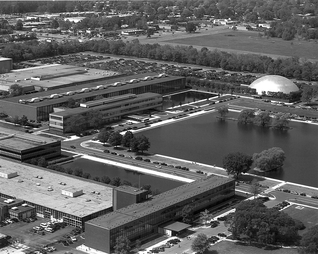
I've seen the PepsiCo building described as a seven-building complex. This does explain the structure, but it's inaccurate. It's clearly all one building.
I've already talked about the rigorous, orderly entrance court, but its formal impact really cannot be overstated.

Obviously, the office floors increase in size from the ground floor to the top. This accomplishes two things. First of all, because the building is so large, the added floorspace really adds up. They therefore got a great deal more square footage for a relatively small footprint. Secondly, it gives the building a decidedly imposing stance. It always seems to be looming over you. On a building even a couple of stories taller, the device might be incredibly oppressive. It works so wonderfully because the building is rather short.
Here's what I mean about the ornament accentuating the overall architectural vision. At the junctions of each wing, as seen in some of the previous photos, there's a pattern of stepped recesses. This is exceptionally brilliant. It's actually the antithesis of conventional ornament because it's subtractive rather than additive. More than that, it echos the design of the entire structure. He didn't attach stepped pyramids to the wall face, but reversed it, exactly what he did with the building.

The pattern on the friezes similarly employs a motif of overlapping stacked blocks twisting in and around one another. This especially calls to mind his treatment of the southeastern end.


It's impressive how adeptly Stone is able to change the tone on the southeastern end. Here he staggers the extensions of the building so it feels almost casual, far less imposing.


He also projects the back end of the building out to greet the phenomenal landscape, as if to say "yes, my building is monumental, but the natural setting is glorious, as well." But it would seem important to create a more open, welcoming mood where employees would gather on the terrace to have lunch.


As you walk around, the stacked balconies shift in and out creating different textures and relationships, as if in motion.


And then, most shockingly there is this one single vantage that congeals back into rigid formality again.
In a sense, it achieves the exact same thing as the landscaping does when it takes you from a wild, natural chaos and plunges you into strict, sharp geometry. It was here that a groundskeeper passed behind me, so I asked him if I was correct in assuming that those balconies are for the presidents and CEOs. He confirmed that they are. I said "they must be really fancy, huh?" He said he's been in those offices a couple of times and a few of them even have fireplaces. "I thought you'd like that," he said. He was right.

The other thing that changes briefly here is the quality of the glass. Around the entire structure, the overhangs bathe the tinted glass windows in shadow, creating stark stripes of black and white. The windows are entirely visually impervious. Since the glass of the cafeteria is allowed to drop lower, and the cafeteria interior was kept bright white, the windows become a bit more transparent and open up a bit, amplifying the welcoming vibe.


He drops the rigor in only three places, really. Here at the back is one. Another is right underneath the Miró sculpture. It's purposely concealed from view by the landscaping, so I couldn't see much, but it appears to be mechanical functions, likely HVAC, and/or a service entrance. The third is at the northeast corner, underneath the Kenneth Snelson sculpture, where there's an entrance to the employees' gymnasium from a remarkably intimate sunken court.


So there's PepsiCo. If this series didn't make it perfectly clear, I'll say one last time, everyone should go and see it in person. It was one of the most amazing places I've ever been. Hope you enjoyed the trip.

All text and images ©2010, Ryan Witte, except where noted.

Saturday, September 25, 2010

Having a Pepsi Day--Part 1 (Landscape)

My most recent trip was to go see Edward Durell Stone's PepsiCo headquarters in Purchase, New York.
--All photos ©2010, Ryan Witte, unless noted.
It's actually immediately across the road from SUNY Purchase, so I'm kind of pleased I didn't go on a weekend during the school year when the place is likely swarming with obnoxious college students. In a way, it seems sort of silly to travel so far to look at some architecture, since there are so very many incredible buildings I could discuss just on the island of Manhattan. I justify in two ways. First of all, anything an hour away or less (and arguably further) is still easily the "New York Metropolitan Area."

In fact, the megalopolis theory of the northeast calls from the northern edge of Boston down to the southern tip of D.C. one enormous city. That is to say, if you were to drive from the northern end to the southern, you could quite literally never encounter any area more rural than a "suburb," which still has an "urb" in it.

Secondly, although a bit hot, the weather was glorious. I even got a tiny little bit of sunburn on my big, powerful, muscular shoulders. These are not the kind of excursions I'm going to want to make when the temperature is below zero and it's threatening to blizzard. So I can use the colder months to explore the sites that are closer and easier to visit.

As many of you know, Pepsi's move to the suburbs was part of the great corporate exodus at the end of the 1960s. General Foods and General Motors had already created suburban campuses. IBM, American Can, Bell Telephone, they were all looking to escape the cities. It was a bit unexpected in the case of PepsiCo, because they had only just finished their New York headquarters. The Purchase compound opened in 1970.


I found it kind of amusing that in the vicinity of the headquarters, there are Pepsi signs and Pepsi vending machines and people selling Pepsi everywhere they could possibly do it.

Wait a minute. I didn't even look at that when I was taking the picture. $3.75 for a twelve-ounce can of Pepsi??? That better be the best damn soda I've ever tasted in my life.


Ironically, I don't drink soda at all. About two or three times a year, I'll have a can of Coke just for the fun of it, but other than that, I don't do junk food. I wasn't raised on it as a kid, and as an adult, I just don't ever crave it, thankfully. I don't even particularly care for the taste of Pepsi, to be honest. And Mountain Dew (distributed by PepsiCo) is just disgusting. Whoever came up with that recipe must have been on drugs. I also don't think the dew on a mountain really tastes like that.

It's also interesting that I'm so addicted to Mad Men at the moment. I arrived a little late to the party because I don't have cable and watch everything online, but I watch another episode almost every evening and can't stop. [As of now, I'm all caught up.] The corporate suburban exodus rides right on the tails of the big business atmosphere depicted so lovingly by
Mad Men. It definitely helped me to put this into its proper context.

Of course, I went primarily to see the architecture, because I'm a huge fan of Stone's work. I was also aware before making the trip that the grounds were beautiful and included an impressive collection of sculpture. What I discovered by being there in person completely transcended a mere collection of nice works of art and design. Instead, PepsiCo is three art forms--Landscape, Sculpture, and Architecture--seamlessly locked together in an endless dialogue of fascinating and perspicuous interrelationships. I've therefore decided to divide this story into those three discrete components, and look at how each responds to and interacts with the other two.

Google Maps view.
The landscaping was by Stone's son, Edward Durell Stone, Jr..

It shouldn't come as much surprise that the landscaping is so perfectly matched with the architecture. Stone's own son not only most likely had a better knowledge of his father's work than anyone, but also just an intuitive understanding of what he's was trying to accomplish stylistically. Ed, Jr. passed away two years ago, but his firm still remains in business.

I'm sure it was incredible when it was first finished, but now that all the trees and plantings have had time to grow in and mature, it's like the Garden of Eden with so many wonderful moments of discovery. I'd come in through the front, but there on the right you can see the first view I had of the building after parking the car.

Then I walked around to the main entrance. As you can kind of see in the bird's eye view, and I'll discuss more later, the entrance is cruciform in shape with three courtyards off the main axis, one in front and one off to either side. I think I gasped out loud when I saw the courtyard at the center.

[From other photos I've seen, it's apparent that there's a fountain behind that tree on the left, but none of them were running that day, unfortunately.] The two courtyards on the sides don't have pools, but sunken gardens with flowers and sculptures. I told the security guard when I walked back out that it would be a bad place to work if you had allergies, but he just said "what," and didn't seem to have a very good sense of humor. It was true, you could really smell all the nature in there air quite vividly.


I was immediately struck by the way the sharply manicured rows of trees create all these incredibly complex geometric relationships with the building.


I thought the frame of trees around the courtyards was quite smart also.


They block the windows from view, giving the offices inside a measure of privacy. If you think about what you'd see looking out the windows, it's something green and natural, but it's a flat plane of greenery. It would be soothing, but not distracting.


In unbelievably striking contrast to the strict orderliness of the main entrance, the western corner of the building may as well have been by a different landscape architect altogether.


Here you encounter a wildly naturalistic vibe. It's not completely disordered, either. I mean, you can see the design if you're paying attention and it was obviously planted with a purpose.


Nonetheless, there is the feeling while walking along that path that from a perfectly mowed lawn, you're suddenly encountering a small, isolated untamed moment before returning to civilization again.


And it's civilization with a vengeance, too. The rigid formality of the southwestern facade is most sobering, indeed.

It's the seriousness of this that makes the location of Joan Miró's Personnage so delightfully genius here, but I'll discuss that more in the next post. The sculptures were brought in after the landscaping had filled in, so they could be positioned just right. It shows.

Keep in mind that while in some places, there are ample opportunities to wander off the path, in others, your route is strictly controlled. This was one of them. Steep berms mostly prevent you from getting too close to the building in some cases (I didn't mind climbing them), controlling your view of it. In this case, plantings and a wall force you to descend a staircase and walk out away from the building quite a distance. 


Then you turn back around and see this.


This was another part of the campus that took my breath away. 

They were very proud of it, also; at the far end is a shady trellised pavilion that frames the view and shelters a bench where you can sit to admire it.


It was here that I became fully aware of how the landscaping matches the forms of the architecture so perfectly.


While the lines are very precise and angular, quite synthetic, the water lilies were a brilliant touch, because it still feels so natural at the same time.


The dragonflies think so, too. I tried to get a picture of one of them, but it was too small and I knew the photo would never come out.

I love how Personnage pokes his head up over the bushes to look at the garden.


Hello there.  

That totally made me laugh.


Keeping watch over the garden on the other side are stylized peacock topiaries.


There are surprisingly few topiaries on the property considering how manicured it is. In fact, these are the only ones I remember seeing. 


These made me grin, too, though. Do these remind you of anything?

Maybe I'm just crazy. I still can't be sure whether or not that was intentional.

Then, after that cluster of activity, everything opens up onto this enormous, beautiful, lush green field.


There on the left is Arnaldo Pomodoro's Triad, which was one of my favorite pieces in the PepsiCo collection, but I'll discuss it in the next installment.


It was so nice for me, a city dweller, to be on so much grass that I actually started running around--not to save time, but just for the pleasure of running.


The glass enclosure at the back is a cafeteria, so outside it is the most delightful seating area shaded by two big blocks of manicured trees.


As you can see, there were people seated there, so I wanted to be careful where I aimed my camera. 

But the terrace looks out over the lawn with a view of an enormous man-made lake at the southern end of the property.


At one time, the lake had a tower of water shooting up out if the middle. I don't know if it's still there, but unfortunately it wasn't spraying that day.


Part 2.

©2010, Ryan Witte

Friday, October 3, 2008

Re-Installation

I recently had the great opportunity to talk with the head of the Richard Lippold Foundation, who is restoring the brilliant sculpture in Walter Gropius' Pan Am Building.  I wasn't sure if it was even still there, but he said they would remove it "over his dead body."  It's really an incredible piece, and what occurred to me is that Lippold was really doing Installation Art before there even was such a thing.  Lippold's pieces weren't sculptures created for a certain application, they were fully determined by and designed around the architectural spaces where they would be placed.  No one was doing work like this in the 1950s.


The Pan Am piece is occasionally rumored to have started out titled The World, but this is incorrect.  It was only ever known as Flight, and it's beautiful, but it's gotten extremely dusty over the years.  The golden sphere at its center got fully blackened by patina and environmental circumstances in as little as five years.  They're meticulously cleaning it up to restore it to its glorious original beauty, and hopefully improving the lighting to showcase it to its best advantage.

His The Sun was the first piece by a living artist ever commissioned by the Metropolitan Museum of Art in 1956.
 
When you look at it in the context of the ancient Middle-Eastern rug designs in the room where it was intended to hang, it appears to be even more brilliant: capturing the same geometric precision and complexity, but in three dimensions.  


In around 1976, it was taken down to the National Air & Space Museum in DC, where I'm fairly certain I may have seen it as a young kid.  I do distinctly remember visiting that museum, but I was probably so overwhelmed in general that I have no specific memory of this piece.  In any case, it's also being completely restored according to Lippold's original drawings and plans, and will eventually be reinstalled at the Met, allegedly.

I'm actually kind of surprised that more people don't talk about Lippold, because his work was really astonishing in a lot of ways, but evidently he rejected the commercialism of the art world in his time and the fame that might accompany it.  That attitude may have contributed to his not being more widely discussed.

I also got to see one of New York's truly hidden treasures.  It's a Lippold piece called Winged Gamma inside the Park Avenue Atrium.  
The building is somewhat bland unfortunately, but got an overhaul by Edward Durrell Stone in 1981, when the piece was installed.  Stone carved a cavernous atrium out of the center of the building, what was originally an air shaft.  In this atrium hangs this sculpture, which is twenty stories high.  It's absolutely astonishing.

I still need to see the Lippold piece hanging over the bar in Philip Johnson's Four Seasons Restaurant in Mies van der Rohe's Seagrams Building, but that's for another post.

©2008, Ryan Witte