Showing posts with label photography. Show all posts

Tuesday, June 12, 2012

The Kinda Work U Wait 4

(ICFF)

When I came upon the booth for Al-Hamad Design, it was immediately obvious to me that there was something very interesting going on there. As I paused to take mental pictures before moving on, I noticed a nice-looking boxy wooden chair with soft, creamy leather upholstery. The person at the booth, who I later learned was the designer himself, Nanu Al-Hamad, lowered the back of the chair. It became a small table. Then he flipped a switch to turn on a light inside the box. It was also a light fixture.


I was sold. I told him it was fantastic and grabbed a card. I later discovered there's a storage compartment under the seat, as well. This thing is four objects in one, and I love that. The piece is called Little Oyster, and a custom-made grouping of them made for a specific client takes it yet still further. The custom pieces have built-in audio speakers and a built-in iPad. The lights in all the units can be dimmed by remote control and the speaker volume is wirelessly controlled from the iPad.

This kind of exploration with different functionality and technology has the potential for Al-Hamad and designers like him to stumble onto just the right and unprecedented combination of elements that could literally give birth to an entirely new kind of design object altogether. I find this incredibly exciting. It's tilling the garden of revolution.

Q8
The other equally fascinating pieces in this collection made it clear to me that I really ought to talk to Al-Hamad and find out more about his history and process. He was born in Kuwait, and would visit Southern California with his family once a year or so. When he was four, Iraq invaded Kuwait and his family moved to California permanently. He said he visited Kuwait somewhat frequently while growing up, but after finishing college in Chicago, he went to live there again for around a year. He said he loved living there and especially appreciated getting to experience it as an adult. He discovered a vibrant contemporary art scene and folks keeping alive and kicking a lot of creative underground culture. Ultimately, there were things he missed. One thing I was unaware of is that alcohol is prohibited there, which means that even if you don't drink, there are no bars or clubs or places to congregate socially aside from people's private homes. He has returned to the United States and now works out of New York City, but travels back and forth often and collaborates frequently with artists in Kuwait.

The image there is Q8, a mirror occupying roughly a three-foot square (a square meter) with the islands off Kuwait's east coast attached to the wall separately. Al-Hamad said he's always loved the the shape of the country where he was born and uses this as his bathroom mirror.

At some point during our conversation, I told Al-Hamad that from what I could tell, most of his work has a combination of three things. 1) A number of different functions in a single design object, 2) an unexpected sort of interactivity, and 3) something transcendent that begs the user to activate his or her imagination. He seemed to think that was a nice way of summarizing. Here I'll also add that they all use interesting or luxurious materials and often consciously call attention to their materiality.

Little Oyster sufficiently covers the first element. I think the piece that most simply and literally demonstrates the second and third is his Bright Idea arm chair.


It is a chair and at the same time, like much of Al-Hamad's work, a piece of Conceptual Art, as well. It's designed to encourage inspiration. You sit comfortably on its buttery Moore & Gilles leather upholstery to contemplate, and when the inspiration comes, a leather-upholstered button in the arm rest turns on a light bulb above your head. Eureka! Not content with a one-trick pony, Al-Hamad gives the piece an added bit of aesthetic distinction by providing the beautiful but relatively conventional walnut armchair with interestingly sculpted legs. The chair appears to be growing out of the floor. Furthermore, the legs pull the piece down into the floor surface far more than balls and claws might have, creating a wonderful tension with the light bulb and the abstract ideas it represents, which want to ascend up into the stratosphere.

Taking advantage of more advanced materials are two pieces of outdoor furniture, Cradle and Gibbous. Both pieces are made from a durable, waterproof, glow-in-the-dark fabric which charges in the sunlight during the day and then gives off light throughout the night. That the pieces are also light sources is not a shocker, of course. Al-Hamad loves incorporating the element of light into his work. With Cradle, it's the fact that the sort of hammock lounge is carried on rockers at the top and bottom that begs you to use your imagination. The piece encourages you to tap into some early, infantile memories of being in a cradle and to be soothed by the comfort of the rocking motion that accompanies it.

Unlike your typical cradle, this is a hammock for two. Pillow-like cushions at both ends rather than just one is another fantastic detail. Not only can you enjoy lounging with a friend or loved-one, but you can face each other to more easily converse, as well. This is not just a piece for resting, but also for socializing.

Gibbous is an ornamental object, an arm chair, an ottoman, and a back-rest all at once, and was regarded highly enough to earn an A'Design Award in 2012.

Looking closely at that image, you may notice the hand-cut brass plaque that marks every Al-Hamad Design piece, a small but very classy detail, in my opinion. The smaller section is clearly an ottoman, but can also be used as a back-rest to sit on the grass. As is no doubt obvious in the image of it opened up, when not in use, Gibbous fits back together to become as perfect a sphere as was possible given the challenge of properly upholstering something in this shape. Closed up after dark, it becomes a mysterious glowing orb haunting the landscape. "Transcendent" may be the wrong word for the image this produces, but "otherworldly" could very easily be applied to it. One measure of proof of this is that the press materials for this and Cradle make a point to identify the images in darkness as indeed being actual photographs. The visual effect is so unusual that it seems entirely justified to do so (especially with the former, because it looks almost like a computer rendering). Still, I think the effect in a landscaped backyard would be delightful and unique.

Somewhat similar in execution, though completely different in form is a custom bar Al-Hamad designed called Vertex. In spirit, it's an object of art, a large, dark, monolithic oak box with a glowing, jagged-edged acrylic cloud floating above it--simple, refined, and distinctive.


All its functions as a bar seamlessly fit into it like a jigsaw puzzle. Drawers and cabinetry all but disappear from sight. The best detail, in my opinion, is a drink cart that fits into one of the ends of the wooden base. With a handle carved carefully out of its visible wooden surface, it's easily accessed, but requires no attached hardware to mar the purity of the forms. The cart even includes integrated but removable serving trays to accommodate a multitude of hosting circumstances.

Al-Hamad has also delved fully into the world of fine art. While visiting his birth country, he visited a small island in the Persian Gulf called Failaka. Failaka Island retains some fame from Alexander the Great, who encountered it in his campaign from Greece to northern India and left some markers of Greek culture behind. It was one of the longest continuously occupied regions of Kuwait and supposedly has glorious seasonal patterns and local flora. In 1990, Iraq invaded the island, exhiling almost all its residents to mainland Kuwait. The Iraqi military used it as a base and for target practice. Sadly, this and the resulting violent expulsion of the Iraqi army by allied forces pretty much obliterated the island.

The result is a lot of ruins of what had been relatively beautiful houses, some fairly palatial. It was strange, he told me, to find houses that were essentially a bombed-out empty shell but with an oddly intact bathroom, for instance. He also said the island has become something of a tourist destination, no doubt due to its scenic beauty, but that the main resort hotel is mildly tacky. Most interesting, he found, was the graffiti. Teenagers have for some odd reason chosen this unique island as a backdrop for messages of love and the search for it. Most of it, he indicated, is of the "Carmen ♥ Faisal" variety, but the kids will also write their email addresses or similar, and quite amusingly, things from popular culture, like "Justin Bieber." Very wisely, he photographed a good number of the more interesting tags.

Those photos would become a series shown at the Sultan Gallery in Kuwait City, one of the oldest art galleries in Kuwait, founded by the late Ghazi and Najat Sultan in 1969.  It closed in 1990 and their surviving sister, Farida Sultan, reopened it in 2006 at a new, multipurpose warehouse location. Al-Hamad confessed that he finds most photography exhibits to be rather dull, though, so he decided to present his photos in a more sculptural format. Appropriate to the subject matter, which occasionally referenced social networking, he created an enormous, fully-functioning Blackberry Bold 9000 with a television monitor mounted inside it. The pictures appear in a slide show, as if seen on a giant Pop hand-held device.

He had only ever intended this to be a one-of-a-kind work of art. However, a certain businessman saw the piece and wanted one for his office. The compromise Al-Hamad made was to instead create for this client a giant Blackberry Curve 9300. This way, he didn't feel as if he were repeating himself verbatim. Moral of the story, you're unlikely to be able to talk him into making one of these for your office unless it's an entirely different device or you a$k him very, very ni$ely. Evidently, and not surprisingly, everyone who enters that client's office and sees the giant Blackberry falls in love with it.

Chandelier is also more a work of Conceptual Art than it is a piece of furniture, although Al-Hamad clearly loves to flirt with those distinctions. I say that not because it isn't a perfectly functional chair or a perfectly functional light fixture. Rather, its installation would require relatively remarkable preparations, and to experience it as its design was intended would require a bit more space than one would expect to find in a typical building interior. The legend goes that he saw a cartoon of a person swinging from a chandelier and wanted to create a more practical way to do that. So he created a low-hanging chandelier with an enormous throne sitting on top of it. The chair rises about six feet (2m), and is upholstered, impressively, in a single piece of leather with no seams.


He had considered the possibility of using camel hide to give this piece an added bit of Kuwaiti flavor, but this proved to be impossible. In talking to a dealer, he discovered that the skinning process involves first cutting off the camel's hump. So the resulting pieces of leather will decidedly have a hole in the middle, making camel hide unsuitable for applications requiring larger sheets of it.

I loved the whole mad party concept, the royal and elegant look of it, and the play of shadows from the small bulbs underneath. But it was only after contemplating this piece for a little while that its magic dawned on me. It hangs perfectly straight, in complete defiance of gravity. "How on earth did you ever balance that thing?" I had to ask him. It seemed to me that even counterweights would not be sufficient to offset the cantilevered seat and arms and the weight of the chandelier, itself. Al-Hamad explained that they went through numerous trials to get this right. In the end, a solution was found by providing a metal shop with the dimensions of a volume inside the back that would be available for counterweight. The shop then created a sheet of extremely dense metal alloy heavy enough to balance the piece. It now weighs in at around 400lbs (182kg) but hangs exactly right.

The piece I'd like to end with is the Embarakiya floor lamp. I end here not because it's my favorite. In fact, the thought of arriving home late at night to a dark apartment and having a human figure looming in the corner of my living room makes me shudder a little (I'll happily recommend it for non-residential applications). Nonetheless, I think it incorporates everything that makes Al-Hamad's work so interesting, and at the same time ends up being somewhat provocative.


Initially, the designer had conceived of this as being adorned in less culturally-specific garments, like perhaps a simple business suit. But in walking around the Embarakiya, which is the large market in Kuwait City where garments, cloth, and other items are sold and traded, he decided he really liked the idea of clothing the lamp in a traditional men's dishdasha. The clincher was when he realized that the headdress, the qitra and egal, would work perfectly as a lampshade. The male figures have speakers in their torso. I was curious if they said something, which they don't; they plug into a normal stereo system.

The female figures don't have speakers--I'll leave it for my Feminist readers to psychoanalyze that--but their garments, the abaya and hijab (or nikab) are more ornamental with, in this case, truly exquisite embroidered gold trim. The headdress fabric was thin enough to warrant a second layer, and as a result, the weave of the two layers of textile overlaps to create interesting patterns in the filtered light.


The interactivity and the transcendent are locked together here. In order to turn on the light in the figure's head, you shake its hand, which has a touch-sensor in it. It seemed to me the narrative being played out here for an American audience was quite striking; to call forth light from the head of a figure in traditional Arabian dress, you must perform a friendly, welcoming gesture with it. I first asked Al-Hamad if it were a political statement he was making. He laughed and said, "no, no, not at all." In fact, in talking to him, I quickly realized he's mostly just having fun creating the pieces that he does. My reading was all wrong, but I think that's partially the point here.

He said that the response from audiences in Kuwait was anything but disturbed. In fact, most people who saw it there simply found it amusing and clever. Responses at the ICFF were quite different. Some people actually voiced concerns about the piece, questioning if those who came across this might have a problem with it. That seemed sadly xenophobic to me at best, and at worst, kind of downright racist. This was why I asked not that question, but the one I did, which was about the differences between the responses from Kuwaiti audiences and the white, European-American ones at the show.

Whether intentional or not, it's incredibly rare to find a work of mere furniture design that can elicit such wildly different emotions from different people. I think the lesson to be learned from this work is that it's those very differences that we must set aside--along with the kind of unnecessarily political readings to which I admittedly fell victim--so we can just have fun and enjoy being a part of a truly global design community.

Much thanks to Nanu Al-Hamad. I'll be eager to see what brilliant directions he takes us next.


All images courtesy Al-Hamad Design. All text ©2012, Ryan Witte.

Thursday, March 17, 2011

The Revitalization Project

The Changes

I'd like to take a post and talk a little about focus. This won't really inaugurate a change in direction for Architextures, but maybe rather a raising of awareness. I've had the great honor of associating with people who care about these things, and who care to talk to me about them. One major force has been the great friend of mine who showed me around Philadelphia, who's very intimately involved with issues of social justice. For sure little traces of it have crept into my posts over the years, but I think it's about time that I faced more of my responsibilities, universally speaking.

What I hope for the future of this blog is to gravitate more toward a conversation about the ways that topics of art, architecture, and design intersect with issues of the marginalization of certain groups in society. Architecture, most especially, has long been and continues to be a suspiciously white male profession. Why is that? How does that impact the way that our spaces define a certain prototype of interaction we have with the built environment? I think it's long past due that we start examining these things. Most certainly women and people of color have been thinking about it all along, but I'd like to enter the dialogue in as much as I remain able to recognize when to shut my mouth and just listen.

One thing I've noticed in my own work at Lincoln Center is that, almost across the board, when I even begin to touch on the topic of architecture, the eyes of young women I address begin to glaze over with boredom so strikingly more and so much more quickly than the young men. I've been overjoyed by the opportunity more recently, with the appearance of Liz Diller, to be able to use female pronouns. With all of the greatest respect to Ricardo Scofidio and Charles Renfro, the difference in the interest level amongst many of the young women I deal with when I use those female pronouns has been subtle but quite noticeable. I lament the fact that Davis, Brody & Associates had not yet welcomed in the late African-American architect Max Bond when they designed LC's Rose Building; there is a connection, but it's not nearly as direct and is more difficult to work into the story.


The Non-Profit

I want to discuss here the non-profit organization that has been brewing in my mind for many years now. The idea springs from two things. First, that many low-income neighborhoods have absolutely beautiful old architecture that its citizens are unprepared to appreciate (as most people are, actually, who aren't architects or artists), and have neither the resources nor, most importantly, the privilege to step back and fall in love with it. The other is that I have always felt that those who accurately, faithfully restore and protect the products of their cultural heritage--old cars, old houses, motorcycles, paintings--are involved in the most noble of pursuits. All of the greatest of our achievements as human beings might crumble into dust if not for the efforts of these people.

1014 East Hoffman
What I would love to do is to form an organization that could go into beautiful old urban neighborhoods, purchase houses for fair market price that are completely boarded up and dilapidated, and restore them to the glory of when they were first built, from around 1870 to 1920 or so. Keep in mind that the picture I have in my mind is this typical, five-story, red-brick row-house found especially in Philly, DC, and Maryland, in New Haven maybe with a prominent front porch, in the Bronx maybe built of brownstone, but it's a distinctly urban type of building. That's not to say that similar neighborhoods all over the country couldn't benefit from this kind of attention. For one thing, I myself have spotted countless Victorian farmhouses of immeasurable charm across the countryside with trees growing out the windows.

In looking for images for this post, I was surprised to discover one city that seems overwhelmingly plagued by this kind of unfortunate situation. Google searches time and again brought up examples from Baltimore. Maybe my having spent so much time there is the reason this imagery is so seared in my mind.
American Brew

You'd be hard-pressed to find a city whose architecture is as exquisitely beautiful as it is tragically neglected. Please don't misunderstand me, in no way do I believe that the people of that city are in any way to blame for the state of things. I'm absolutely certain that there are much deeper, systemic and economic causes far more complicated than I could hope to summarize here.

Catherine Street
Quite the contrary, it was in Baltimore that I found someone who appears to love the architecture of his city as much as I love the architecture in mine. I regret not being able to connect with someone like this from Cairo. Kevin Mueller said he isn't a professional photographer. In fact, he confessed =) to me that he's a Roman Catholic priest. But he has an incredible eye and has documented the city where he has lived for fifty-one years with such obvious love and respect. His images resonated most for me, I think, because he embarked on his journey to photograph Baltimore for reasons very similar to why I write this post, realizing so much about the city he loves was falling into disrepair and being lost forever. All the images in this post are of Baltimore and are the work and property of Kevin Mueller.


The Plan

To fund this project, I'd love to find people from these neighborhoods who have earned a crazy amount of money by their hard work, skills, and great talent. There are so many of them who triumphed over insurmountable poverty, and many of them are prominent faces in culture who might be smiled upon by a great many people for giving back to the communities that helped form them. Possibly as many as half of the wealthiest African-Americans turn out to be from Chicago or surrounding areas (and we all know the person at the top of the list is). I doubt it would be too difficult to start there.

1900 Block West North Avenue 3
Next, I'd like to recruit workers from the neighborhood where the buildings are located, maybe from within a few blocks, depending on the density of the neighborhood and potentially, hard-working people who've found themselves undeservedly out of a job. The best thing would be to bring in experts in accurate historical architectural restoration and train these workers in the skills needed to both reconstruct a building built from the 1890s (or whatever), but also give them a skill that will be entirely marketable in the workforce. This would not only give them a pride in the effort to revitalize their own neighborhood, but also the pride of a new skill gained for themselves. Great care could be taken to both recycle every building material and reclaim materials for subsequent projects to minimize waste and ultimately cut down on costs. These homes could be rebuilt in a way that not only celebrates their historical architectural integrity, but also makes them as self-sustaining and green as possible.

2400 Block Druid Hill Avenue
Though greenery is limited in these row-house neighborhoods, landscape is crucial, as well. It's the public presence that a home on streets like these present, the most crucial to the inherent social nature of the street. The porches and stoops made them so very vital and also safe from crime and mischief, and resistant to neglect and uninvited litter.

In terms of a bigger picture, I suspect that the appearance of one or two or three perfectly pristine houses and lawns with a few nice flowers on a forgotten street could do everything to encourage a sense of pride that other residents might see as a sort of call to competition that could revitalize the beauty of a block. In other words "we care about our block, maybe you should, too." I've seen neighborhoods in Brooklyn where the residents each take great pride in having the most beautiful, glorious flowers possible in front of their houses. That sense of competition has produced the greatest outpouring of beauty and care. The very care I believe--and maybe this is naive--encourages an upward spiral of respect for one's community. Anyone might toss a used soda can onto an overgrown, weed-riddled, badly-maintained brown lawn. Only a very ill-bred, badly raised individual--of which I think there are actually very few in any community--would do so to a nicely-kept, proudly-maintained yard of one of his or her neighbors. Self-respect begets respect from others.

2500 Hollins Street
Then, I'd like to find a family from the same neighborhood and offer them a residence of appropriate size for their needs in these newly remodeled homes at the same rent they're currently paying. Their monthly payments could be applied to a sort of mortgage in the same way. Perhaps community organization to assist with the move would grease the wheels a little. At first, of course, this would be a losing proposition, which is where conscientious investors would come in. But with enough units consistently earning rent and feeding into the system, eventually it would be enough to support the costs of each new building restoration.

At this point, newly restored houses could be traded evenly with neighboring homeowners, their broken down residence for this newly restored, pristine one (landlords need not apply, for obvious reasons). Their old home could become the subject of the next restoration, and so on.
710 East 21st Street

The point would be, though, to not encourage a bunch of yuppie, white, middle-class folks to take over the neighborhood and yet again force people of color or lower-income residents to relocate elsewhere, but to leave it in the hands of those who have molded those neighborhoods in the first place. Allow them to regain the pride in their space that they deserve and make it theirs.
 

The Case Study

I found one block in Baltimore to be particularly haunting: Perlman Place. I stared at these photos for a very long time and couldn't seem to get the imagery out of my head. House after house after house, just...dead.
Perlman Place 16

Patterson Park Avenue 2
First a few basics. Perlman is one block running north to south between Sinclair Lane and East North Avenue. An around one-hundred-foot snippet continues on the other side of E. N. Ave, but the avenue is a rather large barrier, so Perlman is effectively only a single block long. To the west, North Collington Avenue runs parallel to Perlman with an alley in between, to the east, North Patterson Park Avenue with an alley between. At the Sinclair Ave. end is the active Laurence G. Paquin public school which, oddly, appears to accommodate students from pre-kindergarten to twelfth grade. There's a huge high school to the north of Paquin, and what appears to be a public pool to its west. This means that these houses were perfect for families on the one hand, and that Perlman should have been teeming with vibrant street life on the other.

I use the past tense because pretty much the entire block has been razed since these photos were taken. Residents of the area were understandably uncomfortable with the idea of school-age kids walking up and down this ghostly street every day with potential hazards on the street and lurking inside the buildings. My solutions for Perlman Place, therefore, will forever remain a lost opportunity. Nevertheless, I think they could be applied to plenty of other similar streets.

Perlman Place 17
If it weren't for the fact that this one block is so long, I'd suggest banning vehicular traffic altogether. As it is, dropping off passengers and larger items to all these buildings exclusively through the alleys would be unrealistic. In any case, I would ban parking (not stopping) on Perlman completely and be sure to allow for ample parking opportunities on the alleys, particularly for the residents and the occasional visitor. If long stretches of the buildings' rooftops were converted to accessible gardens and terraces, the loss of a few backyards for parking would be less troublesome. I'd also make Perlman a one-way street if it weren't already, repave it, and install speed bumps at regular intervals. If the street were not already so narrow, I'd widen the sidewalks (although maybe a foot or two could be gained), but the rather narrow sidewalks would be less problematic anyway if vehicles were drastically impeded. For sure I'd repave the sidewalks, perhaps even with patterned brick, install benches, trees, plantings, and more ample and attractive lighting fixtures. Some of the more attractive flowering plants that have naturally taken root there--and are therefore relatively indigenous and hearty--could simply be replanted in better spots. If there isn't already a bus stop at the end of this block, I'd petition the city to add one until I lost my mind.

Next, N. Collington is interrupted by two cross streets, Cliftwood Avenue and East 20th Street. I'd do everything possible to demolish the buildings on Collington, Perlman, and Patterson Park on axis with these two streets (perhaps offering those tenants/building owners newly restored homes in return), and create nice landscaped pedestrian pathways through the blocks west-to-east. This way, pedestrians coming from every possible direction would have reason to use Perlman, rather than it being this long, isolated stretch of street. Openings for large windows or doors would be broken through all the now-exposed party-walls to look out onto the pedestrian walkways, and residents adjacent would be encouraged to keep all views unobstructed by trees or bushes in order to discourage mischief. The pathways would also make parking on the alleyways more realistically accessible.

Perlman Place 14
As for the buildings themselves, I don't believe I have some superhuman powers of imagination that are allowing me to see just how wonderful and charming these little houses were when pristine. Looking at various views, you can take a remaining door pediment from one, the frieze from another, and the cornice from yet another and piece them back together again fairly easily, in my opinion. And please use your imagination to remove that horrid fake stone facing. Why anyone would cover such lovely red brick with fake stone made out of plastic or whatever the hell that is, I have no idea, but I suspect the 1960s are to blame. But look at the first floor window. It's huge. It must be practically the entire floor-to-ceiling height of the front room. Imagine beautiful multi-paned double-hinged windows opening up to the fresh air and sunshine, curtains blowing in a soft spring breeze, flowers in a box attached to the sill underneath.

Patterson Park Avenue 1
I'd like to create a multitude of variety here. While the architecture of Perlman might seem a little bland or monotonous compared to the exuberance of some of Baltimore's other streets, its uniformity actually allows for a great deal more possibilities. The ground floors of all the corner buildings--including on the pedestrian pathways--and a couple in the middle of the block would be dedicated to businesses. Little stores of different kinds, a laundry, grocery, internet cafe, maybe a small pharmacy, day-care center, ice-cream parlor, newsstand, a restaurant or two. For a larger business like a restaurant, the ground floor of two adjacent buildings could be combined to create one large space. In those buildings with ground-floor businesses, second floor apartments would be entered through the back from the alleyway. This would also add more pedestrian activity to the alley making it busier and therefore safer. They could be studio apartments, or the second floor of two adjacent buildings could be combined together. Two entire houses could also be combined without any businesses to create double-sized homes. All in all, a diverse street for people with various different incomes and households of many different sizes.

I'd love to think that the businesses could all be co-ops, operated and staffed by residents of the neighborhood. This would accomplish so many different things. Mostly it would fully glue the community together. They could be social gathering spaces where many different interactions could take place. Because space would be rather limited in the storefronts, it would allow them to stock exactly what people in the community want and need without waste, and would ensure that residents had no reason to drive to some big generic store across town. Dollars would stay inside the community. Residents could work full time or share shifts with their neighbors to add a little income to that from an outside job. Retirees with unsurpassed skills in the kitchen could work a couple of days at the restaurants, staying active and making sure the younger folks are eating right. Plus, I've met a few grandmothers in my day who wouldn't let a teenager get away with any nonsense whatsoever. You know the grandmothers I mean.

With all the businesses, this could have great educational benefits as well. The high school kids could learn how to manage a small business, bake a perfect cake from scratch, or make some extra cash watching kids at the day-care center, which they might have had to do for free for their younger siblings after school, anyway. I suspect they'd be less disgruntled to work, for instance, at the internet cafe on the block than they might elsewhere, because they'd essentially be getting paid to hang out where all their friends and neighbors are. Even something requiring more qualifications, like pharmacy or dentistry could be combined with a local community college program to offer training to the neighborhood's young adults, earning them valuable credits.


The Disclaimers

Eventually it would be nice to just pass the non-profit over entirely to a person (of color) who has lived in a neighborhood like these, so the whole organization could be by and for the benefit of the people affected and not me, a relatively fortunate white guy. As a white man living in America, I fear I may be stepping over a line in discussing this at all. To sort of paraphrase things Tim Wise has said, people of color have done just fine without my help for centuries and made remarkable achievements in a culture of oppression and will continue to do so without me. At the same time, it goes without saying that much damage has been done over that time in the interests of further marginalizing certain groups of people. So I don't see this as "charity" but rather doing what is Right to make this the world that I would like to live in: a world where people help one another, regardless of their differences.

I think I do know a few people who would be eager to help with an endeavor like this. They're the people who I respect the most in my universe. But if anyone else reading this has anything else to offer, please do comment. I'm not convinced that I'm strong enough to undertake it, and certainly not alone, but I would love to make it a reality.

In thanks to Kevin Mueller for the use of his photographs, here are some of his own favorites.
Poplar Grove from the North


Fulton Avenue 4
His favorite building in Baltimore, he told me, is the Baltimore Trust Building (1929, now Bank of America) by Taylor & Fisher.
Fulton Street 7

All text ©2011, Ryan Witte.

Thursday, October 21, 2010

Man on Campus--Part 1

This series will definitely be more of a story than I might normally tell. But I just had to discuss the infuriating comedy of errors that has been seeing Philip Johnson's construction drawings for the New York State Theater. [As more and more horrifying press surfaces about David Koch, we're becoming less enthusiastic about honoring him as namesake of the theater he helped renovate. If you're reading this, Mr. Koch, you're always welcome to improve my opinion with a couple-million-dollar donation to Architextures.]

I knew that Columbia's Avery Architectural & Fine Arts Library had a good amount of materials on the subject, and would be a great place to start. I read through the provisions on their website about gaining access, and also called around for a bit of clarification, to make sure I arrived with all the necessary credentials.

My first stop was the Library for the Performing Arts at Lincoln Center. Since I work there, it seemed the easiest choice, and I could just wait until a day when I was there and had a free half hour. Not so easy, after all.

I stopped at the information desk. For the first of many, many times, I recited my explanation of what I wanted to do: "I'm doing research on the Lincoln Center campus. I thought the Avery Library at Columbia might have construction drawings and so on of the Koch Theater. So I need a slip or something to get access." I eventually found out it's called a Metrocard, which is a bit confusing since it has nothing to do with the subway. The woman at the information desk didn't know and sent me to the check out counter.

I explained again. The woman at the check out counter didn't know and said I should ask her supervisor. I told my story to the supervisor. The supervisor wasn't sure but suggested I try the information desk on the third floor. To get into the reading room on the third floor, where I would only need to be for about thirty seconds, you have to check your bag. So I checked my bag. There were three people at the information desk up there. It was almost like I had a cowbell around my neck: the three of them just stared and watched me walk all the way across the room and around to the front of their desk. So weird. I explained again.

The guy there knew exactly what I was talking about but told me I had to go down to the Dance & Drama desk on the second floor. I got my bag back from coat check and headed downstairs. I explained my situation yet again there. The guy at Dance & Drama was very nice and helpful and gave me the yellow Metrocard thing that I would need to get into Avery. I asked him if there were a time limit on it, and he said not really, but that I wouldn't want to wait too long to use it.

A week or two later, I had a free afternoon and the weather was gorgeous, so I decided to make my way up to Columbia. Even when I lived in Manhattan, the Columbia neighborhood seemed like a different planet. From Queens, it's really quite a trek. It probably took me about an hour door-to-door.

My first stop, while the sun was still at a nice angle, was Harrison & Abramovitz' (H&A) Law School Building, now called Jerome L. Greene Hall, built in 1961. Greene was a lawyer who gave Columbia's law school $40 million over the years and gave the university a single gift of $200 million, the largest they've ever received.


I'd like to see as many of the New York area buildings by Lincoln Center's architects as I can in person, to just intuitively understand their work better. But in addition to that, Greene Hall is strikingly similar in style to the Metropolitan Opera House. Even if you didn't know it was by the same architect(s), you could probably tell just by looking at the two buildings.

This building has a reputation for being ugly. The fondness some students grow to have for it has been referred to as "architectural Stockholm syndrome." I think that's somewhat unfair. I don't know what it's like to use the building as a student or faculty member, but architecturally speaking I think it's quite beautiful.

For one thing, I think the main volume has exquisite proportions. Its proportions somehow manage to make this look monumental despite the fact that it's not a particularly large building.

The renovation at the southern end is clearly newer. It was added in 1996 by Polshek Partnership, who have just recently changed their name to Ennead Architects.


I never got to know what this looked like before that addition. Of course I'd been up to the campus many times over the years, but I'm not convinced that I was ever this far east, and if I was, I never had reason to really study this building in depth.

In any case, although it's a shame whenever an older building needs to be altered from its original architect's vision, I think Polshek did a marvelous job of complementing the original structure.

That balcony that sticks out the front has earned the building the nickname "The Toaster." There are certainly worse things you could call a building. I think those boxes are amazing, and I'll explain why below.

Greene has a raised plaza that crosses over Amsterdam Avenue. These plaza bridges I guess seemed like a good idea, in theory, in the 1960s. H&A were the ones to originally design the Milstein Plaza which did the same thing at Lincoln Center, and it's now been torn out, thankfully. Abramovitz also did something similar over the FDR Drive for Rockefeller University. It's one of the things Le Corbusier prescribed: vehicular traffic on ground level, pedestrian traffic raised above it on a separate level.

It's a bit strange that the concept doesn't work. I think the main problem is that, especially in a city like New York, too many people will invariably use the vehicular level, anyway. So in addition to the ever-present noise, smell, exhaust, and danger of interacting with moving vehicles, you've also removed all the sunlight and half of the pedestrians. The sunlight is one of the few remaining things that make strolling along New York's sidewalks pleasurable, and backward as it may sound, the more pedestrians there are, the safer it is. Similarly, on the plaza above, half the pedestrians will remain on ground level and never even see it, removing exactly the thing that can make such a plaza an interesting, vibrant place to be: people.

It was named the Charles H. Revson Plaza and installed in 1964. It is quite nicely landscaped, so it's an added shame that more of the general public will never bother to go up there.

I know all about Revson because he paid for Lincoln Center's fountain which is named for him, also. He founded Revlon Cosmetics in 1932. The "S" in the name was changed to an "L" for his partner and chemist, Charles Lachman. They offered far more colors of nail polish than any other manufacturer at the time, and later they added matching lipsticks.

Luckily, Columbia itself is extremely populous, it serves nearly 30,000 people altogether, students and faculty. So the plaza to the north of Greene, also bordered by a residence hall and I think another academic building, was being used more extensively, perhaps because it was in the shade.

That sort of old-timey lamppost needs to go. It's doing nothing at all for this building.

In this photo and the previous one, you can see one of the things I love about this building. It's the same for the Metropolitan Opera: the deep fin window mullions. The Met's are travertine, to match the rest of the buildings there. Here they're limestone, which matches the much older building that can be seen reflected in the windows.

First of all, the fins give the building a strong sense of verticality in contrast to its relatively squat proportions. Second is the way it plays with the quality of light hitting it and your vantage on the building. From one direction, it reads as a wide open glass structure, transparent and/or reflective. From others, it forms a solid textured block of stone. Even the balcony on this side, being closer to ground (eye) level, while still very much a distinct protuberance, seems to dematerialize somewhat.

I asked one of the students about them, and he said they're cafes and student lounges. It would appear you can't really go out onto the balconies, which I think is very unfortunate. Almost as appealing would be a row of sliding glass doors, but it's still a great touch that there are plantings. I think they're a wonderfully subtle, angular Brutalist detail on an otherwise strictly upright, regular structure. I love how the bottom couple inches of the mullions are allowed to show underneath it, despite the fact that they're obviously cut through on the interior.

I also really liked this detail on the side of it. A recessed glass panel separates the balcony from the main volume. This might have been more successful I think if the glass had been more silvery, more reflective. But I also think if the glass were perfectly clean, and seen in sharp sunlight or lit from the inside at night, it would be more effective. In any case, H&A make the point very clearly that this projecting box is to be read as an individual entity, divorced from the main structure.

This could have been executed in so many different ways. It could have been merely an open balcony with a practically invisible balustrade. The balusters could have been prominent and linear like the bars of a jail cell (thematically appropriate, sure, but a bit like wagging one's finger in your face, and "incarcerating" whom? The students?). It could have been a clear glass box punching through the facade opening up the interior to the outside. Instead, H&A enclose their projections in solid limestone--the same material that gives the overall structure its apparent strength--and adorn them with a strip of soft, friendly greenery. It's almost as if the building is saying to the passerby, "what goes on inside this building is being offered to you, the general public, for your protection by the law. Please avail yourselves of it."

I also really loved the wonderfully late-'50s entryway with its cascading stairs. The three people sitting with their backs to the camera were the law students I asked a few questions. This entrance is not a primary one and is locked (I think students can open it with a key). I actually find it much cooler than the main entrance in the 1996 addition. That sad, empty plastic flower pot and the trash cans should not have been put there. It still has a great style to it, though.


Next up: the artworks.

All text and images ©2010, Ryan Witte

Saturday, September 25, 2010

Having a Pepsi Day--Part 1 (Landscape)

My most recent trip was to go see Edward Durell Stone's PepsiCo headquarters in Purchase, New York.
--All photos ©2010, Ryan Witte, unless noted.
It's actually immediately across the road from SUNY Purchase, so I'm kind of pleased I didn't go on a weekend during the school year when the place is likely swarming with obnoxious college students. In a way, it seems sort of silly to travel so far to look at some architecture, since there are so very many incredible buildings I could discuss just on the island of Manhattan. I justify in two ways. First of all, anything an hour away or less (and arguably further) is still easily the "New York Metropolitan Area."

In fact, the megalopolis theory of the northeast calls from the northern edge of Boston down to the southern tip of D.C. one enormous city. That is to say, if you were to drive from the northern end to the southern, you could quite literally never encounter any area more rural than a "suburb," which still has an "urb" in it.

Secondly, although a bit hot, the weather was glorious. I even got a tiny little bit of sunburn on my big, powerful, muscular shoulders. These are not the kind of excursions I'm going to want to make when the temperature is below zero and it's threatening to blizzard. So I can use the colder months to explore the sites that are closer and easier to visit.

As many of you know, Pepsi's move to the suburbs was part of the great corporate exodus at the end of the 1960s. General Foods and General Motors had already created suburban campuses. IBM, American Can, Bell Telephone, they were all looking to escape the cities. It was a bit unexpected in the case of PepsiCo, because they had only just finished their New York headquarters. The Purchase compound opened in 1970.


I found it kind of amusing that in the vicinity of the headquarters, there are Pepsi signs and Pepsi vending machines and people selling Pepsi everywhere they could possibly do it.

Wait a minute. I didn't even look at that when I was taking the picture. $3.75 for a twelve-ounce can of Pepsi??? That better be the best damn soda I've ever tasted in my life.


Ironically, I don't drink soda at all. About two or three times a year, I'll have a can of Coke just for the fun of it, but other than that, I don't do junk food. I wasn't raised on it as a kid, and as an adult, I just don't ever crave it, thankfully. I don't even particularly care for the taste of Pepsi, to be honest. And Mountain Dew (distributed by PepsiCo) is just disgusting. Whoever came up with that recipe must have been on drugs. I also don't think the dew on a mountain really tastes like that.

It's also interesting that I'm so addicted to Mad Men at the moment. I arrived a little late to the party because I don't have cable and watch everything online, but I watch another episode almost every evening and can't stop. [As of now, I'm all caught up.] The corporate suburban exodus rides right on the tails of the big business atmosphere depicted so lovingly by
Mad Men. It definitely helped me to put this into its proper context.

Of course, I went primarily to see the architecture, because I'm a huge fan of Stone's work. I was also aware before making the trip that the grounds were beautiful and included an impressive collection of sculpture. What I discovered by being there in person completely transcended a mere collection of nice works of art and design. Instead, PepsiCo is three art forms--Landscape, Sculpture, and Architecture--seamlessly locked together in an endless dialogue of fascinating and perspicuous interrelationships. I've therefore decided to divide this story into those three discrete components, and look at how each responds to and interacts with the other two.

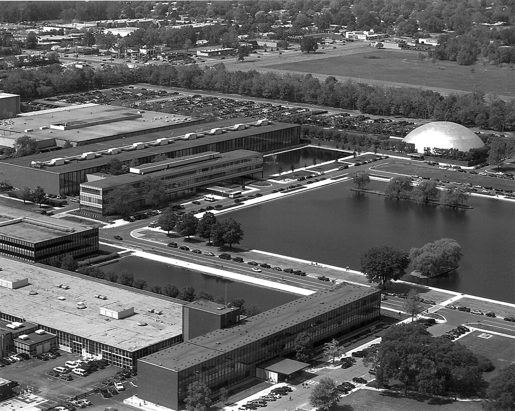
Google Maps view.
The landscaping was by Stone's son, Edward Durell Stone, Jr..

It shouldn't come as much surprise that the landscaping is so perfectly matched with the architecture. Stone's own son not only most likely had a better knowledge of his father's work than anyone, but also just an intuitive understanding of what he's was trying to accomplish stylistically. Ed, Jr. passed away two years ago, but his firm still remains in business.

I'm sure it was incredible when it was first finished, but now that all the trees and plantings have had time to grow in and mature, it's like the Garden of Eden with so many wonderful moments of discovery. I'd come in through the front, but there on the right you can see the first view I had of the building after parking the car.

Then I walked around to the main entrance. As you can kind of see in the bird's eye view, and I'll discuss more later, the entrance is cruciform in shape with three courtyards off the main axis, one in front and one off to either side. I think I gasped out loud when I saw the courtyard at the center.

[From other photos I've seen, it's apparent that there's a fountain behind that tree on the left, but none of them were running that day, unfortunately.] The two courtyards on the sides don't have pools, but sunken gardens with flowers and sculptures. I told the security guard when I walked back out that it would be a bad place to work if you had allergies, but he just said "what," and didn't seem to have a very good sense of humor. It was true, you could really smell all the nature in there air quite vividly.


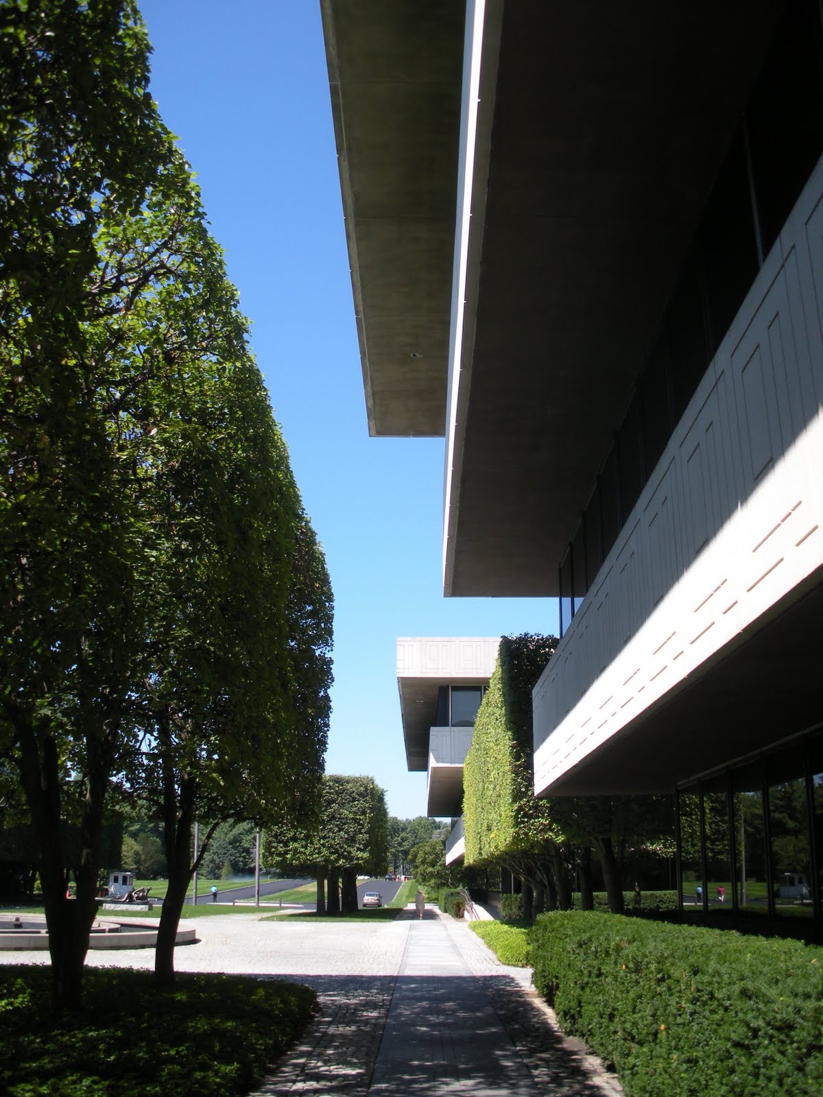
I was immediately struck by the way the sharply manicured rows of trees create all these incredibly complex geometric relationships with the building.


I thought the frame of trees around the courtyards was quite smart also.


They block the windows from view, giving the offices inside a measure of privacy. If you think about what you'd see looking out the windows, it's something green and natural, but it's a flat plane of greenery. It would be soothing, but not distracting.


In unbelievably striking contrast to the strict orderliness of the main entrance, the western corner of the building may as well have been by a different landscape architect altogether.


Here you encounter a wildly naturalistic vibe. It's not completely disordered, either. I mean, you can see the design if you're paying attention and it was obviously planted with a purpose.


Nonetheless, there is the feeling while walking along that path that from a perfectly mowed lawn, you're suddenly encountering a small, isolated untamed moment before returning to civilization again.


And it's civilization with a vengeance, too. The rigid formality of the southwestern facade is most sobering, indeed.

It's the seriousness of this that makes the location of Joan Miró's Personnage so delightfully genius here, but I'll discuss that more in the next post. The sculptures were brought in after the landscaping had filled in, so they could be positioned just right. It shows.

Keep in mind that while in some places, there are ample opportunities to wander off the path, in others, your route is strictly controlled. This was one of them. Steep berms mostly prevent you from getting too close to the building in some cases (I didn't mind climbing them), controlling your view of it. In this case, plantings and a wall force you to descend a staircase and walk out away from the building quite a distance. 


Then you turn back around and see this.


This was another part of the campus that took my breath away. 

They were very proud of it, also; at the far end is a shady trellised pavilion that frames the view and shelters a bench where you can sit to admire it.


It was here that I became fully aware of how the landscaping matches the forms of the architecture so perfectly.


While the lines are very precise and angular, quite synthetic, the water lilies were a brilliant touch, because it still feels so natural at the same time.


The dragonflies think so, too. I tried to get a picture of one of them, but it was too small and I knew the photo would never come out.

I love how Personnage pokes his head up over the bushes to look at the garden.


Hello there.  

That totally made me laugh.


Keeping watch over the garden on the other side are stylized peacock topiaries.


There are surprisingly few topiaries on the property considering how manicured it is. In fact, these are the only ones I remember seeing. 


These made me grin, too, though. Do these remind you of anything?

Maybe I'm just crazy. I still can't be sure whether or not that was intentional.

Then, after that cluster of activity, everything opens up onto this enormous, beautiful, lush green field.


There on the left is Arnaldo Pomodoro's Triad, which was one of my favorite pieces in the PepsiCo collection, but I'll discuss it in the next installment.


It was so nice for me, a city dweller, to be on so much grass that I actually started running around--not to save time, but just for the pleasure of running.


The glass enclosure at the back is a cafeteria, so outside it is the most delightful seating area shaded by two big blocks of manicured trees.


As you can see, there were people seated there, so I wanted to be careful where I aimed my camera. 

But the terrace looks out over the lawn with a view of an enormous man-made lake at the southern end of the property.


At one time, the lake had a tower of water shooting up out if the middle. I don't know if it's still there, but unfortunately it wasn't spraying that day.


Part 2.

©2010, Ryan Witte