
Showing posts with label industrial design. Show all posts
Showing posts with label industrial design. Show all posts
Tuesday, April 8, 2014
It's a little bit late notice, but for anyone who might be interested, on Thursday April 10th at 6:30PM, I'll be giving a short talk on the 1939 World's Fair at the New York Transit Museum, focused on Transportation. The fully extended remix of it will eventually appear here, but this will be sort of a sneak preview. More information.


Sunday, September 2, 2012
Prodigal Roadster
 |
| Photo courtesy RM Auctions. |
 |
| Photo courtesy Oregon CCCA. |
The Lincoln Model K was introduced in 1931. In 1932 it was split into two lines, the KA and the KB. The 1932 Lincoln Model KA V8 Victoria shown here was clearly fancier, more powerful, and more luxuriously detailed than a Ford. It sold for a little over $4400 in '32, almost $70,000 by today's standards. Despite the outrageous price difference, it's not all that significantly different in style.
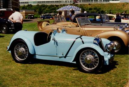
In 1932, Edsel Ford went on a trip to Europe. Who knows if his primary goal was to get a look at the European cars, but there probably can be not the slightest question that someone as intimately involved with the automobile industry would have his eye on every new car he saw. What's more, if a man like Edsel Ford were visiting Europe, I can't imagine he wasn't eating most of his dinners at the homes of people like Aston Martin founder Lionel Martin and Bindo Maserati. I don't know exactly where he went or what he saw there, but I'd like to try to piece it back together using some possibilities.
 |
| Photo courtesy Steve Sexton. |


 |
| Photo courtesy David van Mill. |
 |
| Public domain. |
Perhaps it should come as no surprise that the car that appears to have impressed Ford the most was a Maserati. It was the 8C 3000, designed by the eldest Maserati brother, Alfieri, who passed away before he could see it finished. It has the correctly raked front end (a tiny hint of the streamlining to come) and the tapered rear end, in addition to the comparatively low profile of all the others.
 |
| Photo courtesy Gerry Swetsky. |


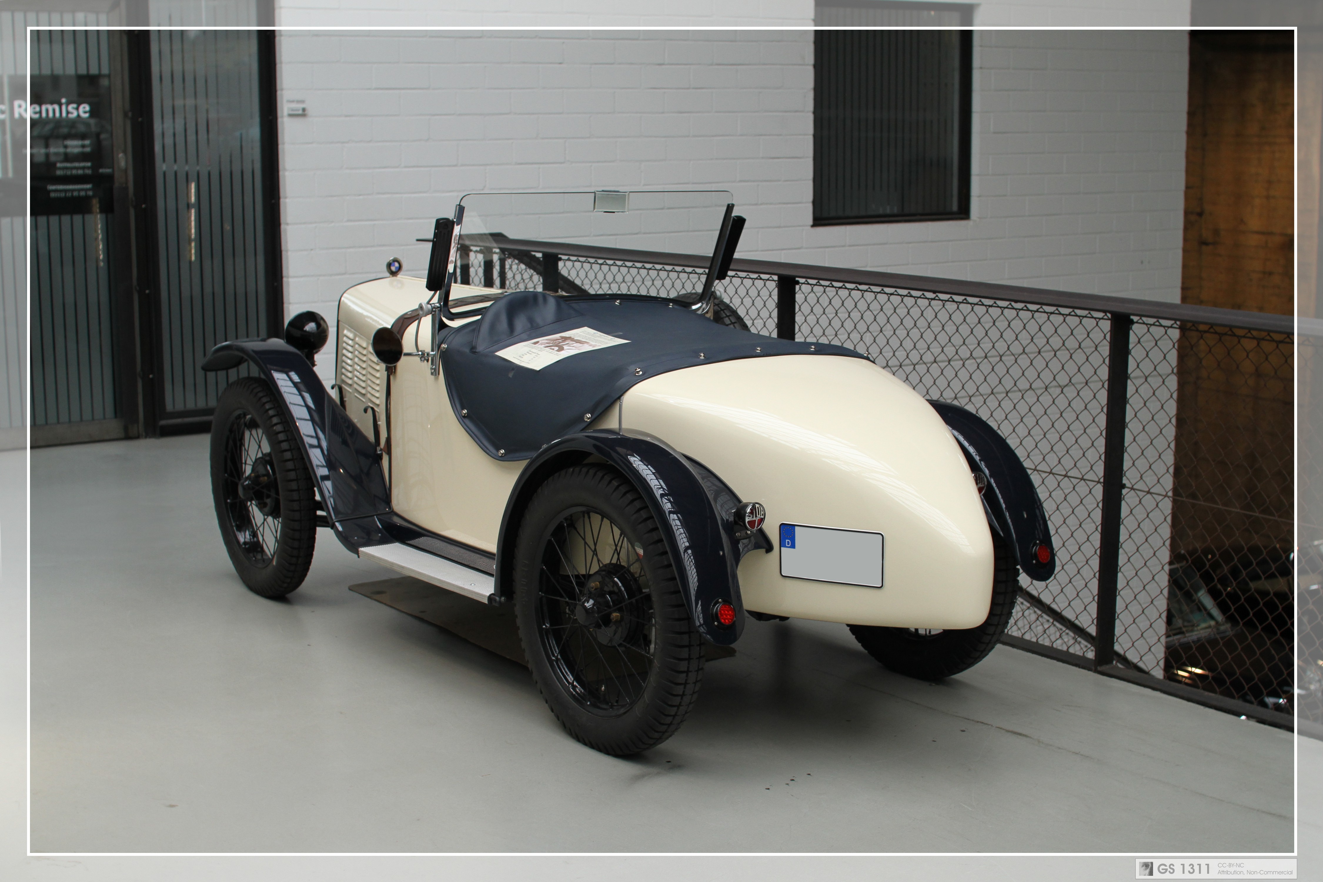
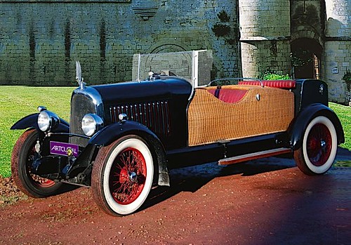
The final result of all of this was Edsel Ford's 1934 Model 40 Special Speedster.




 |
| Restoration and vintage photos courtesy Ford Hous |
But this is not exactly what showed up at the 2012 Auto Show. Its engine had a tendency to overheat, so sometime before 1940, Gregorie redesigned the front end to allow better air cooling and in the process, make it more streamlined again. A winter freeze had cracked the Model 40 engine, so it was replaced with a 09A Mercury V8, the most powerful Ford V8 engine at the time.

 I find the redesign a bit odd because it looks to me like the original grille was larger in area than the 1940 version. However, the overheating may very well have been as much about the location and direction of the incoming air as the amount or speed of it.
Aerodynamics had been discussed by Aristotle, da Vinci, Newton, and plenty other thinkers over the centuries. It remains a mystery why it was not considered by manufacturers of ground transportation vehicles--outside of racing--until the mid-1930s. Perhaps the Depression was sufficient impetus for car owners to consider the fuel economy even in vehicles that didn't necessarily travel very fast. I'd like to point out, though, that Buckminster Fuller's Dymaxion car didn't appear until 1933, the Chrysler Airflow and Union Pacific Railroad's M-10000 not until 1934. But as early as perhaps 1931, Edsel Ford was already on board with this upsurge of interest in the subject, enough so that during his European trip, he knew exactly what to look for. I think it proves him to have been a remarkably forward-thinking individual.

After the 1940 redesign, sadly, Edsel Ford got to enjoy his Speedster for only another three years before passing away in 1943. Strangely, the car was estimated to be worth only $200. This is considerably less than even a regular-production, bottom-line Ford, which probably would have sold for about $750 if most all manufacturing hadn't been focused on the war effort.

It was then handed over to RM Restorations in Canada. RM took the entire thing apart piece by piece and meticulously restored it to its 1939-40 iteration.


©2012, Ryan Witte
Tuesday, June 12, 2012
The Kinda Work U Wait 4
(ICFF)
When I came upon the booth for Al-Hamad Design, it was immediately obvious to me that there was something very interesting going on there. As I paused to take mental pictures before moving on, I noticed a nice-looking boxy wooden chair with soft, creamy leather upholstery. The person at the booth, who I later learned was the designer himself, Nanu Al-Hamad, lowered the back of the chair. It became a small table. Then he flipped a switch to turn on a light inside the box. It was also a light fixture.

 I was sold. I told him it was fantastic and grabbed a card. I later discovered there's a storage compartment under the seat, as well. This thing is four objects in one, and I love that. The piece is called Little Oyster, and a custom-made grouping of them made for a specific client takes it yet still further. The custom pieces have built-in audio speakers and a built-in iPad. The lights in all the units can be dimmed by remote control and the speaker volume is wirelessly controlled from the iPad.
This kind of exploration with different functionality and technology has the potential for Al-Hamad and designers like him to stumble onto just the right and unprecedented combination of elements that could literally give birth to an entirely new kind of design object altogether. I find this incredibly exciting. It's tilling the garden of revolution.
The other equally fascinating pieces in this collection made it clear to me that I really ought to talk to Al-Hamad and find out more about his history and process. He was born in Kuwait, and would visit Southern California with his family once a year or so. When he was four, Iraq invaded Kuwait and his family moved to California permanently. He said he visited Kuwait somewhat frequently while growing up, but after finishing college in Chicago, he went to live there again for around a year. He said he loved living there and especially appreciated getting to experience it as an adult. He discovered a vibrant contemporary art scene and folks keeping alive and kicking a lot of creative underground culture. Ultimately, there were things he missed. One thing I was unaware of is that alcohol is prohibited there, which means that even if you don't drink, there are no bars or clubs or places to congregate socially aside from people's private homes. He has returned to the United States and now works out of New York City, but travels back and forth often and collaborates frequently with artists in Kuwait.
The image there is Q8, a mirror occupying roughly a three-foot square (a square meter) with the islands off Kuwait's east coast attached to the wall separately. Al-Hamad said he's always loved the the shape of the country where he was born and uses this as his bathroom mirror.
At some point during our conversation, I told Al-Hamad that from what I could tell, most of his work has a combination of three things. 1) A number of different functions in a single design object, 2) an unexpected sort of interactivity, and 3) something transcendent that begs the user to activate his or her imagination. He seemed to think that was a nice way of summarizing. Here I'll also add that they all use interesting or luxurious materials and often consciously call attention to their materiality.
Little Oyster sufficiently covers the first element. I think the piece that most simply and literally demonstrates the second and third is his Bright Idea arm chair.

It is a chair and at the same time, like much of Al-Hamad's work, a piece of Conceptual Art, as well. It's designed to encourage inspiration. You sit comfortably on its buttery Moore & Gilles leather upholstery to contemplate, and when the inspiration comes, a leather-upholstered button in the arm rest turns on a light bulb above your head. Eureka! Not content with a one-trick pony, Al-Hamad gives the piece an added bit of aesthetic distinction by providing the beautiful but relatively conventional walnut armchair with interestingly sculpted legs. The chair appears to be growing out of the floor. Furthermore, the legs pull the piece down into the floor surface far more than balls and claws might have, creating a wonderful tension with the light bulb and the abstract ideas it represents, which want to ascend up into the stratosphere.
Taking advantage of more advanced materials are two pieces of outdoor furniture, Cradle and Gibbous. Both pieces are made from a durable, waterproof, glow-in-the-dark fabric which charges in the sunlight during the day and then gives off light throughout the night. That the pieces are also light sources is not a shocker, of course. Al-Hamad loves incorporating the element of light into his work. With Cradle, it's the fact that the sort of hammock lounge is carried on rockers at the top and bottom that begs you to use your imagination. The piece encourages you to tap into some early, infantile memories of being in a cradle and to be soothed by the comfort of the rocking motion that accompanies it.
 Unlike your typical cradle, this is a hammock for two. Pillow-like cushions at both ends rather than just one is another fantastic detail. Not only can you enjoy lounging with a friend or loved-one, but you can face each other to more easily converse, as well. This is not just a piece for resting, but also for socializing.
Gibbous is an ornamental object, an arm chair, an ottoman, and a back-rest all at once, and was regarded highly enough to earn an A'Design Award in 2012.

 Looking closely at that image, you may notice the hand-cut brass plaque that marks every Al-Hamad Design piece, a small but very classy detail, in my opinion. The smaller section is clearly an ottoman, but can also be used as a back-rest to sit on the grass. As is no doubt obvious in the image of it opened up, when not in use, Gibbous fits back together to become as perfect a sphere as was possible given the challenge of properly upholstering something in this shape. Closed up after dark, it becomes a mysterious glowing orb haunting the landscape. "Transcendent" may be the wrong word for the image this produces, but "otherworldly" could very easily be applied to it. One measure of proof of this is that the press materials for this and Cradle make a point to identify the images in darkness as indeed being actual photographs. The visual effect is so unusual that it seems entirely justified to do so (especially with the former, because it looks almost like a computer rendering). Still, I think the effect in a landscaped backyard would be delightful and unique.
Somewhat similar in execution, though completely different in form is a custom bar Al-Hamad designed called Vertex. In spirit, it's an object of art, a large, dark, monolithic oak box with a glowing, jagged-edged acrylic cloud floating above it--simple, refined, and distinctive.

 All its functions as a bar seamlessly fit into it like a jigsaw puzzle. Drawers and cabinetry all but disappear from sight. The best detail, in my opinion, is a drink cart that fits into one of the ends of the wooden base. With a handle carved carefully out of its visible wooden surface, it's easily accessed, but requires no attached hardware to mar the purity of the forms. The cart even includes integrated but removable serving trays to accommodate a multitude of hosting circumstances.
Al-Hamad has also delved fully into the world of fine art. While visiting his birth country, he visited a small island in the Persian Gulf called Failaka. Failaka Island retains some fame from Alexander the Great, who encountered it in his campaign from Greece to northern India and left some markers of Greek culture behind. It was one of the longest continuously occupied regions of Kuwait and supposedly has glorious seasonal patterns and local flora. In 1990, Iraq invaded the island, exhiling almost all its residents to mainland Kuwait. The Iraqi military used it as a base and for target practice. Sadly, this and the resulting violent expulsion of the Iraqi army by allied forces pretty much obliterated the island.
The result is a lot of ruins of what had been relatively beautiful houses, some fairly palatial. It was strange, he told me, to find houses that were essentially a bombed-out empty shell but with an oddly intact bathroom, for instance. He also said the island has become something of a tourist destination, no doubt due to its scenic beauty, but that the main resort hotel is mildly tacky. Most interesting, he found, was the graffiti. Teenagers have for some odd reason chosen this unique island as a backdrop for messages of love and the search for it. Most of it, he indicated, is of the "Carmen ♥ Faisal" variety, but the kids will also write their email addresses or similar, and quite amusingly, things from popular culture, like "Justin Bieber." Very wisely, he photographed a good number of the more interesting tags.
 Those photos would become a series shown at the Sultan Gallery in Kuwait City, one of the oldest art galleries in Kuwait, founded by the late Ghazi and Najat Sultan in 1969. It closed in 1990 and their surviving sister, Farida Sultan, reopened it in 2006 at a new, multipurpose warehouse location. Al-Hamad confessed that he finds most photography exhibits to be rather dull, though, so he decided to present his photos in a more sculptural format. Appropriate to the subject matter, which occasionally referenced social networking, he created an enormous, fully-functioning Blackberry Bold 9000 with a television monitor mounted inside it. The pictures appear in a slide show, as if seen on a giant Pop hand-held device.
He had only ever intended this to be a one-of-a-kind work of art. However, a certain businessman saw the piece and wanted one for his office. The compromise Al-Hamad made was to instead create for this client a giant Blackberry Curve 9300. This way, he didn't feel as if he were repeating himself verbatim. Moral of the story, you're unlikely to be able to talk him into making one of these for your office unless it's an entirely different device or you a$k him very, very ni$ely. Evidently, and not surprisingly, everyone who enters that client's office and sees the giant Blackberry falls in love with it.
Chandelier is also more a work of Conceptual Art than it is a piece of furniture, although Al-Hamad clearly loves to flirt with those distinctions. I say that not because it isn't a perfectly functional chair or a perfectly functional light fixture. Rather, its installation would require relatively remarkable preparations, and to experience it as its design was intended would require a bit more space than one would expect to find in a typical building interior. The legend goes that he saw a cartoon of a person swinging from a chandelier and wanted to create a more practical way to do that. So he created a low-hanging chandelier with an enormous throne sitting on top of it. The chair rises about six feet (2m), and is upholstered, impressively, in a single piece of leather with no seams.

He had considered the possibility of using camel hide to give this piece an added bit of Kuwaiti flavor, but this proved to be impossible. In talking to a dealer, he discovered that the skinning process involves first cutting off the camel's hump. So the resulting pieces of leather will decidedly have a hole in the middle, making camel hide unsuitable for applications requiring larger sheets of it.
 I loved the whole mad party concept, the royal and elegant look of it, and the play of shadows from the small bulbs underneath. But it was only after contemplating this piece for a little while that its magic dawned on me. It hangs perfectly straight, in complete defiance of gravity. "How on earth did you ever balance that thing?" I had to ask him. It seemed to me that even counterweights would not be sufficient to offset the cantilevered seat and arms and the weight of the chandelier, itself. Al-Hamad explained that they went through numerous trials to get this right. In the end, a solution was found by providing a metal shop with the dimensions of a volume inside the back that would be available for counterweight. The shop then created a sheet of extremely dense metal alloy heavy enough to balance the piece. It now weighs in at around 400lbs (182kg) but hangs exactly right.
The piece I'd like to end with is the Embarakiya floor lamp. I end here not because it's my favorite. In fact, the thought of arriving home late at night to a dark apartment and having a human figure looming in the corner of my living room makes me shudder a little (I'll happily recommend it for non-residential applications). Nonetheless, I think it incorporates everything that makes Al-Hamad's work so interesting, and at the same time ends up being somewhat provocative.

Initially, the designer had conceived of this as being adorned in less culturally-specific garments, like perhaps a simple business suit. But in walking around the Embarakiya, which is the large market in Kuwait City where garments, cloth, and other items are sold and traded, he decided he really liked the idea of clothing the lamp in a traditional men's dishdasha. The clincher was when he realized that the headdress, the qitra and egal, would work perfectly as a lampshade. The male figures have speakers in their torso. I was curious if they said something, which they don't; they plug into a normal stereo system.
The female figures don't have speakers--I'll leave it for my Feminist readers to psychoanalyze that--but their garments, the abaya and hijab (or nikab) are more ornamental with, in this case, truly exquisite embroidered gold trim. The headdress fabric was thin enough to warrant a second layer, and as a result, the weave of the two layers of textile overlaps to create interesting patterns in the filtered light.

The interactivity and the transcendent are locked together here. In order to turn on the light in the figure's head, you shake its hand, which has a touch-sensor in it. It seemed to me the narrative being played out here for an American audience was quite striking; to call forth light from the head of a figure in traditional Arabian dress, you must perform a friendly, welcoming gesture with it. I first asked Al-Hamad if it were a political statement he was making. He laughed and said, "no, no, not at all." In fact, in talking to him, I quickly realized he's mostly just having fun creating the pieces that he does. My reading was all wrong, but I think that's partially the point here.
He said that the response from audiences in Kuwait was anything but disturbed. In fact, most people who saw it there simply found it amusing and clever. Responses at the ICFF were quite different. Some people actually voiced concerns about the piece, questioning if those who came across this might have a problem with it. That seemed sadly xenophobic to me at best, and at worst, kind of downright racist. This was why I asked not that question, but the one I did, which was about the differences between the responses from Kuwaiti audiences and the white, European-American ones at the show.
Whether intentional or not, it's incredibly rare to find a work of mere furniture design that can elicit such wildly different emotions from different people. I think the lesson to be learned from this work is that it's those very differences that we must set aside--along with the kind of unnecessarily political readings to which I admittedly fell victim--so we can just have fun and enjoy being a part of a truly global design community.
Much thanks to Nanu Al-Hamad. I'll be eager to see what brilliant directions he takes us next.
All images courtesy Al-Hamad Design. All text ©2012, Ryan Witte.
When I came upon the booth for Al-Hamad Design, it was immediately obvious to me that there was something very interesting going on there. As I paused to take mental pictures before moving on, I noticed a nice-looking boxy wooden chair with soft, creamy leather upholstery. The person at the booth, who I later learned was the designer himself, Nanu Al-Hamad, lowered the back of the chair. It became a small table. Then he flipped a switch to turn on a light inside the box. It was also a light fixture.


This kind of exploration with different functionality and technology has the potential for Al-Hamad and designers like him to stumble onto just the right and unprecedented combination of elements that could literally give birth to an entirely new kind of design object altogether. I find this incredibly exciting. It's tilling the garden of revolution.
 |
| Q8 |
The image there is Q8, a mirror occupying roughly a three-foot square (a square meter) with the islands off Kuwait's east coast attached to the wall separately. Al-Hamad said he's always loved the the shape of the country where he was born and uses this as his bathroom mirror.
At some point during our conversation, I told Al-Hamad that from what I could tell, most of his work has a combination of three things. 1) A number of different functions in a single design object, 2) an unexpected sort of interactivity, and 3) something transcendent that begs the user to activate his or her imagination. He seemed to think that was a nice way of summarizing. Here I'll also add that they all use interesting or luxurious materials and often consciously call attention to their materiality.
Little Oyster sufficiently covers the first element. I think the piece that most simply and literally demonstrates the second and third is his Bright Idea arm chair.

It is a chair and at the same time, like much of Al-Hamad's work, a piece of Conceptual Art, as well. It's designed to encourage inspiration. You sit comfortably on its buttery Moore & Gilles leather upholstery to contemplate, and when the inspiration comes, a leather-upholstered button in the arm rest turns on a light bulb above your head. Eureka! Not content with a one-trick pony, Al-Hamad gives the piece an added bit of aesthetic distinction by providing the beautiful but relatively conventional walnut armchair with interestingly sculpted legs. The chair appears to be growing out of the floor. Furthermore, the legs pull the piece down into the floor surface far more than balls and claws might have, creating a wonderful tension with the light bulb and the abstract ideas it represents, which want to ascend up into the stratosphere.
Taking advantage of more advanced materials are two pieces of outdoor furniture, Cradle and Gibbous. Both pieces are made from a durable, waterproof, glow-in-the-dark fabric which charges in the sunlight during the day and then gives off light throughout the night. That the pieces are also light sources is not a shocker, of course. Al-Hamad loves incorporating the element of light into his work. With Cradle, it's the fact that the sort of hammock lounge is carried on rockers at the top and bottom that begs you to use your imagination. The piece encourages you to tap into some early, infantile memories of being in a cradle and to be soothed by the comfort of the rocking motion that accompanies it.

Gibbous is an ornamental object, an arm chair, an ottoman, and a back-rest all at once, and was regarded highly enough to earn an A'Design Award in 2012.


Somewhat similar in execution, though completely different in form is a custom bar Al-Hamad designed called Vertex. In spirit, it's an object of art, a large, dark, monolithic oak box with a glowing, jagged-edged acrylic cloud floating above it--simple, refined, and distinctive.


Al-Hamad has also delved fully into the world of fine art. While visiting his birth country, he visited a small island in the Persian Gulf called Failaka. Failaka Island retains some fame from Alexander the Great, who encountered it in his campaign from Greece to northern India and left some markers of Greek culture behind. It was one of the longest continuously occupied regions of Kuwait and supposedly has glorious seasonal patterns and local flora. In 1990, Iraq invaded the island, exhiling almost all its residents to mainland Kuwait. The Iraqi military used it as a base and for target practice. Sadly, this and the resulting violent expulsion of the Iraqi army by allied forces pretty much obliterated the island.
The result is a lot of ruins of what had been relatively beautiful houses, some fairly palatial. It was strange, he told me, to find houses that were essentially a bombed-out empty shell but with an oddly intact bathroom, for instance. He also said the island has become something of a tourist destination, no doubt due to its scenic beauty, but that the main resort hotel is mildly tacky. Most interesting, he found, was the graffiti. Teenagers have for some odd reason chosen this unique island as a backdrop for messages of love and the search for it. Most of it, he indicated, is of the "Carmen ♥ Faisal" variety, but the kids will also write their email addresses or similar, and quite amusingly, things from popular culture, like "Justin Bieber." Very wisely, he photographed a good number of the more interesting tags.

He had only ever intended this to be a one-of-a-kind work of art. However, a certain businessman saw the piece and wanted one for his office. The compromise Al-Hamad made was to instead create for this client a giant Blackberry Curve 9300. This way, he didn't feel as if he were repeating himself verbatim. Moral of the story, you're unlikely to be able to talk him into making one of these for your office unless it's an entirely different device or you a$k him very, very ni$ely. Evidently, and not surprisingly, everyone who enters that client's office and sees the giant Blackberry falls in love with it.
Chandelier is also more a work of Conceptual Art than it is a piece of furniture, although Al-Hamad clearly loves to flirt with those distinctions. I say that not because it isn't a perfectly functional chair or a perfectly functional light fixture. Rather, its installation would require relatively remarkable preparations, and to experience it as its design was intended would require a bit more space than one would expect to find in a typical building interior. The legend goes that he saw a cartoon of a person swinging from a chandelier and wanted to create a more practical way to do that. So he created a low-hanging chandelier with an enormous throne sitting on top of it. The chair rises about six feet (2m), and is upholstered, impressively, in a single piece of leather with no seams.

He had considered the possibility of using camel hide to give this piece an added bit of Kuwaiti flavor, but this proved to be impossible. In talking to a dealer, he discovered that the skinning process involves first cutting off the camel's hump. So the resulting pieces of leather will decidedly have a hole in the middle, making camel hide unsuitable for applications requiring larger sheets of it.

The piece I'd like to end with is the Embarakiya floor lamp. I end here not because it's my favorite. In fact, the thought of arriving home late at night to a dark apartment and having a human figure looming in the corner of my living room makes me shudder a little (I'll happily recommend it for non-residential applications). Nonetheless, I think it incorporates everything that makes Al-Hamad's work so interesting, and at the same time ends up being somewhat provocative.

The female figures don't have speakers--I'll leave it for my Feminist readers to psychoanalyze that--but their garments, the abaya and hijab (or nikab) are more ornamental with, in this case, truly exquisite embroidered gold trim. The headdress fabric was thin enough to warrant a second layer, and as a result, the weave of the two layers of textile overlaps to create interesting patterns in the filtered light.

The interactivity and the transcendent are locked together here. In order to turn on the light in the figure's head, you shake its hand, which has a touch-sensor in it. It seemed to me the narrative being played out here for an American audience was quite striking; to call forth light from the head of a figure in traditional Arabian dress, you must perform a friendly, welcoming gesture with it. I first asked Al-Hamad if it were a political statement he was making. He laughed and said, "no, no, not at all." In fact, in talking to him, I quickly realized he's mostly just having fun creating the pieces that he does. My reading was all wrong, but I think that's partially the point here.
He said that the response from audiences in Kuwait was anything but disturbed. In fact, most people who saw it there simply found it amusing and clever. Responses at the ICFF were quite different. Some people actually voiced concerns about the piece, questioning if those who came across this might have a problem with it. That seemed sadly xenophobic to me at best, and at worst, kind of downright racist. This was why I asked not that question, but the one I did, which was about the differences between the responses from Kuwaiti audiences and the white, European-American ones at the show.
Whether intentional or not, it's incredibly rare to find a work of mere furniture design that can elicit such wildly different emotions from different people. I think the lesson to be learned from this work is that it's those very differences that we must set aside--along with the kind of unnecessarily political readings to which I admittedly fell victim--so we can just have fun and enjoy being a part of a truly global design community.
Much thanks to Nanu Al-Hamad. I'll be eager to see what brilliant directions he takes us next.
All images courtesy Al-Hamad Design. All text ©2012, Ryan Witte.
Thursday, May 31, 2012
Extraordinarily Ordinary
(NYIAS)
The next thing to talk about was in the booth for Chevrolet to accompany the release of their new Impala. It was a sky-blue, convertible 1966 Impala Super Sport in seemingly perfect mint condition that was actually much more interesting than the new one. I'd like to say right off the bat that many of the interesting facts herein are courtesy of my friend over at Ate Up with Motor. A huge nod of thanks to him and his vast automotive knowledge.
 It's fortunate that I have such a good excuse to talk about the Impala, considering that I so recently examined Levittown, because the Impala was sort of like the 1960s automobile equivalent to a Levittown house. There was nothing at all exceptional or innovative about it, in fact, its appeal was that it was utterly ordinary. Adding to this is Chevy's choice of a model from 1966 to display at the show. The Super Sport options package was first offered on the Impala in 1961. In 1964, it became the top-of-the-line model, but in 1966 it was surpassed in prestige by the Caprice, which had become its own series. All the standard cars in Chevy's line-up, including Impala and Caprice, shared most of the same basic innards. The differences were in power, styling, and options. There was nothing particularly new about the '66; it was mostly a cosmetic upgrade of the '65. The moral of the story, by 1966 the Super Sport was even less exceptional for a Chevy than previous Impalas had been.
 It was most popular with exactly the same demographic who a decade earlier would have gravitated toward Levittown and communities like it. It was a preferred car for mostly middle-income buyers who wanted a relatively good quality car, easy to service and maintain, but nothing too flashy or outrageous. It's the same demographic that today buys the Toyota Camry and Honda Accord. But while the Camry enjoyed 3% of the market as the best selling car in the United States in 2008, Impala in the 1960s commanded 15% of the market. Out of ten of your car-owning friends, at least one if not two of them would have had an Impala.
It's a fairly mammoth car, over 312 inches long (792cm) and almost 80 inches wide (203cm). Perhaps one of the more interesting things about the engineering of the Impalas from '65 onward was their flexible frame. At the points where the frame curved inward for the wheels at front and rear, the frame was designed to flex to absorb impacts from the road. The body was then mounted onto the frame with no metal-to-metal connections. Instead, rubber pads separated the frame from the body in up to fourteen places, depending on the model. The body was welded together and gusseted extremely rigidly and cross-braced, especially at the front end. The idea was that the body would feel extremely firm while all the vibrations and shuddering from the engine and road were handled by the flexible frame.
 My friend from Ate Up... shared with me one of the critical reactions to Impala at the time which I thought was rather funny. Evidently, the resonant frequency of its coil spring suspension was such that the car would start hopping at certain speeds when driving over the seams of a concrete highway. I'm amused by this in part because I can't remember the last time I was on a highway paved with concrete. Having driven around many parts of the country, I remember the familiar rhythm of those seams in the road slabs. But they use asphalt almost exclusively in the New York area. Asphalt is cheaper and much faster to install on highways that, around here, serve enormous amounts of traffic almost continuously. Potholes in asphalt can also be more quickly and easily spot-repaired rather than having to replace entire sections of road at a time as with concrete slabs.
 In its design, the Impala is anything but a remarkable car. Evidently that was sort of the whole point; above all, it was a safe choice. To put the design of the car under discussion here in some perspective, 1966 was the same year that Ferrari unleashed on Turin this masterpiece by Pininfarina. Nonetheless, in retrospect, there are some nice things about the old Impalas that could have inspired their new one with fantastic results. I think Chevy would have been wise to take a similar approach as they did to the Camaro--and as Dodge did to the Challenger--and look back to the older models for inspiration. For a few things, the broad, muscular grille, forward angled front end, or the side detailing that streaks straight from the front all the way to the back end (most pronounced on the 1964), could have been extrapolated quite wonderfully on a car for 2012.
 Instead, Chevy seems to have recreated the past glory of the Impala in spirit rather than style. Their new offering is about as bland today as the '66 may have seemed when it appeared on the market. I might be tempted to wonder whether it's more difficult for the huge corporate manufacturers to reconcile good design with other concerns like marketing and economics if it weren't for the fact that I've seen comparably large manufacturers overcome these conflicts quite adeptly.
All text and embedded images ©2012, Ryan Witte.
The next thing to talk about was in the booth for Chevrolet to accompany the release of their new Impala. It was a sky-blue, convertible 1966 Impala Super Sport in seemingly perfect mint condition that was actually much more interesting than the new one. I'd like to say right off the bat that many of the interesting facts herein are courtesy of my friend over at Ate Up with Motor. A huge nod of thanks to him and his vast automotive knowledge.


It's a fairly mammoth car, over 312 inches long (792cm) and almost 80 inches wide (203cm). Perhaps one of the more interesting things about the engineering of the Impalas from '65 onward was their flexible frame. At the points where the frame curved inward for the wheels at front and rear, the frame was designed to flex to absorb impacts from the road. The body was then mounted onto the frame with no metal-to-metal connections. Instead, rubber pads separated the frame from the body in up to fourteen places, depending on the model. The body was welded together and gusseted extremely rigidly and cross-braced, especially at the front end. The idea was that the body would feel extremely firm while all the vibrations and shuddering from the engine and road were handled by the flexible frame.


 | |
| The 427 Turbo Jet was newly available on Impala in '66, and was the biggest engine option. |
All text and embedded images ©2012, Ryan Witte.
Thursday, April 26, 2012
Visual Accuracy

The other part, I think, is that it was shown by a manufacturer who I might not have expected to have something this impressive on view. It's the 2013 Acura NSX.


We have industrial designer Dave Marek to thank for this beauty. He's head of Acura's design team and has been since 1987.


©2012, Ryan Witte
Friday, September 24, 2010
Floral Presentation
As some of you will already be aware, Blogspot has a new photo upload feature that allows for a bit more flexibility in their sizing and arrangement. It's kind of a pain in the ass, to be honest, and it's taking me some trial and error to become comfortable with it. So while things may start to look a little nicer on here, there may be some glitches along the way you'll have to forgive.
I wanted to make a quick post about an inspired new light by San Francisco's Peter Stathis & Virtual Studio. They appear to be doing a number of interesting things, but unfortunately the website is quite minimal and doesn't offer much information.
This won an award at the ICFF this year, and I can fully understand why. Like all the greatest ideas, its utterly and elegantly simple. Coincidentally, it's named the same as one of Moser's vases, it's also called "Ikebana." Seems there are a lot of people inspired by the Japanese art of flower arranging.


The first thing to point out is the light source itself. It's an LED, but it uses what's called Front Light Optical Waveguide technology. Gesundheit. Essentially what it does is it spreads the light out over the underside of the flower-shaped panel, making the light quality softer and more even, rather than a single pin-point of harsh brightness.
The flower design is again simple but very nice, and a leaf-shaped switch on the cord is a wonderful little detail.
 The other thing about it that's so smart is that it rests on its stand by pure gravity.
This means a few different things. It means that you can turn it in any direction you need it, raise it or lower it, take it off the table stand and move it to a wall-mounted one. You can also hang multiple lights on a single stand, especially the taller floor version. So simple, so flexible.
©2010, Ryan Witte
I wanted to make a quick post about an inspired new light by San Francisco's Peter Stathis & Virtual Studio. They appear to be doing a number of interesting things, but unfortunately the website is quite minimal and doesn't offer much information.
This won an award at the ICFF this year, and I can fully understand why. Like all the greatest ideas, its utterly and elegantly simple. Coincidentally, it's named the same as one of Moser's vases, it's also called "Ikebana." Seems there are a lot of people inspired by the Japanese art of flower arranging.


The first thing to point out is the light source itself. It's an LED, but it uses what's called Front Light Optical Waveguide technology. Gesundheit. Essentially what it does is it spreads the light out over the underside of the flower-shaped panel, making the light quality softer and more even, rather than a single pin-point of harsh brightness.
The flower design is again simple but very nice, and a leaf-shaped switch on the cord is a wonderful little detail.

This means a few different things. It means that you can turn it in any direction you need it, raise it or lower it, take it off the table stand and move it to a wall-mounted one. You can also hang multiple lights on a single stand, especially the taller floor version. So simple, so flexible.
©2010, Ryan Witte
Friday, September 17, 2010
The Cost Effect
Since my last car post was about something so expensive, I thought I'd switch gears. Of course I love to see all the crazy stuff I'm not likely to be able to drive any time soon, but I can be a realist, also. If I were legitimately going to purchase a car, for the price, I'd have to say I'd be looking at Mazda. I also like the Chryslers a lot in this range, and of course I'd want to test drive a few things, but I really do like Mazda's styling.
Since I've gotten my Zipcar account, I've been trying to choose a different model each time I go out. I did get a Mazda the first time. More recently I drove a Kia Soul. It was a nice enough looking car and nice enough to drive, but I couldn't get past the miserably huge blind spots. I once got into a minor accident merging lanes on the highway (which I still don't think was my fault), so I'm particularly paranoid about that.
I did say that if you're going to spend the money on a Rolls, you deserve something that looks like it costs that much. At the same time, I can't put my finger on how they do it exactly, but the cheapest cars just look cheap. Mostly I'm thinking of the bland sedans offered by Toyota and Ford, the magnificent new Mustang notwithstanding. It's as if they strip the cars of every last detail that could make them remotely interesting. They're about as boring as they could possibly be at best, at worst their design is ugly and awkward.
And I'm actually confused as to why they do it. That is to say, what marketing goal do they hope to accomplish? I've seen some concepts from them and some design drawings that were really not bad at all. What demographic is turned on by this? But maybe I'm asking the wrong question. Maybe the consumer they hope to attract doesn't want to be turned on, because something that turns you on can't possibly be a "sensible" purchase.
Since we just had Fashion Week, I'll use a clothing analogy. We all know someone who can say with the ultimate sincerity that they do not care about clothes. He or she is most often found in jeans and a t-shirt, a plain white one preferably, or something they got for free. Seemingly, very little thought went into their choices and it's purely a matter of luck whether he or she is matched or mismatched. I find this whole notion to be terribly oxymoronic and even self-deluded. The operative word here is "choices." A hundred different choices were required for the resulting jeans and t-shirt outfit, the same amount of choices as for any other outfit. Faded boot-cut button-fly, not pegged stretch acid-wash with too many zippers: choice. Red flannel shirt, not bomber jacket: choice.
Even the person who tells his or her significant other to purchase something at the store that will fit them--beyond that he or she "doesn't care"--is making a wardrobe choice, the choice being that the other person knows what will look good on them and will get it. "Something that will fit" is yet another choice, as opposed to too tight or too baggy, and plenty of people do both.
I'd like to say to these people: you're still making all the same choices the rest of us are, you still have to do the work making those decisions, why not just make better choices or more interesting ones? It isn't passively "not caring," it's actively presenting the appearance of not caring.
So why do people choose the automobile equivalent of jeans and a t-shirt? The purchase of a car is a much bigger commitment than an outfit, so it can't give the appearance of a thoughtless decision. Do they want to attract as little attention to themselves as they can? Or do they want their car to look as much like everyone else as it can? It's a person who presumably wants their car to say to the world, "I'm just a normal person with a normal car, nothing flashy, nothing distinct, nothing special about it or me." Or maybe they simply have bad taste. Who are these people?
This is not to say that the Mazdas are so other-worldly or loud, especially compared to something like the Spyker Aileron. And I will have to say that their interiors leave plenty to be desired. They really need to get an interior designer who can keep pace with their exterior designers. The insides of them can be quite clunky and mostly unattractive. But for a relatively inexpensive car, I think they have a lot of character. They didn't actually unveil anything new this year, except for a new version of the Mazda2, their minicar, with few, if any, improvements. The MX-5 Miata filled an untapped niche and remains a very sweet little car, but it's more or less looked the same since it came on the market. I never did get around to discussing them last year as I'd planned, and I have more to say on the subject now.
Let's start at the beginning, shall we? Here are some early drawings for the Mazda3:


The first thing to notice here is that, aside from some not unexpected stylization in the drawings and a little bit of an overzealous curvaceousness on the front end, this really doesn't look all that significantly different than what came off of their assembly line. For the ways in which it does, I still don't think they lost much of what made this early design concept interesting. All I can say is that they must have someone up top making decisions who has some guts, because their designs are not being watered down for the lowest common denominator like so many other manufacturers do.
Here's an early computer rendering:

Now those three parallel lines at the back end--window, shoulder, and tail--create a really great moment. But the fantastic thing about this is that the final production model is actually nicer and more interesting than this concept. Obviously in these early stages, they just want to work out the basic profile. It's truly a testament to the talent of their design team that as they start adding more of the necessary details to what will be the final product, they don't screw it up along the way.
Here's the Mazda3, and if I'm not mistaken, I believe this was the one I rented:


Here's their CX-7 wagon/minivan crossover:


It's not the best thing they offer, but for what it is, I think its very well done. I especially like how, although it is clearly higher and bulkier, it very much manages to stand like a bulked-up car, rather than a squashed-down van. I also think using a bit of a sharper prow and a smoothed-over back end was a smart move. It makes it feel sleeker and less cumbersome.
Mazda has always done a sports car well. My teacher in fifth grade had an RX-7. He was the kind of guy you'd imagine didn't realize that Disco had died, or if he did, he wished it hadn't. But I thought that was one seriously cool car. Even looking back now, I still think it was incredibly well designed.
Here's the gorgeous Shinari Concept from a couple years ago:

The one we can own is the RX-8. In my opinion it's one of the best designed cars I saw at the show in this relatively reasonable price range.


Normally I much, much prefer a car without all the spoilers and scoops and ground effects. The Lamborghini Countach, for a great example, is absolutely exquisite without them and with them is a complete mess. Why anyone would buy a car like that and then ruin it with all that extra crap is beyond me. The RX-8, on the other hand, is helped by a few added details. The ground work gives it a more solid stance and gives its contours a little bit of needed sharpness.

It also helps to amplify one of the best things about the design: the contrast between the wide, flat, angular front end and the smooth, tapered, upturned back end. They knew what they were doing, too. The front wheel wells and headlights, as well as the taillights and the back of the roof line all work so well with the overall profile. Granted, it's not a Ferrari, but I think this is a great car.
©2010, Ryan Witte
Since I've gotten my Zipcar account, I've been trying to choose a different model each time I go out. I did get a Mazda the first time. More recently I drove a Kia Soul. It was a nice enough looking car and nice enough to drive, but I couldn't get past the miserably huge blind spots. I once got into a minor accident merging lanes on the highway (which I still don't think was my fault), so I'm particularly paranoid about that.
I did say that if you're going to spend the money on a Rolls, you deserve something that looks like it costs that much. At the same time, I can't put my finger on how they do it exactly, but the cheapest cars just look cheap. Mostly I'm thinking of the bland sedans offered by Toyota and Ford, the magnificent new Mustang notwithstanding. It's as if they strip the cars of every last detail that could make them remotely interesting. They're about as boring as they could possibly be at best, at worst their design is ugly and awkward.


And I'm actually confused as to why they do it. That is to say, what marketing goal do they hope to accomplish? I've seen some concepts from them and some design drawings that were really not bad at all. What demographic is turned on by this? But maybe I'm asking the wrong question. Maybe the consumer they hope to attract doesn't want to be turned on, because something that turns you on can't possibly be a "sensible" purchase.
Since we just had Fashion Week, I'll use a clothing analogy. We all know someone who can say with the ultimate sincerity that they do not care about clothes. He or she is most often found in jeans and a t-shirt, a plain white one preferably, or something they got for free. Seemingly, very little thought went into their choices and it's purely a matter of luck whether he or she is matched or mismatched. I find this whole notion to be terribly oxymoronic and even self-deluded. The operative word here is "choices." A hundred different choices were required for the resulting jeans and t-shirt outfit, the same amount of choices as for any other outfit. Faded boot-cut button-fly, not pegged stretch acid-wash with too many zippers: choice. Red flannel shirt, not bomber jacket: choice.
Even the person who tells his or her significant other to purchase something at the store that will fit them--beyond that he or she "doesn't care"--is making a wardrobe choice, the choice being that the other person knows what will look good on them and will get it. "Something that will fit" is yet another choice, as opposed to too tight or too baggy, and plenty of people do both.
I'd like to say to these people: you're still making all the same choices the rest of us are, you still have to do the work making those decisions, why not just make better choices or more interesting ones? It isn't passively "not caring," it's actively presenting the appearance of not caring.
So why do people choose the automobile equivalent of jeans and a t-shirt? The purchase of a car is a much bigger commitment than an outfit, so it can't give the appearance of a thoughtless decision. Do they want to attract as little attention to themselves as they can? Or do they want their car to look as much like everyone else as it can? It's a person who presumably wants their car to say to the world, "I'm just a normal person with a normal car, nothing flashy, nothing distinct, nothing special about it or me." Or maybe they simply have bad taste. Who are these people?
This is not to say that the Mazdas are so other-worldly or loud, especially compared to something like the Spyker Aileron. And I will have to say that their interiors leave plenty to be desired. They really need to get an interior designer who can keep pace with their exterior designers. The insides of them can be quite clunky and mostly unattractive. But for a relatively inexpensive car, I think they have a lot of character. They didn't actually unveil anything new this year, except for a new version of the Mazda2, their minicar, with few, if any, improvements. The MX-5 Miata filled an untapped niche and remains a very sweet little car, but it's more or less looked the same since it came on the market. I never did get around to discussing them last year as I'd planned, and I have more to say on the subject now.
Let's start at the beginning, shall we? Here are some early drawings for the Mazda3:


The first thing to notice here is that, aside from some not unexpected stylization in the drawings and a little bit of an overzealous curvaceousness on the front end, this really doesn't look all that significantly different than what came off of their assembly line. For the ways in which it does, I still don't think they lost much of what made this early design concept interesting. All I can say is that they must have someone up top making decisions who has some guts, because their designs are not being watered down for the lowest common denominator like so many other manufacturers do.
Here's an early computer rendering:

Now those three parallel lines at the back end--window, shoulder, and tail--create a really great moment. But the fantastic thing about this is that the final production model is actually nicer and more interesting than this concept. Obviously in these early stages, they just want to work out the basic profile. It's truly a testament to the talent of their design team that as they start adding more of the necessary details to what will be the final product, they don't screw it up along the way.
Here's the Mazda3, and if I'm not mistaken, I believe this was the one I rented:


Here's their CX-7 wagon/minivan crossover:


It's not the best thing they offer, but for what it is, I think its very well done. I especially like how, although it is clearly higher and bulkier, it very much manages to stand like a bulked-up car, rather than a squashed-down van. I also think using a bit of a sharper prow and a smoothed-over back end was a smart move. It makes it feel sleeker and less cumbersome.
Mazda has always done a sports car well. My teacher in fifth grade had an RX-7. He was the kind of guy you'd imagine didn't realize that Disco had died, or if he did, he wished it hadn't. But I thought that was one seriously cool car. Even looking back now, I still think it was incredibly well designed.
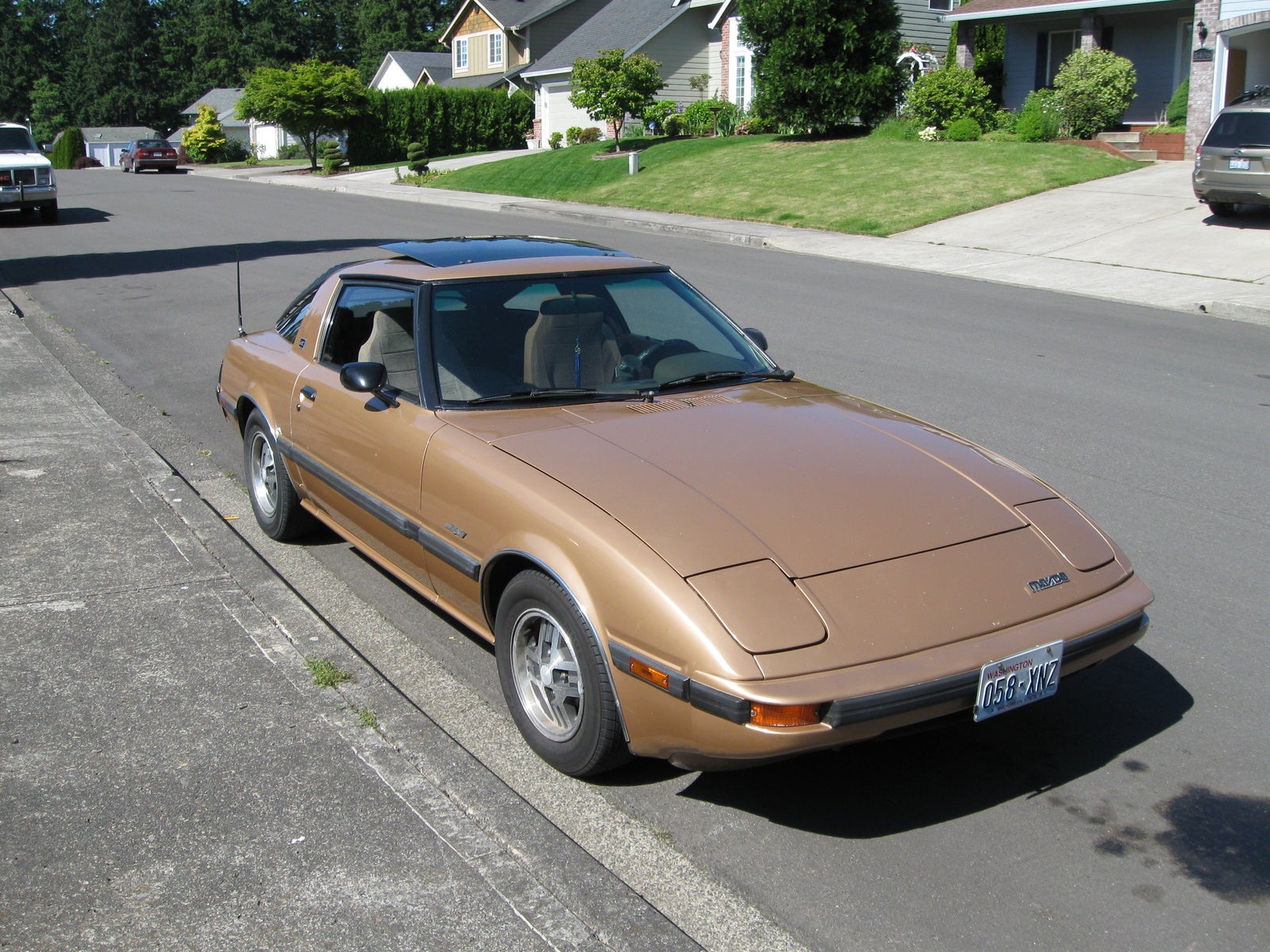
Here's the gorgeous Shinari Concept from a couple years ago:

The one we can own is the RX-8. In my opinion it's one of the best designed cars I saw at the show in this relatively reasonable price range.


Normally I much, much prefer a car without all the spoilers and scoops and ground effects. The Lamborghini Countach, for a great example, is absolutely exquisite without them and with them is a complete mess. Why anyone would buy a car like that and then ruin it with all that extra crap is beyond me. The RX-8, on the other hand, is helped by a few added details. The ground work gives it a more solid stance and gives its contours a little bit of needed sharpness.


It also helps to amplify one of the best things about the design: the contrast between the wide, flat, angular front end and the smooth, tapered, upturned back end. They knew what they were doing, too. The front wheel wells and headlights, as well as the taillights and the back of the roof line all work so well with the overall profile. Granted, it's not a Ferrari, but I think this is a great car.
©2010, Ryan Witte
Subscribe to:
Posts (Atom)