Dis Connecticut--Part One
After my incredible experience at Bronx Community College, I was very excited to see another work by Marcel Breuer. A great opportunity arose a couple weeks ago, so I went to see his Litchfield High School (1956) in Litchfield, Connecticut.

This trip was the most perfect evidence of how the universe decides what path one is meant to follow, greases wheels in some directions, and erects insurmountable walls in others. It also proves how flexibility and spontaneity are requisites for getting the most out of what the universe wants you to experience. So many things in our lives are arguably in the hands of fate, anyway.
I had discussed the unfortunate incompetence of Google Maps where it concerns driving directions before, but had they been perfectly accurate, we never would have passed by our destination and discovered the lovely center of the town of Litchfield where we ended up finding a very nice restaurant at which to have lunch.
We were discussing how all of Connecticut's school districts are regional. Students are bussed to enormous centralized high schools from very long distances. Perhaps this wasn't in the works in the mid-1950s when Litchfield High was constructed, it isn't a terribly large building. But if the state's educational system was undergoing reform or gearing up to do so, it would make sense that a new school building would've been commissioned. As much as Connecticut adores its (gorgeous) traditional architecture at the expense of anything new or innovative, I must commend them for choosing Breuer. I'm calling this a "high school" because it originally housed years nine through twelve. It now has years seven through twelve, and although it was expanded, I'll have to say it's an extremely small building for that amount of student ages.


The best thing about Litchfield High is how banal it would appear in its construction at first glance, and on the other hand, how intriguing and masterful is its design, in spite of that. One might even say that this building is the flip-side to Robert Venturi's Guild House, because the school was made intriguing despite the fact that its origin as a state-funded project might encourage banality, whereas Guild House was made to appear ordinary despite its deeper complexity.
The most frustrating thing about the building is that it's practically impossible to get any clear impression of what of it is actually Marcel Breuer's. So much has been added to this building, so much of a presumably different character, and so much that obscures the evident clarity of the original structure. Even studying and comparing the various photographs of the building, as I have for probably hours now, it's a complete mind game trying to make sense of what is what. As different materials, images, and information have come in, I've had to revise this story a number of times.
Another problem is that this building is very far below anyone's radar. There's a very disturbing pattern of events appearing as this post is being written. Litchfield High is an obscure work, of which few people apparently take notice. No one seems to care about the Bronx Community College buildings and fewer people seem to know anything about them. The Whitney Museum is callously abandoning their iconic Breuer building to move downtown, leaving it in the hands of the Metropolitan Museum, as if it were some bit of random leftovers to be dumped in the trash.
As I've told numerous visitors to New York, the Whitney is my favorite museum here, in large part because of the magic of their Breuer building, which is both a work of art in and of itself and a brilliant space in which to display modern art. For crying out loud, some of the works in the Biennial very smartly and poignantly responded to the specific design of the building where it appeared. I'm sure their new facility will be remarkable. I'm also sure that the Met knows how to handle a twentieth-century masterpiece like the Whitney building on Madison. This is hardly the point. How can a Modern master be so flagrantly and routinely dismissed in this day and age? The same question can be asked about I. M. Pei, with equal chagrin.
While Litchfield High was no doubt a lovely bit of 1950s architecture in its way, and perhaps even sophisticated on some levels, it's anything but a monumental example of Breuer's work. It's been so altered that it hardly counts as something you'd want to attribute to him anymore, as I mentioned above. Syracuse University holds the majority of the Breuer archives, but it was going to take FBI training, a century or two, and a magic wand for me to get copies of the floor plans that I needed. As it is, this post has taken far longer to finish than I ever would have hoped. Looking around on the internet unearthed practically nothing about this project. As unprofessional as it feels, my last resort is to make my best guesses as to what happened when.


The original structure is built almost entirely of simple concrete blocks painted white. While looking around inside, I sort of half lamented that Breuer was forced, likely by budgetary constraints, to use such a mundane building material. I also immediately recognized that it's this very fact that makes this such a fascinating project. It's one thing to see the flights of ingenuity possible when an architect has all the access to funding and new building technologies at her or his disposal, like Saarinen did working for all the biggest corporations in the country. It's quite another to see how a great architect would approach something as commonplace as concrete block and low-cost and, I suspect, highly-standardized building techniques. In this first pavilion, it is already apparent that this is not going to be your typical run-of-the-mill concrete block school building.
First, almost all the windows are recessed to protect the interiors from the direct glare of sunlight. Visually, it gives the façades a real depth, formal power, and drama. Now, it's possible that the bays that contained doorways were stretched by the addition of an entrance just wide enough that they'd be structurally unsound. But the point is that here cylindrical columns support the cross beam, rather than stacks of concrete block or some other solution. With their very subtle, pared-down nod to the classical colonnade, they give the entrances a sense of formality. It's simple, but having noticed Breuer's often exuberant attention to entrances in other projects, I have to believe this was conscious.


Traveling around to the northeast façade, things are a bit more industrial and not as scenic, but it was here that I began to see how every part of this building was going to be different than all the others. First is what is mostly likely a service entrance to the cafeteria up a small stair. Since it is an entrance, it's punctuated by a single cylindrical column.
 Immediately to the right of this is a loading dock supplying the cafeteria with chicken nuggets, foot long hot dogs, and vanilla physedibles, whatever the heck that is.

Breuer most certainly would have coaxed these into his signature isosceles trapezoid had the concrete block construction allowed it, but I'm somewhat impressed that they got fairly close. The choice of pairs for both the alcoves and the wedges is interesting first because two is not enough to create a rhythm. For that you would need three or more. In fact, there's something very conscious about when and where a rhythm would be allowed to bust out in the design. Because they're not rhythmic, these windows instead become singularly ornamental in character. The other thing that's great about the wedged ones is that, as only two together, they desperately want to be symmetrical with each other, but the directional form of them makes this impossible.

There was an entrance here in Breuer's original plan. Had these additions been designed by him, I'd love it. The unfortunate thing is that one must question the brilliance of the architect from the '70s who clearly had so little respect for this building. In the hands of a master, this is quite interesting. In the hands of a less talented practitioner, one is forced to ask if it were merely a bad design decision.

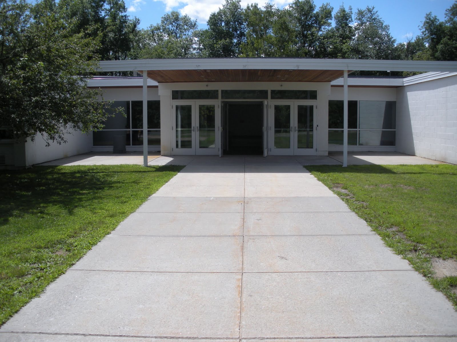
The building here opens up into a wonderful, large, grassy courtyard, which was the school's original main entrance. Breuer characteristically planned the approach to his building very carefully, straight in from the northeast from Bantam Road, rather than from the southeast off Plumb Hill Road, as it is now. The remnants of this roadway can still be seen, now overgrowing with weeds and shrubs. Why they decided to change the entry to essentially the back of the building is unclear. I very much suspect it was for traffic reasons, especially since the stretch of Constitution Way that delivers buses to Plumb Hill is conspicuously widened to four lanes, while the surrounding roads remain mostly at two. Buses would come in at an angle pointing right onto the main entrance canopy. The shallow V-shape of the courtyard's southern facades would greet arriving students like open arms or an open book.


This one opens up onto a large sort of student lounge area with couches and chairs at the junction of a number of hallways which would have to be one of the "hearts" of the school when filled with students. This space is also pleasingly bathed in light thanks to the large windows on either side of the entrance.
I was here drawn for some bizarre reason to the lockers. They appeared as if they might have been the original lockers. They're from a company called Republic Steel Corporation, which has been around since the turn of the twentieth century. This model, though, called the "Designer" line, was in production from 1970 to 2005, so likely they went in during the 1970s renovation. The spooky thing about my attraction to them was that the locker toward which I gravitated was locker A1: the very FIRST locker.
Back outside to the courtyard is what makes the incredible contrast with the main entrance. Perhaps it was programmatic rather than stylistic, but I still think this feature could as easily have been located around to the rear. I suspect this would have been the more obvious choice made by an architect with less vision. It's a small garden on the north side of the main entry court that I'm fairly certain is purposely located off the science classrooms. It's mostly hidden behind a cement block wall.


The whole northwest façade--the extensions of the science wing and the northern end of the main structure--is more or less bland and unfortunate. Coming around to the southwest of the building is a view that it's quite a shame so few people will ever see it. The border of the school's property, lined with trees and shrubs, rides so close to the building itself that it's obviously not intended to be used as a route to or from anywhere on foot, except for grounds maintenance staff. But at the end of a long, regular stretch of window bays appears--in my opinion--the building's most incredible feature: the library.


The extension made the library twice as large and added a clerestory and a row of four windows canted off axis. The geometry of these various intersecting planes is relatively complex, and responds beautifully to the plan of the building proper.
Breuer's main building was essentially Y-shaped in plan, with the top left arm of the Y bent in the middle and the science wing extending off the foot. All these 120-degree angles are most notable on the inside of the building. Although squeezing auxiliary offices and facilities into oddly-shaped corners could have easily produced some awkward lines, the hallways and various circulation routes are prevented by these angles from ever being monotonous. Moral of the story, the design of the library extension was very smart for manifesting Breuer's 120-degree angle as an ornamental bit of architectural sculpture at this joint in the building.
The interior of the library was equally wonderful, bathed in natural light. It was one of the only rooms we entered aside from the cafeteria. But seeing it through the glass doors, I just could not resist.
The four columns clustered in the center create an interesting centerpiece to the room and frame a ramp leading down to a slightly lower level.
 Past this is a stretch of this wing--the top right of the Y--which remains as Breuer intended. Past the concrete wall that juts out in the middle of this length of façade is another extension added in the mid-70s. The treatment of the southern façade of this branch (around the corner at the far end of this wall) shows the same forms as the front of the cafeteria extension, though more asymmetrical.
Further on, at a slightly different angle to this, is one of the additions from 2007. This one is far easier to distinguish from the earlier work, because the firm clad their structures in corrugated metal siding to set it apart.
Past this is a stretch of this wing--the top right of the Y--which remains as Breuer intended. Past the concrete wall that juts out in the middle of this length of façade is another extension added in the mid-70s. The treatment of the southern façade of this branch (around the corner at the far end of this wall) shows the same forms as the front of the cafeteria extension, though more asymmetrical.
Further on, at a slightly different angle to this, is one of the additions from 2007. This one is far easier to distinguish from the earlier work, because the firm clad their structures in corrugated metal siding to set it apart.
Where this wing meets the older structure was something I found very strange. It was these oddly sculpted metal end caps on the firewalls. It seemed a very out-of-place, almost postmodern gesture on the building that I didn't quite understand. Evidently this had been a huge fight between the 2007 architecture firm and their contractor, who would only fix his mistake for an additional fee. It also goes to show how very quasi-traditional most construction must be in this part of the country, that a contractor would even consider doing such a thing on an otherwise so modern building. But the other problem is that as a bit of ornamentation, if intentional, it's not even executed well. It looks like the guy cut the metal sheets with a chain saw.
The opposite side of this is back around the new front entrance again and the incredible gymnasium.
As originally conceived, the gym was not actually attached to the building, but accessed by a covered walkway. It would have been the sculptural equivalent at Litchfield to Begrisch Hall in the Bronx.
 |
| Photo source unknown. |
Adding to the gym's character as a sculptural adornment on an otherwise rather sedate building was a another sculpted volume providing a doorway on its northern end, where the new entrance and administrative offices have now filled in that courtyard.
There's my visit to Marcel Breuer's Litchfield High School. I'm actually not finished with Litchfield or Connecticut, but I'll let the suspense build for my next post.
 |
| Photo source unknown. |
All text and images ©2011, Ryan Witte unless noted.


 Immediately to the right of this is a loading dock supplying the cafeteria with chicken nuggets, foot long hot dogs, and vanilla physedibles, whatever the heck that is.


2 comments:
Wow! Totally just randomly found this post and so glad I did. I live in Litchfield County and have never seen some of these shots of the Breuer designed LHS. Thanks for sharing. Did you get to check out the 'abandoned' Breuer on Gallows Hill? Cheers, Neil
Neil,
Thanks for your comment. It was a really nice trip, Litchfield is a great little town.
Do you mean this house? http://trianglemodernisthouses.com/breuer26.jpg
As the second post this series illustrates, I'm wary of private houses now. So no, I didn't try to see that one. I might have had I know it was abandoned. That website seems to indicate it's been restored, unless I found the wrong house.
Post a Comment