GMW Architects, who were chosen in a competition to design this building, also did buildings at both Gatwick and Heathrow Airports. Perhaps their best known work is the Commercial Union Building (now St. Helen's Building, 1969), a brilliant work of corporate Modernist architecture in London.
The AirTrain and parking garage structures probably obscure this terminal more insensitively than any of the others.

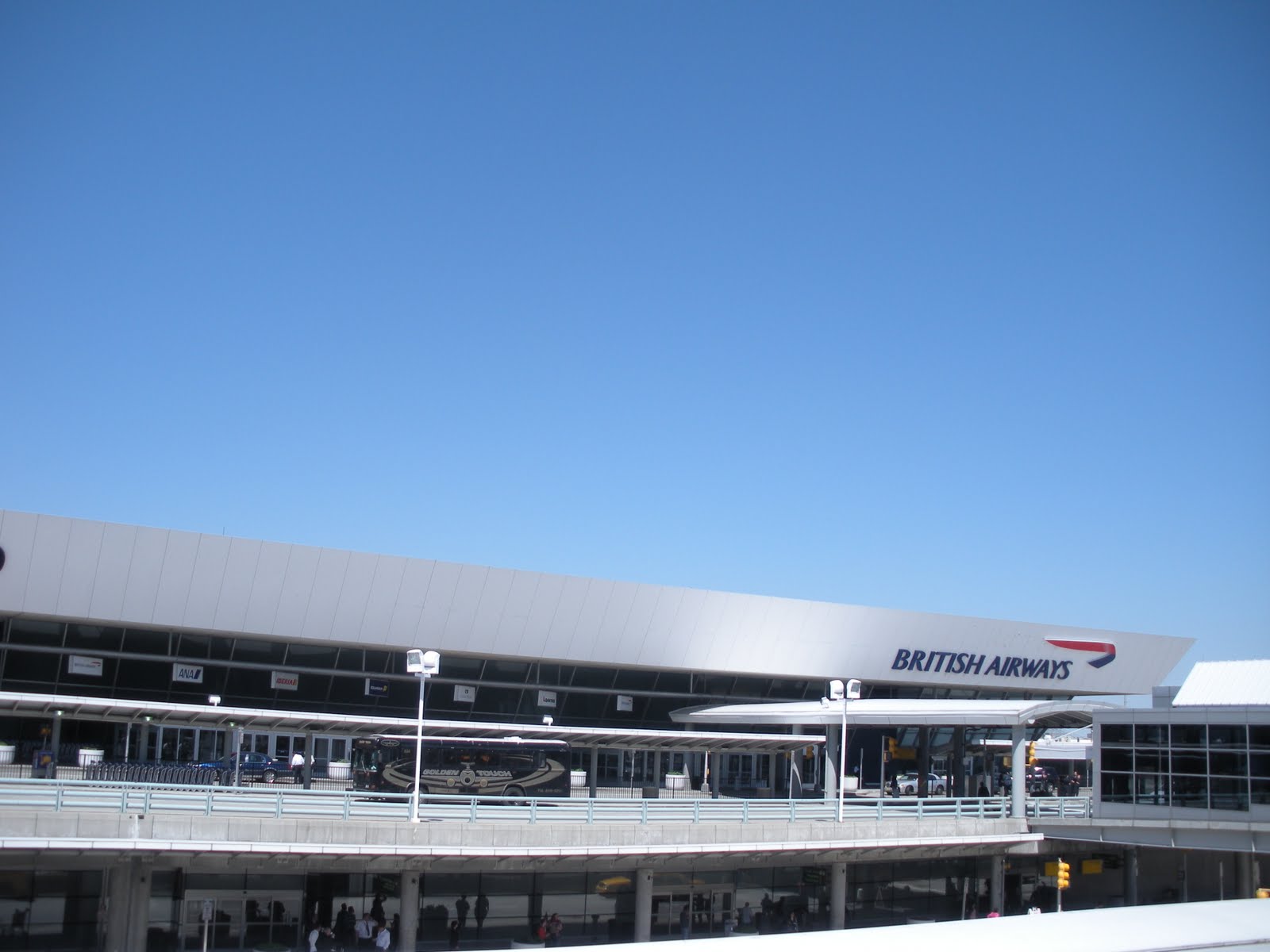
--All JFK photos ©2010, Ryan Witte, unless otherwise noted.
It's so bad that it's quite possible there is nowhere one can be to really appreciate the full front facade of the building without being way too far away, way too close, or at some ridiculously contorted angle like being in the very front row of a movie theater. It's a real shame, too, because I think my appreciation for this terminal has grown more than it has for any other.

Of course, it made little difference anyway, because I passed right by a security guard who told me I that I couldn't take photos outside but that inside the terminal was fine. Personally, I get the very strong feeling that there is no official photography policy in any rulebook. I suspect it's more that security guards get a big kick out of hearing the word "no" come out of their mouths. For one thing, this guy didn't react like he was trying to remember exactly what their policy is. He just came right out with the easiest answer.
Terminal 7 is essentially an extruded, truncated upside-down pyramid. The shape pulls upward and also appears to defy gravity to some degree.

The original heavy Brutalist concrete slab at the top seemed to float weightlessly over the canted glass wall below it. This conflict of materials was described by some as being "awkward," but I love its sense of dynamism. At some later date, the concrete was covered over with an aluminum facing that--while more slick and shiny--in my opinion lessens the impact of the effect.
Seeing the interior of this terminal for the first time was a bit of a revelation. As with far too much of JFK at every scale, it's a bit too cluttered up with stuff. In this case, the clutter is advertising mostly and looks a little sloppy. But I have a good talent for removing all that with my mind so I can imagine what it would have looked like when it first opened. The terminal is really amazingly cool.

When you first walk in the door, directly in front of you overhead is a row of canted windows looking down on the lobby. If it weren't for a row of tacky, overly colorful advertising banners strung along its bottom edge, it might look like the control room at NORAD or something.
I ended up needing to use the restroom here and I'm glad I did. Afterward, coming around the other side from where I'd entered, I discovered a moment that proved how glamorous this terminal must have been. It was the combination of the canted windows, clear at top, frosted at bottom, and these fantastically robust chairs designed by Alan Zoeftig in 1995.

There was something about it that just worked. Zoeftig is a world leader in airport furniture, by the way. These chairs also made an appearance in Star Wars--Episode 1.
Terminal 8: American Airlines (Kahn & Jacobs, 1960)

--Photo courtesy Electro's Spark.
This was the firm of Ely Jacques Kahn, one of the greatest architects of the early- to mid-twentieth century and architect of both Bergdorf Goodman and Bloomingdale's. The entire front facade of T8 was an enormous work of stained glass, said to be the largest in the world, by Robert Sowers. The real crime here is not as much that the piece had to be dismantled, but more that, aside from a few parts of it, they so callously disposed of it. It appears that parts of the window wall can be purchased for your own use from Olde Good Glass. Terminals 8 and 9 were replaced by a gigantic and unremarkable mega-terminal building designed by DMJM (AECOM), completed in 2008.
Terminal 9: United Airlines (SOM, 1961)

--Photo courtesy Unofficial 50th Anniversary.
This was also demolished for the new Terminal 8. I suppose it was no great loss, but it was a nice bit of Modernism by SOM. I can concede that it very likely wouldn't have shown its age very gracefully, were it still standing today.
Overall, JFK is visual chaos. Way too much construction litters the landscape, building after building. Everywhere you look: terminal, hangar, administration building, roadway, hangar, mechanical, terminal, train tracks, hangar. Certainly much of the architecture is stunning, merely in need of a face lift. But there's just too much of it.

©2010, Ryan Witte
No comments:
Post a Comment