Showing posts with label Brutalism. Show all posts

Friday, December 2, 2011

Island in the Stream

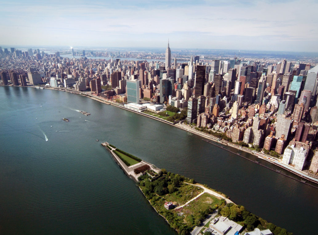
My latest excursion was a trip to see something really unique in New York. I'd been there I think only once before. This time I saw much more of it and looked much more closely. It's accessed by an unusual form of transportation that I think most people would be shocked to find in this city: a tram that was intended as a temporary measure and quickly became iconic. I'm talking about Roosevelt Island.

This was another event planned by the folks at DOCOMOMO New York Tri-State, and it was incredibly impressive. The best thing was the people they arranged to have speak to us, all of whom were so integral to the project. First to speak was Theodore Liebman, who was Chief Architect of the New York State Development Corporation that built up Roosevelt Island. Next was Lo-Yi Chan, who worked for I. M. Pei and designed the tram stations on both the Roosevelt and Manhattan sides of the river. And then there was Ashok Bhavnani, who I mentioned in a previous story. Finally, a well-spoken resident of the island since 1981, Marianne Russem.

There are a ton of interesting things about Roosevelt Island. One of them does not seem to be its nightlife. There are a few restaurants that look fairly nice, although I didn't have an opportunity to look at any menus. Other than that, there are a lot of empty storefronts. From some of the residents' reports, it sounds as if, after hours, it becomes a bit of a ghost town.

Getting in and out of Manhattan for an evening's entertainment sounds like a bit of a chore. The tram can stop running as early as 2AM. Cabbing it back to the outer boroughs for anyone who lives close enough to bother will generally cost around fifteen to twenty dollars, which seems even more worth it if you can share the ride with a friend. But keep in mind that, although it's geographically closer, a cab from Manhattan has to go over the Queensboro Bridge, make a U-turn, and cross back over another bridge to get to this island. It's served by only one subway line, the F train. If the F isn't running, you're $#!+ outta luck, and I wouldn't call the F the most reliable train. I think it would take a somewhat particular kind of person to want to live there, but that's still evidently a lot of people. The waiting list for an apartment there is estimated to take twenty years to turn over.

The uniqueness of Roosevelt Island stems from a few facts. It was a parcel of available land on which to build extremely late in the game, yet extremely close to the island of Manhattan. Although there are swaths of green at its northern end, the entire island of Manhattan had been more or less completely covered with development since the 1930s or '40s at the very latest. By the early-1970s, housing developments that would require the displacement and demolition of existing neighborhoods were almost universally seen as the most sinister of urban evils. Housing projects had promised so much and delivered so little, often making worse the very problems they had proposed to solve. It was the great, ironic, and miserable failure of the tower in a park ideal that had guided urban planning for forty-some years.

Despite the fact that many valuable lessons had been learned the hard way about this type of large-scale residential design and construction, it was all but impossible to put any of the new philosophies into practice. Grassroots neighborhood organizations had become much too vocal, much too savvy, and much too powerful to ever permit the wholesale destruction of urban areas again. And there was nowhere left to build on a large scale, except on Roosevelt Island. So what can be seen on the island is rare: large-scale, high-density, early-1970s residential architecture. What was built there was essentially a brand new town, built from the ground up, and built on late twentieth-century principles of urban space. The only comparison in scale might be gated, suburban housing tracts, but the fundamental differences are too obvious to bother discussing here.

A sort of side-effect of all this is the fact that Roosevelt Island's architecture by Johansen & Bhavnani is vaguely Brutalist, but displays a wonderfully domestic, sometimes even homey character, especially as it relates to the main street. One of the things I noticed on my first trip out many years ago was how modern the forms were, but yet seemed scaled almost like traditional row houses at times. Of course there are many towers to be found as well, but I think their proportions are sensitively handled.

It was originally called Hog Island when purchased from the Canarsie natives, then Manning's Island (1666), Blackwell Island (1686), and Welfare Island (1921), but was named for former New York State Governor Franklin D. Roosevelt in 1973. The Blackwell House is the oldest building on the island and one of the oldest buildings in New York. It was finished in 1804 and restored in 1973.

Around the Blackwell House and here to its north is a nice little green area and fountain designed by landscape architect, Dan Kiley.


Mostly Roosevelt Island was used for the sequestering of people nobody wanted to have to deal with in Manhattan: criminals, the insane, the diseased, and the disabled. It's been home to prisons, asylums, and hospitals for the treatment of smallpox and polio. The focal point of the asylum was the Octagon (with the clever address "888," Alexander Jackson Davis, 1839), which is now the lobby of a high-end apartment building converted in 2006. Why anyone would want to live in an insane asylum I'm not sure, but it does look like a pretty fancy building now.

The Smallpox Hospital (1856), designed by the architect of St. Patrick's Cathedral, James Renwick, is probably the best known building on the island, especially amongst people who have never visited the island itself. It's lit up at night and quite visible from Manhattan. It's an extremely beautiful building and would have to be the absolute greatest place in all of New York City to have a Halloween party. I'm sure they'd never allow that. I've been wanting to see it in person for years, but I'll have an opportunity to do so soon, as I discuss below.

This gorgeously eerie photograph courtesy Too Much Glass.

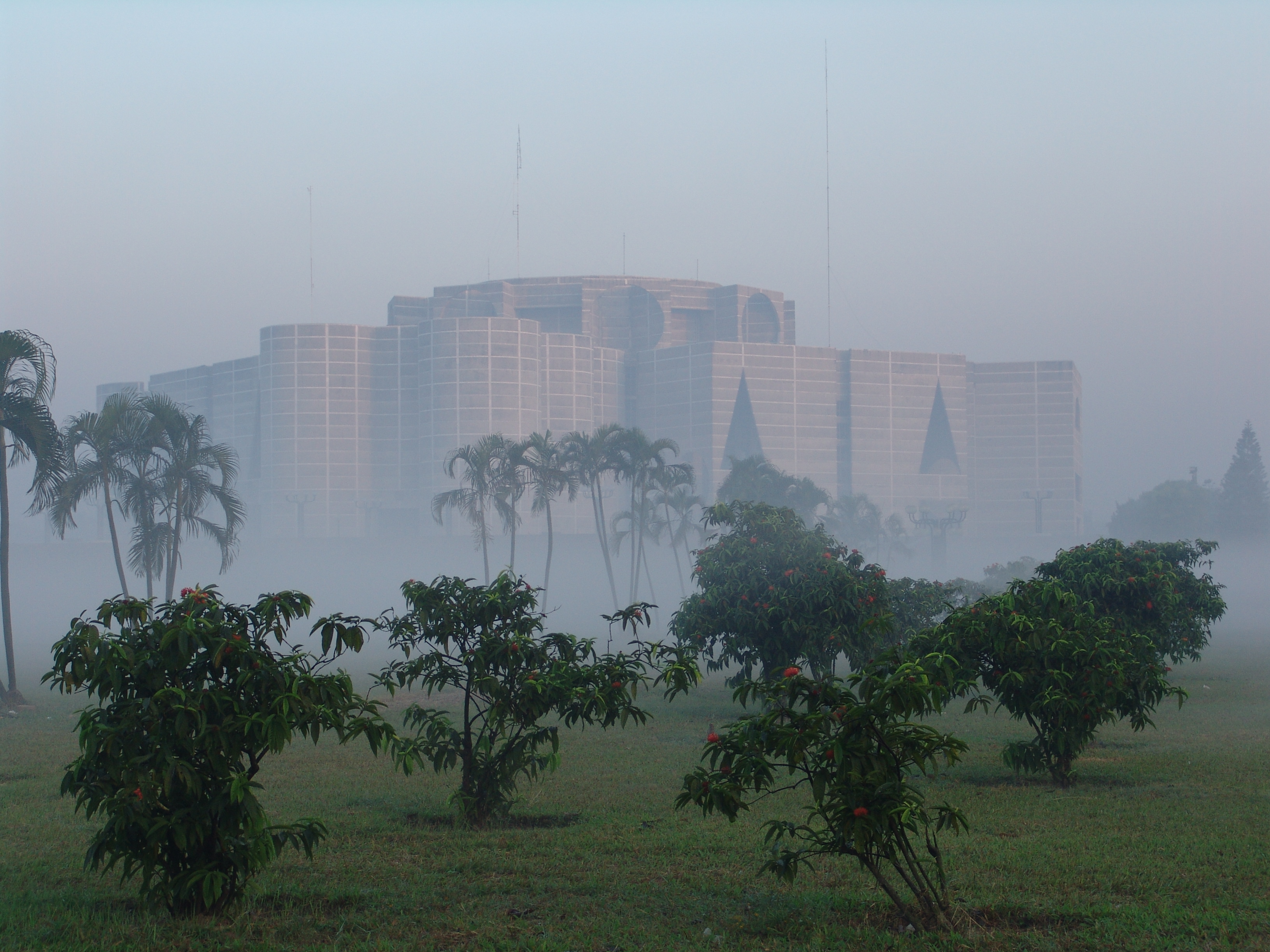
It's appropriate that the island should be named for a president who happened to suffer from polio, considering a hospital dedicated to the illness was located there. As many of you may know, Louis Kahn designed a monument to Roosevelt which was intended to be built at the southern tip of the island around the time of its redevelopment. Almost thirty years later, Four Freedoms Park will finally be built there, just south of the Renwick Ruin. It will be this city's only work by Kahn, sadly (who designed the incredible Salk Institute and, for my South Asian readers, built this in Bangladesh, which must be absolutely astonishing in person). Although there are a few of his works in the tri-state area that will eventually be discussed on this blog at some point. It was pointed out that a statue of Eleanor Roosevelt stands at the United Nations directly across the river, so now husband and wife will be able to "talk" to one another.

Speaking of polio and the wheelchair-bound patients of the hospitals, it was decided from the start that all of the new construction, the entire island in fact, should be fully accessible by wheelchair. The planning was begun by Philip Johnson and John Burgee in 1969, and most of the major construction was complete by 1974, '75, and '76. But the point is that the Americans with Disabilities Act, which states that all new construction and alterations to any building accessible to the general public must be equally accessible to persons with different types of mobility, didn't go into effect until 1992, over twenty years later. In the early-'70s, it was as pioneering an idea as it was socially conscious and socially conscientious. Most of the ramps and similar features are well integrated into the design as a whole. These buildings could be a fantastic model for the seamless incorporation of equality in accessibility even today.

Another very interesting thing you likely would never know unless you lived there is that the island's waste is collected by a pneumatic garbage disposal system. It's the only residential community in the country to use such a system. We went to see the garbage plant and look in the window, but you can't really see much from outside. There's been a short documentary produced about it, which is surprisingly fascinating and fairly funny.

Nature Abhors a Vacuum from gregory whitmore on Vimeo.

Although it hints at it in calling attention to the narrow streets, the film doesn't mention that originally cars were banned on the island. Residents and visitors would drive over the bridge which led directly into the huge parking garage--called "Motorgate," in delightfully 1960s fashion--and just leave their cars there. Transportation around the island was (and is) supplied by electric buses. It's remarkably futuristic, if you think about it. But at one point I said aloud, "wait a minute...there are cars here." It must tell us something about our automobile culture that I'd already been on the island for a couple of hours before I noticed there were cars where there were not supposed to be. Even if (electric) garbage trucks had been allowed along with the buses from the beginning, the only other vehicles on the roads being garbage trucks would have been singularly unattractive.

The parking garage I think is a fantastic building. It was designed by the architects of Boston's wildly controversial City Hall, Kallman & McKinnell, and finished in 1974. The island resident, Marianne Russem, was able to half-heartedly agree that it's an aesthetically interesting structure. But she said most of the residents hate it because it's especially dirty and practically impossible to keep clean. Although photographs I saw of the interior looked pretty spectacular, I didn't have time to go inside it on this trip.

Roosevelt Island's school system was also a bit unconventional. All the residential buildings had small classroom wings incorporated into their designs. So from one year to the next, students would move from building to building to attend school in a different place. Russem said there were problems with this because the arrangement provided no centralized spaces like a gym or auditorium to accommodate school-wide functions. A main public school was built in 1992.

For anyone who might not know, New York City has an interesting public school system where, after their eighth year, students can choose and apply to attend any of the other public schools in the system regardless of location. As far as I know, the admissions process is similar to college applications, and many of the schools are specialized toward a certain field like science, technology, or the arts. My point being that after year eight, students from Roosevelt Island could choose to study elsewhere anyway.

In discussing the experience of her own school-aged children, Russem touched on a topic of relevance on this blog. Because this was a state project, it was required to house residents of a variety of economic levels. This would all seem perfectly great except that, as she pointed out, residents of different economic levels were divided up into separate buildings. She said it "created slums," not at all unexpectedly.

She was fully against the practice, as well, and likely her children's experience only amplified this. "Oohhh, you're from Rivercross..." other kids would say to hers, referring to the only co-op building in the bunch. Although all the buildings were built with swimming pools, the one at Rivercross is the only one that remains operational. Furthermore, it's extremely well maintained. The other pools sit dry, cracking, and unusable, which I found quite sad. I'm going to risk sounding naïve by saying I'd like to think this policy would be implemented differently--better, and with more integration--today.

It was during our stop at Rivercross for refreshments that Mr. Bhavnani spoke to the group, along with Ms. Russem. The enthusiasm for this project, the whole concept of this island, was palpable from all the speakers involved.

Knowing that this post was in the works, I recently went also to see Bhavnani's Kaufman Center Building (1978), on West Sixty-Seventh Street, which is of course very close to where I work. But it was substantially (though respectfully) redesigned by Robert A. M. Stern in 2008.

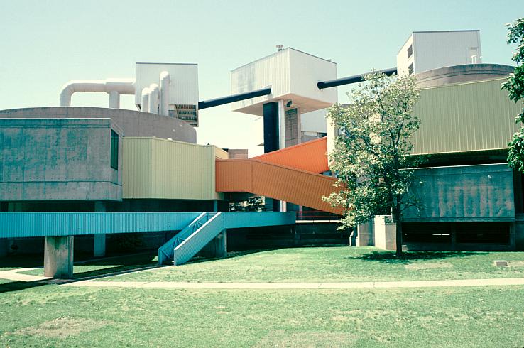
A few things became apparent inside Rivercross. One was that all the buildings are vividly color coded, as can be seen in the tile-clad elevator lobbies and the ornamental ventilation tubes.

The tubes, by the way, are a wonderful industrial detail, vaguely nautical in tone for the riverside site but without being too obvious about it.

Another was the way the interior spaces are interconnected with an amazing progression both horizontally and vertically. Hallways provide long vistas with distinct volumes cut out, brightly colored, and bathed in sections of natural light.

I had the idea in my head that we were going to see one of the apartment interiors and we didn't, but what we did go up to see was pretty cool. It was a tiny moment of futurism from Archigram that links two wings of the building. The tower it leads to feels surprisingly domestic, shows how much individual personality was possible in each unit, and can be accessed only through these tubes. It would never hold up under fire safety laws today. The tubes need to be replaced and for various reasons, namely that maintenance staff needs to access the top of them, sadly, they need to be reinstalled with roofs.

These may be some of the last images of the tubes in their original form.

This had actually been the official end of the event, but many of us continued along with Russem, who kindly offered her time to tell us more and answer additional questions. We walked north and discussed the school, I asked her about the wheelchair-bound residents and other questions about life on the island. We saw Motorgate and the turbine house for the garbage system. Finally we ended at the Octagon, where photos were not allowed inside. Most everyone opted to take the bus back, which was there as if on cue and I believe costs only fifty cents. It was a really beautiful day, so I decided to walk back, instead. Strangely, I still made it back in time to ride the tram with a couple of the people from the DOCOMOMO tour.

I had considered walking down to see the Renwick Ruin, but at that point I was a bit tired, it was getting late, and most importantly I was losing sunlight fast. I'll return when the Roosevelt Memorial is completed. In the meantime, I feel as if yet another corner of this city is within my conceptual grasp, and hopefully...yours, too!

All text and images ©2011, Ryan Witte, except where noted.

Monday, October 24, 2011

Dis Connecticut--Part Two

Normally, I might lament the fact that other projects needed to take priority over this story for a while. In this case, it actually worked out quite fortunately. While this part of the series remained under construction, I got the opportunity to meet the architect of this building in person, purely by accident. I'm not referring to John Johansen, but his partner, Ashok Bhavnani. Johansen's mentor was Breuer, Bhavnani's was Richard Neutra; I can imagine few marriages of architectural lineage with such potential for greatness. How I came to meet Mr. Bhavnani is for a future post, but he told me he was heavily involved with the design of this building. It's the Intermediate School (1968), right up the road from Litchfield High School.


There are three entrances to the building, a new one on the north side (right), that one on the west (above), and one on the south. We first came upon the new one on the north façade, a redesign by the same firm that renovated the high school. They chose to employ brightly-colored corrugated metal as a nod to some of Johansen's later work.

In honor of this post, I decided to finish a book I'd begun a while ago but for some reason never finished. I think it was not quite meaty enough for me, which I'll explain in a second. It's Johansen's Nanoarchitecture--A New Species of Architecture.

A new species it is, but you have to look for it. It's a small book and the majority of it is photographs of models, computer renderings, and drawings, not text. It's a collection of hypothetical projects of Johansen's that he worked on to push boundaries and explore new directions architecture might take as a result of new and emerging technologies. Most of them are extremely interesting conceptually, but I'm tempted to believe most of the conceptual breakthroughs, or at least most of the lines of inquiry that could lead to them, were mapped out by Archigram in the late-1960s. Coincidentally, there are traces of Archigram to be found in Johansen's own Mummers Theater (1970) in Oklahoma City.

The models also come off as being rather homemade. I'm not saying I have any skills whatsoever in taking an Exacto knife to balsa wood and foamcore. But computer renderings that are becoming increasingly indistinguishable from actual photographs these days I think have left me somewhat spoiled.

The last few projects in the book, a discourse on the title subject, and the epilogue are all mind boggling, however. What he calls "molecular engineering" is something I've thought about for years. To oversimplify, the "blueprint" for the house is basically a human-engineered DNA sequence. The organism that results has all the functionality and structure of a house. Nature does pretty much everything a house would need to do, and much more, except for perhaps the ability to connect to communications technology. A single redwood tree represents more mass and structure than most people's houses. Nature can create electricity and light, convert organic waste into energy, moderate temperature. You could even conceivably grow a television or computer monitor by carefully ordering DNA. Once computers start getting more powerful and can be used to analyze genetic code faster and with more precision, I don't think this will sound all that far-fetched.

The epilogue covers what I'd expected more of the book would have, the use of nanotechnology in building. Much faster than a tree, nanobots could be programmed to "grow" a house in much the same way as our organic programming. To me it would seem there are benefits to both. If both genetic engineering and nanotechnology were used together, it's even more incredible to think what could be accomplished. This would have all the capabilities of computer technology and electronics, with all the efficient expenditure of resources and sustainability of the natural world. Certainly people will still want to put up their own structures like they always have. Beyond that, the entire idea of what Architecture even is will change so drastically and in such fundamental ways, it will barely look like the same profession anymore. I'm not sure I can say with any confidence that I will be around to see it happen in my lifetime, but I can only hope.

Back to the Intermediate School, this was a designation I was unfamiliar with and had to ask someone there. "Intermediate" is years four through six. I could find no photographs of what this building originally looked like by Googling around, but it appears that it very much turned itself inward, with the exception of the central entrance. 

At the central façade, seen in the first photo above, windows punch dramatically outwards to meet the street. The addition on the north looks to have broken through a solid masonry wall with its aluminum(?)-framed glass box opening it up. The upper story, like the wing to the south, has no fenestration, although that doesn't necessarily mean there were no windows or doorways on the ground floor.

Subtracting the addition, the main building reads as a transparent glass volume in the center, framed by massive concrete and masonry construction, with a solid, opaque concrete and masonry volume on either side of it. Almost entirely imperceptible in person is the fact that the two side wings are turned outward at the very slightest angles from the central section. The effect is more subconscious than anything.


At the junction of the north and central sections is the first hint that this building is truly a work of art. The first thing to notice is the illusion that these are two separate buildings due to the corridor connecting them being on the ground floor. About a third of it is below grade as seen from the front. Whatever is above grade is hidden by plantings. The other thing, which becomes clearer at the junction between the central section and the southern one, is how the views have been so carefully composed. The two sections have been pulled apart to here reveal a chimney, only very fleetingly, which stands in the courtyard like an ancient obelisk.


The central section does something very interesting with (a)symmetry that reminded me of Breuer's work. The volumes that project outward display a conspicuous, rigid symmetry, while the recessed volume underneath is very much asymmetrical. It's as if the building wants to project a sense of formality to the outside world, but takes a more casual tone for its interior. As I was talking about this, I was evidently being overheard by one of the faculty members, who stared at us out that window in the center until we were out of sight again. I know I'm very interesting to listen to, but it was a little bit weird.

The next junction I found extremely interesting on a number of different levels. First, the two wings are way too close together. In other words, they're so close that they ought to be simply brought together into a single structure. If they were to be separated, they really ought to be further apart from each other. As it is, it frames the view of the obelisk chimney even more specifically than the opening to the north. The corridor that connects the two wings is concealed from view at most angles, amplifying the illusion that these are two separate structures.

Next, a pathway leads straight toward that opening, but then forces a sharp ninety-degree turn to access the doorway it serves. The space between the two buildings, while too narrow for compositional reasons, is just wide enough to appear to be a passageway, probably around four feet wide. But the passage through it is decidedly blocked by a shrub.

Finally, framing this opening--which, all told, must be there only to control views--are two massive, monolithic masonry walls. Beyond the opening, what it reveals is an enclosure with glass on three sides, allowing you to see all the way to the back of the courtyard through first one glass wall and then the second. The contrast this creates between enclosures of opacity and transparency is extremely powerful.

The south entrance is turned at an angle from the great southern volume. Just enough to be perceptible, but not much more.

Around to the right, it's revealed that the wall has been extended out from the enclosure, to call attention to its qualities as a wall, but also drawing attention to the strong, yet false symmetry of the entrance facade. This is further amplified by the fact that it is obviously at an angle from the larger volume behind it that it accesses.

From this point forward, the building completely changes its character about once every yard (meter) you walk.

The first thing you see is this great composition of brick volumes clustered together. The sense of walking into an ancient Roman village is unmistakable and had to have been intentional. Perhaps Brutalism was at its finest at these moments when its Modernism was transitioning into Postmodernism, and recalling our architectural past to create moods.

This one little doorway was especially remarkable. Its masonry frame is easily a mere canopy, but it's deep enough to be surprisingly intimate, while retaining a sense of the monumental at the same time. It also means that from all angles save directly in front of it, the vistas of pure masonry volumes are uninterrupted.

A raised walkway finished in roughly textured concrete prevents the courtyard from coming into view too suddenly, but rather reveals it slowly and carefully.

Once past the walkway, the courtyard is a gorgeous space and truly the heart of this building. The façades on the east and west of the courtyard are the most glazed of any on the building, as I mentioned, turning the building inwards.

The one on the west, while similar to the entrance façade on the opposite side, has an entirely glazed ground floor. In a careful balancing act, these two façades present larger expanses of glass to the courtyard, but are still clearly framed by concrete structure.

To the north and south, glass boxes pop out of the corridors connecting the seemingly separate wings of the building. While smaller in surface area, the structural concrete framing is gone, allowing them to dematerialize more than the fenestration of the east and west walls. The other side of the glass box here, by the way, is the one that can be seen through the strangely narrow opening between the two structures from the front, discussed above.

With most especially these two façades, the architects managed to create something monumental but with intimate moments, as well, formal but not stuffy, somehow ancient yet totally futuristic. There is no doubt a lot of Breuer in this, but it is a fantastic building unto itself. I never did get around to see the east side of the building. It appeared inaccessible, although I suspect it could be accessed around from the north. There were a lot of other things to see that day, and I was getting hungry.

We had a nice lunch in the quaint town center of Litchfield. Only about fifteen minutes from there and out in the middle of nowhere was our next stop, a complete bust. It was Daniel Libeskind's 18.36.54 House.
Photo by Nicolas Koenig courtesy architect's website.
Just looking at the photos of it makes me want to weep at how breathtakingly genius this is. I should have known that a state like Connecticut would never allow something like this to be visible from the road. But that's a complete understatement here. I mean, you can't see anything. It's all the more ridiculous if you can imagine the most rural possible road this is on, it's almost surprising that it's paved with actual asphalt. My point being, if this were visible from the road, probably no more than about ten people would even see it on any given day, and at least one of those ten would be a mail carrier.

Nonetheless, what you see from the road is a fancy motorized gate, not even connected to a fence, and a lonely call box on a stand. Behind that, a cliff rises up about 300 feet (100 meters) at practically a sixty-degree angle, with a driveway snaking up it like Lombard Street. You would not want to try this after even the most minor snowstorm. In fact, I'm surprised there's no staircase up the hill just so they could park at the foot of it and walk up on foot in the case it got icy. Maybe the driveway is heated, I don't know.

In any case, I was not going to let this go so quickly. We turned around, I rehearsed a little speech along the lines of "I write an architecture blog and was hoping, if it's not a terrible intrusion, that I could maybe get a few photos of the outside of your house," worked up some courage, and pulled up to the gate. I pressed the button on the call box. It rang and rang, and rang...and rang. No answer. The thought did cross my mind that, if there were no one home, we could probably just climb the hill on foot and walk around. Who would know? But all along I was aware that just because there was no answer to an unexpected ring at the gate didn't necessarily mean there was no one up there. And ending up in jail for trespassing probably would have ruined the day.

Drat.

Eventually I would really like to go back up to see it. The problem is that I've now already seen everything even remotely close to that house, so it seems almost silly to drive so far just for that one building (Litchfield took about three hours from the city). I have been in contact with Libeskind's studio about getting in contact with the owners, but the fact remains (as I knew) that this is a private residence. If my experience with another private home I've been wanting to profile is any indication, it may be prohibitively difficult. Cross your fingers.

Stay tuned for Part Three.

All text and images ©2011, Ryan Witte, unless noted.

Friday, June 24, 2011

Being and Breuer in the Bronx

My trip to see Marcel Breuer's buildings at the New York University Heights Campus in the Bronx  was a much deeper experience than I was expecting. Consciously, I thought that I had a beautiful sunny day to see another work by a modern master that was close enough (accessible enough by public transportation) that I wouldn't need to spend the money on renting a car again. Perhaps the reading I've been doing lately (at the moment: White Papers, Black Marks--Architecture, Race, Culture)--and my interest in the intersection of architecture and issues of race, gender, and so on--subconsciously made the name "Bronx" shine a little more brightly than usual on my Trips map. But for certain I didn't consciously expect University Heights to necessarily be a neighborhood inhabited predominantly by people of color. The Bronx is a big borough, after all, and I really don't know it all that well.

In some weird way, I appreciated being one of the only white faces on the street. I know this is an experience that many people of color have every day of their lives, so I wanted to pay attention to it. But the reason it made me uncomfortable (the emotion I was examining, and honestly, it was not strong) I found very interesting. It wasn't because of some stupid "these are not my people" sensation, and of course no one made me feel even slightly unwelcome. Rather the discomfort came from the fear that I was intruding, that my very presence would be seen as offensive in some way. What I mean is, I imagine many of the residents of this neighborhood, in their day-to-day lives, have to deal with entitled white people all day long who have no clue what "entitlement" even means. Their own neighborhood, therefore, I would think becomes an escape from that. For me to just waltz down the street, invading their retreat, their safe zone(?), felt intrusive on my part, like I was invading something sacred to the long-time residents and off-limits to me.

And that's where another conflict arises. No matter where I am, I always make the point to be comfortable in my own skin. While in Montreal, for instance, it worked; at least four or five people asked me for directions, assuming I lived there, that I belonged there. Certainly being in any urban area with the look of "I'm lost and confused! Where am I?" all over your face (or having a big-ass camera hanging around your neck) is a great invitation for a questionable character to try to scam you...or worse. And I don't think there was any question that I'm not a resident of University Heights, not just because I'm white, but a whole lot of other things, the simplest of which being that I'd never been there before, had never been seen before in a neighborhood of presumably familiar faces. 


Maybe I'm projecting my own issues, but a lot of the looks I got seemed to say not "what is he doing here?" but at the very least, "oh, there's a white guy here." But the reason that pun--"in my own skin"--is available to me in this discussion is precisely the problem. I have no doubt that what enables me to feel at ease in an unfamiliar urban environment are my privileges as a white man that, historically speaking, "entitle" me to go with impunity wherever I choose to go.

The question this uncovers is this: Where is the middle ground between a respectful acknowledgement of not belonging in an environment carved out, commanded, and valued as a retreat (merely my empathetic assumption) by people of color, and comfortably inhabiting one's own (white) body in that environment so as not to appear naïve and out-of-place? From the other direction, I almost feel like most any reasons I might have to feel uncomfortable in a neighborhood that's largely Black and Hispanic would have to have racist roots. So how much of my comfort level do I gain from my white privilege, and how much do I get from my devotion to anti-racism? Is it possible to determine what kind of "comfort" one is feeling? I was unable to get a grasp on the answer during this brief excursion.

I'd like to add the disclaimer that my ideas about the racialization of the urban, architectural environment are immaterial in a discussion that is best had by the people of color who shape and inhabit those environments. My hope is no more than that another voice in the mix might help to shed added and helpful light on a subject that should concern all of us in the twenty-first century, despite the fact that my voice is a white male one. I mean only to be an ally, not a colonialist. Take them or leave them, as is everyone's prerogative.


Across the board, my interactions with people on this trip were remarkably pleasant. Perhaps too pleasant, and I do hope my experience wasn't glossed over with an insincere veneer. I was diligently studying the map of the campus to try and figure out which buildings I was looking for when I suddenly realized there was a cute couple of Hispanic kids behind me looking at it also. I quickly stepped aside and apologized for blocking their view. They were trying to find their bearings, so I pointed out to them where on the map I suspected we were.

Finding the buildings by name was not at all easy because the names have changed. The original campus is by McKim, Mead & White, not surprisingly, and is beautiful, if staid. I looked fairly closely at the original buildings but won't include them here, which I'll explain below. Breuer's buildings started to appear in the 1960s and are otherworldly. Because of the financial crisis New York faced in the early-1970s, which also affected its many institutions, NYU was forced to sell their Bronx campus to the City University of New York in 1973. It then became Bronx Community College (BCC). Finding Breuer's work by sight was not difficult at all. I just needed to know where to walk. The first one I found was Technology I & II (1972), now called Meister Hall for Dr. Morris Meister, BCC's first president.


When you see it in person, it looks entirely 1972. But something about the two-dimensionality of the photographic image allows me to see something more. Meister is H-shaped in plan. The front wing (the left side of the H), which houses classrooms and seminar rooms, has proportions that are a bit too unusual, and its piers too Corbusian. The tower behind it housing laboratories and offices, on the other hand, reads like an updated version of a typical turn-of-the-century office building. In fact, I'm seeing shadows of Louis Sullivan in it.

A sign of Breuer's genius is what he does with the entrance here. And one might be tempted to say that no mid-twentieth-century master could do a building entrance as dramatic as Breuer. Wright's, Mies', and Johnson's were all pretty straightforward. Corbusier, Saarinen, Rudolph, Pei, and Gehry mostly allow(ed) their building's ideological conception and sculptural expressionism to all but swallow them whole. Kahn seemed more concerned with arrival than with entrance, and Meier more with circulation. One always knows exactly where and how to enter a Breuer building, but more than that, doing so is an event.


The front of Meister is mostly uniform, with the regular piers along the bottom with a four-window bay above each. The entrance is perfectly visible between those third and fourth piers, but is tucked away behind them. Instead of something stuck onto the front of the building and disrupting its horizontal mass, a sheer, asymmetrical brick tower rises up behind it to announce the entrance.

Seeing this image in a thumbnail size in order to load it, there's something about the forms that appear vaguely Italianate or perhaps even Collegiate Gothic to me. Okay, very vaguely. But squinting or unfocusing your eyes maybe you can tell me I'm not crazy?


At the eastern end, the horizontal front volume pronounces itself by standing on its piers with just parking underneath. At the western end, the glass-enclosed lobby space continues out to the edge. Because the land slopes downward, at eye level here the underside of the building opens up revealing the contrast between the solid concrete structure and the bright, seemingly weightless glass enclosure.

Back around to the east, a gradual progression begins, in between the two wings of the H, toward a more muscular, purely geometric Brutalism. Notice how the windows now are nothing more than tiny slits in their deep, inverted pyramidal recesses. The sun at this angle also happily helps to amplify the strength of the geometry.

Windows are permitted to interrupt the massive brick and concrete forms in only the most reluctant slivers, in between them and mostly recessed out of sight.

When I came around this corner and the southern façade came into full view, I could barely breathe enough to whisper to myself "Oh. My. God."

I honestly think this has to be one of the most brilliant moments in all of twentieth-century architecture (one of many, of course). This entire façade of the building is nothing more than one enormous entrance. The texture is pure architectural sculpture, a wall, a great dramatic play of light and shadow. I can't say what it would be like to work in a building with no windows on one whole side (although I suspect this side may be the laboratories).

The terrace at the back seems to be a mildly unfriendly place to gather, as many of the great works of landscaping were up to this time, for better or for worse. It may have only looked so barren because of the very fact that there were no students using it at the time. Visually speaking, I think it is one of the most stunning places I have ever been.

And to be fair, there is a group of shade pavilions in the center that I would be very surprised people didn't enjoy using to have their lunches.

After that experience, I was very excited for what I would find next. Unfortunately, it was a bit of a let-down.

In fact, when I first came upon the Gould Hall of Technology, now called Carl Polowczyk Hall, I thought to myself, "that can't really be one of the Breuer buildings, can it?" And as much as I have (hopefully successfully) defended a lot of buildings on this blog that people hate(d), I think I can safely say I find this building ugly. This and the rest of the Breuer work to follow was completed in 1964, except for the last building at the end.

Never one to condemn the work of someone with this much talent in such ultimate terms, I'd like to try to defend him. I have a very hard time believing that the corrugated metal nonsense on the top was ever Breuer's idea. In fact, I suspect that floor wasn't even in his original plans. Why anyone would put a prefabricated farm machinery storage shed on the top of this building is beyond me. Without question the college should employ a uniform type and color of window blind (I'm going to presume I understand what Breuer was doing here and suggest a light grayish-blue). That might require a maddeningly fascist co-op board in a residential building, but this isn't even a residence hall. It's classrooms for math, physics, and medical technology. There is really no excuse for it to look like they hung brown paper bags in the windows.

Buildings from this time period suffer from an unfortunate circumstance which I also discussed in regard to Harrison & Abramovitz' buildings at Rockefeller University. It's the continued Modernist use of relatively strict, regular horizontal bands of cladding materials on buildings built when central air conditioning was not yet seen as a basic necessity. Possibly Polowczyk employs electric radiators precluding the possibility of incorporating air conditioning into a centralized duct system. Nonetheless, I have no doubt that individual units could have been installed by a conscientious contractor that would have been far less visible on the outside. Assuming cost was the major controlling factor, at the very, very least, those visible units should have been all exactly the same brand and size (many are, too many others are clearly not) and installed at precise, uniform intervals. As it looks now, it's just a disaster that quite conspicuously helps to ruin what might be not an altogether awful building otherwise.

No one, not even a professor I was transferred to on the phone, could tell me anything at all about why there are cannons on the grounds. The best I could piece together from his cryptic explanation is that perhaps top-secret military research was being conducted here during World War I and there needed to be some kind of artillery protection. But he also said, "no, I don't think it was to protect the property," so who knows. Then he suggested I would need to ask someone in Washington, D.C., as if they'd ever tell me anything.

I was also a little bit disturbed by the yellow brick. But I quickly noticed that the original McKim, Mead & White buildings were built of similar brick. While his results might have been a bit questionable in this case, it was actually rather smart of Breuer to take this material and frame it in modern concrete construction as a way to relate contextually to the rest of the campus. One section of this eastern façade with a pattern of flower-pot-shaped openings in it was the first little hint that this was indeed a work by Breuer. That shape, the isosceles trapezoid, is also reflected in other forms, the plan of Begrisch Hall and the plaza around the Community Hall for two examples discussed below. It was clearly one of Breuer's favorite and signature shapes.

Cementing this (pun intended) as a work by Breuer was-- surprise--the entrance. The soaring, sculptural canopy screaming expressively up into the sky is so spectacular it almost makes up for the numbing banality of the building it adorns. As much as I would love to be able to just dismiss this building outright, the entrance canopy makes it entirely impossible.

On the western side of the building, it all starts to make sense. Here we find an incredible piece of architectural sculpture, the Begrisch Lecture Hall.

Although connected by a suspended walkway rather than being a sculptural adornment like the entrance canopy, it's not difficult to imagine how brilliantly this was conceived. Polowczyk Hall, tight, rigidly ordered, stacked horizontal bands of warm concrete, cold aluminum-framed glass, and traditional gold brick, punctuated by three intriguing and unique sculptural moments: entrance canopy, trapezoid orifice wall, and this lecture hall. I'm convinced that in a simple water-color rendering, this would have seemed the very highest form of the art of architecture on a 1964 par with contemporary Zaha Hadid.

Begrisch is a concrete sculpture that just happens to be large enough to contain an inhabitable interior space. The way it teeters so perfectly and precariously on only two legs is the most incredible feat of engineering prowess and speaks of incredible balance and precision.

Unfortunately some idiot decided it was necessary to dig a hole and put in some lame addition with a shingled roof and a metal fence around it? One would expect CUNY, as a whole, to have enough architectural historians on their payroll to throw a tantrum over something like that. Where were the professors of Architecture when this crime was being perpetrated?

In any case, thankfully, with some rustic stone walls, Begrisch still retains some of the qualities of, like, aliens landing on earth and creating Stonehenge. The contrast between the ancient form of the stone wall and the Space-Age concrete sculpture hovering above it is magical. This is what Architecture is all about, in my humble opinion. It's a tour de force.

Behind this is the Community Hall. On this lower level, it has the forms of a modest 1950s residence, which caused another small epiphany for me. The neglect and misguided uses of this part of the campus I found a bit disturbing, however. It's as if a collective agreement has been made to turn this wonderful, homey, almost domestic-looking enclave into something useless and unappealing.

Three lonely wood-plank boxes planted with random crops of indeterminate purpose that no one really cares to maintain. Weeds growing up around everything. An upside-down trash can. Some random potted plant as if forgotten sitting on the stone wall. A broken window replaced with what appears to be translucent Plexiglass? Walkway fieldstones completely surrounded by weeds, part of it replaced with asphalt, and then back to cement like some kind of sad patchwork quilt. A desk chair holding the door open, and why? The inner door is still closed. A garden hose someone couldn't be bothered to coil back up after using it. And last but certainly not least, that awful oversized plastic day-care-center picnic table.

I refuse to accept that no contract furniture company is making inexpensive versions of something along the lines of Harry Bertoia's patio furniture from the 1950s that would compliment the architecture here in the most delightful way.

The long, narrow terrace around to the left of this entrance, although accessed more directly from the far end, would be the loveliest cool, shady spot to sit around at little cafe tables on hot summer afternoons, but is riddled with weeds and pools of water too large to step over and no doubt festering with mosquitoes. I find the whole scene very unfortunate.

None of this was able to ruin my enjoyment of what Breuer accomplished to the west of this. My mouth just hung open when I came around that corner.

He swings back and forth between a familiar 1950s Modern aesthetic and these moments that were easily 1969. These raised walkways, as much as Begrisch, must have seemed incredibly futuristic and so groovy when the building was completed in 1961. This westernmost building was originally Silver Hall and is now called Colston Hall, named for Dr. James Colston, the college's second president. It's a residence hall, but the BCC website hints that it now also contains some classrooms and labs. This shallow U-shaped plan looks suspiciously similar to Breuer's UNESCO Headquarters in Paris, which also happens to have a sculptural entrance canopy very similar to Polowczyk.

Colston evidently towers up over Fort George to the west quite majestically, but for me to walk all the way around the campus to Segdwick Avenue on the other side probably would have taken me another hour and a half. Here's the beautifully modernist top level of the Community Hall with Colston behind it, what I first saw coming around the corner from Polowczyk.

My story unfortunately ends abruptly here. My camera chose exactly the wrong moment to run out of memory. I mean exactly wrong because if it had run out not much more than five to ten photos earlier, I almost certainly would have left the campus, bought a new memory card, and returned to finish taking pictures. But as it was, I only would have taken around five or so pictures after this. It really wasn't worth it for me to walk all the way back over here for so few additional images. Still, I left feeling a little bit frustrated that I wasn't able to capture my visit to full completion.

I walked around a bit more to check out the original buildings (which, as I mentioned above, I'm unable to include here) and left the campus. At one intersection I asked a woman if she'd ever spotted an electronics or camera store in the neighborhood. I quickly realized she was on some type of drug. To me it seemed like some kind of sedative, maybe drunk, but a little different than that. There was just something kind of unstable and hazy about her behavior. She said she thought there was such a store back down Burnside Avenue, where I'd come from the subway. She was headed in that direction and offered to show me herself. She was walking extremely slowly, though, so I asked her what side of the street she thought it was on, thanked her, and continued on my way.

It wasn't on that side of the street. What I found was a cellphone store that happened to carry the memory card I needed. Even though I was finished with BCC, I was going to need a new card anyway. But I also had a second Breuer stop to make before returning home. I also went to see his Shuster Hall and Fine Arts Building at Lehman College a few subway stops north. What I never could have known is that it was Lehman College's graduation ceremony that day. As incredibly irritating as it is to have to deal with graduations every day for weeks on end at Lincoln Center, I had to choose this day to visit Lehman. So the first issue was that the entire Lehman campus was absolutely lousy with graduates, professors, family members, events, picnics, bands, balloons, and festivities. It was a mess. Had I gone only a week later, I could have gotten pristine photos without so much as a single human in sight.

The other thing is that the one wing of the building has been altered beyond all recognition with a new black glass cladding, and the other wing that remains as Breuer designed it is not nearly as impressive as BCC, especially since it no longer has a matching wing to mirror it. On top of this, one of the best things about the buildings is how the interiors were constructed with sort of upside-down umbrella-shaped structures, not visible on the outside obviously, and badly lit and very difficult to photograph properly on the inside. So I snapped a couple photos I won't bother to include here and returned home.

Nevertheless, seeing BCC and the revelations about Marcel Breuer it caused in my brain made this trip anything at all but a bust. I hope you enjoyed it as much as I did.

All text and images ©2011, Ryan Witte.