Happy New Year everyone! To ring in 2011, I'm going to discuss something outside of New York. I didn't end up spending New Year's here, but instead I went down to Philadelphia to hang out with my good friend, Kathrin. On the train I realized I was headed in the right direction. The trains headed toward New York at 5PM on New Year's Eve have to be the most irritating experience on the planet, I'm guessing. A tin can stuffed with loud, drunken fools running up and down the aisles, shouting and barfing everywhere. No, thanks! The train I was on was practically empty and quite pleasant.
New Year's Day we went on a little adventure to see some buildings. I'm very grateful since Kathrin's main area of interest isn't architecture, but we were able to find things that we were each interested in seeing for different reasons. I'll have to say that I was quite impressed by Philadelphia's twentieth-century architecture. On my previous trip, I ended up seeing a lot of the older historic buildings, which of course are wonderful. But this time, hanging out with someone who's lived there, I saw a lot of things I probably wouldn't have as a tourist.
Perhaps I'll discuss the other things we saw a in a separate post. This post I'd like to dedicate to one of the most important buildings in Philadelphia, arguably one of the greatest works of Postmodernism on the entire east coast, and probably the most important thing built in Philly by Venturi, Scott, Brown & Associates (VSBA). It's Guild House.
There are a number of different years of completion to be found, but VSBA says 1966, and they ought to know. I told my friend she was probably going to laugh when she saw it and think to herself, "THIS is the building you wanted to see???" At first glance, it looks extremely ordinary. At second glance, it looks downright mediocre. And of course, that was the whole point. There's so much more to this building than I realized before seeing it in person.
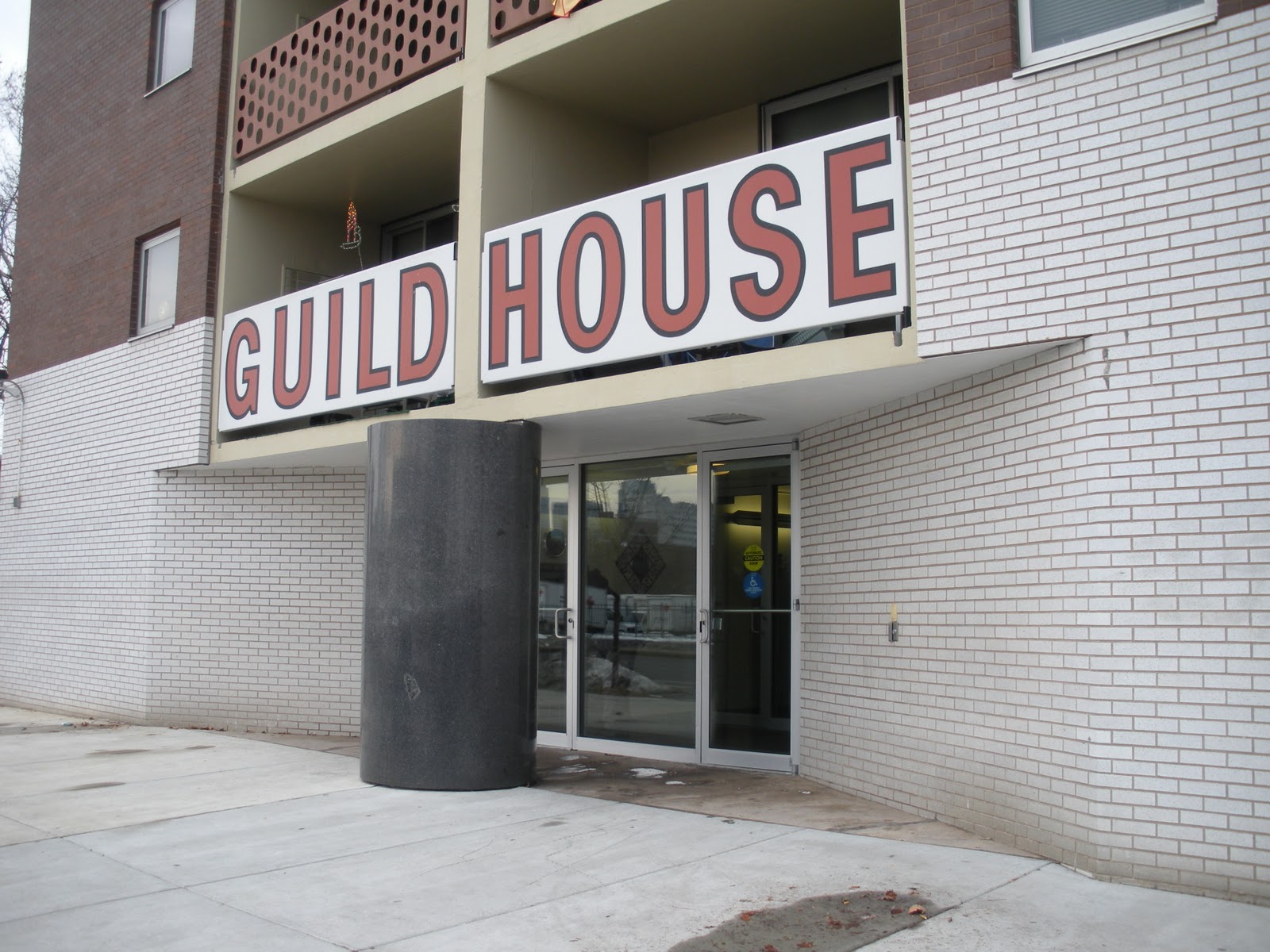
 Dominating the front façade is obviously the sign, announcing what this building is, like a giant Pop advertisement. While I was taking that first picture, Kathrin was talking to the receptionist, who said it's a historic landmark, which I was very happy to hear. Actually, the entire central section is a sign or, more properly speaking, a group of signs. But what I mean is how VSBA makes this a "decorated shed."
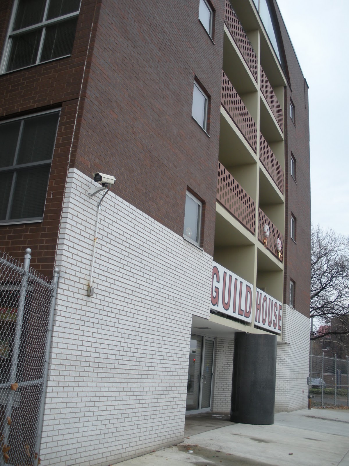
The white brick at the bottom is quite clearly only one brick deep and stops at the first corner instead of continuing around the building. So already you have the sensation that this wall has been slapped onto the front of the building.
This is then contrasted at the top, where a very thin stripe of white bricks, starting one brick behind the front wall, wraps around the sides of the building. Notice, too, that although the windows are a number of different shapes and sizes, every single one of them breaks the white stripe. In other words, that white stripe isn't located in between floors where it would remain unbroken, but is allowed the complexity (grin) of discontinuity. As for the many different types of windows, I have complained previously about the "too many windows" problem as you'd normally see it in McMansion architecture. What VSBA does, though, is use that variety with purpose, to give the building rhythm and intrigue.
There are also breaks in the masonry forming recessed lines that appear to demarcate the individual floors. This may be the case, but it also forces the impression that the windows are positioned right up at the ceiling on the interior, with no room for even a window frame. This happens again with the main window on the front, which I'll get to below.
Back to the front wall, at that first corner, you can see that the wall extends upward--needlessly--above the roof line. If all of the walls are higher than the actually roof plane to control the drainage of water or whatever, this one is clearly higher. It's thicker than a single brick deep, likely for structural reasons, but yet again, the planar quality of the wall is being emphasized. And if that weren't enough, slots have been cut out at the top corners, so that you can actually see the shallow depth of this wall, even from directly in front of the building.
The other great thing about this building, which my friend and I spoke about a little bit, is how beautifully awkward the whole thing is. I was really quite disturbed that the enormous television antenna is no longer there, smack in the middle of the top of the front façade. You can see a sort of pipe or something sticking up where it should be. Guild House was, and is, senior housing, now operated by Friends' Housing for the Elderly. The large room behind that arched window is the common area, lounge, recreation room, whatever they call it. What VSBA was saying, basically, is that all elderly people do is sit around and watch television all day long. The antenna was completely irreverent, very funny, and somewhat controversial, which is probably why it was taken down. Only a firm like this one would ever dare do something like that, and I think they proved their genius with that one very small gesture. For very similar reasons, they also composed the posts of the chain link fence in the front, which I wish I'd noticed at the time.
In my opinion, in the interests of preserving the architectural integrity, I think they should have DirecTV come in and install a big, fat satellite dish right on that spot. In fact, with recognizable hardware up there, they'd probably give Guild House free installation and satellite service indefinitely. "It would be so unattractive," my friend said. But that's exactly what VSBA was doing, taking something completely ordinary and using it as ornamentation, every bit as much as Andy Warhol was taking ordinary objects and images and making them "Art." Evidently VSBA came in and completely renovated Guild House in 2008. I'm very surprised they didn't try to do something about the missing antenna.
But the awkwardness remains with that window despite the removal of the antenna above it. The first thing to notice, and VSBA did this a lot, is that it slips right up under the top edge of the wall like the windows on the side wings. It's way too close for comfort to the top of the building. This makes the slots on either side even more brilliant, because it totally contradicts them (grin). Obviously it's not open behind the full width of this wall, you can see right into that window that there's an interior space there. In a sense, the building is "lying" to you, something I discussed earlier about the brilliance of VSBA. The slots are telling you there's nothing behind the top few feet of that wall, the window is telling you the opposite.
Structurally speaking, this gets even more interesting. The arch, historically, is a structural form. That was its principal function. But although it's in the shape of an arch, this window opening is quite clearly not even supporting itself, because there's a pillar right in the center of it (obscured by the window dressings). Then, because the window is so large, you can see into it and see the three support columns in the space behind it, extending up from the balcony framing. The load being carried out to the ends of the arch is also obviously being supported in some other way, because directly underneath the arch, on the floors below, is a window bay. The whole structural purpose of the arch is completely canceled out.
The main entrance is equally as awkward, for sort of opposite reasons.
There didn't really need to be a column there, we've all seen much larger cantilevers than that tiny little balcony. But okay, there's a column. So you have the central spine and the first floor balcony hanging out over the entrance. To increase the impact of this, the group of balconies all the way to the top is framed by a big sectioned box, in different colors and materials, to give it added visual weight. Possibly the column is truly supporting all of that above it. But the column is gigantic, far, far bigger than it would ever need to be to hold up the front of the building, and it appears to be a solid block of granite. Clearly the doors are positioned on either side of it, but still, you can't just walk straight into the building. Instead you have to walk around that column. You have to physically engage with the architecture of the building in order to enter it.
And there's more. The column is lying, also, and it's quite obvious about it. The front half of the granite cylinder is sticking out from the front wall plane. That half of the column therefore can't possibly be serving any structural function. If that weren't clear enough, in another delightful little detail, the top of the column is stepped up at the back where the balcony rests on it, further emphasizing its being divided in two halves. In one perfect, cylindrical shape, the column has two distinctly different natures. In a sense, I think this might be quite a bit less transcendent had the column been fluted. Fluting would have been visually distracting from the purity of this. At the back--if it is, in fact, supporting anything, and that's debatable--it is what a column is supposed to be, structural support. At the front, it's a sculpture of a column. It's merely the architectural symbol, "column," divorced from function, what I elsewhere called an "architeme." It accomplishes exactly the same thing as the arched window; it makes architecture into a visual language.
Behind the column, the slanting white brick walls are in complete contradiction with the outer edges of the front façade. At the edges, as pointed out above, the white brick reads as a single flat plane, whereas the angled walls leading to the doors make the center of the building read as three-dimensional volumes. These slanted walls also cut out under the ends of the balconies on either side, providing no support at all, despite the fact that the columns visible inside the window at the top are significant precisely because they appear to be adding the needed support that the arch has been rendered unable to provide.
If I weren't already a huge fan of VSBA and absolutely certain of their genius in so many ways, I definitely would be after seeing this building with my own eyes. The singular focus of their vision and the way that very similar and primary contradictions are expressed in such a wide variety of different architectural statements reminds me of what I was able to say about Hans Hofmann and Barnett Newman. I think it's entirely worth noting that this building is more or less concurrent with some of the best work by those two painters. If a little later, then at least we must allow for the fact that a building is a much bigger commitment than a painting.
More from Philadelphia to come.
All text and images ©2011, Ryan Witte
Dear Radical Muslim Suicide Bomber,
I realize your faith is the most important thing in your life. There's no reason to even discuss that. I also realize you may feel frustrated, ignored, helpless, poverty stricken, and any number of different things. But I'd like to ask you to look at this:
 As you probably know, that's the Wazir Khan Mosque in Lahore, Pakistan. Please click on that picture, and look at it. I mean really look at it. Look at it like you've never seen it before. Look at it like you've never seen anything like it before. Look at what your people accomplished. It is absolutely breathtaking. This building was built in 1634. Sixteen Thirty-Four.
Just so you can understand where I'm going with this, I propose a little game. Go to Google Maps and look at my home, New York City. Choose any point at random on the island of Manhattan and start looking up and down streets. I'll give you an entire hour to find any building built more than 250 years ago.
I could probably do it, because I know the history of the city, so I'd know where to start searching. But I'm assuming you live in another country. If you can find one by searching at random that way, I'll give you a million dollars. One of the things I love about New York is that we do have more gorgeous historical buildings than many other parts of this republic, in addition to our futuristic structures, but they are few and far between, and you have to know where they are. They probably pale in comparison to someplace like Boston or even Philadelphia.
And don't get me wrong, I love the Modernity of my city. The gravity-defying domes and soaring minarets of your mosques, the sun-bathed reach for the heavens of Europe's medieval cathedrals, as much as the sky-scraping steel and glass monoliths of America's newer cities, these all attest to the wondrous glory of the human spirit. They show what beauty and majesty is possible in the world when mere mortal human beings care to dream and push the boundaries of engineering and construction and artistry.
We all have our differences. There are parts of my country I could go where my political ideology, social attitudes, or spiritual philosophies would meet hostile, even violent opposition. But maybe there's something more important than all of that. It's this:
 That's the Shrine of Hazrat Ali (the Blue Mosque) in Mazari Sharif, Afghanistan. This one was built in 1521.
Fifteen-hundred and twenty-one.
I'm only using these as mere examples: I mean whatever mosque you might see down your street. Your part of the world is filled with architecture of this age and caliber from one corner to the next.
I realize you may look at this and feel that it represents ideas in Islam that you find particularly offensive, even disgusting. It may make you terribly angry. This may seem so important that you MUST do something to stop it, even at the expense of your own life. You may feel that people practicing their faith in such a way MUST realize the errors of their ways, and you are the person to show them, with a bomb strapped to your chest. My interest is in aesthetics and culture and history, but the loss of human life will always be the greatest tragedy. I personally feel that killing is always wrong, period, regardless of what my government and its military are doing, but that's not a discussion for here.
But what I'd like to ask is that for just one moment, you stop...and look. Look at it. Look at how beautiful and majestic and important that structure is. How truly valuable is the age and longevity of its majesty in this fleeting, ever-challenging, alienating twenty-first century. Look at the exquisite, elaborate patterns of its ornament and consider how one of your ancestors had to be a genius in geometry to even conceive such grace. Consider the millennia of ceramacists perfecting the art of tile-making to produce glazing of an intricacy and vibrance the world had never seen. Notice a sense of proportion, elegance, and symmetry clearly inspired by Allah, Himself, and in glory to Him, every bit as much as Beethoven was inspired by God.
Instead of anger and fear and hate, there's a much more positive emotion you might feel: Pride (don't ask the Catholics). I implore you to just stop and think to yourself, "this is what my people contributed to the world. This is what the culture of which I have the honor to be a part was capable of producing." Maybe for just one moment, think not of the differences in cultures and beliefs, but what fantastic and impressive beauty your great ancient culture has been able to give all of the world, and don't destroy it. Please, don't destroy it. If I were to be able to look at, for instance, the Blue Mosque, and think "my people did this," I might weep with joy and pride.
Your ancestors gave you the greatest gift. Please don't take that for granted.
Yours Sincerely,
Ryan Witte

 Dominating the front façade is obviously the sign, announcing what this building is, like a giant Pop advertisement. While I was taking that first picture, Kathrin was talking to the receptionist, who said it's a historic landmark, which I was very happy to hear. Actually, the entire central section is a sign or, more properly speaking, a group of signs. But what I mean is how VSBA makes this a "decorated shed."