Showing posts with label Robert Venturi. Show all posts

Monday, January 3, 2011

Contrary Wise

Happy New Year everyone! To ring in 2011, I'm going to discuss something outside of New York. I didn't end up spending New Year's here, but instead I went down to Philadelphia to hang out with my good friend, Kathrin. On the train I realized I was headed in the right direction. The trains headed toward New York at 5PM on New Year's Eve have to be the most irritating experience on the planet, I'm guessing. A tin can stuffed with loud, drunken fools running up and down the aisles, shouting and barfing everywhere. No, thanks! The train I was on was practically empty and quite pleasant.

New Year's Day we went on a little adventure to see some buildings. I'm very grateful since Kathrin's main area of interest isn't architecture, but we were able to find things that we were each interested in seeing for different reasons. I'll have to say that I was quite impressed by Philadelphia's twentieth-century architecture. On my previous trip, I ended up seeing a lot of the older historic buildings, which of course are wonderful. But this time, hanging out with someone who's lived there, I saw a lot of things I probably wouldn't have as a tourist.

Perhaps I'll discuss the other things we saw a in a separate post. This post I'd like to dedicate to one of the most important buildings in Philadelphia, arguably one of the greatest works of Postmodernism on the entire east coast, and probably the most important thing built in Philly by Venturi, Scott, Brown & Associates (VSBA). It's Guild House.


There are a number of different years of completion to be found, but VSBA says 1966, and they ought to know. I told my friend she was probably going to laugh when she saw it and think to herself, "THIS is the building you wanted to see???" At first glance, it looks extremely ordinary. At second glance, it looks downright mediocre. And of course, that was the whole point. There's so much more to this building than I realized before seeing it in person.
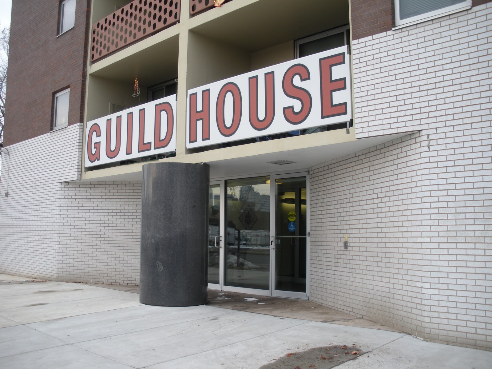
Dominating the front façade is obviously the sign, announcing what this building is, like a giant Pop advertisement. While I was taking that first picture, Kathrin was talking to the receptionist, who said it's a historic landmark, which I was very happy to hear. Actually, the entire central section is a sign or, more properly speaking, a group of signs. But what I mean is how VSBA makes this a "decorated shed."

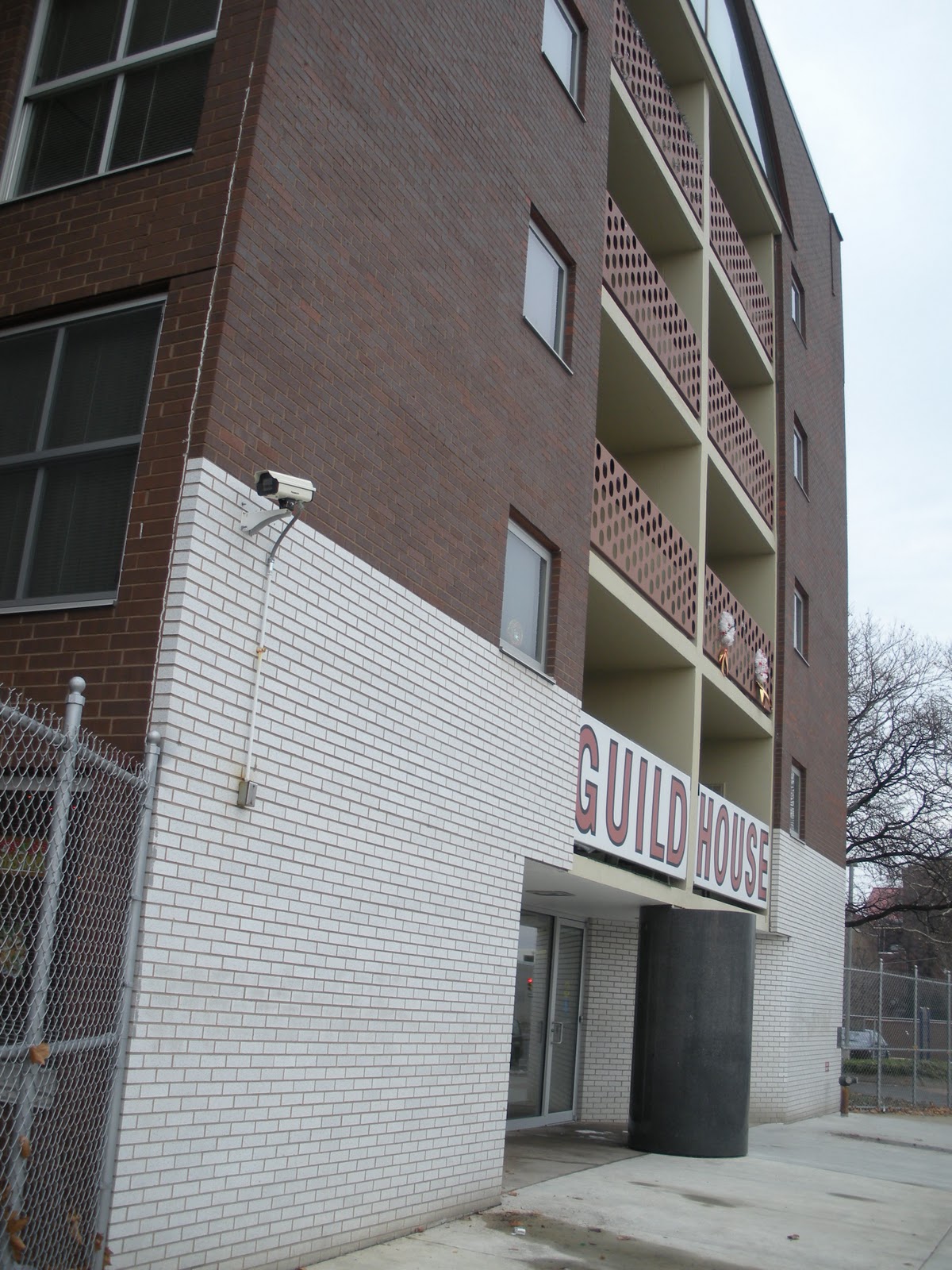
The white brick at the bottom is quite clearly only one brick deep and stops at the first corner instead of continuing around the building. So already you have the sensation that this wall has been slapped onto the front of the building.

This is then contrasted at the top, where a very thin stripe of white bricks, starting one brick behind the front wall, wraps around the sides of the building. Notice, too, that although the windows are a number of different shapes and sizes, every single one of them breaks the white stripe. In other words, that white stripe isn't located in between floors where it would remain unbroken, but is allowed the complexity (grin) of discontinuity. As for the many different types of windows, I have complained previously about the "too many windows" problem as you'd normally see it in McMansion architecture. What VSBA does, though, is use that variety with purpose, to give the building rhythm and intrigue.

There are also breaks in the masonry forming recessed lines that appear to demarcate the individual floors. This may be the case, but it also forces the impression that the windows are positioned right up at the ceiling on the interior, with no room for even a window frame. This happens again with the main window on the front, which I'll get to below.

Back to the front wall, at that first corner, you can see that the wall extends upward--needlessly--above the roof line. If all of the walls are higher than the actually roof plane to control the drainage of water or whatever, this one is clearly higher. It's thicker than a single brick deep, likely for structural reasons, but yet again, the planar quality of the wall is being emphasized. And if that weren't enough, slots have been cut out at the top corners, so that you can actually see the shallow depth of this wall, even from directly in front of the building.

The other great thing about this building, which my friend and I spoke about a little bit, is how beautifully awkward the whole thing is. I was really quite disturbed that the enormous television antenna is no longer there, smack in the middle of the top of the front façade. You can see a sort of pipe or something sticking up where it should be. Guild House was, and is, senior housing, now operated by Friends' Housing for the Elderly. The large room behind that arched window is the common area, lounge, recreation room, whatever they call it. What VSBA was saying, basically, is that all elderly people do is sit around and watch television all day long. The antenna was completely irreverent, very funny, and somewhat controversial, which is probably why it was taken down. Only a firm like this one would ever dare do something like that, and I think they proved their genius with that one very small gesture. For very similar reasons, they also composed the posts of the chain link fence in the front, which I wish I'd noticed at the time.

In my opinion, in the interests of preserving the architectural integrity, I think they should have DirecTV come in and install a big, fat satellite dish right on that spot. In fact, with recognizable hardware up there, they'd probably give Guild House free installation and satellite service indefinitely. "It would be so unattractive," my friend said. But that's exactly what VSBA was doing, taking something completely ordinary and using it as ornamentation, every bit as much as Andy Warhol was taking ordinary objects and images and making them "Art." Evidently VSBA came in and completely renovated Guild House in 2008. I'm very surprised they didn't try to do something about the missing antenna.

But the awkwardness remains with that window despite the removal of the antenna above it. The first thing to notice, and VSBA did this a lot, is that it slips right up under the top edge of the wall like the windows on the side wings. It's way too close for comfort to the top of the building. This makes the slots on either side even more brilliant, because it totally contradicts them (grin). Obviously it's not open behind the full width of this wall, you can see right into that window that there's an interior space there. In a sense, the building is "lying" to you, something I discussed earlier about the brilliance of VSBA. The slots are telling you there's nothing behind the top few feet of that wall, the window is telling you the opposite.

Structurally speaking, this gets even more interesting. The arch, historically, is a structural form. That was its principal function. But although it's in the shape of an arch, this window opening is quite clearly not even supporting itself, because there's a pillar right in the center of it (obscured by the window dressings). Then, because the window is so large, you can see into it and see the three support columns in the space behind it, extending up from the balcony framing. The load being carried out to the ends of the arch is also obviously being supported in some other way, because directly underneath the arch, on the floors below, is a window bay. The whole structural purpose of the arch is completely canceled out.

The main entrance is equally as awkward, for sort of opposite reasons.


There didn't really need to be a column there, we've all seen much larger cantilevers than that tiny little balcony. But okay, there's a column. So you have the central spine and the first floor balcony hanging out over the entrance. To increase the impact of this, the group of balconies all the way to the top is framed by a big sectioned box, in different colors and materials, to give it added visual weight. Possibly the column is truly supporting all of that above it. But the column is gigantic, far, far bigger than it would ever need to be to hold up the front of the building, and it appears to be a solid block of granite. Clearly the doors are positioned on either side of it, but still, you can't just walk straight into the building. Instead you have to walk around that column. You have to physically engage with the architecture of the building in order to enter it.

And there's more. The column is lying, also, and it's quite obvious about it. The front half of the granite cylinder is sticking out from the front wall plane. That half of the column therefore can't possibly be serving any structural function. If that weren't clear enough, in another delightful little detail, the top of the column is stepped up at the back where the balcony rests on it, further emphasizing its being divided in two halves. In one perfect, cylindrical shape, the column has two distinctly different natures. In a sense, I think this might be quite a bit less transcendent had the column been fluted. Fluting would have been visually distracting from the purity of this. At the back--if it is, in fact, supporting anything, and that's debatable--it is what a column is supposed to be, structural support. At the front, it's a sculpture of a column. It's merely the architectural symbol, "column," divorced from function, what I elsewhere called an "architeme." It accomplishes exactly the same thing as the arched window; it makes architecture into a visual language.

Behind the column, the slanting white brick walls are in complete contradiction with the outer edges of the front façade. At the edges, as pointed out above, the white brick reads as a single flat plane, whereas the angled walls leading to the doors make the center of the building read as three-dimensional volumes. These slanted walls also cut out under the ends of the balconies on either side, providing no support at all, despite the fact that the columns visible inside the window at the top are significant precisely because they appear to be adding the needed support that the arch has been rendered unable to provide.


If I weren't already a huge fan of VSBA and absolutely certain of their genius in so many ways, I definitely would be after seeing this building with my own eyes. The singular focus of their vision and the way that very similar and primary contradictions are expressed in such a wide variety of different architectural statements reminds me of what I was able to say about Hans Hofmann and Barnett Newman. I think it's entirely worth noting that this building is more or less concurrent with some of the best work by those two painters. If a little later, then at least we must allow for the fact that a building is a much bigger commitment than a painting.


More from Philadelphia to come.

All text and images ©2011, Ryan Witte

Thursday, October 28, 2010

Having a Pepsi Day--Part 3 (Architecture)

To wrap up, here is the building, itself, which I think is remarkable. I honestly have no idea why Ada Louise Huxtable hates Stone so much. Clearly, she found the majority of Postmodernism to be frivolous hackery. She makes great arguments in support of that. I find it very strange, also, that she seemed to like the General Motors Building (1968) so much.

It is a beautiful building, to be sure, but I think it was one of the less interesting things that Stone did. And that was at the beginning. She evidently changed her mind after it was finished.

In my estimation, Edward Durell Stone really was one of the first to bring ornament back into architecture after the Modernists rejected it so completely. But he reinterpreted the concept of ornamenting architecture in a truly post-Modernist way (and I mean that to read "with Modernism behind us" not in the sense of the Postmodern movement, although he was doing that, also). It wasn't as if he hadn't fully obeyed Loos' Law and embraced the International Style, either, quite the contrary. Had his use of ornament been consistent from the '20s through the '40s, it would just feel cheap.

His ornament was in a very Modernist idiom, if there can be such a thing, rather than being a new embrace of historical forms. And his very contemporary use of ornament was also fully incorporated into the architecture. It was, in other words, a very architectural kind of ornamentation. It wasn't just some bit of sculptural decoration slapped onto the side of an otherwise conventionally Modernist structure.

I don't mean to imply any derision toward Robert Venturi. True, Venturi was slapping (often two-dimensional) ornament onto numbingly bland structures (what was so genius about it). But that was the whole point. Venturi was after something else entirely. His use of ornament was much more Pop. It was advertising, and in a very broad sense; the number nine on the Lieb House "advertises" its street address. It turned architecture into a consumer product just like any on a supermarket shelf. In a non-commercial sense, his ornamentation was similarly about "announcement," in the way that a pediment can "announce" the main entrance to a building and distinguish it from other doorways. Venturi's approach was therefore more of a linguistic one, while Stone was using ornament to emphasize and accent his overall geometric vision.

Coincidentally, Stone also designed a nice little Gulf gas station at JFK Airport, but it's no longer there and was impossible for me to find in a photograph. He also designed what was once a Bloomingdale's and is now a Sears not much more than about 500 yards from my mother's house on Long Island. If I'm out there on a nice day, I may walk around and get some pictures of it. I have a vague recollection of knowing it was by Stone, but it's so similar to PepsiCo that the last time I was out there, I was immediately reminded that it was his work.

Google Maps view.
I've seen the PepsiCo building described as a seven-building complex. This does explain the structure, but it's inaccurate. It's clearly all one building.
I've already talked about the rigorous, orderly entrance court, but its formal impact really cannot be overstated.

Obviously, the office floors increase in size from the ground floor to the top. This accomplishes two things. First of all, because the building is so large, the added floorspace really adds up. They therefore got a great deal more square footage for a relatively small footprint. Secondly, it gives the building a decidedly imposing stance. It always seems to be looming over you. On a building even a couple of stories taller, the device might be incredibly oppressive. It works so wonderfully because the building is rather short.
Here's what I mean about the ornament accentuating the overall architectural vision. At the junctions of each wing, as seen in some of the previous photos, there's a pattern of stepped recesses. This is exceptionally brilliant. It's actually the antithesis of conventional ornament because it's subtractive rather than additive. More than that, it echos the design of the entire structure. He didn't attach stepped pyramids to the wall face, but reversed it, exactly what he did with the building.

The pattern on the friezes similarly employs a motif of overlapping stacked blocks twisting in and around one another. This especially calls to mind his treatment of the southeastern end.


It's impressive how adeptly Stone is able to change the tone on the southeastern end. Here he staggers the extensions of the building so it feels almost casual, far less imposing.


He also projects the back end of the building out to greet the phenomenal landscape, as if to say "yes, my building is monumental, but the natural setting is glorious, as well." But it would seem important to create a more open, welcoming mood where employees would gather on the terrace to have lunch.


As you walk around, the stacked balconies shift in and out creating different textures and relationships, as if in motion.


And then, most shockingly there is this one single vantage that congeals back into rigid formality again.
In a sense, it achieves the exact same thing as the landscaping does when it takes you from a wild, natural chaos and plunges you into strict, sharp geometry. It was here that a groundskeeper passed behind me, so I asked him if I was correct in assuming that those balconies are for the presidents and CEOs. He confirmed that they are. I said "they must be really fancy, huh?" He said he's been in those offices a couple of times and a few of them even have fireplaces. "I thought you'd like that," he said. He was right.

The other thing that changes briefly here is the quality of the glass. Around the entire structure, the overhangs bathe the tinted glass windows in shadow, creating stark stripes of black and white. The windows are entirely visually impervious. Since the glass of the cafeteria is allowed to drop lower, and the cafeteria interior was kept bright white, the windows become a bit more transparent and open up a bit, amplifying the welcoming vibe.


He drops the rigor in only three places, really. Here at the back is one. Another is right underneath the Miró sculpture. It's purposely concealed from view by the landscaping, so I couldn't see much, but it appears to be mechanical functions, likely HVAC, and/or a service entrance. The third is at the northeast corner, underneath the Kenneth Snelson sculpture, where there's an entrance to the employees' gymnasium from a remarkably intimate sunken court.


So there's PepsiCo. If this series didn't make it perfectly clear, I'll say one last time, everyone should go and see it in person. It was one of the most amazing places I've ever been. Hope you enjoyed the trip.

All text and images ©2010, Ryan Witte, except where noted.

Tuesday, March 31, 2009

The Odyssey--Part 4

The way I'd originally planned it, I'd still have been traveling out to Long Island during rush hour--the wrong direction, but there'd still have been trains. By the time I got to Woodside, there was not another train on the line I needed for another forty minutes. When I got that news, a clock started ticking loudly in my head. I went to get a bagel and coffee from the Dunkin Donuts across the street. When I did board the train, you could almost hear the William Tell Overture in the background.

I jumped in the car, and risked the opportunity to use the powder room at my mother's house--I figured if I were going to miss the house arriving, that two minutes wasn't going to make any difference. I got on the road. I made an anxiety-producing wrong turn at a tiny little road that had no sign and looked like a driveway, had to double back, but otherwise I didn't have too much difficulty. Having memorized the route on Google Maps was extremely helpful because it wasn't too long before I just knew I was going the wrong way.

The property is on a small island on the North Shore that was once owned entirely by J. P. Morgan and was therefore named Morgan Island. The property is absolutely insane. It's its own shark-fin shaped peninsula jutting out into the Long Island Sound with 270° views. Check out the satellite image from Google:
Completely out of control.
When I drove up it was immediately clear that I hadn't missed it, and I heaved a sigh of relief. I introduced myself to Andrew Sarnoff and his friend, both of whom were very nice and welcoming. Here's the VSBA house that had always been on the site, simply called the House in Glen Cove (1985):


And the little matching pool house:

Andrew had told me that Robert Venturi was there, as well as a lot of other people, gathered in the tent off to the side which was, gratefully, heated. First, though, I recognized Fred Adelson (he doesn't look like a Magritte painting in person). He'd been introduced at the Storefront event as the historian who really took notice of Lieb House and wrote a good deal about it while it was still "under the radar," as well as a number of VSBA's other buildings around New Jersey, where he lives and teaches. Adelson was a particularly nice, interesting guy, and he and I chatted on and off for much of the day.

Then around came the man himself, Robert Venturi. I grabbed the opportunity to introduce myself, shake his hand, and tell him what a profound influence his work has had on me. He asked if I were an architect, and when I told him no, that I'm a writer, he seemed to immediately lose any and all interest in talking to me. Oddly enough, I've gotten that reaction from artists before, but not architects, who are often impressed that I actually know what I'm talking about. Anyway, it was not a big deal and I'm sure he had far more important things on his mind. I'm also sure at that point he was sick to death of all the reporters harassing him nonstop.

It was around this time that the barge first appeared on the horizon off to the west:
Click that.
This ended up taking a remarkably long time, because they had to bring it around to the eastern side of the peninsula where the house would end up on the site. 

Jim Venturi, I think I mentioned before, is making a documentary about his parents. His timing couldn't have been any better, and no doubt this whole event will be in the film. You can look for me when it comes out; I must have stumbled in front of his cameras at some point. The crew had these miniature remote-controlled electric helicopters specially designed to hold cameras and fly around for about twenty minutes on their battery power.
They're totally silent, so I didn't even hear them take off or land, but you can see one of them in the sky in one of the later photos. I was impressed by how rock steady it was in the air; it appeared to just hover without moving an inch. I was talking to the guy about them for a while, I think he said he's from one of the Carolinas. He makes the helicopters totally from scratch by hand and tunes them to have practically no vibrations or shimmy. He was telling me that HD video is relatively unforgiving of vibration making most miniatures unusable. I suspect he's one of the only people in the country building things like this, a good position to be in. They have their limits, and it complicated things that it was somewhat windy, but for a small documentary film, they're considerably less expensive than renting a full size helicopter. 
The new site:
The suspense built for a while, but the house's arrival almost took a little too long to sustain it. I'd like to go through some of the nuts and bolts of how they did this, because I found it really fascinating. It had to be done at high tide, which gave them maybe a four hour window, but the water level was still quite a bit lower than the land. You can see it's not beach, either, but a small rocky cliff maybe ten to twelve feet high. They had sort of a scout boat that came in first to set things up.
Here's Deborah Sarnoff (in the earmuffs) talking to Venturi as the house approached:
You can see the miniature helicopter in this one:

They had to secure the barge far better than any anchor could do, so they had steel cables attached to the two front corners of it. On land, the cables were hooked onto two of their front-end loaders, which backed up pulling the cables taught with the barge pulled up against the rocks.

It was around this time that I started to realize that, as I said before, this was one of the most incredible things I have ever witnessed in my lifetime. It's really something to see a house being moved (which I have). It's another thing altogether to see a house being moved on a barge over large bodies of water. That would have been an experience, anyway, even if this hadn't been a terribly important structure designed by one of the most important American architects of the twentieth century. This was all three. I can't even tell you how grateful I was to have been there to see it.

It was also around this time that Fred Adelson pointed out Inga Saffron to me--I don't think I'd have recognized her otherwise. I went to say hello. It was very nice meeting her, since I'd emailed back and forth with her a few times about the Lieb House and other things. I told her how talented I think she is as a writer, and that's true: I highly recommend her column in the Philadelphia Inquirer. She just has a very smooth, eloquent way of putting sentences together and has a ton of intelligent things to say about the architecture of that city.

To get the house up onto land from the barge, they pulled these four steel girders out and lined them up with the wheels.

Then at the top, they dumped a bunch of dirt, patted it down, and laid these big sheets of what appeared to be industrial-strength plastic tread.

By "they" of course I mean Wolfe House & Building Movers (they've obviously gotten extremely popular: at the time of this post their website has exceeded its bandwidth). When I saw a couple of their wives and daughters on my way in, I thought maybe Hasidic Jews, but Adelson suggested they're Mennonites, which seemed more accurate. So you can see they all have wide-brimmed hats and/or big old ZZ Top beards. Someone, Adelson probably, I can't remember who, mused that since Jim Venturi was filming it all for the documentary, they chose house movers with a lot of character.

Then it rolled up the girders, apparently powered by a motor on the house platform, rather than being pulled by winch or something similar. 
It was completely steady, so I'm sure no one was all that nervous. But there was this one tense point where it was out over the water. 
One little wrong move and it would have fallen crashing onto the rocky shore, impossible to save. I also can't help but wonder how a house can withstand these changes of orientation without at least a window pane cracking or other minor damage. At long last the Lieb House rolled out onto solid ground, they gave the horn four or five long celebratory blasts, and the crowd cheered.
Here's Venturi watching as it rolled out, surrounded by TV reporters:
Robert Gotkin and Deborah Sarnoff being interviewed:
I went up to her later, after the furor had died down. I thanked her for saving this house, which she seemed to appreciate. I asked her how much it'd cost to do this. She said they bought the house for $1, no doubt just to have a dollar amount on paper, and the move had cost $100,000. It was actually a lot less than I was expecting after seeing everything they went through. Furthermore, building a new guest house on their property would probably have cost four times that much if it cost a dime.

Venturi had said something at the Storefront talk about how they don't like to invest too much of their own personality into their projects. I understood that to mean that it's the nature of the individual client that should be realized in the architecture, not their own. But along those lines I wondered how emotionally invested he got, and asked him if he was relieved that somebody had wanted to save this house. "And how, yes" he said. I walked around a little bit more, said my goodbyes, and left. I had just enough time for a quick bite of sushi before I had to return to Manhattan for an appointment. The day really couldn't have worked out any more perfectly, and I'll not soon forget it. 


If there ever is a Part 5, it won't be until late in the summer. If they're kind enough to let me stop by to take some photos, I'd like to go to see it on a nice summer day after it's sited and the landscaping has all grown back in. Until then, I hope you've enjoyed the tale.

©2009, Ryan Witte

Saturday, March 21, 2009

The Odyssey--Part 3

The morning of Friday the 13th, I woke up before the sun probably around 6AM. I knew the house was scheduled to pass by South Street Seaport sometime around 7:45. As soon as I heard that the house would be sailing up the East River, I knew exactly where I wanted to be to see it, and it wasn't there. I still don't know what kind of opportunity I missed by not going down there. I assume there were a number of architects gathered, including people I'd have loved to have met. It was a tough decision whether or not to go, but there were a number of reasons for me not to. 

Instead, I went over to Gantry State Park in Long Island City. One of the more pressing reasons was that, as soon as it had passed and was out of sight, I planned to immediately jump onto the Long Island Railroad and attempt to beat it out to Glen Cove, a race I wasn't sure I would win as it was. I arrived there around 7:30, not expecting the house to pass me until around 8:00 or 8:15, but there was no way I was going to risk missing it.

Though it wasn't the main Seaport event planned, with an appearance by Venturi himself, I still expected to find at least a small group of architecture buffs and curiosity seekers gathered at Gantry Park. There was no one. Every half hour or so, someone would circle behind me on their morning jog or walking their dog. 

On the pier just south of me was a pervert with an enormous telescope trained on the apartment buildings across the river. I was too far away to see if he had a camera attached to it. But if you live in one of those buildings with a view of Long Island City out your window and feel perfectly safe walking around naked in front of them, it's very possible you're now on some kind of High Society Candid Porn site. I'll give him this much, for a pervert, he certainly was dedicated. The telescope couldn't have been cheap, it was ridiculously cold, disturbingly early in the morning (he was there when I arrived), and he was there for at least an hour.

After all I went through, I was going to be extremely pissed off if some creepy peeping tom got photos of the Lieb House from there. He left some time before it passed, though. I was talking to a nice woman with her dog when it came by, but otherwise, the photos in this post are the only ones in existence from this particular location, the only ones that will ever exist.

I had on the warmest sweater I own and a thermal shirt underneath, another shirt over that, my leather pants, which allow through practically no cold air, and a bulky winter coat. I was still so freaking cold I had to keep dancing around to my iPod, running around the pier, and jogging in place to not go into hypothermia. It was awful. It was cold anyway, but also at that time of day--the coldest time of day--and the very last place you'd ever want to be on a bitter cold winter day? Right. On a pier sticking out into the East River.

On top of that, the house was late. I stood there waiting for it for nearly two hours freezing my buttocks off. I got there before the sun had officially come up over Queens from behind me, but at a certain point, I couldn't have been any happier about the location I'd chosen. Check this out:
Click images for larger views.
--All photos posted here ©2009, Ryan Witte.
Suddenly the whole skyline was bathed in the most heavenly, golden early-morning sunlight. If the house had appeared right at that moment, I'd have peed my pants. Instead I stood around for another hour waiting. Nonetheless, the light was still far better for me than it would have been from the Manhattan side where it'd have been glaring right into my face.

It got so late, in fact, that I had to call my mother--who had kindly consented to let me borrow her car--or she'd have gone to pick me up at the train station by her house only to find me nowhere in sight. I began to actually fear that the barge had been surprisingly early and had passed by before I even arrived at the park. There was really no one I could call to find out if that'd been the case, and I feared that while I waited there having already missed it, it was getting closer and closer to Glen Cove, and I'd miss it landing there, also. Big trouble.

At long last, the little house did appear making its way up the river. Here it is against Davis, Brody & Associates' wonderfully Brutalist Waterside Plaza (1974):

Davis and Brody's later partner, the immensely influential African-American architect Max Bond, just passed away only a couple of weeks ago. May he rest in peace.

But this is the real reason I chose this location, with the Empire State Building (Shreve, Lamb & Harmon, 1931) and the United Nations:

The Empire State, another incredibly Herculean task nonetheless completed during an economic disaster. These are immediately before and immediately after the photo I put into my introductory post:

But really, what could be a more beautifully poetic visual description of how important an event this was? Two absolutely epic architectural tales, one resulting in one of the grandest International Style Modernist monuments in the world by arguably the movement's biggest star, Le Corbusier (et al); the other, a tiny little house all but completely dwarfed on the river. But the reason this image is possible at all is that--despite its diminutive size--the Lieb House was on this journey so that a monument to the birth of Postmodern Architecture could be saved and was. David, meet Goliath.

And then it was gone, heading for the dangerous waters of Hell Gate. Here with Hugh Stubbins' Citicorp Center (1978):

It was 9:30 at the earliest, and I didn't know how quickly I could get to Glen Cove, or how quickly a house on a barge could get there, so I made a brisk pace to the train station. This chapter of the tale next time. Stay tuned for Part 4.

©2009, Ryan Witte