Saturday, September 25, 2010

Having a Pepsi Day--Part 1 (Landscape)

My most recent trip was to go see Edward Durell Stone's PepsiCo headquarters in Purchase, New York.
--All photos ©2010, Ryan Witte, unless noted.
It's actually immediately across the road from SUNY Purchase, so I'm kind of pleased I didn't go on a weekend during the school year when the place is likely swarming with obnoxious college students. In a way, it seems sort of silly to travel so far to look at some architecture, since there are so very many incredible buildings I could discuss just on the island of Manhattan. I justify in two ways. First of all, anything an hour away or less (and arguably further) is still easily the "New York Metropolitan Area."

In fact, the megalopolis theory of the northeast calls from the northern edge of Boston down to the southern tip of D.C. one enormous city. That is to say, if you were to drive from the northern end to the southern, you could quite literally never encounter any area more rural than a "suburb," which still has an "urb" in it.

Secondly, although a bit hot, the weather was glorious. I even got a tiny little bit of sunburn on my big, powerful, muscular shoulders. These are not the kind of excursions I'm going to want to make when the temperature is below zero and it's threatening to blizzard. So I can use the colder months to explore the sites that are closer and easier to visit.

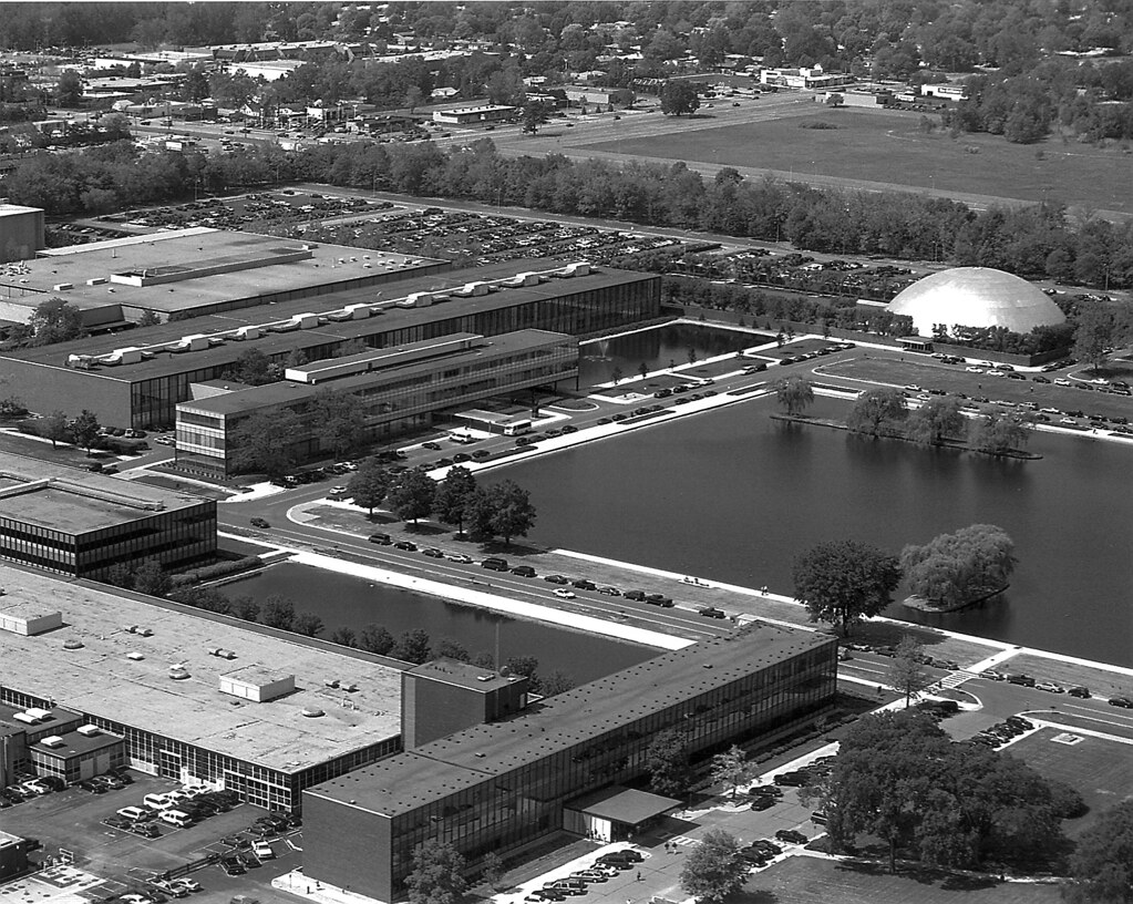
As many of you know, Pepsi's move to the suburbs was part of the great corporate exodus at the end of the 1960s. General Foods and General Motors had already created suburban campuses. IBM, American Can, Bell Telephone, they were all looking to escape the cities. It was a bit unexpected in the case of PepsiCo, because they had only just finished their New York headquarters. The Purchase compound opened in 1970.


I found it kind of amusing that in the vicinity of the headquarters, there are Pepsi signs and Pepsi vending machines and people selling Pepsi everywhere they could possibly do it.

Wait a minute. I didn't even look at that when I was taking the picture. $3.75 for a twelve-ounce can of Pepsi??? That better be the best damn soda I've ever tasted in my life.


Ironically, I don't drink soda at all. About two or three times a year, I'll have a can of Coke just for the fun of it, but other than that, I don't do junk food. I wasn't raised on it as a kid, and as an adult, I just don't ever crave it, thankfully. I don't even particularly care for the taste of Pepsi, to be honest. And Mountain Dew (distributed by PepsiCo) is just disgusting. Whoever came up with that recipe must have been on drugs. I also don't think the dew on a mountain really tastes like that.

It's also interesting that I'm so addicted to Mad Men at the moment. I arrived a little late to the party because I don't have cable and watch everything online, but I watch another episode almost every evening and can't stop. [As of now, I'm all caught up.] The corporate suburban exodus rides right on the tails of the big business atmosphere depicted so lovingly by
Mad Men. It definitely helped me to put this into its proper context.

Of course, I went primarily to see the architecture, because I'm a huge fan of Stone's work. I was also aware before making the trip that the grounds were beautiful and included an impressive collection of sculpture. What I discovered by being there in person completely transcended a mere collection of nice works of art and design. Instead, PepsiCo is three art forms--Landscape, Sculpture, and Architecture--seamlessly locked together in an endless dialogue of fascinating and perspicuous interrelationships. I've therefore decided to divide this story into those three discrete components, and look at how each responds to and interacts with the other two.

Google Maps view.
The landscaping was by Stone's son, Edward Durell Stone, Jr..

It shouldn't come as much surprise that the landscaping is so perfectly matched with the architecture. Stone's own son not only most likely had a better knowledge of his father's work than anyone, but also just an intuitive understanding of what he's was trying to accomplish stylistically. Ed, Jr. passed away two years ago, but his firm still remains in business.

I'm sure it was incredible when it was first finished, but now that all the trees and plantings have had time to grow in and mature, it's like the Garden of Eden with so many wonderful moments of discovery. I'd come in through the front, but there on the right you can see the first view I had of the building after parking the car.

Then I walked around to the main entrance. As you can kind of see in the bird's eye view, and I'll discuss more later, the entrance is cruciform in shape with three courtyards off the main axis, one in front and one off to either side. I think I gasped out loud when I saw the courtyard at the center.

[From other photos I've seen, it's apparent that there's a fountain behind that tree on the left, but none of them were running that day, unfortunately.] The two courtyards on the sides don't have pools, but sunken gardens with flowers and sculptures. I told the security guard when I walked back out that it would be a bad place to work if you had allergies, but he just said "what," and didn't seem to have a very good sense of humor. It was true, you could really smell all the nature in there air quite vividly.


I was immediately struck by the way the sharply manicured rows of trees create all these incredibly complex geometric relationships with the building.


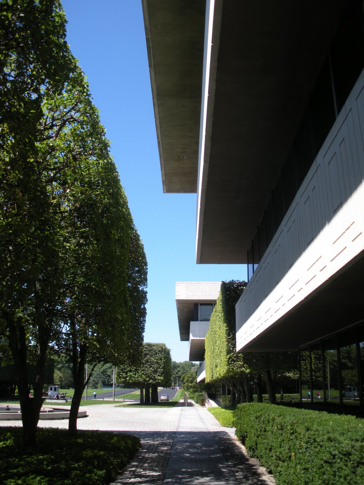
I thought the frame of trees around the courtyards was quite smart also.


They block the windows from view, giving the offices inside a measure of privacy. If you think about what you'd see looking out the windows, it's something green and natural, but it's a flat plane of greenery. It would be soothing, but not distracting.


In unbelievably striking contrast to the strict orderliness of the main entrance, the western corner of the building may as well have been by a different landscape architect altogether.


Here you encounter a wildly naturalistic vibe. It's not completely disordered, either. I mean, you can see the design if you're paying attention and it was obviously planted with a purpose.


Nonetheless, there is the feeling while walking along that path that from a perfectly mowed lawn, you're suddenly encountering a small, isolated untamed moment before returning to civilization again.


And it's civilization with a vengeance, too. The rigid formality of the southwestern facade is most sobering, indeed.

It's the seriousness of this that makes the location of Joan Miró's Personnage so delightfully genius here, but I'll discuss that more in the next post. The sculptures were brought in after the landscaping had filled in, so they could be positioned just right. It shows.

Keep in mind that while in some places, there are ample opportunities to wander off the path, in others, your route is strictly controlled. This was one of them. Steep berms mostly prevent you from getting too close to the building in some cases (I didn't mind climbing them), controlling your view of it. In this case, plantings and a wall force you to descend a staircase and walk out away from the building quite a distance. 


Then you turn back around and see this.


This was another part of the campus that took my breath away. 

They were very proud of it, also; at the far end is a shady trellised pavilion that frames the view and shelters a bench where you can sit to admire it.


It was here that I became fully aware of how the landscaping matches the forms of the architecture so perfectly.


While the lines are very precise and angular, quite synthetic, the water lilies were a brilliant touch, because it still feels so natural at the same time.


The dragonflies think so, too. I tried to get a picture of one of them, but it was too small and I knew the photo would never come out.

I love how Personnage pokes his head up over the bushes to look at the garden.


Hello there.  

That totally made me laugh.


Keeping watch over the garden on the other side are stylized peacock topiaries.


There are surprisingly few topiaries on the property considering how manicured it is. In fact, these are the only ones I remember seeing. 


These made me grin, too, though. Do these remind you of anything?

Maybe I'm just crazy. I still can't be sure whether or not that was intentional.

Then, after that cluster of activity, everything opens up onto this enormous, beautiful, lush green field.


There on the left is Arnaldo Pomodoro's Triad, which was one of my favorite pieces in the PepsiCo collection, but I'll discuss it in the next installment.


It was so nice for me, a city dweller, to be on so much grass that I actually started running around--not to save time, but just for the pleasure of running.


The glass enclosure at the back is a cafeteria, so outside it is the most delightful seating area shaded by two big blocks of manicured trees.


As you can see, there were people seated there, so I wanted to be careful where I aimed my camera. 

But the terrace looks out over the lawn with a view of an enormous man-made lake at the southern end of the property.


At one time, the lake had a tower of water shooting up out if the middle. I don't know if it's still there, but unfortunately it wasn't spraying that day.


Part 2.

©2010, Ryan Witte

Friday, September 24, 2010

Floral Presentation

As some of you will already be aware, Blogspot has a new photo upload feature that allows for a bit more flexibility in their sizing and arrangement. It's kind of a pain in the ass, to be honest, and it's taking me some trial and error to become comfortable with it. So while things may start to look a little nicer on here, there may be some glitches along the way you'll have to forgive.

I wanted to make a quick post about an inspired new light by San Francisco's Peter Stathis & Virtual Studio. They appear to be doing a number of interesting things, but unfortunately the website is quite minimal and doesn't offer much information.

This won an award at the ICFF this year, and I can fully understand why. Like all the greatest ideas, its utterly and elegantly simple. Coincidentally, it's named the same as one of Moser's vases, it's also called "Ikebana." Seems there are a lot of people inspired by the Japanese art of flower arranging.


The first thing to point out is the light source itself. It's an LED, but it uses what's called Front Light Optical Waveguide technology. Gesundheit. Essentially what it does is it spreads the light out over the underside of the flower-shaped panel, making the light quality softer and more even, rather than a single pin-point of harsh brightness.

The flower design is again simple but very nice, and a leaf-shaped switch on the cord is a wonderful little detail.


The other thing about it that's so smart is that it rests on its stand by pure gravity.

This means a few different things. It means that you can turn it in any direction you need it, raise it or lower it, take it off the table stand and move it to a wall-mounted one. You can also hang multiple lights on a single stand, especially the taller floor version. So simple, so flexible.

©2010, Ryan Witte

Tuesday, September 21, 2010

You Have Arrived--Flight 607

Terminal 7: British Overseas Airways Corporation (Gollins, Melvin, Ward & Partners--now GMW Architects, 1970)

GMW Architects, who were chosen in a competition to design this building, also did buildings at both Gatwick and Heathrow Airports. Perhaps their best known work is the Commercial Union Building (now St. Helen's Building, 1969), a brilliant work of corporate Modernist architecture in London.

The AirTrain and parking garage structures probably obscure this terminal more insensitively than any of the others.


--All JFK photos ©2010, Ryan Witte, unless otherwise noted.
It's so bad that it's quite possible there is nowhere one can be to really appreciate the full front facade of the building without being way too far away, way too close, or at some ridiculously contorted angle like being in the very front row of a movie theater. It's a real shame, too, because I think my appreciation for this terminal has grown more than it has for any other.


Of course, it made little difference anyway, because I passed right by a security guard who told me I that I couldn't take photos outside but that inside the terminal was fine. Personally, I get the very strong feeling that there is no official photography policy in any rulebook. I suspect it's more that security guards get a big kick out of hearing the word "no" come out of their mouths. For one thing, this guy didn't react like he was trying to remember exactly what their policy is. He just came right out with the easiest answer.

Terminal 7 is essentially an extruded, truncated upside-down pyramid. The shape pulls upward and also appears to defy gravity to some degree.

The original heavy Brutalist concrete slab at the top seemed to float weightlessly over the canted glass wall below it. This conflict of materials was described by some as being "awkward," but I love its sense of dynamism. At some later date, the concrete was covered over with an aluminum facing that--while more slick and shiny--in my opinion lessens the impact of the effect.


Seeing the interior of this terminal for the first time was a bit of a revelation. As with far too much of JFK at every scale, it's a bit too cluttered up with stuff. In this case, the clutter is advertising mostly and looks a little sloppy. But I have a good talent for removing all that with my mind so I can imagine what it would have looked like when it first opened. The terminal is really amazingly cool.


When you first walk in the door, directly in front of you overhead is a row of canted windows looking down on the lobby. If it weren't for a row of tacky, overly colorful advertising banners strung along its bottom edge, it might look like the control room at NORAD or something.

I ended up needing to use the restroom here and I'm glad I did. Afterward, coming around the other side from where I'd entered, I discovered a moment that proved how glamorous this terminal must have been. It was the combination of the canted windows, clear at top, frosted at bottom, and these fantastically robust chairs designed by Alan Zoeftig in 1995.


There was something about it that just worked. Zoeftig is a world leader in airport furniture, by the way. These chairs also made an appearance in Star Wars--Episode 1.


Terminal 8: American Airlines (Kahn & Jacobs, 1960)


--Photo courtesy Electro's Spark.
This was the firm of Ely Jacques Kahn, one of the greatest architects of the early- to mid-twentieth century and architect of both Bergdorf Goodman and Bloomingdale's. The entire front facade of T8 was an enormous work of stained glass, said to be the largest in the world, by Robert Sowers. The real crime here is not as much that the piece had to be dismantled, but more that, aside from a few parts of it, they so callously disposed of it. It appears that parts of the window wall can be purchased for your own use from Olde Good Glass. Terminals 8 and 9 were replaced by a gigantic and unremarkable mega-terminal building designed by DMJM (AECOM), completed in 2008.


Terminal 9: United Airlines (SOM, 1961)


--Photo courtesy Unofficial 50th Anniversary.
This was also demolished for the new Terminal 8. I suppose it was no great loss, but it was a nice bit of Modernism by SOM. I can concede that it very likely wouldn't have shown its age very gracefully, were it still standing today.


Overall, JFK is visual chaos. Way too much construction litters the landscape, building after building. Everywhere you look: terminal, hangar, administration building, roadway, hangar, mechanical, terminal, train tracks, hangar. Certainly much of the architecture is stunning, merely in need of a face lift. But there's just too much of it.


©2010, Ryan Witte

Monday, September 20, 2010

Vases Loaded

Very quickly I wanted to link to a nice blog post written about my Art & Architecture Tour of Lincoln Center. I can't really pat myself on the back over it: Sims works for LC. He can't very well say anything too negative about the tour. Of course my tour is awesome, so I'm sure it wasn't difficult to find good things to say about it. Anyway, it was interesting to see what he remembered most.


That's not what I wanted to talk about, though. I wanted to show some things from Moser Glass that I spotted at the ICFF.
Ludwig Moser founded the company in 1857, and they hail from Karlovy Vary, Czech Republic, which is sort of smack in the middle of the triangle formed by Prague, Dresden, and Richard Wagner's headquarters, Bayreuth.

Unfortunately I need to say that this was the website I found quite a bit less than inspiring, although perfectly nice to look at. For my purposes, I found it very awkward to get around. Every movement I made seemed to require a reload of a web page and constant backpedaling. The photos of their products are so small that they're hardly worth browsing. To be fair, this extremely high-quality cut glass is certainly better seen in person, anyway, where one can fully appreciate its weight, clarity, and the way it catches light. Their contact person was also very nice, very helpful, and quicker to respond than most. Having experienced the whole range of possible responses to email queries, I can sincerely say I place a lot of value on that.

Having been around for well over a century, they not unexpectedly have some very nice traditional work that's been treasured by royalty and heads-of-state all over Europe. In fact, they're quite proud of their clients and list on their website the kings and princesses who have owned the various collections over the years.

While I liked tracing their evolution into the modern age, from about the 1910s to the late-1920s, it was in 1934 that I noticed something that really grabbed me. It's a collection called simply "Bar" from 1934, designed by Rudolf Eschler:


The four wide facets of the base and the gentle curve of the vessel make this so serene and sophisticated. More than that, although it's seventy-five years old, I think no one would be at all shocked to see this in a store today. There's something wonderfully timeless about the design.

Leaping quite a bit forward to 1998, here's a vase called "Ikebana," designed by Lukáš Jabůrek, who I believe is their most promising designer:


[On a side note, I'm about the least linguistically xenophobic person you'll ever meet, but I have no idea how the Czechs can get anything typed at all, with all those diaereses, circumflexes, carons, and tildes over every other letter.] This is also offered in a version with vertical facets that curve up from the bottom to the top. There's something beautifully chemistry laboratory about it. Things like this always strike me as being somehow naturalistic in a very subtle, even subconscious sort of way. But it's also taking great advantage of the medium of cut glass. It uses the materials to create an intense optical experience and manipulate the quality of light hitting it.

Two years later they unveiled "Gema" by Kateřina Doušová:


This is equally fascinating for the way it exploits the qualities of the glass, but adds color to the mix. The various different color combinations are also dramatic and very well chosen: icy blues, deep rich purples, firey yellows. Each of them is gorgeous in its own way, while being very different in character at the same time.

In 2002 they did something a bit more fun and clever. This is "Tipsy" by Jiří Rydlo:


I had seen these before, not at a trade show, but in some design store somewhere. At the time, I didn't take much of a closer look to note that they were by Moser. The more your guests drink, the more likely I can imagine that you're going to have liquor all over the table, but I still adore this concept. They're perfectly counterbalanced with the weight of a heavy glass base, of course, but can rock back and forth. Even just visually, they're uncommon and interesting. I would also think that the movement of them, as a group of people pick up their glasses and set them back down, would be delightfully festive. They're also available in a clear version, but I think the lens at the bottom of a matte glass would help emphasize its movement even better.

Getting back to Lukáš Jabůrek, most of the newer items Moser has out that impressed me were his designs. The rest of these are all his and all from 2009. First, the vases, here's "Balada":


This was where I started to see Moser as an adept competitor in the present design market, in addition to doing high-quality work. This is a great piece. It's a very simple relationship, but so well done. At the top, it's vertical, rigorous, formal, geometric, and restrained. The horizontal pattern at the bottom is in sharp contrast free, loose, casual, and almost organic.

The next three make up Jabůrek's "Comfort" collection, lens cut:


Very nice, although this one could probably have appeared just as easily in the 1950s or '60s.

Spool cut, which is interesting for a lot of the same reasons "Balada" is, though I think just slightly less successful:


Here the serious formality is set against something much more fun and playful, but I think just aesthetically I don't find it as satisfying.

And my definite favorite of the three, olive cut:


It's like he took the lens cut version above, got drunk, and started carving away at it. But it's more than that. The lines that swirl around the middle of it have completely distorted the whole vase as if you were seeing it in a fun-house mirror. There's something almost irreverent about this which appeals to me in the same way as Jaime Hayon's work for Baccarat. At the same time, it's utterly sculptural, dynamic, even futuristic.

Jabůrek also designed a couple sets of drinking glasses for Moser. Here's "Zero," which is extremely edgy and modern:


And "Galileo" which is some of the most suave and elegant glassware I've seen in a long time:


I'd like to point out that Moser specifically recommends against putting any of their pieces into a dishwasher. I don't have a dishwasher, anyway, much to my chagrin and ongoing annoyance (I very literally dream about having a dishwasher on a somewhat regular basis). The pin-point bottom of the champagne flute would be exquisite with the pale champagne color filling it up. However, if for some reason it were allowed to stand over night with the beverage still in it, it would be practically impossible to get clean the next morning. I'd never descend to living in squalor, but strict housekeeping is not one of my most reliable habits, so I have to consider these things. Regardless, they are visually stunning, and the soft, graceful curves of their stems would feel so perfect in one's hand.

©2010, Ryan Witte