Once again, I'm seeing way more things lately than I have time to write about. One of the shows was Georgia O'Keeffe--Abstraction at my favorite museum, the Whitney. There can hardly be any doubt the Whitney was at least in part prompted to mount this show by the recent film with Joan Allen in the role of the artist.

Alfred Stieglitz, Georgia O'Keeffe (1918, gelatin silver print)
--Image courtesy The Artist's Magazine.
There was a lot of discussion about her relationship with Alfred Stieglitz. He championed her work in his gallery, and when she moved to New York, they quickly fell in love and became this sort of crazy Power Couple in the art scene. They kind of remind me of Matthew Barney and Björk. The press would eat up everything they did, basically. He took a series of nude photographs of her, many of which are on display in a dedicated museum gallery. The photographs cemented her image in the public consciousness, but also gave her a reputation, true or not, of being this kind of free-wheeling, free-thinking, Bohemian modern woman.
When I showed up, I was lucky to find a gallery tour just beginning, so I started to listen. This docent was so fantastic that I followed her for her entire talk, which I almost never do. A lot of other people thought so, too; there were about thirty or thirty-five little old ladies who stayed with the docent and...one other guy and myself. Then there's this third guy, maybe in his early forties, who was like 225 pounds of muscle and made for a kind of amusing contrast. It was an olfactory experience, too, since each little old lady was surrounded a heavy cloud of some different sickly sweet, flowery perfume, and one of them was--audibly--passing gas. I find it so bizarre that the little old ladies worship O'Keeffe so readily since the woman was, essentially, painting her private parts.


[EDIT: To all the porn-seekers who arrived here looking for Georgia's boobs, I hope you learned something.]

Georgia O'Keeffe, Blue Line (1919, oil on canvas)
--Image courtesy The Art Database.
This one is probably not safe for work or for underaged readers: Alfred Stieglitz, Georgia O'Keeffe (1922, gelatin silver print). I absolutely love the irony of how difficult this image is to find. As practically impossible as it is to avoid seeing pornography on the internet at least twelve times a day, this photograph, which is indubitably a work of art, is sorely hidden behind pages and pages of Googling.
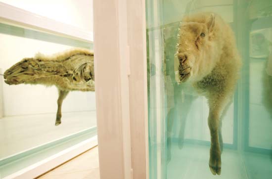
It's true that she was one of the only influential female artists to be recognized as such during her lifetime, which is empowering and must have been a great deal more so for women of the generation who grew up in the 1940s. If you're not paying attention, she's just painting nature, and with extraordinary use of color. Her work is without question pretty. In that sense, her work is very "safe" by today's standards, especially compared to someone like Damien Hirst, showing us the insides of animals. But I just thought it was fairly obvious to everyone that she was painting female genitalia. Doesn't that kind of stuff make little old ladies uncomfortable? I don't get it.
Although women are legally permitted to go topless anywhere that men are, and this is also clearly a work of art, I'd prefer to keep things clean on here: Alfred Stieglitz, Georgia O'Keeffe--Breasts (1919, gelatin silver print). Unfortunately, the work in the show that most alludes to this, Alligator Pears (1923, oil on board), is from a private collection and impossible to find online.
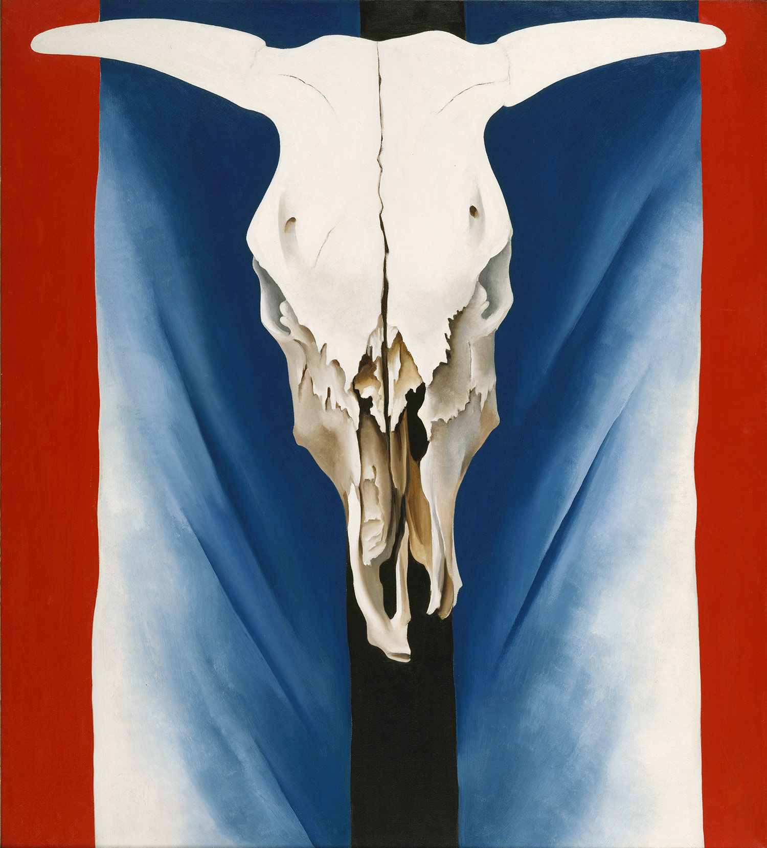
By the way, the museums are once again in sync with one another in this regard. The sexual subtext of the Vermeer exhibit has obvious parallels. Wassily Kandinsky's work went through an exploration of abstraction very similar to that of O'Keeffe at various points in her career. Perhaps I'm being unconsciously indoctrinated, myself. Her depictions of skulls (none of which are in this show) can't help but remind me of Sylvie Rosenthal, and some of her later work very much reminded me of Daniel Zeller's:

Black Place I (1944, oil on canvas)
--Image courtesy The San Francisco Museum of Modern Art.
In any case, I had the added challenge of setting aside my feelings about O'Keeffe's stigma in order to appreciate her work as fully as it deserves. I think I was fairly successful, despite my company in the galleries. I'd seen many of these pieces before, of course, but there's nothing like a full retrospective to clarify what an artist truly accomplished. As usual, the Whitney has done a fantastic job.
The first couple of galleries are devoted to her early studies in watercolor, where you can see how she was beginning to experiment with abstraction and develop the visual elements that would recur time and again throughout her career. Although extremely illustrative, I wasn't as impressed with the watercolors and early oils, so I'd like to begin a little further along.

Dark Abstraction (1924, oil on canvas). The docent kind of joked about the titles O'Keeffe gave her paintings, which said so very little about what the work was. This is a great example.
--This and following three images courtesy SoHo Art.
I'll have to say that I like these darker works far better than the lighter, pastel ones. They just feel so much more legitimate to me. There is always an element of Beauty in all works of art, even those that might be considered ugly. Ugly works of art in their own way question our perceptions and concepts of Beauty, by rejecting it. Ironically, I feel as if I trust the intentions of artworks more if they aren't trying to be "pretty." I also heard it said recently that, once it was commandeered and widely disseminated by industrial production around the beginning of the twentieth century, Beauty became no longer the province of Art.
That's the problem I think I have with her use of color: it's too pretty. In a way, I feel that it isn't challenging me as the viewer and feels cheap and too easy. For instance, I think it'd be fairly easy to see the problems with an evaluation of the historical significance of someone like Robert Mapplethorpe based solely on his floral still-lifes, considering how very shocking and disturbing his other work was. That's not to say Dark Abstraction is ugly in the slightest, quite the contrary. But with these works, she feels more like a real artist to me. Maybe that's pretentious of me.

Corn Dark (1924, oil on composition board)
I also consider her abstract work infinitely more interesting than her representational pieces. Perhaps that's another reason her work often felt little-old-ladylike to me and why I found this show so fantastic. When she got into the skulls and the imagery of the American West, there was the element of something dark--macabre I think is a little too strong a word--to balance out her style. With the flowers, rendered very realistically, it becomes a bit too prissy for me. Not that I can't find beauty in nature, of course, but that's exactly the point. To merely recreate that beauty on the canvas, it's little more than a pale copy. With her more abstract pieces, her artistry becomes tantamount. Here it's the work of art that's beautiful, in and of itself, not the subject being represented. Certainly her artistry comes through in all her different styles. But with the representational work, it's too muddled and obscured by the subject. With her abstract work, the painterly affects she achieved with line and color become much more prominent, and I think it makes the work in this show far more historically poignant.

Red and Pink (1925, oil on canvas)
This was one of the more interesting pieces on view. It's somewhat small, and it's actually one of a series of illustrations for a fabric manufacturer's advertising campaign. O'Keeffe here wasn't painting flowers, but a sheet of fabric with a floral pattern on it.

Pink Tulip (1925, oil on canvas)
This is exactly what I mean. The overwhelming pinkness and the frilly contours of the flower are just a bit too much for me to handle. I can't help but fear it's sexist of me to say such a thing, or at least bordering on it. But perhaps my embarrassing reaction to this painting is precisely the point. The art world was completely overrun by a whole lot of men, none of whom would have or could have painted this painting in a million years. It required a woman's voice for this type of imagery to come into existence. And while she was without question innovative in many ways that later (male) artists would emulate, she was also distinctive in ways they couldn't. She was going down a road where they couldn't follow.

Line and Curve (1927, oil on canvas)
--Image courtesy Happy Shadows.
Another one from this period, Abstraction White (1927, oil on canvas), was unfortunately impossible to find. I can imagine few more obvious precursors to Minimalism than these pieces, and this is nearly forty years earlier. I also really appreciate her work in black and white, because it offers an opportunity to ignore color for the moment and better discern what she was doing with line and field.

Abstraction Blue (1927, oil on canvas)
--Image courtesy Museum of Modern Art.
It's the way lines emerge, converge, diverge, and disappear again. Lines are always appearing out of fields, gradually changing their color or intensity, and threatening to dissolve back into complex fields of color. For O'Keeffe, lines don't just demarcate fields, they become part of the essence, the very body of the fields.


Jack-in-the-Pulpit--No. 3, No. IV, No. 5, and No. VI (all 1930, oil on canvas)
This was really one of the best things about this show. It's a series of paintings of one type of flower, a Jack-in-the-Pulpit (hence the titles), which shows with incredible clarity the process the artist went through in abstracting her subjects.

--Photo courtesy William Tanneberger.
With one simple series, it's as if she's training the viewer's eye to see in a very specific and peculiar way. Seldom has this been possible with any other artist outside of a retrospective of their work, after the fact. These were executed inside a single year.

Green Grey Abstraction (1931, oil on canvas)
--Image courtesy Art in Transit.
She and Stieglitz spent a lot of time apart because she loved to travel and he refused to leave New York City. Upon her return from one retreat, she discovered Stieglitz was having an affair. It devastated her. This dark, somber work is actually a portrait of Stieglitz. The fascinating thing this show illuminates, by focusing on her abstract work, is that she did virtually none of it for this entire decade. Abstraction was very hard on O'Keeffe; it took a lot out of her. It required her to bring to the surface and make manifest something very deep and personal inside her. Representational works were an escape, and in her depression, she found solace in them.
After this period, she began to realize that she could once again start to explore some of the principles of abstraction, but remain true to her interest in landscape and the natural world. This was the period that gave rise to works like Black Place I, above. They are representational, but frame the real world in an abstract manner. From there she continued in this direction, becoming more and more primary. Eventually, by the 1950s, she gets to a place that the Minimalists of a decade later should've been ashamed to not have acknowledged more vocally.

My Last Door (1954, oil on canvas)
--Image courtesy The Art Browser.

Black Door with Red (1954, oil on canvas)
--Image courtesy Antiques and the Arts.
They actually depicted her house and yard. These pieces so obviously prefigure the work of artists in the 1960s, it's quite astonishing. Not long after this, she started going blind. The docent pointed out that there could be no fate more cruel for a painter than this. Beethoven allegedly contemplated suicide. When her eyesight began to fade in the 1970s, she returned to simple watercolors which were easier for her eyes to handle. She lived another ten years, and in 1986, we lost one of the most important artists of the twentieth century.
You have until January 17th to catch the Whitney's show. I must highly recommend it, whether you're a little old lady or not.
[EDIT: To all the porn-seekers who arrived here looking for Georgia's boobs, I hope you learned something.]
©2009, Ryan Witte