Showing posts with label Frank Lloyd Wright. Show all posts

Sunday, November 13, 2011

The Original Suburban American House

This post is dedicated to one of the most important structures in the entire United States. In a way, the numbing banality of what's in these photographs should, ironically, make it less shocking that I say that. In other words, saying that this is the most important structure in the United States is too easy, and also could be easily debated. It would be a rather interesting debate, in fact.

But the subject of this post is possibly among the top ten most important buildings in the country for the very reason that it looks like nothing, or...everything. It's the last remaining unaltered Cape Cod House in Levittown, Long Island. It was financed by Abraham Levitt, designed by his son Alfred Levitt, and built and sold by Abe's other son William Levitt. It was likely completed around 1947 or 1948. Alfred had actually apprenticed with Frank Lloyd Wright, although whether that stamp of legitimacy would stick to this is questionable.

In order to explain why this utterly forgettable little house is so terribly important, I'd like to tell a story, beginning with an imaginary person named John Smith.  

John is born to a Polish father and Italian mother on the Lower East Side of Manhattan in 1923, when "John" is the most popular American name for baby boys. He barely remembers the crash of the stock market, being only six years old at the time. But the initial panic could be felt by just about everyone, at any age. From that point onward, the slow, excruciating advance of sadness, desperation, frustration, and anger among the adults around him becomes a part of his daily life. Dealing so much with the failing economy robs his childhood of many of its innocent joys. While his parents insist on keeping him in school, most of his free time is spent working at a local cleaners to bring in whatever miniscule coins he can to help his family keep food on the table.

Following a brief romantic career of sordid hand-holding and a few stolen kisses, John meets a girl who makes him positively flip his wig. Her name is Mary--the most popular name for girls his age, seventeen. He'd known her from the neighborhood, but they start going steady. A sinister rumble can be faintly heard from that far off, distant land called "Europe." But here the new cars and trains are shiny and streamlined, this guy called Buckminster Fuller is doing some wacky new stuff, all the new technology is terribly exciting. Women are joining the work force like never before. The Works Progress Administration has a whole lot of projects running; John's uncle is working on one of them, paving roads. There's a light appearing at the end of the Depression Tunnel. Things look hopeful for John and Mary, their young love affair blossoming.

Then, at the tender age of eighteen and still his mama's boy, John is drafted into the war and shipped off to France. At first, he's mostly so terrified all the time that his adrenaline-soaked brain simply goes onto autopilot. As time goes by, his shell hardens and he learns to cope with the horrors of every new day. Thinking about his home life is a powerful coping mechanism, a "safe place." As the real memories of struggling through the Great Depression fade, they're slowly replaced by an idealized version of what home life had been like, full of hot apple pies, stick-ball on the street on late summer afternoons, and mom's hugs. Sitting in a trench freezing and crusted with mud, one bombshell away from having no arms or legs, it's a version much more comforting than the real memories were.

Growing into his early-twenties, he gets more used to the mature but crass conversations about love and sex, girls and women with his fellow soldiers (some of them older and wiser). A nervous trip to a French brothel awkwardly shoves him one step further into adulthood. Mary writes him at least once a week like always, but their correspondence has matured accordingly. She tells him about her work at the factory making wheel struts for bomber planes and the girls she's befriended there. She tells him the neighborhood gossip and which boys have come home wounded. She ends every letter with "I'm true to you always and count the days until you return home."

As the war appears to be nearing its bloody conclusion, slowly the figure of Mom in John's fantasy home life becomes replaced by Mary. He's no longer looking back to his past life in the States, but toward the future he'll find when he goes home again. Aside from that appearance by Betty Grable at the United Service Organization show--leading to the Military Masturbation Epidemic of April 1944--John thinks only of Mary. Increasingly, the only thing keeping him going--keeping him alive, even--is thoughts of her and the tears of joy she'll shed when he first throws his arms around her. After one uncommonly honest and sincere conversation with a close army buddy about their sweethearts back in the States, John decides that as soon as he's again on home soil, he is going to ask Mary to marry him.

Finally, V-Day. On the one hand, John is now an adult man with the cruel, real-life experiences of someone twice his age. He's killed. He's been forced to be self-sufficient both practically and emotionally. He's endured hunger and cold and hardships he never could have imagined. On the other hand, and in a way because this has been his way of life for the past four years, he's still just a child. The time normally spent to smoothly, healthily grow into adulthood has been completely arrested by the war. Behind his sometimes cold, steely eyes and manly, stoic, hardened demeanor lies the heart of a fragile, hopeful, idealistic little boy.

Mary looks different, but more beautiful than ever. She says "YES!" A year later, they're hitched. A few months after that, she's in the family way. The Lower East Side is appearing to be less and less a place one would want to raise a child. There are few trees and practically no grass. It's dirty, smelly, and dangerous. The schools are not great. "If we're going to set up house and home," Mary says, "we should do it right."

They buy this little house in Levittown, Long Island for around $8000. It's got a yard with real grass. It's a nice, friendly neighborhood where everyone looks like everyone else (white) and everyone knows everyone else. Not only do all the people look the same, but all their houses look the same. It's the very portrait of conformity, normality, consistency, and safety, and in sharp contrast to the sudden deployment of an army regiment in a firestorm of whizzing bullets, whistling bombshells, and growling German tanks.

Floor plan courtesy of Peter Bacon Hales
A sign of how childlike and idealistic this picture was is to be found in the architectural character of the house. If you asked a three-year-old to draw a picture of a house, this is exactly what she or he would give you. The cute little chimney sticking up out of the middle of the pitched roof, the door in the middle with a window on each side, the teeny-tiny little lantern fixture above the door--it's almost like a cartoon simplification of a real house. The odd little rectangular frames just under the roof line appear to have been additional windows. Although it would be difficult to argue the benefit of more light, and they must have been great for regulating temperature, most of the houses have them boarded over. It's possible they were difficult to keep clean and/ or wouldn't accommodate screens.

To put the $8000 price tag into perspective, one of the most expensive regular-production automobiles, the Cadillac Coupe DeVille convertible, sold for just under $3500 in 1949. The Levitts were able to drastically reduce costs by employing techniques used to build barracks during the war. The houses were built as if on an assembly line, so characteristic of U.S. industry. Sadly, the provision that no Levittown house could be owned or occupied by a person of color was written (IN UPPERCASE, no less) right into the lease.


This IS Leave it to Beaver. This IS The Donna Reed Show. No country in the world has suburbs like the United States. Certainly it would never have been possible at this time in the economic devastation and war-torn land surrounding Europe's great cities, where nazi occupation was felt so much more acutely, not to mention the psychological repercussions of entire families murdered off and orphaned children everywhere. And no American city has suburbs like New York. The flight out of urban centers was endemic, but New York was and is the largest urban center from which to fly. Here it was also exacerbated by Robert Moses, who made the suburban exodus not only easier, but virtually unstoppable.

The house shown here, the Ranch House, is right around the corner from the unaltered Cape Cod. It's extremely close to being intact. According to the person I spoke to at the Levittown Historical Society, the kitchens were extremely small, so almost immediately, most of them had extensions added to double the size of their kitchens. This Levittown Ranch has an extension at the rear on the left (likely expanding the living room) and a covered porch on the right. The man who rents it with his wife and kids said of altering what was an almost intact original house, "I need a home, not a museum."


Yes, I know one can make the suburb argument easily for Los Angeles. But L.A. is one big suburb. L.A. really has no urban to subordinate the suburban. New York in 1950 far better characterizes the true American urban/ suburban dichotomy because of the fact that the city is still vibrant, crowded, commercial, fast-paced, dirty, smoky, and diverse. Its suburbs therefore can truly be its opposite: quiet, sparsely populated, leisurely, clean, pastoral, and demographically homogeneous. John and his (male) neighbors work in New York City. They settle in Levittown.

In 1949, John and Mary's first daughter is born and named the most common name for baby girls in that year (strangely), Linda. Her brother would be named James.

Over the first seven or eight years of Linda's life, a new paradigm of American society is firmly cemented into place. Morals, protocol, ethics, manners, fashions, gender and race relations, child-rearing practices, the nature of marriage, everything becomes codified, agreed upon by a new white suburban middle-class. Commercial consumption of highly branded products becomes synonymous with personal identity to be manipulated by media, advertising, and the television and automobile culture. It's a naïve, idealized, at times almost Victorian simulation of what Community is supposed to be. These communities created the myth of the American Dream (which does not exist, by the way, for any readers who have never been here for any extended period of time). This house is the very epicenter of the American Dream's emergence.

The first cracks in the pretty picture start to show in 1955. The Douglas Sirk melodrama All That Heaven Allows, Picnic, Rebel Without a Cause, and The Seven Year Itch and public consciousness of the marital problem its title describe all appear in 1955. Even The Trouble With Harry from that year would seem an apt metaphor for the ways that a community's dark, scandalous truths are hidden beneath a thin pretense of conservative social conventions.

John's secretary is possibly too flirtatious for his mid-life crisis to withstand. Mary, alone all day and under the influence of "mother's little helper," might find the new young, fit mailman's smile a bit too irresistible. But outward appearances usurp anything else in the white middle-class suburb, because its foundation had rested so heavily on appearances from the very beginning. "They seemed so happy--the perfect family, really," friends would later say of John and Mary Smith.

By the time Linda reaches her eighteenth birthday in 1966, the world is an entirely different place. It's no longer possible to ignore hard reality like her parents had. First of all, the world is just moving far too fast. And why would you want to, anyway? There's about to be an exhiliarating revolution in science and technology, plastics and chemistry, information processing, space travel, medicine, and of course society, itself. What's more, it would be entirely irresponsible to ignore it and not try to change it, as she and her friends discuss more and more, considering the way their parents messed everything up.

Fueling the fires, they're at the age where all people in any era must, for their own growth and development, question and reject what they've been brought up to believe. They have to forge their own way. For the first time in history, the millions of them are becoming a very real demographic, identified (mostly by marketing executives bent on exploiting it for profit) as a "youth culture." Linda and her parents can barely understand one another anymore. Linda, at least, is losing interest in trying to make them understand.

The Levittowns of this country--John and Mary's white middle-class suburban American Dream of the 1950s--had been the soil. Into that soil was planted a new generation, Linda's, which began to bear fruit around 1967. In art, music, film, theater, design, architecture, commerce, technology, politics, religion, philosophy, theoretical methodologies, social mores, gender relations, sexuality, parenting, race relations, the very nature of human identity, the entire western cultural landscape undergoes one of the most important revolutions in human history. From that point forward, some vague moment in 1968 or 1969, nothing would ever be the same again. One look at the upheavals of the early-1970s and we might be tempted to suggest the world that gave birth to the Cape Cod House in Levittown had been completely turned upside-down.

Looked at in this way, this charming little house represents so much more than it could ever hope to handle. In some bizarre way, I consider it a monument in the strictest sense to some elusive quality instrumental to the evolution of our culture. In the interests of completion, Linda's hypothetical son, most commonly named Michael in the early 1970s, is of the generation that produced writers like myself who would write about the last unaltered Levittown house in these terms. Obviously, I didn't live through any of the events described here. My perspective is a chronologically outsider's one. Social anthropologists live their subjects, however, historians very seldom do.


All text and images ©2011, Ryan Witte except where noted.

Monday, November 29, 2010

We Couldn't Get Much Higher

The final, inescapable fact remains that architecture is now breaking scale, and style, everywhere. (In his secret heart there is hardly an architect who doesn't want to do so.) The objective historian realizes that the twentieth century is in transition to a remarkable new technology and a formidable new environment, before we have learned how to handle the old one. Who's afraid of big bad buildings? Everyone, because there are so many things about gigantism that we just don't know. The gamble of triumph on this scale--and ultimately it is a gamble--demands an extraordinary payoff. The Trade Center towers could be the start of a new skyscraper age or the biggest tombstones in the world.
--Ada Louise Huxtable, May 26th, 1966

There have been quite a few lines that made me almost gasp and think "Holy @#!+ can this person ever compose a sentence." But the end of that paragraph I'm pretty sure made my jaw drop open. So profound, so prophetic, and with such a deep understanding of what it means to create architecture and the inherent implications of what we build. And I think most appropriate considering where I was headed on the train.

This was what I'd just finished reading when I arrived to see the premiere sponsored in part by DOCOMOMO (who, by the way, have a newly revamped website which looks great) of what turned out to be a gorgeous documentary about Louis Sullivan, titled for him with the subheading The Struggle for American Architecture. It's a wonderful film directed by Mark Richard Smith, and the icing on the cake was that the premiere was held at the showroom for the greatest American furniture manufacturer of the twentieth century: Knoll. There's almost a kind of electric buzz about being in the Knoll showroom, almost as if you're in the vortex of a much bigger storm of creativity and design history.

I was very surprised to hear that no one has ever made a documentary about this man. Actually, there was just one, called Tall: The American Skyscraper and Louis Sullivan from 2006 which concentrated on only one aspect of his career. But really? That's it? There's at least sixteen or so about Sullivan's protégé, Frank Lloyd Wright. For crying out loud, Sullivan pretty much invented the skyscraper, put Chicago on the map as an architectural wonderland, and coined one of the most famous lines in all of architecture: "form (ever) follows function." He's probably the architect most integral to the transition into the twentieth century.

Photo courtesy Photosfan.
The film is brilliantly framed. It starts with the Chicago fire of 1871. It was an obvious choice, but it works so well, both narratively and thematically, because it makes the city, itself, a blank sheet of vellum. The photographs of what remained after the fire are incredible. It was a virtual wasteland, with only a wall still standing here and there. They actually remind me a bit of the shots of European cities immediately after World War II. But Chicago's infrastructure--namely the train lines and the stockyards--was left unscathed, which meant the city could be rebuilt. And was it ever. It was during this boom, needless to say a great time and place to be in any way involved with the building industry, that Sullivan arrived in Chicago and decided it was right where he needed to be.

It was a bit of a bumpy start, because a recession hit that slowed down new construction a bit. Sullivan took this opportunity to go to Paris to study at the École des Beaux-Arts, which he found insufferably boring. While making a side trip to Rome, he discovered Michelangelo's ceiling of the Sistine Chapel, which had a profound influence on him. When he returned to Chicago, he teamed up with Dankmar Adler, who was a fantastic engineer and acoustician, but nowhere near as talented a stylist as Sullivan, making them the perfect team.

It was well known that, if you wanted a great theater, you hired Dankmar Adler. Ferdinand Peck did just that for the design of the Chicago Auditorium. The exterior was uncharacteristically bland for Sullivan, inspired by the adjacent Marshall Field Warehouse (1885) by H. H. Richardson. But it was the largest building of its kind ever constructed at the time.
Image courtesy Chuckman's Photos.

Photo courtesy Sampleboard Online.
The interior of the opera house, on the other hand, was an absolute symphony of ornament and decoration, color and luxurious materials, which Smith's cameras captured with the most loving admiration to the sound of a Richard Wagner swell. The film makes a point to note that, because of the intimate collaboration between the two partners, everything was seamlessly integrated into the interior's style, down to the ventilation grilles and the lighting, which was the frighteningly-new electric technology. It was a gargantuan job, self-inflicted by Sullivan, who wanted to design all the ornament from scratch to cover every inch of the place. A young Frank Lloyd Wright, hearing that Sullivan was swamped, sent over some sample drawings asking if they needed another draftsman. Quite wisely, Sullivan hired him. The Auditorium catapulted the team of Adler & Sullivan to fame. They also made their new home in offices in the building's tower.

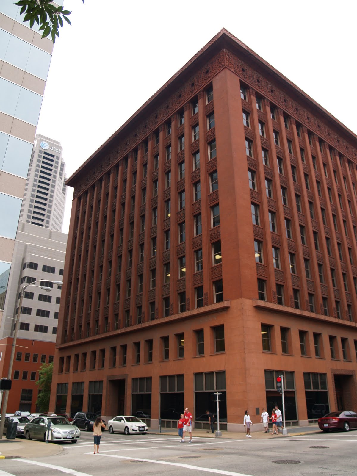
His next big breakthrough was a result of his attitude toward buildings, that they should look like what they are. Sullivan was dismayed by the handling of height. The technologies making it possible--namely steel frame construction and the elevator--were too recent, and architects were not sure yet how to deal with it. These early tall buildings were typically in any number of different architectural styles stolen from Western Europe and stretched vertically. His response in 1891 was "every inch a proud and soaring thing," the Wainwright Building in St. Louis, Missouri.
Photo courtesy Brandon.
Because Sullivan thought the main problem was that tall buildings didn't realize what they were, he strongly emphasized the Wainwright's height. His model was the classical column, with base, shaft, and pediment. If you look at the building at a sharp enough angle, you can very much see the fluted column in it. Five years later he did something very similar with the Guaranty Building in Buffalo, New York. Guaranty, however, was an explosion of ornament in terracotta that adeptly masked the necessity of terracotta to be installed in tiles.
Photo courtesy Cuda swiata.

Photo courtesy SFSU.
The end frame for the story appears in 1893: The Chicago World's Fair. The gleaming white architecture of the fair by Daniel Burnham (with Frederick Law Olmstead) was strictly Beaux-Arts (though built, characteristic of our Drive-Thru Fast-Food culture, like a stage set).

Sullivan had rejected all this contrived pomp for being decidedly European. He felt American architecture deserved its own idiom, rather than simply deriving forms from another time and another continent. As the title of the documentary suggests, he was looking for a truly American architectural vocabulary. The country, however, was too young, too fragile in the wake of the Civil War. So while European visitors to the fair were fascinated by Sullivan's unique and colorful Transportation Building, American visitors were much more turned on by the pretense of legitimacy neoclassicism could bestow upon the United States. Sullivan said it set back American architecture by forty years.

From that point on, classicism was it. Every substantial commission purchased a big, white marble Beaux-Arts temple. Nobody wanted Sullivan's eccentric, unfamiliar brand of Americana. His last great large building would be the Carson, Pirie, Scott department store in Chicago.

Photo courtesy iReference.
Quite amusingly, outside of this store is where one can purchase a demon-possessed Good Guy™ doll from a homeless man.

Finished in 1899, this building is easily twenty-five years ahead of its time and about as modern as any building could have been in the nineteenth century. Additionally, his nature-inspired ornamentation was the perfect complement to what was beginning to be understood as the market driving force behind the art of the fashions sold inside the store, namely the changing of the seasons.

Photo courtesy Exoterika.


Sullivan died penniless and broken in 1924. Despite the fact that he'd built one of the most beautiful tombs in the world--for Carrie Eliza Getty--his friends could only scrape together enough money to buy him a sad, forgettable headstone. His last work wasn't even a building, but merely the façade of a tiny little music store. That a man of such unbelievable talent should meet such a tragic end is shameful and disheartening.

The sort of happy post-script onto the story, though, is a flurry of incredible creativity and exquisite work he did for a bunch of small banks in mid-western farm communities. He built eight of them, from 1908 to 1919, in Minnesota, Indiana, Wisconsin, two in Ohio, and three in Iowa. In my opinion, it's some of the best work he ever did.
Photo courtesy Primitive Screwheads.

His use of ornament had reached a level of sophistication that could be matched only by a true genius, like Michelangelo himself, isolated to brief moments of explosion and intricacy, while tempered by expanses of serenity and restraint.


The modest scale and proportions presented a welcoming, down-to-earth stance to the farming communities and very much appealed to them, quite contrary to the overblown elitism of the common neoclassical approach to bank architecture. Furthermore, his use of natural, organic ornament here spoke to the lives of townspeople who earned their living from the land. The banks became beloved. They also ended up in small towns where little ever changes. So in one last, small victory, while much of Sullivan's work was heedlessly demolished, the banks all remain standing as jewels on the countryside.

One of the great things about them is that he'd begun "signing" his buildings. Right underneath the bank's sign, it would say "Louis Sullivan Architect." It sort of reminds me of how Fellini started to put his name into the actual titles of his films: Fellini Satyricon, Fellini's Roma. But entirely justified because Sullivan's work was so distinctive and at the same time, in a way, quite modest.

After the screening, there was a short talk by the director and a Q&A session. He said he'd never made a film before, which made this project a bit difficult to get produced, and makes it even more impressive as a debut effort. I asked Smith if, while shooting the film, there'd been any one building that really grabbed him, that really took his breath away. He said the Guaranty in Buffalo. He lamented the fact that, due to issues with the current owners, Prudential, it was just not possible to get inside it. But he did manage to get some stunning photography of the exterior with the help of a window-washing platform. A couple other questions and we all headed over to finish off the wine they'd so nicely supplied.

I'd said hello to Kathleen, John, and Leslie from DOCOMOMO when I arrived. I'd met them all at their Kips Bay Towers event for Open House New York, which will be the subject of a later post. But afterward I got the chance to chat with John Arbuckle, who I was impressed to discover works for Gwathmey Siegel. He was telling me all about Buffalo since it's the location of the building Smith said most grabbed him. He reminded me that Frank Lloyd Wright's Darwin D. Martin House is also there and is now open to the public, and a few other things that all together might make it worth a trip to Buffalo. I think he might have sold me on going at some point.

I also asked Smith if this might be picked up by PBS or a similar network. He said he had spoken to people at PBS, but that they already have their own stable of directors with whom they work almost solely. I think this is very ridiculous and unnecessary. It limits the voice of their programming and means that some very good material (this film, for instance) will never see air time on their stations.

You can purchase a copy of the DVD (also available on Blu-ray), Louis Sullivan: The Struggle for American Architecture, on the website for the film (link at top). I highly recommend seeing it. Personally, I'm looking forward to buying my copy when the expanded edition is released with (perhaps) behind-the-scenes footage and commentaries and whatever else.

©2010, Ryan Witte

Friday, August 20, 2010

You Have Arrived--Flight 203

Terminal 1: Eastern Airlines (Chester L. Churchill, 1959)

Chester L. Churchill has fallen well into obscurity, and evidently this forgettable building didn't help. He was also a tugboat, though, by the way. His T1 was demolished when Eastern dissolved. The new building, designed by William Nicholas Bodouva & Associates and completed in 1998, is alright but mostly uninteresting. I skipped it. I was admittedly more interested in the original mid-century buildings, anyway.


Terminal 2: Braniff International, Northeast, and Northwest Orient (White & Mariani, 1961)

At the moment, construction barriers obscure Terminal 2. Likely the best thing about it is its entryway, a group of hexagonal roof platforms on stilts vaguely reminiscent of Wright's Johnson Wax Building (though not nearly as sophisticated). It's now operated by Delta, which acquired both Northeast and Northwest Orient. Braniff, the coolest airline to ever fly, is sadly gone. My first terminal was Terminal 3.


Terminal 3: The Worldport (Tippets, Abbett, McCarthy, Stratton--now TAMS Architects, 1960)


--All JFK photos ©2010, Ryan Witte, unless otherwise noted.
The name of this one says it all: The Worldport. I can't imagine a name that more perfectly sums up this golden age of air travel; it could truly be, for the first time in transportation history, a gateway to the entire planet. Built for Pan American World Airways, the colossus of the industry, it's now the home of Delta Air Lines, which purchased most of the assets when Pan Am was going bankrupt in 1991.


The Worldport is a truly spectacular building.

The rumor is that it's at risk of being demolished by Delta. The project was supposed to begin this summer, but there it still stands. I will admit that it very much needs some tender loving care, but no way should it be razed. The underside of the four-acre canopy appears a little bit pockmarked but otherwise has held up remarkably well.


The minuscule interior is arguably in worse shape than the exterior. When its entire elliptical volume was both unobstructed by interior structures and freely navigated, it was no doubt far more majestic. As it stands now, it's chopped in half by ticket counters and cluttered with security checkpoints. As soon as you walk in the door, you can barely take two steps before colliding with something. As merely a grand entrance lobby on a much larger, expanded terminal, this room would be glorious. At the moment, it looks like it's about the burst at the seams.


The windows are a bit grimy and really ought to be replaced. The ceiling is stained with what appears to be water damage. Then there are these weird flag things with rope (tubes?) hanging from them that appear to be either trying to conceal air ducts or some kind of badly conceived art installation. Possibly they collect water from leaks in the roof.


An intervention to save this terminal would have to be very careful, however. While the original terminal would be beautiful as an entrance lobby, a renovation would do it great justice to allow some planes to be boarded under the canopy as originally intended.


If it could, for certain T3 could boast the shortest walk from gate to airplane of any terminal in the world. Likely, with security as tight as it's become, this wouldn't be possible. My idea was to allow express service for top frequent flyers to quickly board commuter planes here with some kind of high-tier ID card, and send the regular passengers into the larger terminal to the rear. TAMS also designed the expansion behind this building in 1976.

The AirTrain structure here is not as much a huge blight on the vista--though it definitely is--as it is so very out of place, stylistically.


Thoughtful architecture could have made the AirTrain construction a seamless part of the older structures. Instead, the new battles with the old, and quite inelegantly. The airport had been sharply criticized from the very beginning as being a disconnected hodgepodge of architectural confusion. The construction of the AirTrain was one last opportunity to pull the wildly disparate architecture into a cohesive whole once and for all. This opportunity was entirely lost.


Also now gone are Milton Hebald's sculpture Zodiac Screen for the enormous glass wind buffer that now announces Delta's residency.

--Photo courtesy Life, obviously.
It was the largest sculpture grouping of its kind in the world at the time and is now allegedly owned and stored by the New York Transit Authority. [I say "of its kind," because the people calling it simply "the largest sculpture in the world" have clearly never heard of either this or this, or for that matter, this.] Aside from the reference to the skies, I'm not sure I see the relevance of the Zodiac signs here, although I suppose they were a better choice of mythological subject than the story of Icarus.

It was around the Worldport, also, that I took notice of the landscaping.


There's not much land left to scape, and visually it pales pathetically in comparison to Wallace Harrison's original plans. But I was pleased to see that the small amount of landscaping that remains is quite lush, very well maintained, and as pleasing to the eye as it can manage under the circumstances.

Giving me a hard time about photography at this terminal was another paranoid construction worker. The irony this time being that I wasn't even anywhere near the building, particularly, but rather facing out a window from inside the AirTrain station. I found this to be the most bizarre thing about the nature of security at JFK...

Part 3.

©2010, Ryan Witte

Monday, September 29, 2008

Chemistry Sets

Now I know I did pretty much trash the Guggenheim, and honestly their curatorial choices do make up for a lot of the failings in the building and their display tactics.  One really happy accident was the work of Koo Joeng-a.  This piece, Oslo (1998), is a giant pile of crushed aspirin:
There's definitely an interesting comment about chemical dependency here, or worlds of pharmaceutical financial might, but the others were a lot more fascinating.  There were several piles of pollen, HUGE conical piles, like a foot high, all from one type of flower.  Can you even imagine how long it would take to actually collect that much pollen?  And even if you don't have hay fever, that kind of project could give you hay fever, or some serious sinus problems.  It's such an incredible take on Earth Art, gathering it and bringing it into the gallery space, this BRIGHT vivid yellow, very geometric, almost scientific display of a substance of natural reproductive processes.

But the one I wanted to mention--and I really wish I could find something about this piece, its title or anything, because it was so remarkable--was a giant pile of salt, I think sea salt.  This pile of salt was probably five feet high, if not higher.  What was really incredible about it, and I think you'd only really get this at the Guggenheim with its spiralling floors, is that there was a stream of water flowing out the bottom of it.  I'm sure it very unintentionally, unexpectedly caused a major hassle for the maintenance people.

This giant mountain of salt was like a monstrous chemical machine for extracting moisture from the ambient air.  Absolutely brilliant, especially considering that humidity is so strictly controlled in museums.  I'm not even sure if the artist realized when the piece was conceived that it would act that way, but it did.  On a perfectly leveled gallery floor, like Noguchi would have demanded, the piece would never have done that, wept.  It might have looked a little gooey at the bottom of the mountain, but it wouldn't have wept.  The other thing that just now occurs to me is that the piece is constantly in the very natural, chemical process of eroding itself, self-destructing.  It extracts moisture from the air and bleeds salty water out the bottom.

So I will concede that the Guggenheim is not disastrous to sculpture 100% of the time.  This was just a happy accident, though, I suspect.

©2008, Ryan Witte

Friday, May 30, 2008

Habiendo Diversión


This here post is about a company from Spain called Stone Designs.  I found them by way of RS-Life, who've recently merged with them, and who I'd like to mention separately, because their website is one of the best-designed websites I've seen in a long time.  It really should be nominated for some kind of web design award.

RS-Life is doing some fancy foosball tables and some other items using the foosball player figures, but I really liked their picnic tables (click for larger):


I really like them.  They're very graphic and playful without being tacky or childish.

Stone Designs, in general, are doing some extremely interesting and beautiful work, all around.

First, for the Beautiful, we have "Burger":

There's a wider version of this called "Hot Dog," but I thought this one was more successful.  The wider version is probably a two-seater, but it doesn't look like the backrest is bigger enough to accommodate both people, and is still in the center, so it seemed less practical to me.

Here's "On the Road":

The symbolism this exploits is so interesting.  Knowing the name of it doesn't hurt, but it connotes the outdoors not by mimicking natural forms, but secondarily, by using visual references from gear, instead.  Very smart, and I've not seen something quite like this before.

Here's the hypermodern "Tuy Yo":

Sort of a piece of installation art for lounging, a somewhat bizarre and fully striking take on the conversation nook.

As for the Natural, we have "Bee":

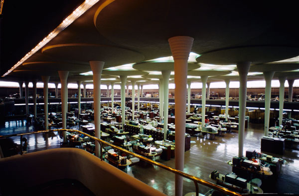
Even here, they're using organic forms in wholly uncommon ways.  This totally reminds me of Wright's Johnson Wax Building:
It is kind of a shame that the stool component only works so well on a white floor.  Very few of us have white floors, and otherwise you'd see the platform base very noticeably.  This is still very cool though.  You may not be surprised that I love the contrast here between the Modern/Synthetic and the Natural.

Same with "Drops":

Inspired by the waves caused by drops of water.  A glamour shot of these in the middle of a shallow, stony stream reminded me how great these would be next to a swimming pool.

As "Nenufar" would be next to a pond:

This almost looks like it was bent out of one solid circular sheet of metal, which would be really interesting, but I'm not sure that's geometrically possible.  I'd have to see it in person, and I don't believe they had these at the show.  Anyway, calling on natural forms, but--especially with the white ones--in an extremely subtle ways.

There are also a lot of pieces from them for the Clever category, like "Bon Voyage":

Shelves that hint at marine forms, maybe even surfboards.  And it's difficult to see in this photo, but this one also contributes to that trend I mentioned earlier of objects that dissolve or disappear into the wall, on its left side.

Here's their "Casper" Collection:

Knowing what this one is called makes it very funny, actually, but I don't think you'd think "ghost" right away.  Rather, stools, etc. that appear as if they're draped with fabric.  These really remind me of this stool that's been around in my parents' houses since before I was born.  The one from my childhood is more elaborate, but it's in the shape of an upholstered, tufted, and ornamented stool, executed in glossy white porcelain.  I like the tension between hard and soft here.

"Equilibrio" has it where it concerns flexibility:

The large casters and metal support--aside from breaking up the visual monotony very simply and nicely--first of all makes the piece easier to move around at will, and secondly responds to the fact that books need to lean.  This bookshelf will stay neat without needing bookends.

They had their "Guerrilla Containers" at the show, and I think this is such a great idea:
They're based on the sandbags used in trench warfare.  This really has so much.  It has flexibility, because you can throw them around and stack them, pile them as you please, where you need them.  It has the dual purpose of being both floor pillows and storage at the same time (a combination I don't think I've ever encountered before).  And above all else, it's poignant, expressive, and even somewhat disturbing in its symbolism.  I had to show you the glamour shot, too, because for some reason it made me grin:

Spies!

Last but not least, when I first saw the "Linehouse" pieces, I kind of thought "uh, oh, reform school furniture":


Ouch, better have a fluffy pillow if you're going to lean on that bar to watch TV.  But you have to see what they've done with this whole room concept, because it's really extremely cool:

It comes from the trick of drawing a picture in one continuous line without ever lifting the pencil up off the paper.  So every piece of furniture in your room is actually connected together in this single conceptual design object.  I think it would be extremely fascinating and so visually dynamic.

RS-Life
Stone Designs
(Barcelona) 3493-658-9503

©2008, Ryan Witte