Showing posts with label Ada Louise Huxtable. Show all posts

Tuesday, June 21, 2011

I Can Can

After visiting IBM, I went to see Gordon Bunshaft's American Can Company Headquarters (1970) in Greenwich, Connecticut. To be perfectly honest, I wouldn't even have known about this building if it weren't for Ada Louise Huxtable, and I'm grateful to her for making it known to me. It was magical.


There are a couple of things I find very ironic about this building. The first is that the very things that the town of Greenwich demanded in allowing this to be built there--namely that it not be over forty feet tall and that parking be as concealed as possible--are the very things that made it cause such an enormous impact on the land. Basically, the conservative residents surrounding this building didn't want to see it, period. Bunshaft's (very smart) solution was to bury probably a third of it underground, meaning far more earth would have to be excavated and disturbed.

The second is that the reason Huxtable praises this building as being considerate to its rural site is the very same reason it would be condemned as such today: that the building is essentially a dam interrupting the flow of a stream through the ravine and creating a man-made lake on the property. With today's attitudes, it might have been forgiven, even praised, if hydroelectric turbines provided all the necessary power to the building, but no. It just got plopped down and completely altered the existing ecosystem.

In the building's defense, times have changed. In the context of the late-1960s and its rampant abuse of and disregard for Mother Nature, this was a highly sensitive and monumental improvement. In any case, it would always be unfair to judge a work of art by present standards--evaluate, of course, but not judge. And whatever its ironies, it is an incredible building that was every bit a rival for Saarinen's IBM for me, believe it or not.


With this building, Bunshaft--head of Skidmore, Owings & Merrill, the absolute masters of the curtain wall--has effectively turned the conventional building form completely inside-out. With the conventional curtain wall, the structure was on the inside of the building, with the steel and glass "curtain" hanging from it on the outside. It had a gradual evolutionary progression, which I started to discuss in terms of his bank at JFK, but at American Can it comes into full bloom. Not only has he separated the structure from the enclosure, but he's made the structure into an expressive element of the building. This is a sort of quirky Brutalism, it's also a form of structural expressionism as per Saarinen, but Bunshaft made it something quite unique to himself that defies categorization.

From what appears to be the main public entrance, one would have absolutely no concept of the scale or character of this building. Truth be told, although beautiful, the front entrance doesn't seem to differ terribly much from any other suburban office complex.


The astonishing side façades were actively, purposely concealed from view, making one's experience of the building a true journey of discovery. These three stories are all you can really see from the front, although there is a hint with a carefully controlled view of the luscious landscaping that there is much more to this building.

The front faces the southwest, so I got back in the car and first drove around to the east. My first shock was the dramatic entrance to the parking garage built into the building's base.

I probably gasped. Even I had no idea the building was this huge. A curving lane feeds each of two parking levels. The base of the building looks like a medieval fortress, strong and imposing.

At this point, I was kind of stuck. I'm thinking, "how am I going to get a look at the back of the building?" I got back into the car and continued in the same direction I was going. But I had to actually exit the entire office complex. My idea was to continue around the outside and keep making left turns until I got around to the other side of it. Before too long, I realized this wasn't going to work because I'd passed over a highway cutting off the building's grounds from where I was headed. I found myself in this really ritzy Connecticut neighborhood. The only way I would have been able to see American Can from there would have been to walk onto and through someone's property, which probably would have gotten me arrested. But the other thing is that the whole point of the siting of this building was that none of the neighboring residents would be able to see it. Very likely it's entirely concealed from view from any property nearby.

I retraced my route past the front of the building and instead went around to the west. This turned out to be another vehicular route to the back of the building which I should have tried first. I ended up not losing too much time. This was another astonishing discovery. A bridge crosses over the tip of the triangular pond formed by the building. This is what one sees from the bridge:


Unbelievable. And as monumental and majestic as that looks, the rear of the building, which I presumed to be the employees' entrance, is quite modestly scaled, especially the way it interacts with the landscaping.


Behind the main building is a much smaller one-story structure which evidently originally housed the executive offices. Here's where I got my first suspicious looks of the day for exploring the building. I got up close to the front doors, and was looking into the building at how a square courtyard was carved out of the middle of it, Bunshaft's signature. Eventually, I realized the receptionist was peering out at me with this snotty look on her face like, "and just what exactly do you think you're doing?" 

It continues to baffle me how people can work every day in a building as gorgeous as this one and really not be able to grasp the concept that someone might want to look at it. It's a testament to the shameful fact that architecture is not legible to the vast majority of people. I might even venture to propose that most good architecture has greater potential to disappear from public sight than bad. When a building works, its users don't need to think about why it works. When a building is ugly, it's called an "eyesore." For something to make your eyes sore, you have to be seeing it. If the architecture causes you inconvenience by being awkwardly planned, you're aware of your interaction with the architecture. Helping make (good) architecture visible to those not indoctrinated in its forms is why I do what I do, on this blog and at work. These looks and the other reaction I describe below are exactly why it's so sorely needed.


I ignored the suspicious receptionist. You can see that the beams on this building have rather conspicuous hardware at the ends. I found this very strange, and I can only think they must be merely ornamental or they most certainly would have been necessary on the beams of the much larger building, which no doubt have a heftier structural job to do. That may have been precisely the point, though. Since this building is so much more petite, the needless strength of the beams and posts was already going to be conspicuous. Rather smart of Bunshaft to emphasize that even more.


The smaller building also gave me a better chance to get a nice close look at the details shared by both structures. The contrast between the relatively rough, muscular concrete engineering and the sleek, shiny black glass is really delightful.


Another thing I liked a lot was how a few of the rock outcroppings were (apparently) left where they were, and used to kind of punctuate the building in interesting ways. The larger of them worked very well with the smaller executive building behind it, emphasizing its diminutive size, this time in relationship to a natural element rather than an architectural one.


Another one interrupted a row of hedges lining the northeastern façade of the main building.


I was pretty much finished, and it was getting very close to the time I needed to head back home so as not to return the Zipcar late. My last stop was the beautifully landscaped employees' entrance, down a grand staircase to a terrace, which I believe was cantilevered over the pond.


When I got to the terrace, some tool in a dumpy brown t-shirt and a baseball cap was coming out the door. He sort of asked if I was headed into the building so he could hold the door for me (polite enough, but wait). I said "no, no, I'm fine, thanks." And went around into this little corner behind the entrance to get my last photo. When I turn back around, Dork is standing there glaring at me and says, "excuse me, what are you taking pictures of?" I said, "the building." "For what?" "I write an architecture blog." "Well, I work here and I can't let you do that. Yeah, you can't be taking pictures here."

Oh, yeah? And why not, Baseball Cap? It's a freaking movie studio now. It's not the FBI headquarters. Hell, it's not even a major international airport. What I should have said is, "oh, really? On whose authority will you 'not allow it?'" But I'm not generally a trouble-maker and the last thing I needed at that point was a spontaneous trip to the office of the building's head of security. I needed to get the car back.

I am called upon to forbid photography at work, too, but that's inside the buildings, where there are many very good reasons it can't be permitted. No one would even pretend to try to forbid it outside; it would be laughable. The best thing about Photo Policeman's little performance of being so very, very important is that I might have snapped another picture or two, but basically I had been there for around an hour and was already entirely finished taking photos. It was an unfortunately sour ending to a wonderful trip out of the city, too wonderful to be ruined by one person's delusions of grandeur.

And there you have Gordon Bunshaft's American Can Company Headquarters.


All text and images ©2011, Ryan Witte.

Monday, November 29, 2010

We Couldn't Get Much Higher

The final, inescapable fact remains that architecture is now breaking scale, and style, everywhere. (In his secret heart there is hardly an architect who doesn't want to do so.) The objective historian realizes that the twentieth century is in transition to a remarkable new technology and a formidable new environment, before we have learned how to handle the old one. Who's afraid of big bad buildings? Everyone, because there are so many things about gigantism that we just don't know. The gamble of triumph on this scale--and ultimately it is a gamble--demands an extraordinary payoff. The Trade Center towers could be the start of a new skyscraper age or the biggest tombstones in the world.
--Ada Louise Huxtable, May 26th, 1966

There have been quite a few lines that made me almost gasp and think "Holy @#!+ can this person ever compose a sentence." But the end of that paragraph I'm pretty sure made my jaw drop open. So profound, so prophetic, and with such a deep understanding of what it means to create architecture and the inherent implications of what we build. And I think most appropriate considering where I was headed on the train.

This was what I'd just finished reading when I arrived to see the premiere sponsored in part by DOCOMOMO (who, by the way, have a newly revamped website which looks great) of what turned out to be a gorgeous documentary about Louis Sullivan, titled for him with the subheading The Struggle for American Architecture. It's a wonderful film directed by Mark Richard Smith, and the icing on the cake was that the premiere was held at the showroom for the greatest American furniture manufacturer of the twentieth century: Knoll. There's almost a kind of electric buzz about being in the Knoll showroom, almost as if you're in the vortex of a much bigger storm of creativity and design history.

I was very surprised to hear that no one has ever made a documentary about this man. Actually, there was just one, called Tall: The American Skyscraper and Louis Sullivan from 2006 which concentrated on only one aspect of his career. But really? That's it? There's at least sixteen or so about Sullivan's protégé, Frank Lloyd Wright. For crying out loud, Sullivan pretty much invented the skyscraper, put Chicago on the map as an architectural wonderland, and coined one of the most famous lines in all of architecture: "form (ever) follows function." He's probably the architect most integral to the transition into the twentieth century.

Photo courtesy Photosfan.
The film is brilliantly framed. It starts with the Chicago fire of 1871. It was an obvious choice, but it works so well, both narratively and thematically, because it makes the city, itself, a blank sheet of vellum. The photographs of what remained after the fire are incredible. It was a virtual wasteland, with only a wall still standing here and there. They actually remind me a bit of the shots of European cities immediately after World War II. But Chicago's infrastructure--namely the train lines and the stockyards--was left unscathed, which meant the city could be rebuilt. And was it ever. It was during this boom, needless to say a great time and place to be in any way involved with the building industry, that Sullivan arrived in Chicago and decided it was right where he needed to be.

It was a bit of a bumpy start, because a recession hit that slowed down new construction a bit. Sullivan took this opportunity to go to Paris to study at the École des Beaux-Arts, which he found insufferably boring. While making a side trip to Rome, he discovered Michelangelo's ceiling of the Sistine Chapel, which had a profound influence on him. When he returned to Chicago, he teamed up with Dankmar Adler, who was a fantastic engineer and acoustician, but nowhere near as talented a stylist as Sullivan, making them the perfect team.

It was well known that, if you wanted a great theater, you hired Dankmar Adler. Ferdinand Peck did just that for the design of the Chicago Auditorium. The exterior was uncharacteristically bland for Sullivan, inspired by the adjacent Marshall Field Warehouse (1885) by H. H. Richardson. But it was the largest building of its kind ever constructed at the time.
Image courtesy Chuckman's Photos.

Photo courtesy Sampleboard Online.
The interior of the opera house, on the other hand, was an absolute symphony of ornament and decoration, color and luxurious materials, which Smith's cameras captured with the most loving admiration to the sound of a Richard Wagner swell. The film makes a point to note that, because of the intimate collaboration between the two partners, everything was seamlessly integrated into the interior's style, down to the ventilation grilles and the lighting, which was the frighteningly-new electric technology. It was a gargantuan job, self-inflicted by Sullivan, who wanted to design all the ornament from scratch to cover every inch of the place. A young Frank Lloyd Wright, hearing that Sullivan was swamped, sent over some sample drawings asking if they needed another draftsman. Quite wisely, Sullivan hired him. The Auditorium catapulted the team of Adler & Sullivan to fame. They also made their new home in offices in the building's tower.

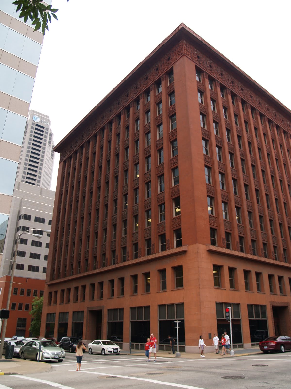
His next big breakthrough was a result of his attitude toward buildings, that they should look like what they are. Sullivan was dismayed by the handling of height. The technologies making it possible--namely steel frame construction and the elevator--were too recent, and architects were not sure yet how to deal with it. These early tall buildings were typically in any number of different architectural styles stolen from Western Europe and stretched vertically. His response in 1891 was "every inch a proud and soaring thing," the Wainwright Building in St. Louis, Missouri.
Photo courtesy Brandon.
Because Sullivan thought the main problem was that tall buildings didn't realize what they were, he strongly emphasized the Wainwright's height. His model was the classical column, with base, shaft, and pediment. If you look at the building at a sharp enough angle, you can very much see the fluted column in it. Five years later he did something very similar with the Guaranty Building in Buffalo, New York. Guaranty, however, was an explosion of ornament in terracotta that adeptly masked the necessity of terracotta to be installed in tiles.
Photo courtesy Cuda swiata.

Photo courtesy SFSU.
The end frame for the story appears in 1893: The Chicago World's Fair. The gleaming white architecture of the fair by Daniel Burnham (with Frederick Law Olmstead) was strictly Beaux-Arts (though built, characteristic of our Drive-Thru Fast-Food culture, like a stage set).

Sullivan had rejected all this contrived pomp for being decidedly European. He felt American architecture deserved its own idiom, rather than simply deriving forms from another time and another continent. As the title of the documentary suggests, he was looking for a truly American architectural vocabulary. The country, however, was too young, too fragile in the wake of the Civil War. So while European visitors to the fair were fascinated by Sullivan's unique and colorful Transportation Building, American visitors were much more turned on by the pretense of legitimacy neoclassicism could bestow upon the United States. Sullivan said it set back American architecture by forty years.

From that point on, classicism was it. Every substantial commission purchased a big, white marble Beaux-Arts temple. Nobody wanted Sullivan's eccentric, unfamiliar brand of Americana. His last great large building would be the Carson, Pirie, Scott department store in Chicago.

Photo courtesy iReference.
Quite amusingly, outside of this store is where one can purchase a demon-possessed Good Guy™ doll from a homeless man.

Finished in 1899, this building is easily twenty-five years ahead of its time and about as modern as any building could have been in the nineteenth century. Additionally, his nature-inspired ornamentation was the perfect complement to what was beginning to be understood as the market driving force behind the art of the fashions sold inside the store, namely the changing of the seasons.

Photo courtesy Exoterika.


Sullivan died penniless and broken in 1924. Despite the fact that he'd built one of the most beautiful tombs in the world--for Carrie Eliza Getty--his friends could only scrape together enough money to buy him a sad, forgettable headstone. His last work wasn't even a building, but merely the façade of a tiny little music store. That a man of such unbelievable talent should meet such a tragic end is shameful and disheartening.

The sort of happy post-script onto the story, though, is a flurry of incredible creativity and exquisite work he did for a bunch of small banks in mid-western farm communities. He built eight of them, from 1908 to 1919, in Minnesota, Indiana, Wisconsin, two in Ohio, and three in Iowa. In my opinion, it's some of the best work he ever did.
Photo courtesy Primitive Screwheads.

His use of ornament had reached a level of sophistication that could be matched only by a true genius, like Michelangelo himself, isolated to brief moments of explosion and intricacy, while tempered by expanses of serenity and restraint.


The modest scale and proportions presented a welcoming, down-to-earth stance to the farming communities and very much appealed to them, quite contrary to the overblown elitism of the common neoclassical approach to bank architecture. Furthermore, his use of natural, organic ornament here spoke to the lives of townspeople who earned their living from the land. The banks became beloved. They also ended up in small towns where little ever changes. So in one last, small victory, while much of Sullivan's work was heedlessly demolished, the banks all remain standing as jewels on the countryside.

One of the great things about them is that he'd begun "signing" his buildings. Right underneath the bank's sign, it would say "Louis Sullivan Architect." It sort of reminds me of how Fellini started to put his name into the actual titles of his films: Fellini Satyricon, Fellini's Roma. But entirely justified because Sullivan's work was so distinctive and at the same time, in a way, quite modest.

After the screening, there was a short talk by the director and a Q&A session. He said he'd never made a film before, which made this project a bit difficult to get produced, and makes it even more impressive as a debut effort. I asked Smith if, while shooting the film, there'd been any one building that really grabbed him, that really took his breath away. He said the Guaranty in Buffalo. He lamented the fact that, due to issues with the current owners, Prudential, it was just not possible to get inside it. But he did manage to get some stunning photography of the exterior with the help of a window-washing platform. A couple other questions and we all headed over to finish off the wine they'd so nicely supplied.

I'd said hello to Kathleen, John, and Leslie from DOCOMOMO when I arrived. I'd met them all at their Kips Bay Towers event for Open House New York, which will be the subject of a later post. But afterward I got the chance to chat with John Arbuckle, who I was impressed to discover works for Gwathmey Siegel. He was telling me all about Buffalo since it's the location of the building Smith said most grabbed him. He reminded me that Frank Lloyd Wright's Darwin D. Martin House is also there and is now open to the public, and a few other things that all together might make it worth a trip to Buffalo. I think he might have sold me on going at some point.

I also asked Smith if this might be picked up by PBS or a similar network. He said he had spoken to people at PBS, but that they already have their own stable of directors with whom they work almost solely. I think this is very ridiculous and unnecessary. It limits the voice of their programming and means that some very good material (this film, for instance) will never see air time on their stations.

You can purchase a copy of the DVD (also available on Blu-ray), Louis Sullivan: The Struggle for American Architecture, on the website for the film (link at top). I highly recommend seeing it. Personally, I'm looking forward to buying my copy when the expanded edition is released with (perhaps) behind-the-scenes footage and commentaries and whatever else.

©2010, Ryan Witte

Tuesday, August 17, 2010

You Have Arrived--Flight 172

At long last, here is the huge project to which I've made reference a few times. It's a follow-up to my story about JFK Airport from a couple years ago and a more in-depth look at its architecture.

I've now had the opportunity to visit the greatest gateway in the United States twice, just for the pure pleasure of doing so. The first time was by train, starting from another important structure in the story, Walter Gropius' Pan Am Building (now MetLife, 1962). My second, more recent trip was by car.


--Google Maps view.
Arrival by automobile is sort of like riding a kiddy roller coaster at an amusement park--but without the fun part. This is not to say that the signage isn't terrifically clear and easy to follow, but the arrangement of the roadways defies all common sense. Having driven around "Terminal City" most of the afternoon, I finally feel that I have some concept of how it's all laid out, and I'm sure seasoned taxi drivers are comfortable with it. For the occasional traveler, it's something of a mess.

It was admittedly before my time, but I can't help but pine for so intuitive a notion as a simple oval roadway dotted by well-placed terminals, as it was originally conceived. I'm sure employees who arrive by car know the tricks, but getting from one place to another inside the airport is a nightmare. Every time I left a terminal, I had to exit the airport entirely, go around that South Service Road, and enter again. I must have done that seven times.


Building 72: First National City Bank (Skidmore, Owings & Merrill, 1959)


Click for larger views.
--All JFK photos ©2010, Ryan Witte, unless otherwise noted. I reserve all rights to them, but please do contact me if you'd like to use any of them.
My first stop was this glorious little bank, which I had seen only in photographs and for a split second passing by it on the AirTrain. Construction workers are fixing up the building. Obviously, things aren't looking so clean, but in my opinion, Citibank should be proud of the fact that they're taking good care of such a lovely and under-appreciated building.

As much of the work of Gordon Bunshaft, head of Skidmore, Owings & Merrill (SOM) at the time, this bank is a truly marvelous example of International Style Modernism. But of course, Bunshaft was also responsible for one of the most wonderfully innovative examples of bank architecture, the Manufacturers Trust Company at Fifth Avenue and Forty-Third Street.

Though quite modestly sized, this bank has very suave proportions and is wonderfully sleek. Raised up off the ground on thin steel pillars, it appears to float on the horizon in a quite magical way. It was functional, though: the open ground level was originally intended to accommodate drive-in services.


There's something very Miesian about that, as well.

As Ada Louise Huxtable has said, SOM were and are the absolute masters of the curtain wall. This building shows off their skills to great effect.

The structure of the building--that is, the row of steel piers--has been pulled apart from the glass enclosure. Structure and enclosure become rationally two separate functions of the architecture.


The interior--accessed by a floating double staircase--is sparse and shiny in a deliciously 1950s sort of way.


Ironically, although it isn't even an airline terminal, this was where I encountered the most staunch resistance to my camera. This was an over-zealous construction worker with delusions of CIA involvement. Not only did he give me a good talking to, but very nearly grabbed me by the scruff of the neck to drag me bodily into the bank manager's office upstairs. The manager was very nice, but I could tell he needed some assuaging before he'd be comfortable with the idea that I was there only to appreciate the architecture of his workplace (which I'm fairly certain he'd never considered before).

Part 2.

©2010, Ryan Witte

Tuesday, August 25, 2009

News

I have a whole bunch of posts in the works, many of which are waiting for one thing or another to go up, but in the meantime, a couple of interesting items.

First of all, definitely check out Charlie Rose's interview with Ada Louise Huxtable. I haven't agreed with everything she's said, but there's no question she is the preeminent architectural critic in the United States and possibly this entire hemisphere. It's a wonderful and charming conversation they have, and it's delightful to listen to her.

I found a few interesting connections in my research for work. Her late husband was the industrial designer Leonard Garth Huxtable (1911-1989). It's that he designed the Opera Café at the Metropolitan Opera House, which was allegedly replaced by their live broadcasting facilities in the late-1980s. He started out working with the Immortal Norman Bel Geddes. While with Bel Geddes, he was a member of the design team that created General Motors' landmark Futurama exhibit at the 1939 World's Fair.
--Photo courtesy the Discovery Channel.
He worked for GM for a while in Detroit, and then returned to New York to work at the office of Henry Dreyfuss, another colossus in the world of industrial design. Later he founded his own firm. He designed the delegate's desks and chairs and lounge furniture for the United Nations, a project led by Wallace Harrison (as was the opera house and to some extent the '39 World's Fair). He also created the glassware, china, and serving pieces for Philip Johnson's Four Seasons Restaurant. It's sort of very funny and ironic how much Ada Louise seems to hate Johnson's AT&T (Sony) Building. That's one thing I don't agree with; I think it's gorgeous and perfect.

Slightly related to my recent plumbing/ water purification rant, there's also this extremely interesting article about vertical farming in urban locations that recently showed up in the New York Times. I highly recommend it and hope the ideas put forth become a reality not too long from now.

I also had to show you the Corvette Rondine by Pininfarina, which debuted around 1963 and just recently came onto the market in California. It's absolutely exquisite:

Click them for slightly larger.
--Photos courtesy the New York Times.
Gimme.

©2009, Ryan Witte