Monday, October 24, 2011

Dis Connecticut--Part Two

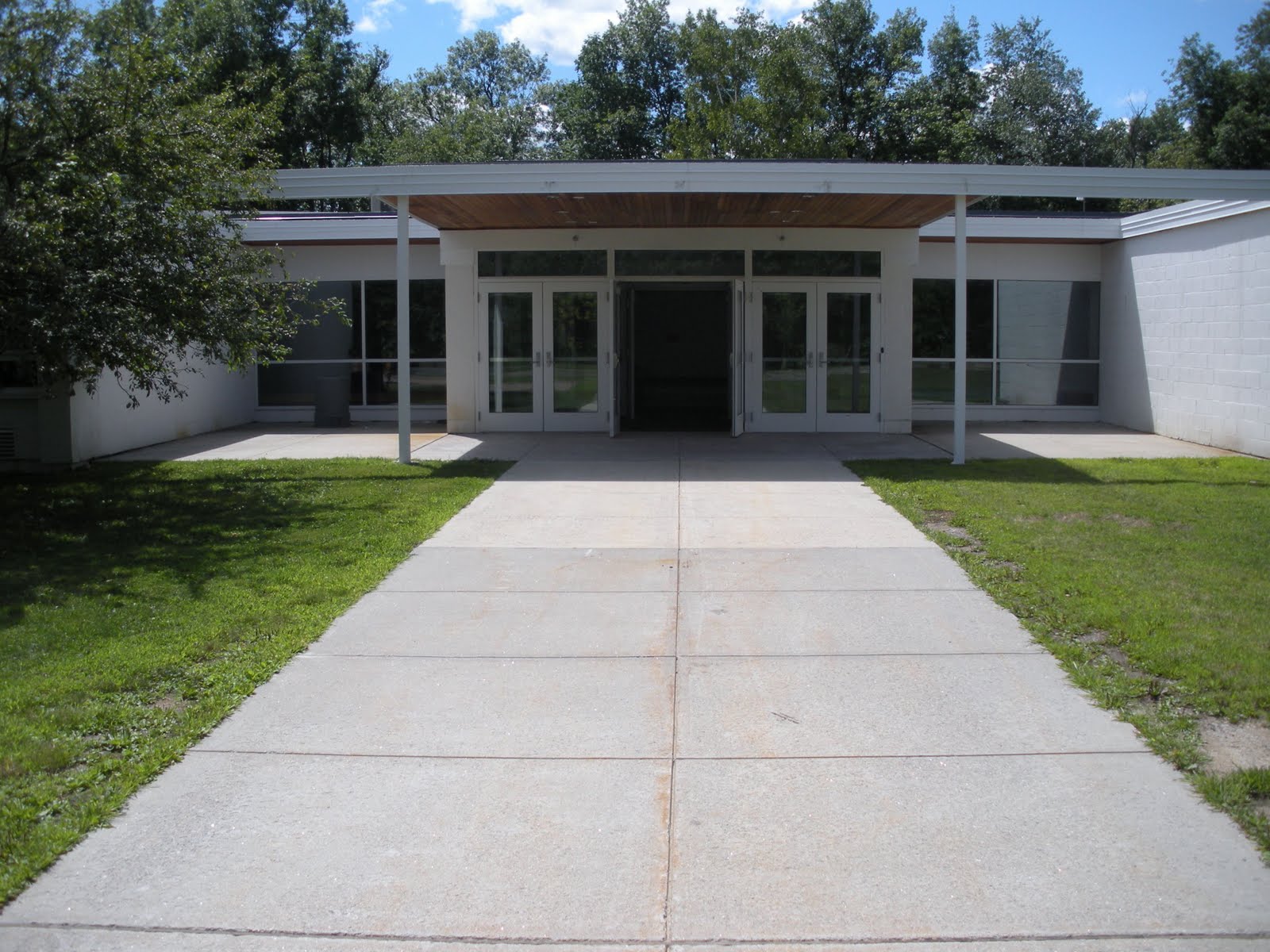
Normally, I might lament the fact that other projects needed to take priority over this story for a while. In this case, it actually worked out quite fortunately. While this part of the series remained under construction, I got the opportunity to meet the architect of this building in person, purely by accident. I'm not referring to John Johansen, but his partner, Ashok Bhavnani. Johansen's mentor was Breuer, Bhavnani's was Richard Neutra; I can imagine few marriages of architectural lineage with such potential for greatness. How I came to meet Mr. Bhavnani is for a future post, but he told me he was heavily involved with the design of this building. It's the Intermediate School (1968), right up the road from Litchfield High School.


There are three entrances to the building, a new one on the north side (right), that one on the west (above), and one on the south. We first came upon the new one on the north façade, a redesign by the same firm that renovated the high school. They chose to employ brightly-colored corrugated metal as a nod to some of Johansen's later work.

In honor of this post, I decided to finish a book I'd begun a while ago but for some reason never finished. I think it was not quite meaty enough for me, which I'll explain in a second. It's Johansen's Nanoarchitecture--A New Species of Architecture.

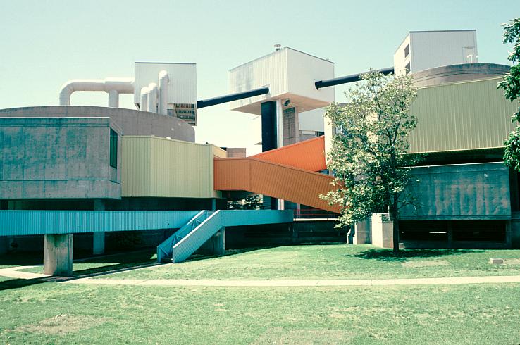
A new species it is, but you have to look for it. It's a small book and the majority of it is photographs of models, computer renderings, and drawings, not text. It's a collection of hypothetical projects of Johansen's that he worked on to push boundaries and explore new directions architecture might take as a result of new and emerging technologies. Most of them are extremely interesting conceptually, but I'm tempted to believe most of the conceptual breakthroughs, or at least most of the lines of inquiry that could lead to them, were mapped out by Archigram in the late-1960s. Coincidentally, there are traces of Archigram to be found in Johansen's own Mummers Theater (1970) in Oklahoma City.

The models also come off as being rather homemade. I'm not saying I have any skills whatsoever in taking an Exacto knife to balsa wood and foamcore. But computer renderings that are becoming increasingly indistinguishable from actual photographs these days I think have left me somewhat spoiled.

The last few projects in the book, a discourse on the title subject, and the epilogue are all mind boggling, however. What he calls "molecular engineering" is something I've thought about for years. To oversimplify, the "blueprint" for the house is basically a human-engineered DNA sequence. The organism that results has all the functionality and structure of a house. Nature does pretty much everything a house would need to do, and much more, except for perhaps the ability to connect to communications technology. A single redwood tree represents more mass and structure than most people's houses. Nature can create electricity and light, convert organic waste into energy, moderate temperature. You could even conceivably grow a television or computer monitor by carefully ordering DNA. Once computers start getting more powerful and can be used to analyze genetic code faster and with more precision, I don't think this will sound all that far-fetched.

The epilogue covers what I'd expected more of the book would have, the use of nanotechnology in building. Much faster than a tree, nanobots could be programmed to "grow" a house in much the same way as our organic programming. To me it would seem there are benefits to both. If both genetic engineering and nanotechnology were used together, it's even more incredible to think what could be accomplished. This would have all the capabilities of computer technology and electronics, with all the efficient expenditure of resources and sustainability of the natural world. Certainly people will still want to put up their own structures like they always have. Beyond that, the entire idea of what Architecture even is will change so drastically and in such fundamental ways, it will barely look like the same profession anymore. I'm not sure I can say with any confidence that I will be around to see it happen in my lifetime, but I can only hope.

Back to the Intermediate School, this was a designation I was unfamiliar with and had to ask someone there. "Intermediate" is years four through six. I could find no photographs of what this building originally looked like by Googling around, but it appears that it very much turned itself inward, with the exception of the central entrance. 

At the central façade, seen in the first photo above, windows punch dramatically outwards to meet the street. The addition on the north looks to have broken through a solid masonry wall with its aluminum(?)-framed glass box opening it up. The upper story, like the wing to the south, has no fenestration, although that doesn't necessarily mean there were no windows or doorways on the ground floor.

Subtracting the addition, the main building reads as a transparent glass volume in the center, framed by massive concrete and masonry construction, with a solid, opaque concrete and masonry volume on either side of it. Almost entirely imperceptible in person is the fact that the two side wings are turned outward at the very slightest angles from the central section. The effect is more subconscious than anything.


At the junction of the north and central sections is the first hint that this building is truly a work of art. The first thing to notice is the illusion that these are two separate buildings due to the corridor connecting them being on the ground floor. About a third of it is below grade as seen from the front. Whatever is above grade is hidden by plantings. The other thing, which becomes clearer at the junction between the central section and the southern one, is how the views have been so carefully composed. The two sections have been pulled apart to here reveal a chimney, only very fleetingly, which stands in the courtyard like an ancient obelisk.


The central section does something very interesting with (a)symmetry that reminded me of Breuer's work. The volumes that project outward display a conspicuous, rigid symmetry, while the recessed volume underneath is very much asymmetrical. It's as if the building wants to project a sense of formality to the outside world, but takes a more casual tone for its interior. As I was talking about this, I was evidently being overheard by one of the faculty members, who stared at us out that window in the center until we were out of sight again. I know I'm very interesting to listen to, but it was a little bit weird.

The next junction I found extremely interesting on a number of different levels. First, the two wings are way too close together. In other words, they're so close that they ought to be simply brought together into a single structure. If they were to be separated, they really ought to be further apart from each other. As it is, it frames the view of the obelisk chimney even more specifically than the opening to the north. The corridor that connects the two wings is concealed from view at most angles, amplifying the illusion that these are two separate structures.

Next, a pathway leads straight toward that opening, but then forces a sharp ninety-degree turn to access the doorway it serves. The space between the two buildings, while too narrow for compositional reasons, is just wide enough to appear to be a passageway, probably around four feet wide. But the passage through it is decidedly blocked by a shrub.

Finally, framing this opening--which, all told, must be there only to control views--are two massive, monolithic masonry walls. Beyond the opening, what it reveals is an enclosure with glass on three sides, allowing you to see all the way to the back of the courtyard through first one glass wall and then the second. The contrast this creates between enclosures of opacity and transparency is extremely powerful.

The south entrance is turned at an angle from the great southern volume. Just enough to be perceptible, but not much more.

Around to the right, it's revealed that the wall has been extended out from the enclosure, to call attention to its qualities as a wall, but also drawing attention to the strong, yet false symmetry of the entrance facade. This is further amplified by the fact that it is obviously at an angle from the larger volume behind it that it accesses.

From this point forward, the building completely changes its character about once every yard (meter) you walk.

The first thing you see is this great composition of brick volumes clustered together. The sense of walking into an ancient Roman village is unmistakable and had to have been intentional. Perhaps Brutalism was at its finest at these moments when its Modernism was transitioning into Postmodernism, and recalling our architectural past to create moods.

This one little doorway was especially remarkable. Its masonry frame is easily a mere canopy, but it's deep enough to be surprisingly intimate, while retaining a sense of the monumental at the same time. It also means that from all angles save directly in front of it, the vistas of pure masonry volumes are uninterrupted.

A raised walkway finished in roughly textured concrete prevents the courtyard from coming into view too suddenly, but rather reveals it slowly and carefully.

Once past the walkway, the courtyard is a gorgeous space and truly the heart of this building. The façades on the east and west of the courtyard are the most glazed of any on the building, as I mentioned, turning the building inwards.

The one on the west, while similar to the entrance façade on the opposite side, has an entirely glazed ground floor. In a careful balancing act, these two façades present larger expanses of glass to the courtyard, but are still clearly framed by concrete structure.

To the north and south, glass boxes pop out of the corridors connecting the seemingly separate wings of the building. While smaller in surface area, the structural concrete framing is gone, allowing them to dematerialize more than the fenestration of the east and west walls. The other side of the glass box here, by the way, is the one that can be seen through the strangely narrow opening between the two structures from the front, discussed above.

With most especially these two façades, the architects managed to create something monumental but with intimate moments, as well, formal but not stuffy, somehow ancient yet totally futuristic. There is no doubt a lot of Breuer in this, but it is a fantastic building unto itself. I never did get around to see the east side of the building. It appeared inaccessible, although I suspect it could be accessed around from the north. There were a lot of other things to see that day, and I was getting hungry.

We had a nice lunch in the quaint town center of Litchfield. Only about fifteen minutes from there and out in the middle of nowhere was our next stop, a complete bust. It was Daniel Libeskind's 18.36.54 House.
Photo by Nicolas Koenig courtesy architect's website.
Just looking at the photos of it makes me want to weep at how breathtakingly genius this is. I should have known that a state like Connecticut would never allow something like this to be visible from the road. But that's a complete understatement here. I mean, you can't see anything. It's all the more ridiculous if you can imagine the most rural possible road this is on, it's almost surprising that it's paved with actual asphalt. My point being, if this were visible from the road, probably no more than about ten people would even see it on any given day, and at least one of those ten would be a mail carrier.

Nonetheless, what you see from the road is a fancy motorized gate, not even connected to a fence, and a lonely call box on a stand. Behind that, a cliff rises up about 300 feet (100 meters) at practically a sixty-degree angle, with a driveway snaking up it like Lombard Street. You would not want to try this after even the most minor snowstorm. In fact, I'm surprised there's no staircase up the hill just so they could park at the foot of it and walk up on foot in the case it got icy. Maybe the driveway is heated, I don't know.

In any case, I was not going to let this go so quickly. We turned around, I rehearsed a little speech along the lines of "I write an architecture blog and was hoping, if it's not a terrible intrusion, that I could maybe get a few photos of the outside of your house," worked up some courage, and pulled up to the gate. I pressed the button on the call box. It rang and rang, and rang...and rang. No answer. The thought did cross my mind that, if there were no one home, we could probably just climb the hill on foot and walk around. Who would know? But all along I was aware that just because there was no answer to an unexpected ring at the gate didn't necessarily mean there was no one up there. And ending up in jail for trespassing probably would have ruined the day.

Drat.

Eventually I would really like to go back up to see it. The problem is that I've now already seen everything even remotely close to that house, so it seems almost silly to drive so far just for that one building (Litchfield took about three hours from the city). I have been in contact with Libeskind's studio about getting in contact with the owners, but the fact remains (as I knew) that this is a private residence. If my experience with another private home I've been wanting to profile is any indication, it may be prohibitively difficult. Cross your fingers.

Stay tuned for Part Three.

All text and images ©2011, Ryan Witte, unless noted.

Monday, September 12, 2011

Dis Connecticut--Part One

After my incredible experience at Bronx Community College, I was very excited to see another work by Marcel Breuer. A great opportunity arose a couple weeks ago, so I went to see his Litchfield High School (1956) in Litchfield, Connecticut.

Ironically, despite the architect, it feels like a bit of neglect to the directions begun by my posts discussing equality to be visiting a state that is almost eighty percent white/ non-hispanic. To be fair, Connecticut's population of people of color is larger than I would have thought. I fear that too many of them are to be found in urban areas without the scenic beauty or New England charm of towns like Litchfield.

This trip was the most perfect evidence of how the universe decides what path one is meant to follow, greases wheels in some directions, and erects insurmountable walls in others. It also proves how flexibility and spontaneity are requisites for getting the most out of what the universe wants you to experience. So many things in our lives are arguably in the hands of fate, anyway.

I had discussed the unfortunate incompetence of Google Maps where it concerns driving directions before, but had they been perfectly accurate, we never would have passed by our destination and discovered the lovely center of the town of Litchfield where we ended up finding a very nice restaurant at which to have lunch.

We were discussing how all of Connecticut's school districts are regional. Students are bussed to enormous centralized high schools from very long distances. Perhaps this wasn't in the works in the mid-1950s when Litchfield High was constructed, it isn't a terribly large building. But if the state's educational system was undergoing reform or gearing up to do so, it would make sense that a new school building would've been commissioned. As much as Connecticut adores its (gorgeous) traditional architecture at the expense of anything new or innovative, I must commend them for choosing Breuer. I'm calling this a "high school" because it originally housed years nine through twelve. It now has years seven through twelve, and although it was expanded, I'll have to say it's an extremely small building for that amount of student ages.

The people at the school, namely the secretary, Ms. Johnson, and her coworker (Ms. Fox or Ms. Ream, I didn't see her name plaque), couldn't have been nicer, more helpful, or more accommodating. It turns out her first name is Kathleen, but I think it's much funnier to keep calling her "Ms. Johnson," since that's what all the students would be calling her. Strangely, they were really the only two souls we encountered during our hour and a half or so visit there. I heard voices down hallways a few times, but saw no other faces. The school's administrative offices are now inside the main entrance seen here. This is all new construction from 2007. The architects did their level best to restore as much of Breuer's intent after a very unfortunate renovation in the mid-1970s nearly destroyed the design entirely. The original main entrance to the school was around to the northwest, which I'll get to below.

It was fortunate that the opportunity arose to see this before the school year had begun, when likely keeping students out of my camera's lens even on a Sunday would have been very difficult. I also don't know if Litchfield has any summer school or summer programs, but there was no one there at this time of August. We were given free rein to explore pretty much the entire building. We didn't try to really access any classrooms or anything, I felt that would be taking unnecessary advantage of their hospitality. The design of the school is such, however, that everything is so opened with interior windows and glass doors that we could examine most of it by sight anyway.

The best thing about Litchfield High is how banal it would appear in its construction at first glance, and on the other hand, how intriguing and masterful is its design, in spite of that. One might even say that this building is the flip-side to Robert Venturi's Guild House, because the school was made intriguing despite the fact that its origin as a state-funded project might encourage banality, whereas Guild House was made to appear ordinary despite its deeper complexity.

The most frustrating thing about the building is that it's practically impossible to get any clear impression of what of it is actually Marcel Breuer's. So much has been added to this building, so much of a presumably different character, and so much that obscures the evident clarity of the original structure. Even studying and comparing the various photographs of the building, as I have for probably hours now, it's a complete mind game trying to make sense of what is what. As different materials, images, and information have come in, I've had to revise this story a number of times.

Another problem is that this building is very far below anyone's radar. There's a very disturbing pattern of events appearing as this post is being written. Litchfield High is an obscure work, of which few people apparently take notice. No one seems to care about the Bronx Community College buildings and fewer people seem to know anything about them. The Whitney Museum is callously abandoning their iconic Breuer building to move downtown, leaving it in the hands of the Metropolitan Museum, as if it were some bit of random leftovers to be dumped in the trash.

As I've told numerous visitors to New York, the Whitney is my favorite museum here, in large part because of the magic of their Breuer building, which is both a work of art in and of itself and a brilliant space in which to display modern art. For crying out loud, some of the works in the Biennial very smartly and poignantly responded to the specific design of the building where it appeared. I'm sure their new facility will be remarkable. I'm also sure that the Met knows how to handle a twentieth-century masterpiece like the Whitney building on Madison. This is hardly the point. How can a Modern master be so flagrantly and routinely dismissed in this day and age? The same question can be asked about I. M. Pei, with equal chagrin.

While Litchfield High was no doubt a lovely bit of 1950s architecture in its way, and perhaps even sophisticated on some levels, it's anything but a monumental example of Breuer's work. It's been so altered that it hardly counts as something you'd want to attribute to him anymore, as I mentioned above. Syracuse University holds the majority of the Breuer archives, but it was going to take FBI training, a century or two, and a magic wand for me to get copies of the floor plans that I needed. As it is, this post has taken far longer to finish than I ever would have hoped. Looking around on the internet unearthed practically nothing about this project. As unprofessional as it feels, my last resort is to make my best guesses as to what happened when.

Litchfield High tells a story with its façades, of which no two are alike and which change continuously around the building. My narrative plan was to go around the outside, around the outside, but a couple of spaces won't really translate to the outer façades because they're in the center of the building. One thing I liked a lot was the central courtyard, which truly does fill the hallways with natural light. This would seem to be a signature of mid-century architecture, as much as it was a staple for ancient Greek domestic architecture. The mid-century architects loved carving these glass boxes into the interiors of their buildings. I'm not convinced it's a feature that needed to go away, either.

For some reason I was drawn to the Home Economics classroom, which is now called a "Food Lab." It just looked so warm and inviting. I'm not convinced that "Home Economics" is necessarily an outdated name for the subject, except that presumably this course is more about the art of cooking than it is about the financial management of a household. I still can't help but wonder why cooking isn't packaged differently in schools, first of all as a true tool of survival, health, and fitness, but also as an art form bursting with fascinating chemistry. The first time I experienced how simple syrup (half water, half sugar) behaves, doing such completely different things at different temperatures of boiling, I instantly became fascinated. All the other staple ingredients are like that, too.

Litchfield High unfolds in a particularly linear way because, with what one might consider the exception of the two-story-high gymnasium, it's all on one level. That whole wall at the gymnasium's upright end wall, as Breuer designed it, was entirely glass. The 1970s crime removed the entire glass wall and covered it over. There was concern about having a glass wall in a room designed for projectiles to be flying through the air, and the glare from the sun was so bad that, at a certain time of day, you couldn't even see the basketball hoop in that direction. Luckily the architects were permitted in 2007 to restore at least the top half of that wall to its original glass, but not without a fight.

The new main entrance now faces the southeast. To the east of this is a pavilion housing the cafeteria, which I believe was one of the additions made in the 1970s. I'm baffled as to where students ate lunch before this, as the original layout seems to include no space large enough aside from the gymnasium. Presumably the wing of the building behind this was originally a cafeteria and was divided into smaller classrooms, including the one now housing the Food Lab.

The original structure is built almost entirely of simple concrete blocks painted white. While looking around inside, I sort of half lamented that Breuer was forced, likely by budgetary constraints, to use such a mundane building material. I also immediately recognized that it's this very fact that makes this such a fascinating project. It's one thing to see the flights of ingenuity possible when an architect has all the access to funding and new building technologies at her or his disposal, like Saarinen did working for all the biggest corporations in the country. It's quite another to see how a great architect would approach something as commonplace as concrete block and low-cost and, I suspect, highly-standardized building techniques. In this first pavilion, it is already apparent that this is not going to be your typical run-of-the-mill concrete block school building.

First, almost all the windows are recessed to protect the interiors from the direct glare of sunlight. Visually, it gives the façades a real depth, formal power, and drama. Now, it's possible that the bays that contained doorways were stretched by the addition of an entrance just wide enough that they'd be structurally unsound. But the point is that here cylindrical columns support the cross beam, rather than stacks of concrete block or some other solution. With their very subtle, pared-down nod to the classical colonnade, they give the entrances a sense of formality. It's simple, but having noticed Breuer's often exuberant attention to entrances in other projects, I have to believe this was conscious.

Another thing to bear in mind is the wedge-shaped roof providing a clerestory that bathes the cafeteria below in natural light. Only a tiny triangle of it is visible on the top left of the photo above. There's also a much more striking example of this, which I'll discuss below. Ms. Johnson said the cafeteria might look a bit of a mess since all the tables were folded up, but I thought it looked clean and fine. The natural light really does flatter the interior and likely those occupying it. I was surprised to notice that the cafeteria was rather small. Doing some rough math, figuring on maybe three lunch periods, I can't imagine the school has a roster of more than around 300 students, which is really not very big, only 50 students per grade.

Around the corner from this is another moment which would seem to confirm the symbolism used for the entrances, but first is what happens at the corner. Unlike the sort of buttress at the opposite end, this carved-out corner of the building serves no purpose but a sculptural one, to both emphasize the massing of the façade to the left and to mark the corner of the building with a bit of (pragmatically unnecessary) artistry. It seems to lighten the mass of the building to some degree, as well.


Traveling around to the northeast façade, things are a bit more industrial and not as scenic, but it was here that I began to see how every part of this building was going to be different than all the others. First is what is mostly likely a service entrance to the cafeteria up a small stair. Since it is an entrance, it's punctuated by a single cylindrical column.

Immediately to the right of this is a loading dock supplying the cafeteria with chicken nuggets, foot long hot dogs, and vanilla physedibles, whatever the heck that is.


This section and the one to follow I also believe were added in the '70s. At the corner of this wall are two small window alcoves. Then there are these two wedge-shaped window bays, unique to this façade of the building. We are pretty much full on into Brutalism at this point. By about 1976 and beyond, Postmodernism had mostly taken over new construction (for better or worse). Perhaps not amongst less adventuresome architecture firms. In any case, in adding to a 1950s Modernist structure, besides Brutalism there was really no other style to draw from besides the highly geometrically complex late-late-Modernism that would eventually lead to Deconstructivism.

Breuer most certainly would have coaxed these into his signature isosceles trapezoid had the concrete block construction allowed it, but I'm somewhat impressed that they got fairly close. The choice of pairs for both the alcoves and the wedges is interesting first because two is not enough to create a rhythm. For that you would need three or more. In fact, there's something very conscious about when and where a rhythm would be allowed to bust out in the design. Because they're not rhythmic, these windows instead become singularly ornamental in character. The other thing that's great about the wedged ones is that, as only two together, they desperately want to be symmetrical with each other, but the directional form of them makes this impossible.

Then another entrance with its tell-tale cylindrical columns. This entrance is unique on the building because, much like the adjacent window bays, it's the only one that is decidedly asymmetrical, but more prominently so because the columns are so symmetrically placed under the crossbeam. In addition to that, rather than leading straight into the entrance, the path makes an ostentatious turn from the direct center of the columns to the off-center doorway. It's as if the placement of the columns is asking for one thing, and the location of the doorway is asking for the opposite.

There was an entrance here in Breuer's original plan. Had these additions been designed by him, I'd love it. The unfortunate thing is that one must question the brilliance of the architect from the '70s who clearly had so little respect for this building. In the hands of a master, this is quite interesting. In the hands of a less talented practitioner, one is forced to ask if it were merely a bad design decision.

Happily enough, the footprint for the next addition happens to be Breuer's favorite shape, an isosceles trapezoid. It's a small shallow wing that juts out to the north which I assume was also constructed in the 1970s. Due to its plan, the next two corner angles are both obtuse. A surprising level of artistry in the construction is displayed at these corners if you consider that each of the rectangular (and hollow) concrete blocks up at the roof line would necessarily have to have been cut on a not-very-imprecise angle to fit together that way and form a seamless line between the adjacent walls.

The building here opens up into a wonderful, large, grassy courtyard, which was the school's original main entrance. Breuer characteristically planned the approach to his building very carefully, straight in from the northeast from Bantam Road, rather than from the southeast off Plumb Hill Road, as it is now. The remnants of this roadway can still be seen, now overgrowing with weeds and shrubs. Why they decided to change the entry to essentially the back of the building is unclear. I very much suspect it was for traffic reasons, especially since the stretch of Constitution Way that delivers buses to Plumb Hill is conspicuously widened to four lanes, while the surrounding roads remain mostly at two. Buses would come in at an angle pointing right onto the main entrance canopy. The shallow V-shape of the courtyard's southern facades would greet arriving students like open arms or an open book.

The centerpiece is an entrance easily as significant as the new main entrance at the front, if not more so. The metal columns which help support the canopy are practically invisible in comparison to the cylindrical concrete ones used elsewhere (and I suspect were intended to visually dematerialize). Clearly the apparent floating of the canopy, or at least the impression that its principle support is the horizontal beam in front, was the main emphasis here.

This one opens up onto a large sort of student lounge area with couches and chairs at the junction of a number of hallways which would have to be one of the "hearts" of the school when filled with students. This space is also pleasingly bathed in light thanks to the large windows on either side of the entrance.


I was here drawn for some bizarre reason to the lockers. They appeared as if they might have been the original lockers. They're from a company called Republic Steel Corporation, which has been around since the turn of the twentieth century. This model, though, called the "Designer" line, was in production from 1970 to 2005, so likely they went in during the 1970s renovation. The spooky thing about my attraction to them was that the locker toward which I gravitated was locker A1: the very FIRST locker.

Back outside to the courtyard is what makes the incredible contrast with the main entrance. Perhaps it was programmatic rather than stylistic, but I still think this feature could as easily have been located around to the rear. I suspect this would have been the more obvious choice made by an architect with less vision. It's a small garden on the north side of the main entry court that I'm fairly certain is purposely located off the science classrooms. It's mostly hidden behind a cement block wall.

It looks a bit overgrown. I kind of want to get in there, clean it up, and actually landscape it with all kinds of interesting, educational, and edible plants carved through with nice field stone walkways. This could be linked up so advantageously with the Food Lab. All those carnivorous plants would be so cool, although I don't think we have the right climate for them. Same thing with those crazy desert plants that store gallons and gallons of water in huge tank-like forms. Anyway, the point is that in contrast to the main entrance, this garden has the most domestic quality to it. The greenhouse I think I heard was part of the mid-1970s renovation, perhaps also the diminutive doorway access on the right. If you saw this photograph out of context, for sure you'd think it was the backyard of some modernist house.

This wing juts out to the northeast of the main structure. The walkway leading to it (from which the greenhouse protrudes) marked the northern end of the main structure and this wing extended just a bit further north. From what I can determine, the entrance here and the end wing were added in the '70s, along with a sizable extension of the main building behind it. The windowless cement walls form a relatively unfriendly barricade and must provide somewhat grim interiors. It's a bit confusing that there'd be no glass, especially considering they are I believe also science classrooms, the rooms that have the most potential to require ventilation. Stylistically, the end of this wing is not bothering me at all. Because the building reads in such a strictly linear fashion, these windowless masses form a very strong punctuation mark at the end of the long, complex northeast façade. Around this corner, the character of the building changes drastically from public to private.

The whole northwest façade--the extensions of the science wing and the northern end of the main structure--is more or less bland and unfortunate. Coming around to the southwest of the building is a view that it's quite a shame so few people will ever see it. The border of the school's property, lined with trees and shrubs, rides so close to the building itself that it's obviously not intended to be used as a route to or from anywhere on foot, except for grounds maintenance staff. But at the end of a long, regular stretch of window bays appears--in my opinion--the building's most incredible feature: the library.

Appropriate for an institution of learning, perhaps, that aside from the gymnasium, the building's most sculptural moment would be the library. This was also not Breuer's work, from what I can tell, but extremely well done.


The extension made the library twice as large and added a clerestory and a row of four windows canted off axis. The geometry of these various intersecting planes is relatively complex, and responds beautifully to the plan of the building proper.


Breuer's main building was essentially Y-shaped in plan, with the top left arm of the Y bent in the middle and the science wing extending off the foot. All these 120-degree angles are most notable on the inside of the building. Although squeezing auxiliary offices and facilities into oddly-shaped corners could have easily produced some awkward lines, the hallways and various circulation routes are prevented by these angles from ever being monotonous. Moral of the story, the design of the library extension was very smart for manifesting Breuer's 120-degree angle as an ornamental bit of architectural sculpture at this joint in the building.
The interior of the library was equally wonderful, bathed in natural light. It was one of the only rooms we entered aside from the cafeteria. But seeing it through the glass doors, I just could not resist. 

The four columns clustered in the center create an interesting centerpiece to the room and frame a ramp leading down to a slightly lower level.


Past this is a stretch of this wing--the top right of the Y--which remains as Breuer intended. Past the concrete wall that juts out in the middle of this length of façade is another extension added in the mid-70s. The treatment of the southern façade of this branch (around the corner at the far end of this wall) shows the same forms as the front of the cafeteria extension, though more asymmetrical. 
Further on, at a slightly different angle to this, is one of the additions from 2007. This one is far easier to distinguish from the earlier work, because the firm clad their structures in corrugated metal siding to set it apart.


Where this wing meets the older structure was something I found very strange. It was these oddly sculpted metal end caps on the firewalls. It seemed a very out-of-place, almost postmodern gesture on the building that I didn't quite understand. Evidently this had been a huge fight between the 2007 architecture firm and their contractor, who would only fix his mistake for an additional fee. It also goes to show how very quasi-traditional most construction must be in this part of the country, that a contractor would even consider doing such a thing on an otherwise so modern building. But the other problem is that as a bit of ornamentation, if intentional, it's not even executed well. It looks like the guy cut the metal sheets with a chain saw.

The opposite side of this is back around the new front entrance again and the incredible gymnasium.
As originally conceived, the gym was not actually attached to the building, but accessed by a covered walkway. It would have been the sculptural equivalent at Litchfield to Begrisch Hall in the Bronx.


Photo source unknown.


Adding to the gym's character as a sculptural adornment on an otherwise rather sedate building was a another sculpted volume providing a doorway on its northern end, where the new entrance and administrative offices have now filled in that courtyard.


There's my visit to Marcel Breuer's Litchfield High School. I'm actually not finished with Litchfield or Connecticut, but I'll let the suspense build for my next post.

Photo source unknown.
All text and images ©2011, Ryan Witte unless noted.